There are a large number of kitchen design options. However, typical solutions, which are in many ways offered by popular sources, are already implemented in tens of thousands of apartments at least. Use of non-standard approaches helps to stand out for the owners.
Features
A conversation about unusual kitchens is appropriate to start with the fact that they are made not only for reasons of originality. The fact is that typical layouts and layouts may not fit into the structure of the room itself. Not to mention the fact that only in this way is it often possible to get closer to the realization of one's ideas. With a skillful approach, it will turn out to realize the most non-standard solutions. From the very beginning, you should clearly choose an expressive and multifunctional or simple and concise-looking room.
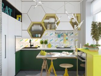
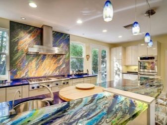
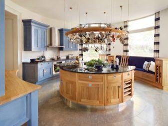
If the owners really like small details and souvenirs, you can add amendments to the interior of any style at your discretion. But from the very beginning you need to thoroughly think through the whole composition and agree on the smallest details. Drawing up a concept involves taking into account:
- personal wishes and tastes;
- the latest fashion trends;
- allocated budget.
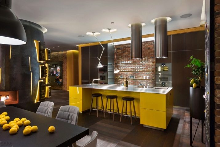
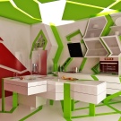
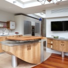
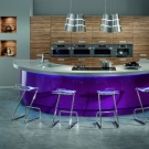
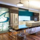
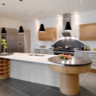
Original kitchen design options can be created by playing around the entrance. Instead of conventional door leafs, arches are mainly used. If the kitchen has only a single window, it is impractical to curtain it. Priority in an unusual setting should be given not to artificial, but to natural lighting.
Wood should be used carefully so that excessive humidity and temperature do not damage it. This is important to remember even when finishing the floor.
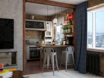
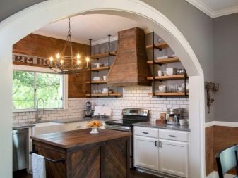
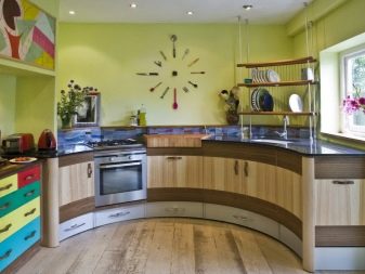
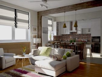
Atypical design of a small space
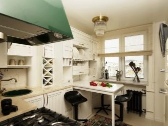
In a large kitchen, you can safely embody a variety of aesthetic solutions. But if the area is small, you will have to select the composition much more carefully. Another thing is that even with a low ceiling, you can arrange the space perfectly. For maximum space saving and at the same time for the greatest functionality of the room it is worth using built-in furniture. The technique may have the same design.
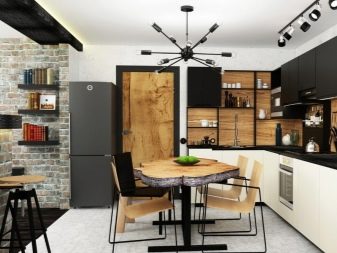
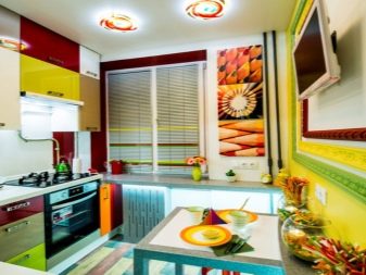
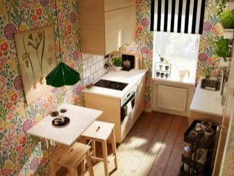
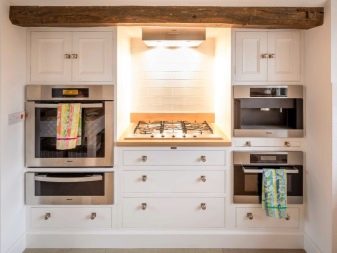
Mounting ovens and microwave ovens on the walls helps to free up space in a small-sized dwelling. An interesting idea may be the fundamental rejection of refrigerators. This step will help to use the space more efficiently.
A similar measure is appropriate if the refrigerator can be moved to another room. On the vacated plot put backup furniture or a kitchenette.
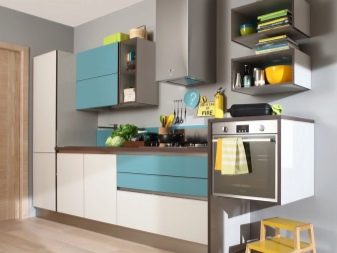
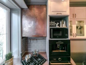
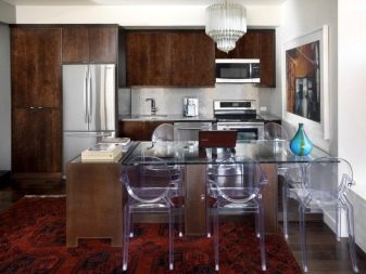
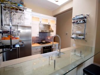
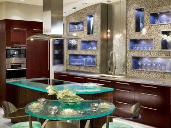
In a small kitchen, glass furniture becomes an appropriate choice. A table made of transparent material or the same chairs look not just non-standard, but also look more compact than other solutions. An alternative step is to use a minimum number of roomy furniture items as possible. But to overload the room, using a lot of modest-sized cabinets, shelves and chests of drawers, is impractical.
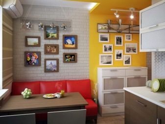
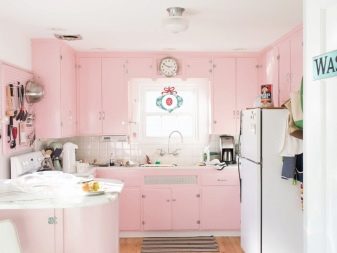
A non-standard step may be the rejection of the usual black-and-white and light compositions. Decoration of space in the kitchen is done, for example, in pink colors. And when pink or other bright furniture is unreasonably radical or expressive, you can paint at least one of the walls in this tone. Creative cuisine can also be created by appealing to old-fashioned motifs. In this case, they rely on ideas specific to country and vintage styles.
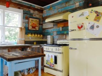
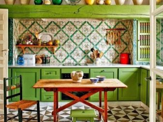
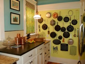
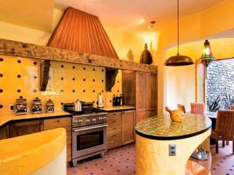
Authentic textiles and fun decor add color. But it’s possible to do otherwise - using tiles of an unusual geometric shape to revitalize the situation. By the way, it’s also worth playing with colors. Coloring different tiers of the kitchen in 2 pure colors often becomes a very fresh and non-standard solution.
It makes no sense to indicate the optimal combination (for example, white and yellow, blue and light green). Your decision depends on personal preferences.
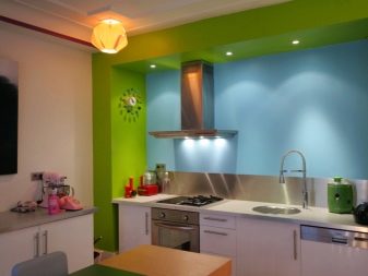
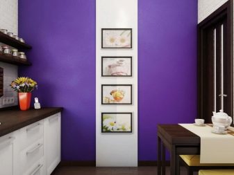
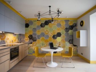
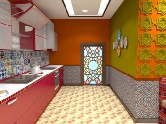
To create an atypical interior, it is not at all necessary to carry out major repairs or change finishing materials. It is much easier to use skillfully selected decorative objects and accents. Painted ceramics, bright-looking metal dishes will add chic and charms to even the most modest interior.
Attention should be paid not only to walls and other vertical surfaces. Manipulations with the aesthetics of the ceiling can be very useful.
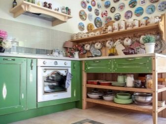
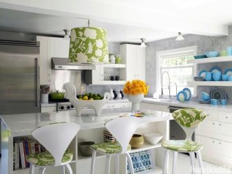
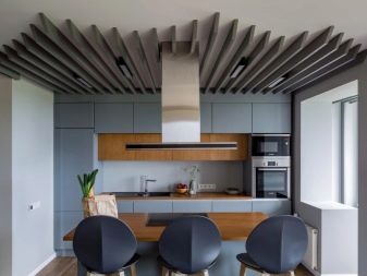
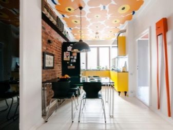
An original step will be the use of individually selected fixtures. It is not at all necessary to give preference to point versions, on the contrary - they have already lost their original charm and by no means look original. Where the best choice is the use of suspended lamps. It makes sense to look at the wallpaper. This finishing material, or rather, its ability to transform space, is often underestimated.
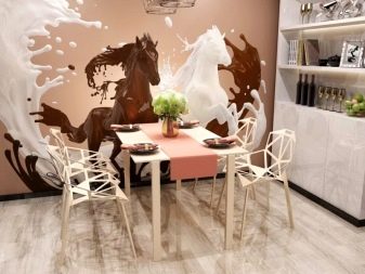
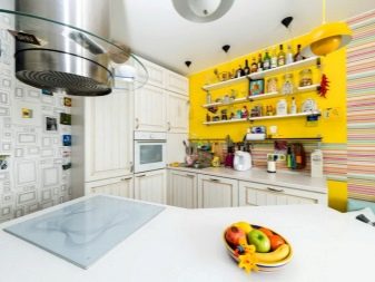
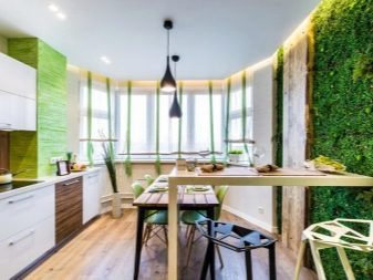
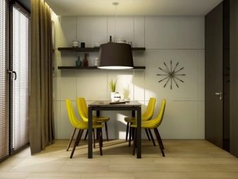
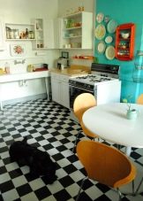
And meanwhile, it’s enough to cover only one wall with canvases so that the room looks bright and unusual. Designers advise choosing vinyl or non-woven wallpaper. They are much better than paper to match the specifics of the kitchen. Another possible way is to design the kitchen space in the spirit of a large cafe, for which they are used:
- checkerboard floors;
- sparkling dishes shimmering in the rays of the sun or lamps;
- chairs or armchairs of catchy tones;
- lightweight curtains.
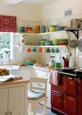
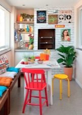
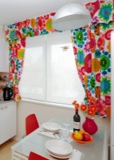
Another possible step is variations with the shape of the furniture. This opportunity is often underestimated, focusing on the "game" with the dimensions of objects. Even the easiest deviation from the canon (for example, the use of open curved shelves) will help diversify the interior.The use of artifacts from distant countries is sometimes not less good choice. Exotic souvenirs also solve the problem.
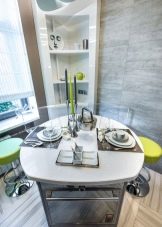
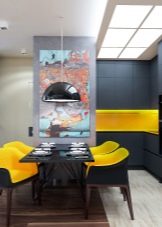
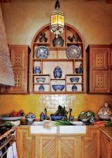
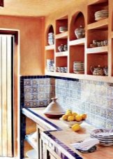
However, it is worth using them only in a thematic interior. Otherwise, a more comic effect may occur.
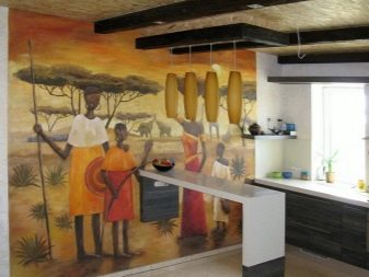
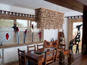
You can show your originality by designing an African-style kitchen. For this purpose:
- choose the preferred gamut of colors (focusing on the colors characteristic of the savannah, desert or jungle);
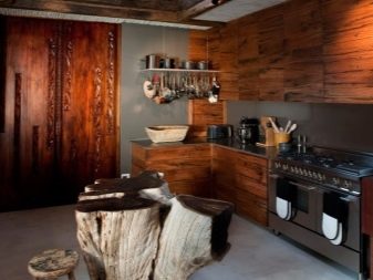
- apply strictly natural materials;
- achieve expressive roughness of the interior.
Beautiful examples
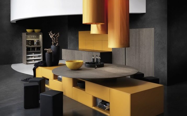
It is possible to state the general principles and suggestions for the atypical design of the kitchen for a very long time. But it will be much more interesting to see which design projects will deserve attention. So, a combination of very dark and light yellow tones only seems like a bad idea. This photo clearly refutes this opinion. Light gray wooden details are also used in the interior.
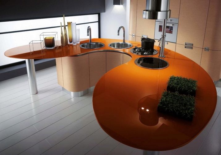
The curved-shaped worktop on metal legs also looks nice and unusual. Beauty adds an orange countertop. Design elements, a sink, and a working cutting zone are placed on one surface. A light tiled floor and a wall of large tiles only add to the space of charm. Both in the island zone and near the far wall, they used local illumination competently.
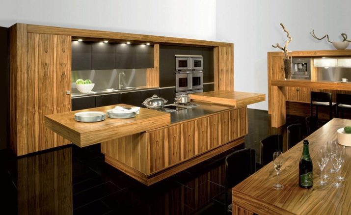
The combination of plain light wood furniture and a very dark floor can create an equally attractive look. Sliding worktop is very practical. The work area is decorated with a light apron. It used several spotlights. Deer horns are used as accessories.
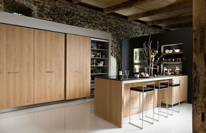
And here the combination of a light bottom and a dark top is uniquely beaten. Implemented even a relatively smooth transition of colors into each other. The graceful light brown tree from which the facade of the upper tier cabinets and the bar counter is made is in perfect harmony with the white bulk floor. A very dark wall with the texture of wild stone is complemented by other natural accessories (including dry branches). Very high chairs with a shortened back complete the composition.
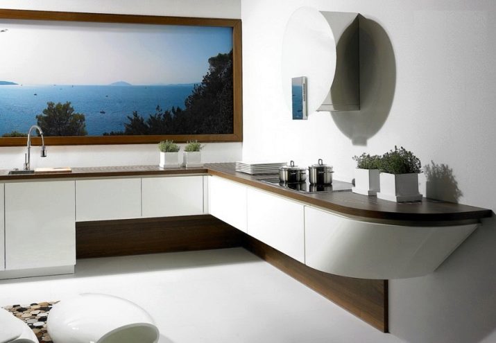
A striking and expressive solution is the use of a large landscape picture. The light facade is combined stylistically with the same kind of floor. The brown countertop is duplicated in fact by a tabletop of the same color. Ornamental plants look very beautiful. Light walls look expressive.
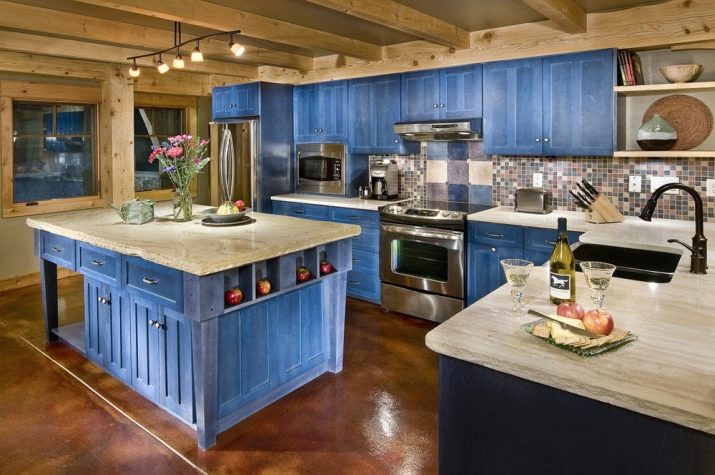
And in this interior, blue paint was used as a dominant. It is used for island cabinets and for the facade of wall-mounted furniture. White countertops and moderately dark stoves do not look unnatural in such an interior. Charm is added by a spotty brown floor and a ceiling made of light beams. Additionally, several open shelves and a mosaic apron were used.
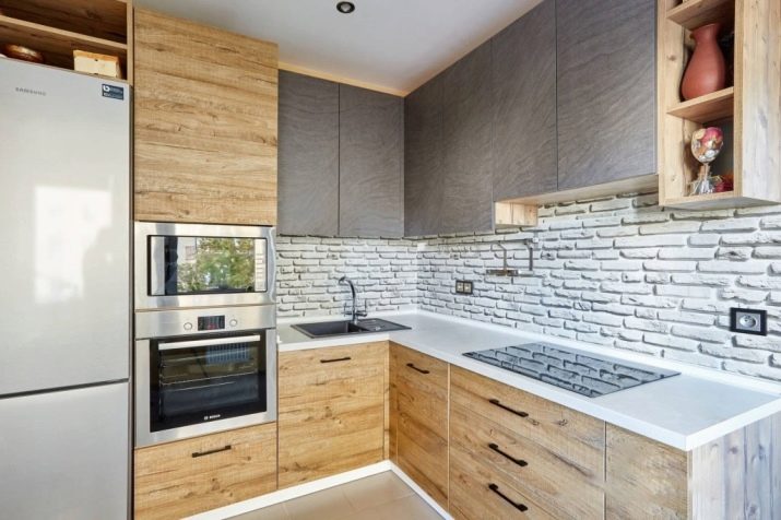
In this interior, only a refrigerator and countertop will be white. The light wood surface of the facades looks very nice. The brick texture of the apron adds a pleasant touch. All work surfaces are very smooth, which is achieved thanks to the use of induction hob. Along with closed cabinets, several shelves were used. The middle part of the upper corner tier is painted in an original tone.
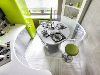
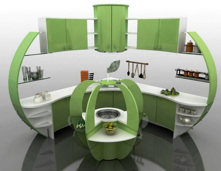
Even furniture sets of “curved” shape can now be made to order. Light green bent elements and white countertops, shelves will look impressive and exacting. The symmetrical arrangement of decorative objects on the shelves adds visual comfort. Against this background, the dark gray floor at first even seems to be lost sight of. The island zone in miniature reproduces the overall composition.
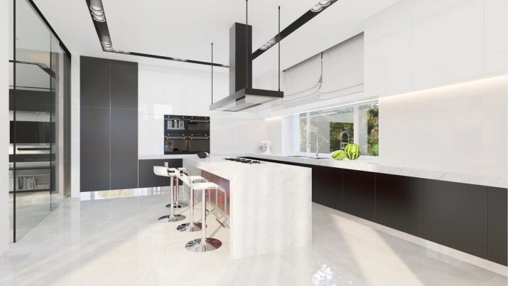
The interior in hi-tech style can be designed at the expense of only the balance of black and white colors. This combination is used both on the walls and on the ceiling (including in the area of fixtures).The main working area is located at the window and is equipped with an additional top lighting. Metal chairs are fully consistent with the aesthetics of hi-tech. You can safely take as a basis any of the described options, mix their components.
