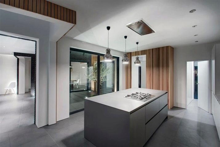
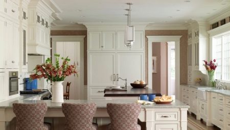
The open kitchen is most often found in a private house than in an apartment, but in any case it becomes a problem for the owners. This room can be large and small, narrow and wide. The owners see a huge minus in the fact that such a room with two doors is a passage to another room, which means that the design project must be non-standard. It is very important to create a comfortable room, functional and aesthetic. Despite the difficulties, creating an interior can be very interesting. There are a lot of options, you need to choose the one that will be optimal for your kitchen.
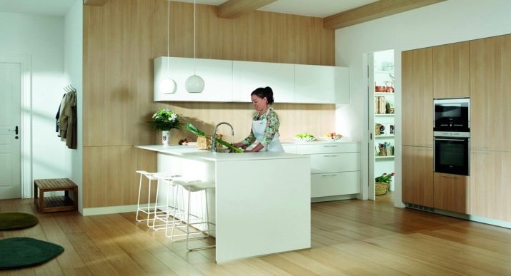
Layout Features
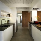
The most important requirement is that any kitchen should be ergonomic, even a walk-through. Therefore, begin to think through the interior with the location of the main functional areas. Besides, you must immediately take measurements and decide what maximum width and length a kitchen set can have. After that, you can start choosing the style, color, materials. The size of the walkways is of utmost importance in the walk-through room.
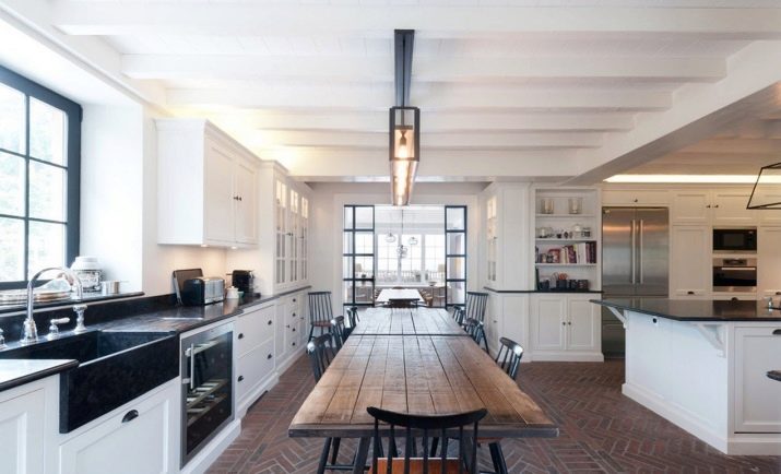
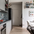
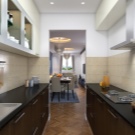
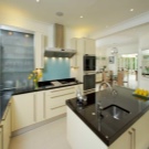
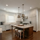
Designers recommend taking into account the following nuances at the planning stage:
- the working area should not be in the aisle and, in general, impede movement in the room, otherwise the hostess will be constantly disturbed;
- in the event that the room is large, you can think about the island layout, but only at the border of the zones, not in the center of the aisle, it is also possible to place a bar;
- a small room should have a minimum passage of 120 cm, otherwise family members will constantly bump into each other and interfere with the cooking process;
- no furniture, even the most important, should interfere with free passage through the kitchen;
- also exclude thresholds, different floor levels, possible communications, wires, cables in the passage zone;
- it is very important to correctly organize lighting, especially if the room does not have a window, in any case, the working area should have its own light source;
- cabinets with standard doors are not very convenient in such a room, it is better if they are of a compartment type;
- the dining area can be placed only in a rather large passage kitchen, but if the area is modest, it should be moved to the living room or separate room;
- it’s quite possible to equip a small folding table even in the smallest kitchen.
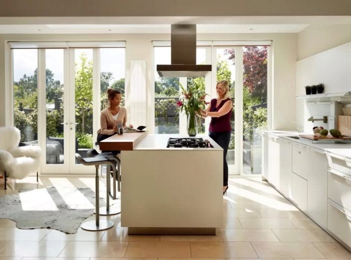
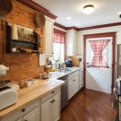
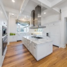
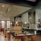
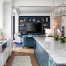
In addition to these techniques, you also need to properly zon the entrance kitchen. Of course, we are not talking about real partitions, but the visual division into zones is quite real.
Zoning
In order for the functional areas to be separated from each other, but the overall composition was harmonious, a number of design techniques can be used. In the passage room, a clear zoning of the dining room and the working area cannot be done. Visual methods of zone separation:
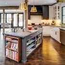
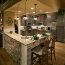
- the island in the form of a working area or bar counter is appropriate only in large areas, as well as in the combination of kitchen and living room;
- over the island you can place hanging cabinets or pendant lights;
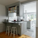
- since partitions in the passage room are undesirable, you can use furniture such as shelves or cabinets;
- color zoning is not the most time-consuming, such a technique will not only highlight the zones, but also fix the room’s flaws, for example, a kitchen that is too long can be visually shortened with color;
- another way to replace the partition is to use thread curtains;
- even rugs of different prints or colors, correctly positioned, can highlight areas;
- different materials for decoration in different areas.
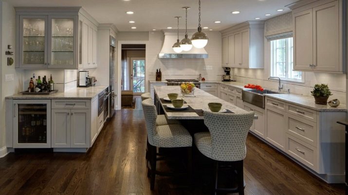
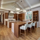
Furniture selection
It is very important to consider not only the size of the room, but also the overall style. In order for the composition to be harmonious and aesthetic, all furniture, appliances and decor should correspond to the chosen direction. Designers recommend the following rules:
- shades, materials, design of objects is better to choose so that with adjacent objects they look organic;
- discard the decor, which you can catch on when passing by;
- do not forget about aesthetics; externally, the furniture should fully correspond to your idea;
- it is better to minimize the glass doors of cabinets or completely abandon them by opting for closed ones;
- the bar in the center of the room should hold chairs underneath, otherwise they will interfere with the passage;
- choose materials and accessories that are easy to wash, this applies to absolutely all objects in the kitchen through passage, it becomes more polluted.
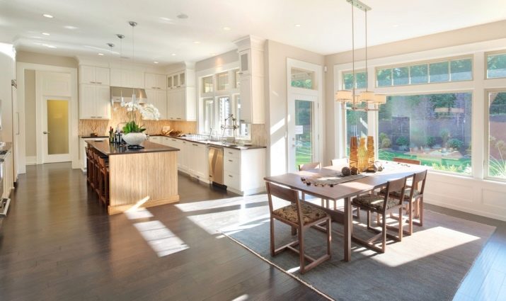
Window work area
This is a very original design decision, which many owners of walk-through kitchens are afraid of. However, following the example of Western designers, this method of placement is increasingly gaining popularity. In this way, you achieve better lighting of the working area, in addition, the view from the window can not but rejoice in the process of cooking.
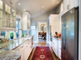
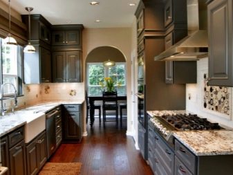
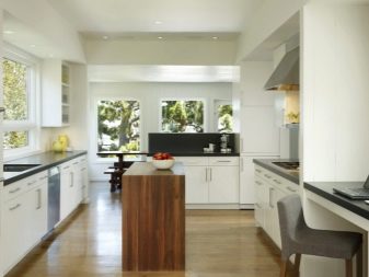
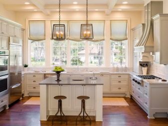
In a private house, such a layout is convenient because you can watch the yard, children.
First of all, you need to think over the countertop and cabinets so that they do not overlap the opening. In fact, the window sill is replaced by a tabletop, and the window flows into the overall structure very organically. We'll have to abandon the curtains, replacing them with blinds, roller and Roman models. Be sure to think over the transfer of heating appliances, which in apartments are most often located under the window.
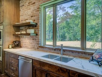
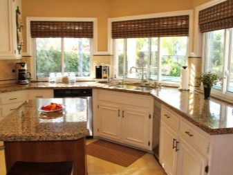
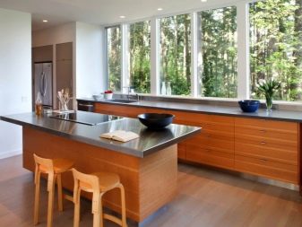
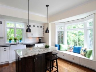
You can install a system of underfloor heating, if the problem of transfer can not be solved.
Lighting
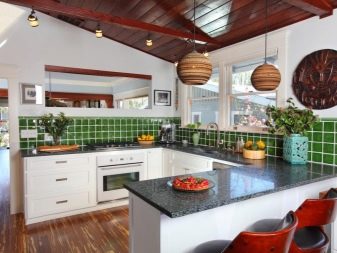
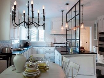
There will not be enough central lighting in the walk-in kitchen, so a lonely chandelier on the ceiling is the wrong decision.First of all, lighting should penetrate into each zone, while betting on the natural only is impossible. In the dark, it will be rather uncomfortable for you to cook, wash dishes or set the table. The entire perimeter of the walk-through kitchen should be under the light of any appliances. The working area is most often illuminated with LED strips or built-in lamps.
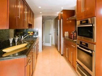
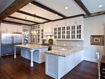
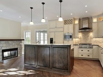
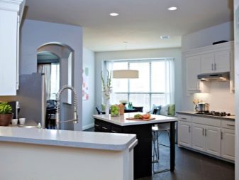
Above the dining area you can hang a chandelier or ceiling lamp. In the passage, you must have a separate light source for the passage in the dark. Light can not only emphasize zoning, but also give the room coziness. If the ceilings are not too high, it is best to avoid suspended structures in favor of ceiling lamps.
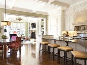
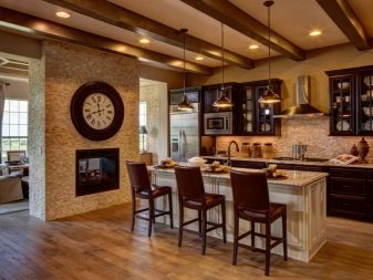
Style, color schemes, decor
The choice of style for the open-plan kitchen should be chosen taking into account the characteristics of the room, its size. If the room is large, there are very few style restrictions. One should only avoid too luxurious directions, for example, baroque or art deco. A great choice for any room size - Provence, country, classic, minimalism. In a small kitchen, laconic styles of minimalist trends - minimalism, hi-tech - will look best. Despite its simplicity, a loft requires a lot of space, so it will not be appropriate in a small walk-in kitchen.
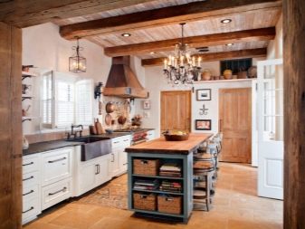
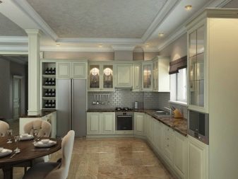
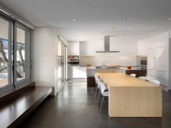
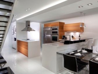
The color scheme is directly related to the size of the room and style. In a large bright room, you can safely apply contrasting and catchy color schemes, in a small one it is better to bet on simplicity and light shades. In the latter case, style and color should work to increase the visual space.
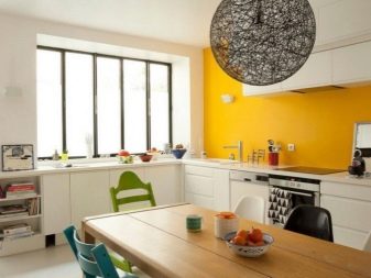
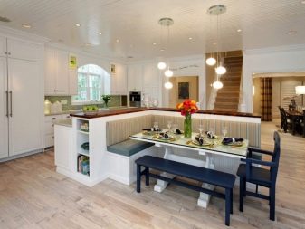
As for the decor, it should be minimal. Do not use objects that will interfere with movement around the room. It is better not to clutter the passage room even visually. Therefore, adhere to the principles of minimalism - this is a win-win option.
