Headsets in contrasting colors give any kitchen dynamism and style. However, the selection of such furniture must be carried out in accordance with a number of rules.
Features
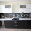
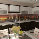
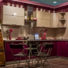
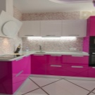
The design of the kitchen with a light top and a dark bottom allows you to create a bright and memorable interior, the mood of which is determined by the colors used. For example, the hard pronounced contrast between black and white creates the effect of some aggression and even masculinity, and a combination of pink and purple shades adds femininity. For a neutral environment, it is customary to use soft combinations of brown and beige or gray and blue tones. In addition, it is customary to make the top of the headset more relaxed, and add brightness to the bottom.
Although classic is the strict separation of the dark bottom and light top, you can also additionally use colors for accents in the form of geometric shapes or lines.
Advantages and disadvantages
Combined headsets have both a number of advantages and some disadvantages. The light top and dark bottom immediately create a bright and unusual accent in the room, which increases the possibilities for decoration and the rest of the space.
Convenient that two-tone furniture is suitable for any stylistic decision, of course, with some modifications. The presence of a dark color allows you to "fit" the equipment available in the kitchen into a single picture. In addition, a combination of contrasting shades visually divides the room horizontally, and this greatly expands the space. The combined headset will look interesting even with the usual linear layout.
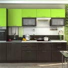
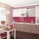
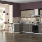
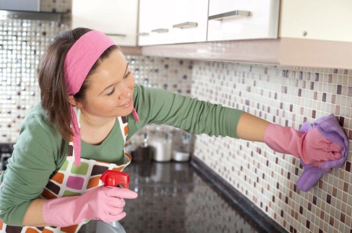
Regarding the flaws, the only obvious one is the need for regular cleaning. The fact is that on light surfaces spots and deposits immediately become noticeable, and on dark surfaces - drips and dust. If you neglect regular cleaning, then the furniture will seem stained. Another little difficulty can be the selection of shades: it is important that they not only combine with each other, but also that the dark color does not overload the space and does not make it smaller.
Basic combination rules
In order for the kitchen set to look organically, you need to adhere to several basic rules. The darker and smaller the room itself, the more light spots should be located on the headset. For example, in addition to the light top, at the bottom you can place several accents of the same color on the facades, and choose a representative of a light palette as the third “connecting” shade.
In addition, if the headset looks too dark due to the massive bottom, then the rest of the kitchen should be contrasting light.
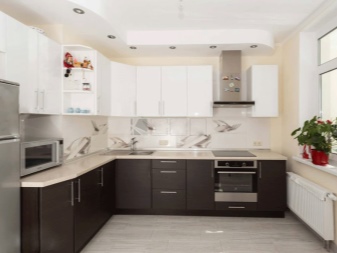
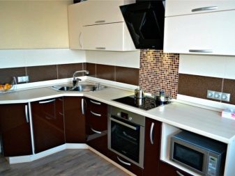
An important role is played not only by colors, but also by textures, shapes and accessories. You need to consider the appropriateness of the glossy effect or dullness, as well as play with forms. It is believed that in this case, angular headsets or those that have a countertop of an unusual shape look much more interesting. As “supporting” accessories, textiles, upholstered furniture, lamps or even utensils are used. Curtains are better to choose one of the used shades or "connecting" tone.
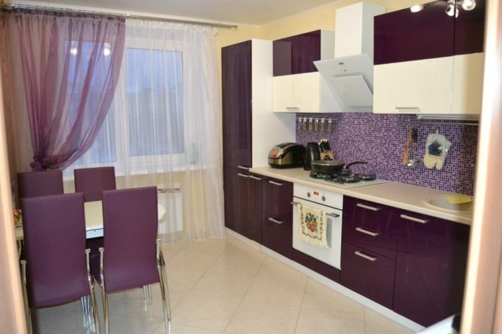
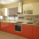
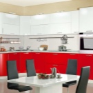
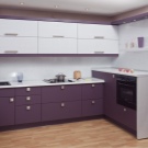
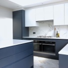
Sofas, banquets or pouffes are purchased in accordance with the same rule. It is better to choose ceiling lights with a shade of the corresponding dark shade to provide the necessary contrast in the "ceiling" zone.
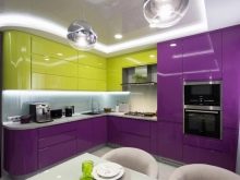
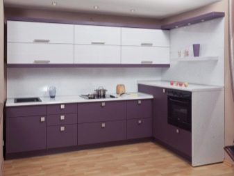
Cookware is recommended to choose one or both of the main colors. For example, if the kitchen set has a dark purple bottom and a yellow top, and the countertop is painted in basic black, then the latter should definitely place a beautiful ceramic container of the corresponding yellow shade. Together with it, a purple container for fruits or sweets is used, standing on the dining table.
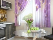
If possible, curtains should be acquired shades of lemon or ripe banana with any purple patterns, for example, peas or stripes. It is better to choose a sofa with purple upholstery, and place on it a couple of yellow pillows.
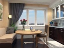
To prevent overloading the interior, all major surfaces - ceiling, floor and walls, should be as neutral as possible, for example, in gray or beige colors. In such a room, a glass round table will look good.
Color schemes
The combined kitchen set allows you to use almost any shade. The classic is, of course, black, the variations of which vary from saturated matte to light gloss. It successfully combines with any pale shades, white, blue, pink, yellow and even cream. No less common is the dark gray shade, which, depending on the second shade, can create both warm and cold atmosphere in the kitchen. It looks organically with white, creamy, light blue and others.
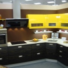
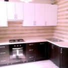
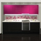
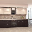
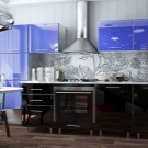
It is common for a combined headset and the use of a shade of chocolate in all its many variations. For example, it may be a combination of beige-brown or wenge-vanilla. In general, you should focus on combining dark brown with a warm palette, for example, milk or a shade of champagne. Dark green, almost emerald, it is customary to combine with cream, beige or champagne again.
This combination is ideal for classic interiors.
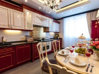
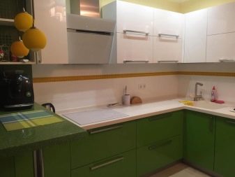
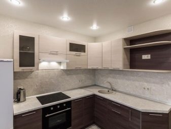
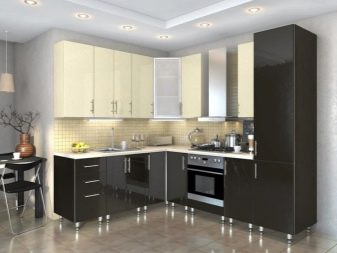
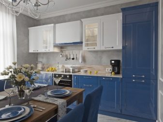
Deep blue is suitable for styles such as Art Nouveau, Mediterranean, Greek or again classic. You can combine it with warm beige tones, and with a pale yellow color or a shade of ivory. Violet shade is indispensable in modern interiors. The most harmonious is to combine it with beige, creamy or light purple.
In general, choosing colors for a headset with a dark bottom and a light top, we must not forget about the need for a third shade, which will be used to place accents, as well as fulfill the “connecting” role between the two parts.
How to choose?
In order to complement the interior with a two-color headset, you need to focus on the footage and features of the room, as well as the chosen style and desired mood. It’s worth saying right away that angular design is indispensable in small rooms. Brown, blue and green shades successfully fit into classic interiors, as they create the effect of luxury and nobility.
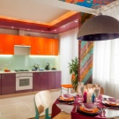
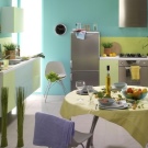
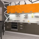
Combine these colors with solid wood, wood countertops, and carved furniture. Modern light interiors allow you to use bright colors, for example, mix purple and orange shades. In this case, the apron can be made plastic, and in the kitchen itself it is imperative to place wide flying curtains and a small rug. Turquoise and olive colors look good in combination with mirror surfaces and modern technology.
Interesting ideas
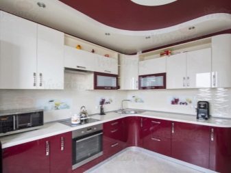
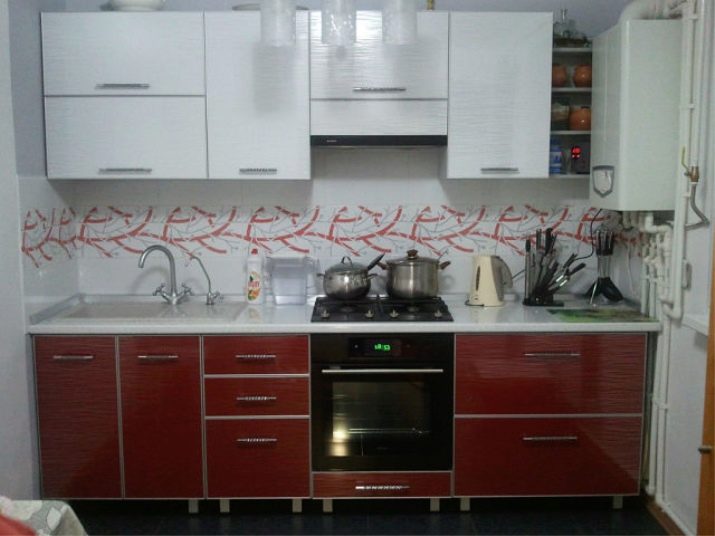
Such a difficult shade, like red, will look completely non-aggressive, if you combine it with a simple white color as part of a combined headset. Unusual texture and gloss are repeated both above and below. The lower cabinets are covered with a white countertop in the same shade as the upper ones. Red color is used not only for the lower modules, but also are part of the pattern on the kitchen apron.
The third “connecting” tone can be called a silver shade - it is also present on the apron, on the handles of cabinet doors, on the faucet of the sink and placed dishes. Despite the fact that the headset is linear, its good location does not "steal" free space and does not modify the layout of the room for the worse.
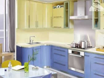
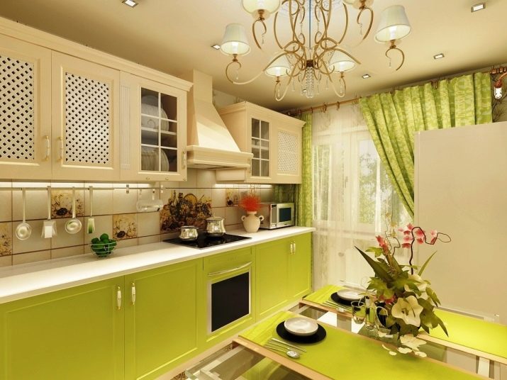
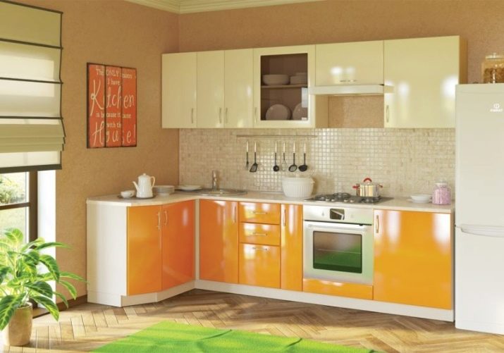
A combination of a saturated yellow hue and a color close to champagne looks bright and sunny. The “connecting” shade in this case is white. This is how the worktop, the existing equipment and the ends of the cabinets are painted. The apron is decorated with beige shades, close to the color of the upper modules. The doors of all cabinets are glossy. The length of the floor modules exceeds the length of the hinged ones, but a poster of a harmonious shade was successfully placed on the vacant wall space.
It is important to add that in such a bright kitchen, the decoration of the walls, floor and ceiling is as neutral as possible.
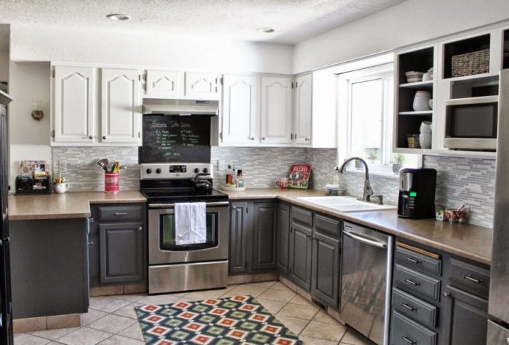
The main shades of the Scandinavian style are dark gray and white, which look perfect in one combined headset. The dark bottom creates a feeling of support and coziness, and light cabinets, merging with the ceiling, give the room capacity and the necessary space. The tabletop headset is painted in a beige shade, which is also found at the bottom of the floor modules. The apron is decorated with a pattern combining both of the main shades involved in the headset.
The stove and dishwasher, made of dark steel, are ideally combined with floor modules. The walls of the room are painted white, and the shade of the tiles on the floor is identical to that used for countertops.
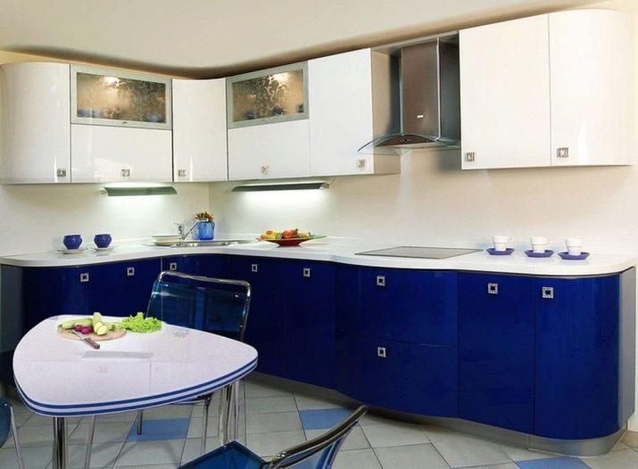
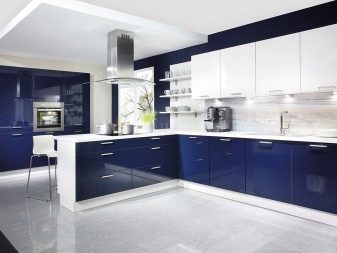
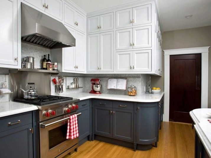
The combined kitchen set looks very stylish and spectacular, the lower cabinets of which are painted in dark blue, and the upper ones reaching the ceiling in white. The “connecting” shade is gray. It is used to decorate an apron, cabinet handles, as well as the equipment used - stoves and hoods. It is worth mentioning that although the upper cabinets form a pronounced angle, and the lower ones have a rounded module, their combination still looks extremely organic. The floor in the room is laid with a laminate of light shades, and the walls are painted in neutral gray so as not to overload the interior.
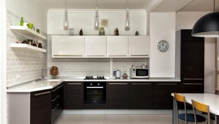
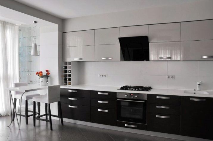
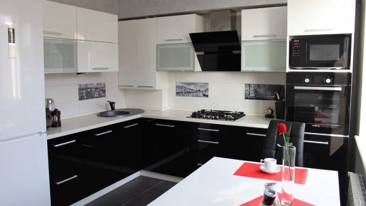
The combination in the headset of black and white can be called almost a classic. Glossy doors look extremely impressive. An additional tone here is gray - it is present in the design of an apron, cabinet handles, as well as existing household appliances. The countertop, by the way, is painted in plain white, identical to the color of the mounted modules. Other items in the kitchen support the contrast: a white table, a white refrigerator, a black stove, an oven, chairs and a microwave. The floor is covered with dark gray tiles, matching the additional tone.
See how to combine colors in the kitchen in the next video.
