For lovers of coffee and connoisseurs of sophisticated chic, a cappuccino coffee color kitchen is suitable for coffee with milk. This is a complex shade that has a rich palette and looks great in the interior. Warm colors will help create an atmosphere of comfort, exquisite softness in any chosen style.

Shades
In the coffee range there are different tones: cold, almost gray, and warm light beige and chocolate. A traditional cappuccino is darker than beige, but lighter than brown. The characteristic light reddish tone makes it truly “hot”, it warms the interior, at the same time creates a feeling of relaxation and peace.
Cappuccino
Designers are very fond of using cappuccino in the decoration of rooms, since it has a number of undoubted advantages:
- completely changes the appearance of the environment;
- suitable for any style;
- goes well with many colors;
- Suitable for different areas.
The kitchen is completely elegant in this design. More modern than beige and brown options.
White, black, gray - these basic colors and their derivatives are in perfect harmony with cappuccino. It combines with bright pink, raspberry, violet, lilac, soft mint, turquoise, green, khaki, marsh, pistachio.
Cappuccino itself can vary from yellowish to grayish, evoking pleasant memories of coffee and chocolate, filling the atmosphere with aromatic warmth.
Coffee
Coffee tone - dark brown of medium density - is closest in color to roasted coffee beans. This warm and muted shade is traditionally used to design furniture facades, is representative and aristocratic. Coffee is a changeable tone, under the influence of lighting it becomes: in daylight white - milky, in the sunlight - it acquires a saffron hue. To revitalize the interior, it makes sense to arrange bright color accents: orange, cherry, blue, lemon, fuchsia.
Coffee with milk
It has a reflective effect, adds positive emotions, but can be somewhat monotonous. But it provides an opportunity for experiments, goes well with different colors (green, brown, yellow, orange) and textures (matte, glossy, pearl, metallic).
Cocoa
Delicate woody brings sweet associations about a drink memorable from childhood, has a beneficial effect on the psyche, has a calming effect, gives a feeling of comfort and warmth.
Fashionable color scheme, popular for more than one season, and, according to forecasts, will remain in trend for a long time. Universal, goes well with beige, flesh, sand, cream brulee and silver. Harmoniously combined with white. With green, burgundy, lilac, blue and dark chocolate color creates interesting decor options. Bright colors are mainly turned on with the help of individual details: utensils or curtains, tablecloths or chairs.
Latte
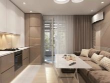
Light beige shade creates positive emotions and expands the space in the room. An excellent solution for both traditional classic interiors and modern minimalist ones.
It is combined with green, bronze, gray, violet, red. In a monochrome design, latte with different variations of coffee creates interesting compositions.
Accent colors will help revitalize the situation: red will add energy to a calm background, yellow, orange will bring dynamics and make a bright contrast. Latte in a strict duet with dark brown or black will give completeness and sophistication.
This shade goes well with textures like wood, brick, stone.
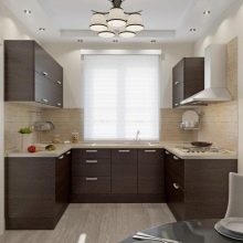
Chocolate
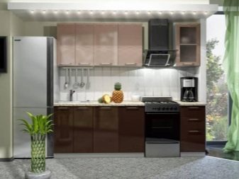
It includes several varieties of brown: from a shade of milk chocolate to dark bitter. Soft muted tones bring peace to the atmosphere. It is easily combined with different colors, with the exception of dark gray, dark green and black. It goes well with turquoise, pink, blue, light green and white. Beige and gold make it possible to create a luxurious and sophisticated interior. It must be remembered that chocolate coloring visually can overload a small room.
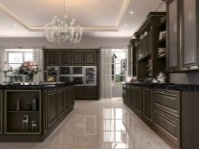
Designers note that Chocolate is especially loved in cold climates, it causes a feeling of warmth spreading over the body. It is perfect for furniture, gives the impression of stability and comfort. Using dark chocolate in the design, complement it with more milky or even white tones.
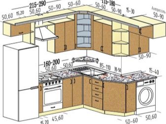
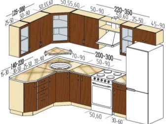
Types and placement of kitchen units
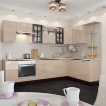
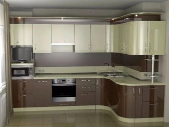
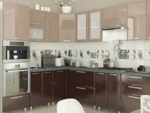
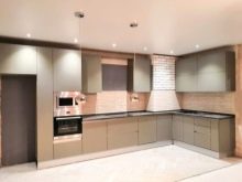
For angular kitchen sets are advised to use contrasting decor: one part of the cabinets should be made in a lighter range, the other in a darker one. So, you can make the upper part more airy, and the lower - less mark. Zoning different areas is also an interesting idea, for example, to separate the working and dining parts.
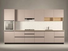
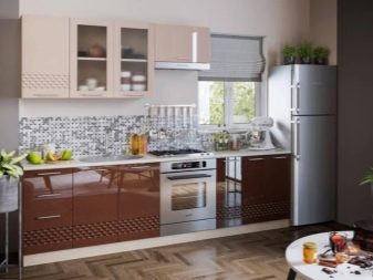
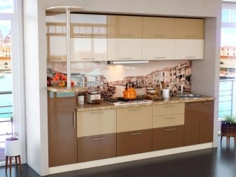
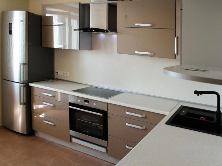
Single row a cappuccino-style kitchen will look more elegant if you add black color, for example, household appliances: a refrigerator, an extractor hood, an oven. In combination with pink or white tones, headsets of this kind look original and fresh.
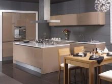
Double row kitchens In this color, they are good using the whole gamut: light facades and hanging cabinets, brown side panels and countertops, the headset creates a warm, relaxing atmosphere.
For small rooms U-shaped coffee kitchens are best chosen in a pastel version. Chocolate tones are recommended to be combined with light walls, ceilings and other elements. An excellent choice with dark facades will be light countertops and wall cabinets.
In a white kitchen studio, chocolate-colored furniture will help separate the space for the cooking process.
Headsets with a peninsula look great in one color and in a combination of two or three. Nevertheless, it must be taken into account that brightened options and combinations make the furniture more weightless, thereby expanding the area. For small rooms it is better to choose cabinets and cabinets with light fragments (doors, countertops), dark options are perfect for large kitchens, or combined with the living room, where there is a lot of free space.
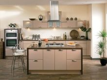
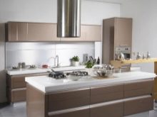
Headsets with the island look spectacular in the color of cappuccino, you can not be afraid of the glut of this shade in the room. Even if the kitchen is almost one-color, the spicy flavor will make it a winner, without gloom and dullness. White countertops add airiness to the headset, and a glossy surface brings light to the decor.
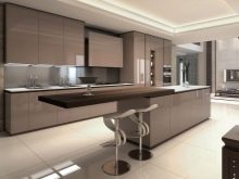
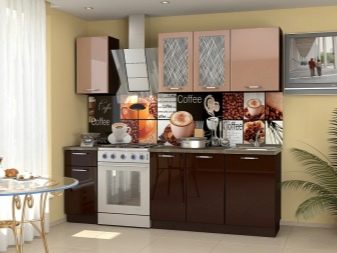
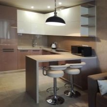
With a bar, the kitchen can be decorated in one palette and in contrast, it is interesting to highlight the counter top lighter or, conversely, darker than the main background. You can make part of the headset with a chocolate counter, and the other - coffee with milk, so the room will seem voluminous and harmonious.
Individual designs of kitchen sets - this is a unique design option. Now very popular modular headsets, consisting of different blocks: cabinets, cabinets, chests of drawers. The advantages of designer furniture are obvious: you can buy such furniture quickly and at a lower price.
Modular furniture in fashionable colors will help to update the interior without high financial costs. Combining cabinets with milk and coffee colors, it is easy to create a stylish and practical model for a cozy home.
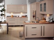
Kitchens in the cappuccino palette can be chosen with glossy and matte facades.
The shiny surface reflects the light incident on it and thereby increases its amount around, creating the effect of expanding space. For a small room, such furniture is an excellent solution. Glossy furniture must be correctly combined with wall decoration: dark ones absorb light, and glossy facades in this situation will not save the situation.
Velvety matte surfaces create the effect of comfort and warmth, they are practical and look respectable. Frosted facades will remind you of morning coffee, create an atmosphere of peace and relaxation. Matt furniture in any light will look advantageous.
Matte surfaces are preferable for roomy rooms. Such facades require more light than gloss. It should be remembered that the dark gamma does not reflect light, thereby visually reducing the space. Muted tones are suitable for classic and provence styles.
Good color combinations
Cappuccino goes well with all pastel colors, as well as brown, white, black and olive. One of the most popular design techniques in the design - a combination of coffee and milk shades - creates stylish compositions.
The range of coffee allows you to play with milk and coffee colors, combine bright and pastel options.
Using a two-color design, you can visually unload the space, add volume and air, and be in the trend of modernity.
- Vanilla. It will add tenderness and airiness to the room, it is suitable for a small area. Compared to pure white, which creates a feeling of winter cold or the gloss of the lobby, vanilla refreshes the design and serves as a backdrop for bright colors. Cappuccino is perfectly combined with vanilla, a delicious couple will decorate the house of a true coffee lover, suitable for both classic and democratic styles: Provence, country.
- Grey. It will add restraint to any composition, in combination with cappuccino it will become a cooling element in the headset. Gray details in a soft and warm design will dilute the monophonic interior, will translate the design of the room into a neutral gamut.Gray - conservative and non-marking in combination with the same soft coffee will give a practical, rigorous composition.
- Olive. The thick and warm color relieves the atmosphere, the palette from pastel to deep tones harmoniously combines with shades of coffee, gives an unusual ratio of soft green and cream shades, refreshes and enlivens the interior. Natural combinations will cause pleasant warm and spring associations.
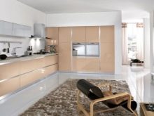
- Metallic Adds shine and light to the room, adds a touch of glamor. In modern design, metal objects are used quite often. Metallic in various combinations is considered the most popular in recent years, it is used in different styles. The surfaces are decorated with shiny and cold metallic coatings that shimmer and reflect light.
For a kitchen set, this design is most often chosen, it is here that there are many metal objects (appliances, dishes), and the modern color will successfully complement the look of the room.
Style selection
The design in the coffee range gives room for many styles, combines with any color, does not burden, creates a sense of stability and adds modernity.
For classic style the possibilities of a noble cappuccino can be used in both light and dark versions. Light furniture is elegant and aesthetically decorate small areas, chocolate sets are elegant and aristocratic, suitable for spacious rooms. Two-color design is best used carefully, contrast is unsharp, for example, countertops and facades to choose different shades.
Minimalism gravitates to strict tones, soft coffee with milk is suitable for a laconic and strict interior. For contrast, it is better to use a coffee palette: a combination of chocolate cabinets and pastel wall cabinets. Please note that dark range complements the general decor, serves for zoning the space.
High tech prefers a large amount of light, air, free space. Either one-color gamut or contrast is used, combinations of both its own cappuccino palette and in combination with accent paints are acceptable here, but they must be used dosed.
Glossy coffee facades in the same tone with the walls are welcome, you can design only the countertops in the same way as the background or only the facades of the upper or lower cabinets.
To create a touch of style provence or country prefer light furniture, and coffee with milk will be very useful in such a design. Matte facades are finished with gratings, planks, decorative cornices, with and without glass. As a rule, the furniture is decorated in one color, but you can highlight the island or peninsula, making 1-2 tones lighter than the entire set.
Features of the interior in monochrome
Coffee and milk colors wallpaper and kitchen set create a warm and positive atmosphere. The room looks spacious, playing with shades of coffee, you can create the most incredible interior.
The choice of colors for the walls depends on the location of the kitchen and how well it is lit. For northern rooms, light warm colors will be most successful; for the south side with good lighting throughout the day, cold grayish tones are recommended.
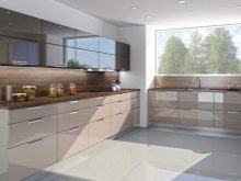
Tiles, plastic, wallpaper, paint and varnish mixtures - these decorative elements of the coffee palette, assembled like a mosaic, will become the backdrop for the kitchen. The area near work surfaces, stoves and sinks are most often laid out with ceramic tiles, but also plastic panels, stone, glass and mosaic will be a good option for decorating an apron. You can make it lighter than the main background of the walls, or, conversely, much darker. A good solution is an apron painted under the countertop.
Designers recommend choosing chocolate furniture when decorating walls in the coffee and milk range, and choose a light coffee set for dark brown walls.
The floors are covered with linoleum, tiles or laminate in the colors of coffee or milk chocolate, completely vanilla - can be very easily soiled, spots and splashes are more noticeable on them. The floor will look good a tone or two darker than all furniture and walls.
Tile with a mirror shine will create the effect of expanding the space, it will be beneficial to look at the chocolate floor.
Beautiful design examples
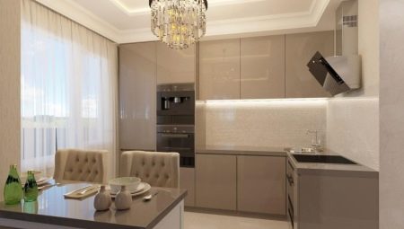
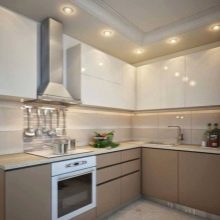
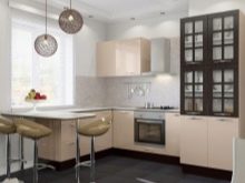
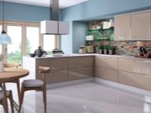
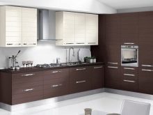
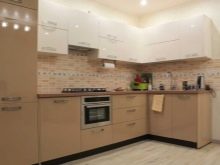
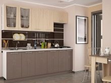
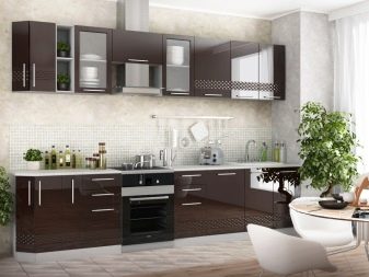
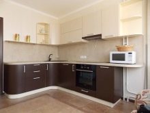
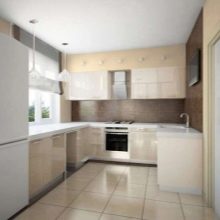
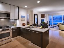
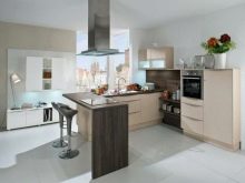
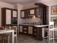
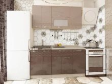
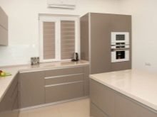
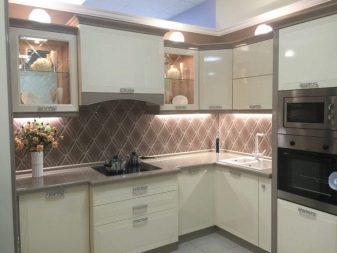
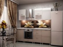
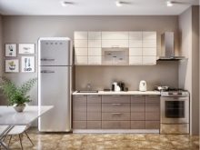
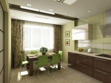
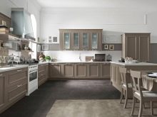
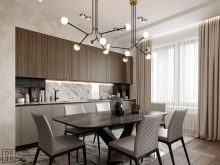
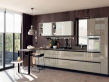
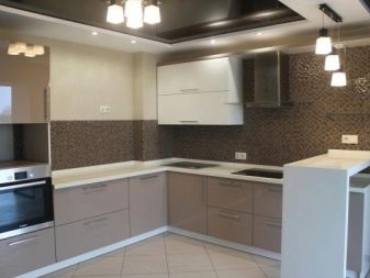
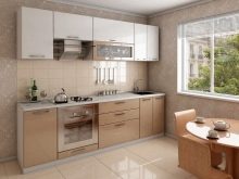
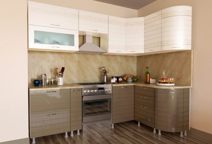
Cappuccino is a combination of whipped milk and a light brown drink, if transferred to the headset, you will get coffee cabinets and countertops, and cream cream-colored lockers above.
Cappuccino Kitchen
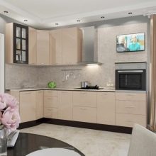
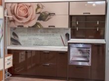
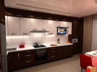
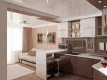
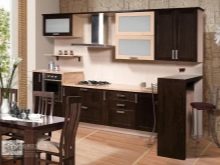
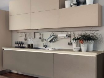
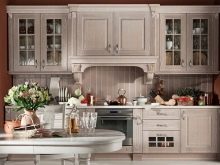
Combines a soft, muted color of coffee on the gloss of the floor tables with a matte surface of the hinged sections of delicate pastel color. The walls are painted in warm beige, the floor is covered with linoleum to match the floor cabinets with darker splashes. The space between the work surface and the wall cabinets - an apron - is made in a transitional combination of coffee and vanilla headset design.
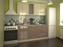
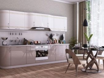
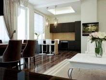
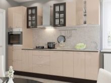
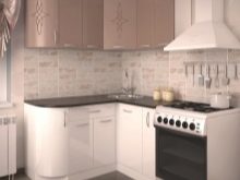
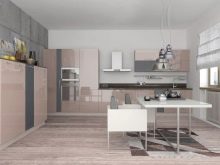
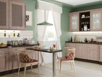
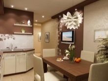
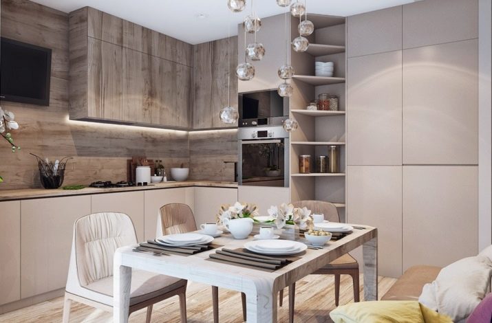
Minimalistic option
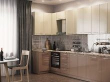
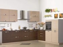
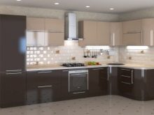
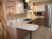
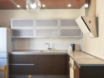
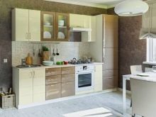
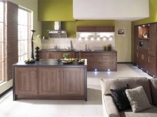
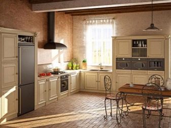
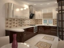
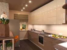
A prime example of cappuccino furniture with wood trim. Designers use different textures and tones in the headset: milky accents are shifted to the dining table, the corner zone is slightly darkened. This is facilitated by wood surfaces and a more coffee shade. The emphasis is on textiles - dark chocolate napkins and transparent spheres above the table.
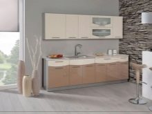
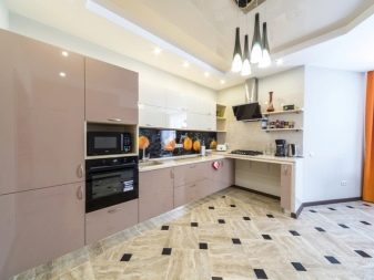
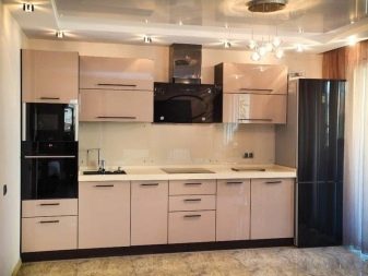
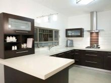
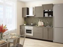
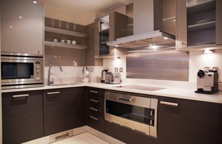
Coffee with chocolate
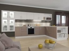
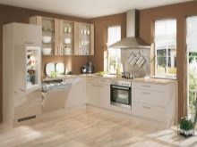
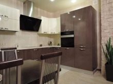
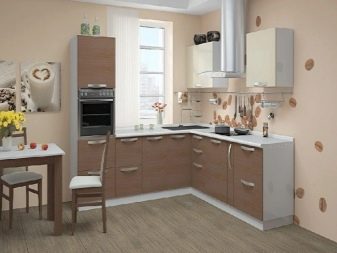
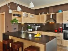
By tiling the apron is divided into two halves: lighter - vanilla and darker - cappuccino. Wall cabinets are finished in gloss. Floor stands matt with metal elements. The floor, walls and ceiling are selected in the same tone, a light skirting board softens the transition from floor to pedestals. Built-in lamps and fixtures create a smooth play of light and shadow on the furniture.
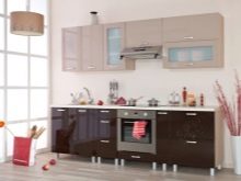
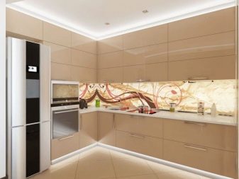
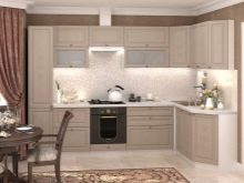
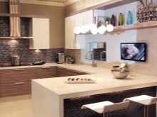
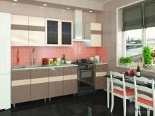
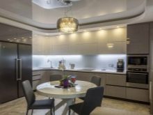
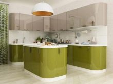
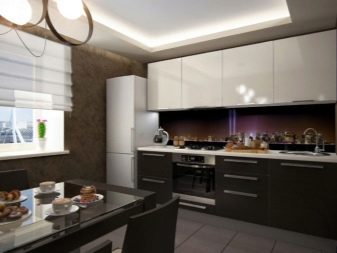
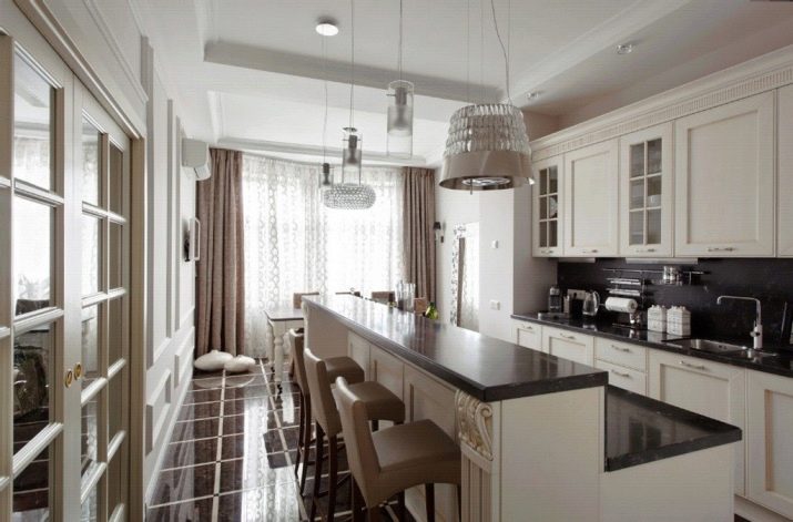
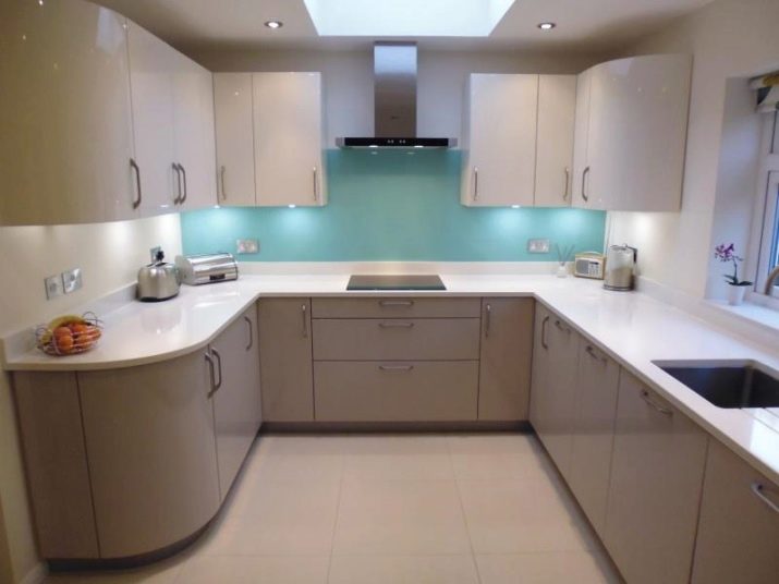
U-shaped kitchen with a color accent
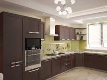
The glossy facades of the upper cabinets and the matt surface of the lower cabinets give the impression of a room opening upwards. Rounded facades and white countertops to paint the walls create a feeling of airiness. Tiffany color successfully combines with the rest, attracts the eye and expands the format of the room. The lighting on the ceiling and cabinets only enhances the effect of a spacious environment.
The main rules for combining colors in kitchen interiors are in the next video.


