Coffee-colored kitchens, regardless of the size and area of the room, always look at home cozy and attractive. A variety of color palettes makes this design option very harmonious. Soft transitions of shades, dessert warm gamut, democratic and aristocratic design decisions. A kitchen set in the colors of coffee, mocha, cappuccino and other tones in the interior will make the space comfortable for long evening gatherings or morning gatherings for work. Various kitchen design options make it possible to use your favorite color in a bachelor’s dwelling, in a cozy family nest, and in a luxurious apartment with a claim to luxury.
How to harmoniously combine shades of coffee with other colors and shades, whether it is possible to use a monochrome gamut, which configuration of furniture to choose - the answers to these questions help to adapt an unusual color scheme for a typical home décor or to decorate a modern studio with it. It is enough to study the established rules and advice of designers, and then make your choice in favor of your favorite coffee tones.
Color palette
When decorating the kitchen, the most popular options for coffee shades, such as whitened desserts and rich dark colors. As a base for a headset, it is customary to use several popular options.
- Bitter coffee. Saturated dark brown, repeating shade of coffee beans. It looks most interesting in a glossy design. Depending on the choice, the degree of “roasting” can be changed from dark French to medium American.
- Mocha. Such a coffee-colored kitchen will be distinguished by a cold gamut and a rich black and brown tint. This is the darkest version of brown, under different lighting conditions that can look like dark chocolate or black.
- Red-brown, reminiscent of low-roasted coffee. It looks very respectable, it is quite actively used when creating furniture in the spirit of the Victorian era.
- Coffee with cinnamon. Beige brown, colder and noble, reminiscent of powdered truffle. It looks very stylish in a small kitchen.
- Cappuccino. A shade of coffee with milk of different intensities emphasizes the nobility of style in the interior, goes well with glossy facades.
- Taup or taupe. A characteristic color for Scandinavian-style interiors. It looks like coffee, to which quite a lot of milk has been added.
- Cocoa or beige pink. A cheerful color that can be used in the decoration of facades or in the monochrome design of the kitchen. It does not tire the look, goes well with bright colors.
Of course, this range of coffee shades, so rich and vibrant, is not limited to. But even using only 7 basic colors, you can get a completely different design of the kitchen. And each will have its own vision of coffee.
Types and placement of headsets
When choosing a coffee color for decorating the kitchen, you should pay attention to the fact that for the decoration of the facades in any case you have to choose the gloss. The matte finish in this case can simplify the deep complex tone, make it flat and uninteresting. It is better to choose a solid worktop, when using two colors, it is made to match the top row of cabinets. This helps to balance the chosen design decision.
By configuration, the coffee kitchen can be of several types.
Straight
The set in one line fits even in a small kitchen, and the lack of storage space can be compensated by a classic wardrobe-pencil case in the corner. Coffee color here is better to use in the entire headset, except for the countertop. In the Scandinavian style, you can replace the upper row of cabinets with shelves or shelves.
L-shaped or angled
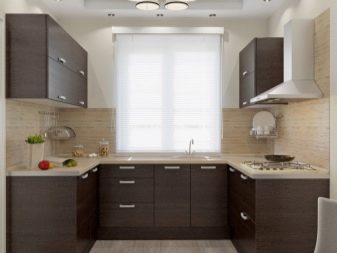
The most popular option. In coffee colors, it is usually made with soft, rounded corners. In a square kitchen, the continuation of the corner module usually becomes a bar counter located along the window opening.

Island
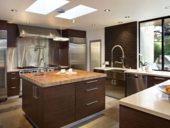
If the area of the room is more than 20 m2, it is worth considering the option of transferring part of the equipment and work surface to a separate unit. The island can serve as an addition to a linear (direct) or corner kitchen, to separate the working area from the dining room.
U-shaped
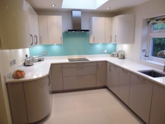
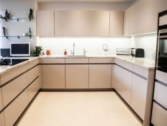
A modern solution that allows the most rational use of the entire area of the room. Such a set is located along three walls of the room or in the corner version with a bar counter on the side.
Parallel
This is an interesting solution in which the headset is placed along two opposite walls. You can distribute household appliances, if there is a podium, separate the dining area due to the difference in height. This option is best implemented in a spacious kitchen.
Color combinations
Combine coffee colors in the interior also need to be correct. Consider what shades can be added to the soft dessert chocolate gamut. When creating a warm interior solution, you can dilute the dark tones of coffee with lighter milk and cream. A combination of a bright upper row of cabinets and a dark bottom of the headset looks aesthetically pleasing.
Beige tones require support in the form of creamy iris or cream. If you want to complicate the interior, you can use the combination option with a gray steel or light graphite tone. Gray-beige shades, including taupe, look good in combination with juicy colors: orange, sunny yellow, turquoise. In this case, the activity of the auxiliary tone can be used in the form of inserts on the facades, contrast edging, in the design of the apron.
Cappuccino in the decoration of the kitchen set - a universal tone that allows you to make the interior cold and modern or delicate dessert. In combination with white and gray, it acquires the necessary restraint.
But it is worth complementing it with warm golden brown blotches or rich cherry - and this color changes dramatically, becoming light and airy.
They go well with the brown tone of the cabinets in the green colors of malachite or young grass. Mint color can be added to cold cappuccino. Pale pastel yellow with a light note of turmeric will also be a harmonious addition to any coffee tones in the kitchen. Dark mocha or rich rich color of roasted coffee beans is well complemented by deep ultramarine, luxurious shades of gold.
From a natural color palette, the shades of Americano and Cappuccino blend well with the following tones:
- mahogany;
- amber;
- pistachio;
- lilac and violet;
- khaki;
- scarlet;
- thatched
- gray and black.
Monochrome coffee set for the kitchen looks too boring and fresh. Correct selection of a pair will help to add designer chic and gloss to it.
Style selection
To design a kitchen in coffee tones, you can choose a variety of options for translating design ideas. We list the most popular solutions.
Scandinavian
Laconic scandi has long been used by many beloved shades of coffee with milk. Here they usually have a gray undertone, cold and deep. Such a kitchen should be as simple as possible - without unnecessary frills and details, with painted or textured matte facades made of solid wood. Scandinavian style does not imply a pile of furniture; cabinets can be replaced with open shelves.
A good solution would be an island with a working surface laid out on it.
Provence
Like other country styles, it allows you to use pastel-beige shades of milk-whitened coffee in the decoration of the kitchen. Here it is better to use not plain cabinets, but options with contrast edging or panel inserts on the facades. Such a solution looks good with pink-peach, turquoise, mint flowers. In the style of Provence, the countertop may well have one tone with the facades, and a completely monochrome kitchen is acceptable.
Modern
Elegant glossy facades headset shade of coffee with milk are able to decorate the Art Nouveau style. As a complement, they use black and white colors. Angular headsets look good with exquisite geometry of smooth lines and an accurate fit into the design solution.
Eco
Dark mocha or classic coffee color in eco-style is combined with juicy green, blue, yellow flowers. Furniture in the headset should be simple without unnecessary details, preference should be given to an array of natural wood. The dark coffee version of the kitchen in eco-style involves finishing the apron with ceramic tiles, stone or wood, copper and bronze fittings, patchwork tiles on the floor combine well with it.
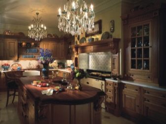
Victorian
Good old England, during the time of Queen Victoria, preferred to tint furniture in golden brown shades of freshly ground coffee. Modern designers propose using this tradition in stylish kitchens, creating practical headsets from solid wood with dark tinting and carving.
Some retro element makes these solutions optimal for classic country houses.
Design features in monochrome
When choosing a monochrome coffee range for the decoration of the kitchen, it is very important to pay attention to the combination of elements. So, the walls, floor and ceiling harmoniously look in total beige or a cappuccino shade in a classic version. But mocha or a dark coffee set will definitely not look just as decorative in combination with a tone finish. He simply merges into a single mass, losing his personality.
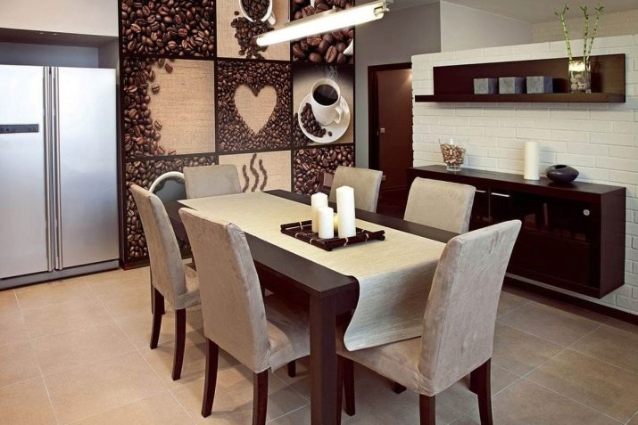
If the room also serves as a dining room or living room, it is better to decorate the walls with textile or dense textured wallpaper, paint it. The apron should be decorated with a luxurious panel with photo printing, or use ceramic tiles of chocolate brown, milk, cream shades as a decor element.
Any decor with a coffee theme looks interesting here.
The work surface in the coffee kitchen can be black or white, made of wood. Light beige versions often use dark gray countertops. The ceiling in such an interior is best left white or contrasted, dark, if height allows.
The flooring in the total coffee interior is better to mount practical, but rather light. The parquet board in taupe color or dark brown laminate of a shade of dark chocolate looks interesting. Large-format milk-beige tiles also look quite harmonious and respectable.
You can use contrasting masonry in two colors.
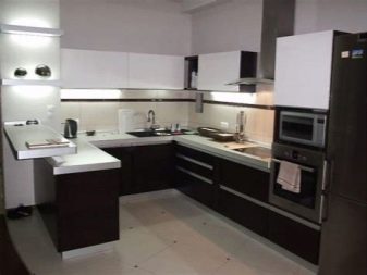
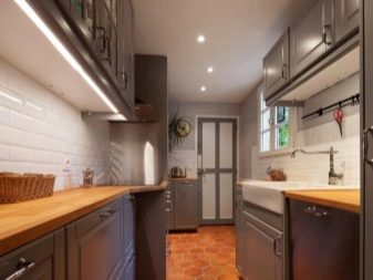
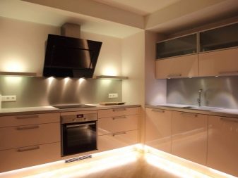
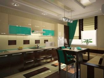
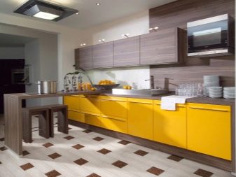
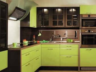
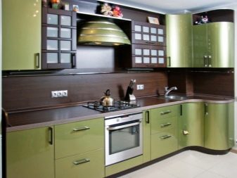
Beautiful examples of kitchen interior design
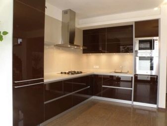
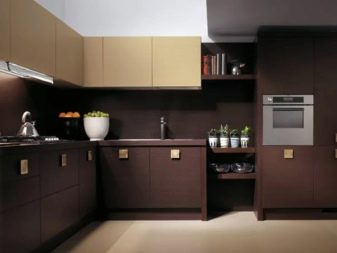
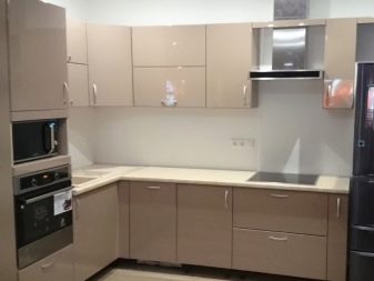
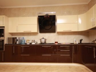
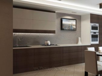
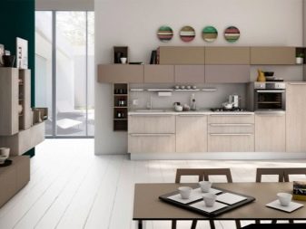
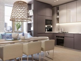
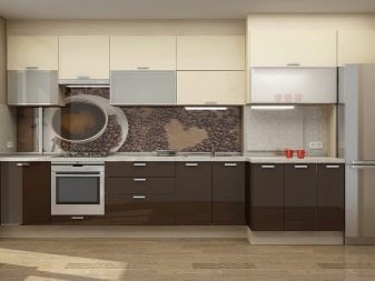
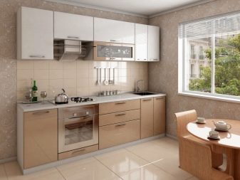
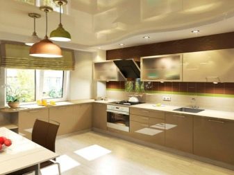
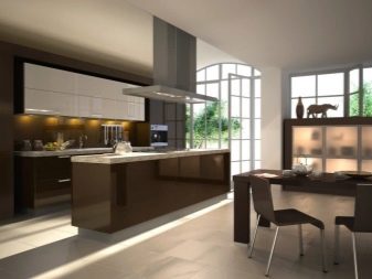
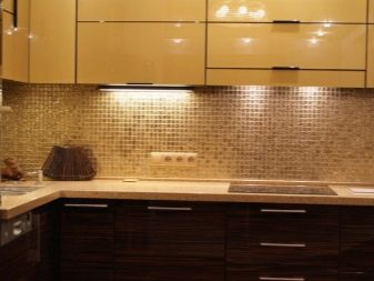
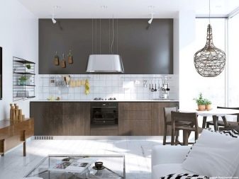
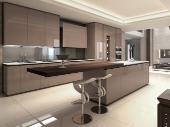
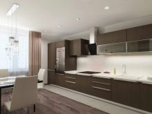
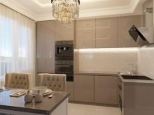
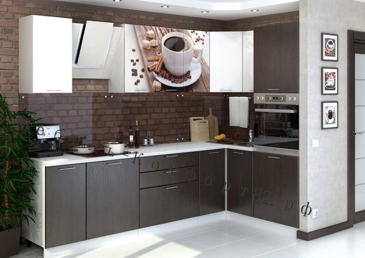
A vivid example of modern cuisine in the shade of cappuccino with a black background complement and an apron with photo printing. Images of coffee beans are often used in such interiors to enhance the contrast of the decor. Here, this technique is also used in the decoration of the facades of wall cabinets.
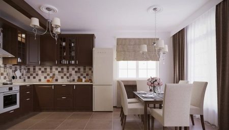
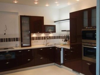
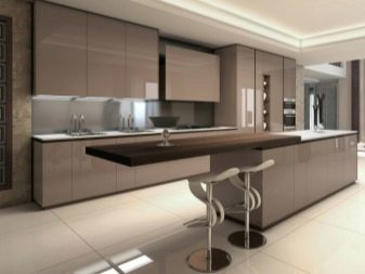
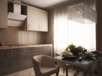
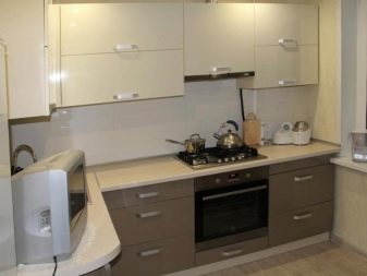
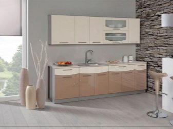
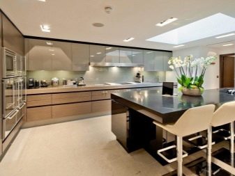
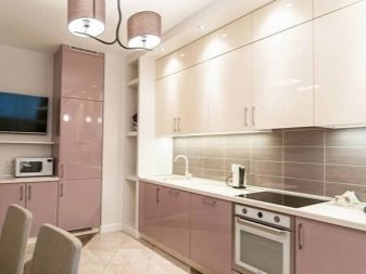
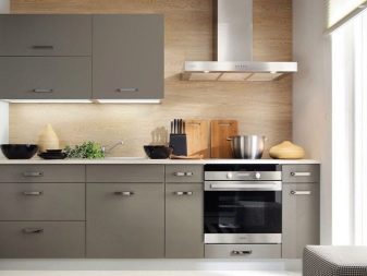
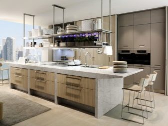
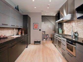
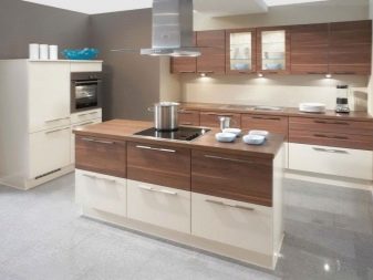
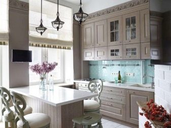
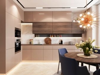
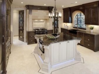
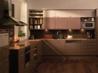
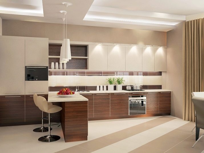
Harmonious peninsular kitchen with a two-color bar counter. The light cappuccino in the upper cabinets is complemented by a white tabletop and rich coffee tone in the warm colors of the lower row of modules.
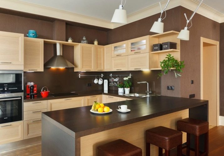
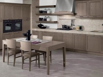
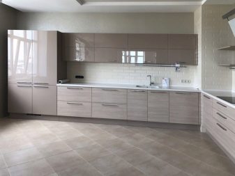
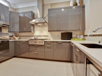
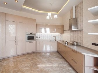
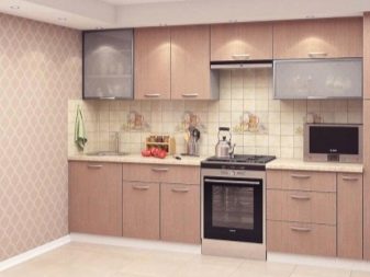
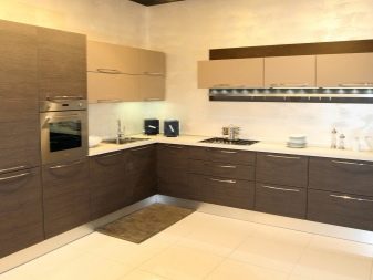
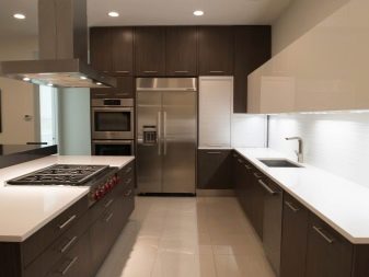
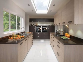
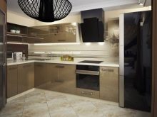
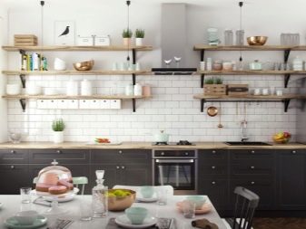
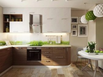
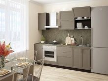
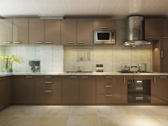
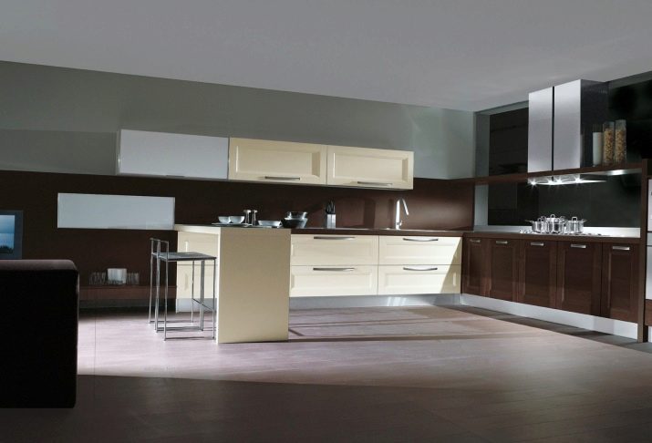
Minimalistic cuisine in shades of cappuccino and cocoa. The set is made mainly in the colors of Irish coffee, complemented by modern metal fittings and a white cabinet body. The shades of coffee used in the decoration of the floor and walls create a warm mood in the interior.
For errors when ordering a kitchen, see the next video.


