It is a long-known fact - we spend a lot of time in the kitchen, if it is cozy, warm, and there is a slight smell of our favorite coffee or spices, fresh vegetables, fruits or meat. And if at the same time the kitchen space is aesthetically attractive, then the whole family will be happy to gather at the dinner table to share their successes and failures. Coziness largely depends on a competent combination of colors in the design of the kitchen. The color palette will affect not only the mood of households, but also their appetite. That is why when designing a kitchen from scratch or repairing it, it is advisable to develop several color combinations and choose the one that suits all family members.
Basic Rules
Color in the interior plays not only an emotional role, but also carries utilitarian functions.
With the help of color, you can visually raise or lower the ceiling, expand or reduce the area of the kitchen, zoning the space, emphasize the style, or hide the construction flaws.
Professional designers have developed several color matching rules that will help to avoid mistakes even at the stage of repair planning.
Determine the starting point. It will depend on what is already in the room. When planning a kitchen in a new apartment, you can choose a color scheme, based on your own desires and possibilities. If we are talking about redecorating to an existing kitchen set (the most expensive kitchen component) or an unusual color technique, then we need to build on it.
Take into account the size and geometry of the room. With the help of light reflecting surfaces it will be possible to visually enlarge the kitchen and raise the ceiling.The dark niche can be lightened with white furniture and appliances. A small kitchen will be even smaller if it is painted with more colors. And too much space can be compressed using rich dark colors and shades.
Consider artificial and natural light sources. The number and size of windows, lamps, sconces, tabletop lights, as well as the side of the world - all will affect the choice of color scheme. With a small amount of lighting, the kitchen will be made lighter and more comfortable with cream, beige, yellow shades. Shades of blue, gray, black will create a feeling of coolness in the hot southern cuisine.
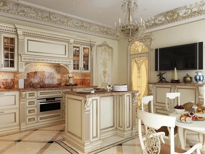
Remember that each style has its own colors. If we are talking about standard apartments with a kitchen no more than 15-16 square meters. m, then not every style is appropriate in a small room. For example, pretentious baroque, empire, rococo is hard to imagine in such a kitchen.
But minimalism, hi-tech, modern, modern and classic styles are perfect for the kitchen and dining room.
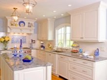
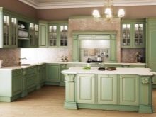
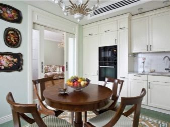
- Classic different natural colors: white, green, gold in combination with pastel shades can be both primary colors and accents.
- Restrained Minimalism will visually expand the space not only due to a small amount of furniture, but also soothing colors in the design.
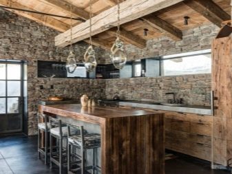
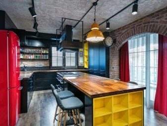
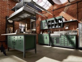
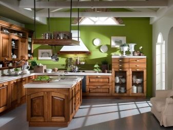
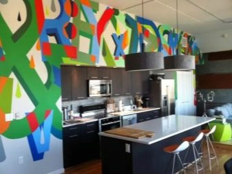
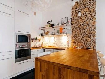
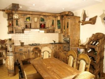
- Loft and industrial loft love space, natural wood, raw brick and various metal structures. Therefore, the colors here will be appropriate: brick red, brown, metallic. But this style respects the bright accessories of yellow, green colors.
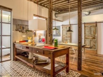
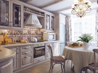
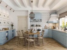
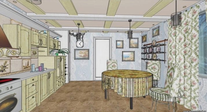
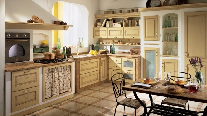
- Rural styles They look cozy and cute not only in a private house, but also in a city apartment. Therefore, Provence and country are chosen by those who love a calm range of wildflowers, knitted rugs and lace doilies. And the natural wood inherent in country will make the kitchen even warmer.
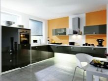
- Chrome plated - glass hi-tech - these are not only shades of gray, but also lilac, lemon. Plus style in the ability to increase space through the use of glass.
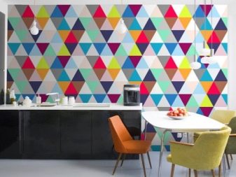
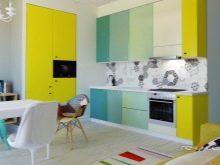
Do not try to use all your favorite colors at the same time. No matter how big the kitchen is, there is no need to set the cacophony of color. With an existing tabletop under a tree, lilac wallpapers in a silver star are unlikely to look beautiful, no matter how beautiful they are. In the design of any interior, it is recommended to use no more than 3 colors, or rather - 3 color schemes (that is, khaki and olive will refer to the same color, as they are shades of yellow).
This rule is also called "60/30/10". Professionals consider it to be the main one, and home craftsmen have long and successfully applied it in practice.
It is about combining 60% of the dominant color (along with shades) with 30% of the complementary color and 10% of the accent. This color scheme is called contrast. Moreover, it should be borne in mind that the background color is dominant in this triple, due to which elements in the additional color and accessories will be clearly visible - accents.
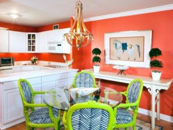
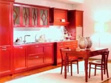
Most likely, those who choose red, poisonous green, yellow as the dominant color, that is, any bright color, will soon regret it. Still, the background should be calm, not irritate vision and the nervous system.
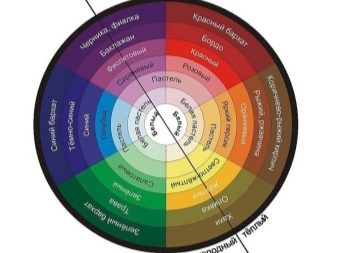
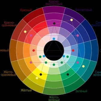
The rule of three colors applies to neighboring shades. Find out which colors are adjacent and which are contrasting, using the Itten color wheel. This is an indispensable assistant not only in the selection of the interior, but also in clothing. With it, you can create a large number of options for combining the colors of primary, secondary and tertiary colors. Moreover, there are many options for such circles with tips to determine how best to combine certain shades.
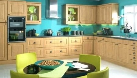
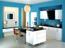
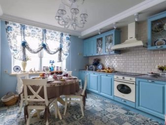
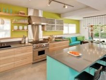
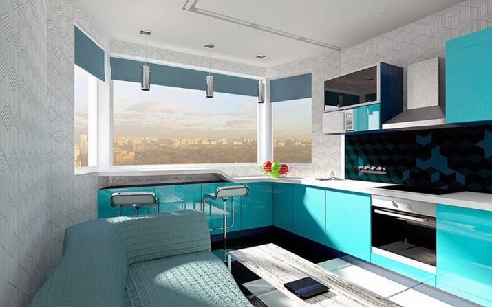
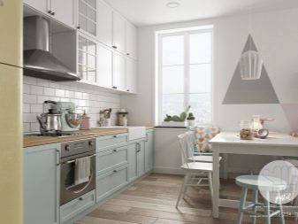
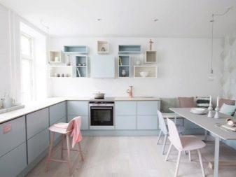
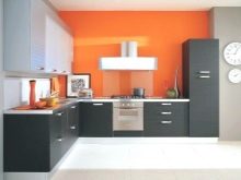
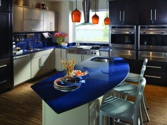
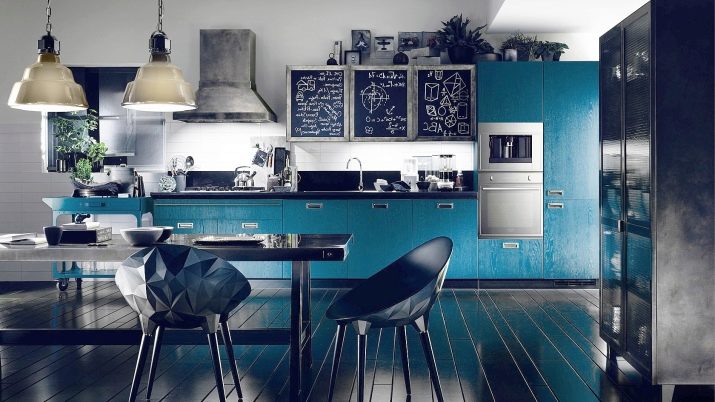
For example, this blue kitchen is nothing more than the competent use of neighboring shades of blue.
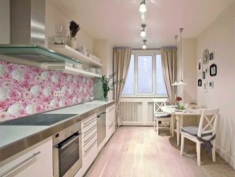
An analog kitchen is a combination not of shades of the same color, but of nearby colors. For example, by the color wheel it is easy to see that bright peach, light yellow and light green are adjacent flowers.
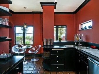
In addition to a contrasting and similar choice of colors, the interior can be monochrome, that is, monochrome. This option is considered the most difficult for beginners. If you make the kitchen truly monochrome, it will even be unpleasant to go here: a single color, reflected from all surfaces, will cause depression or aggression.
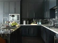
Here it is important to correctly use the shades of the primary color and to place accents with the help of accessories, as, for example, in these photos.
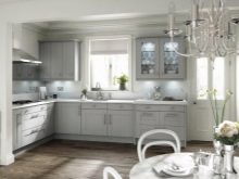
- Choose the right background. Advice for all occasions will help a novice designer: if you doubt the choice of color - take pastel tones as a basis. Itten's circle will also help determine which shades are pastel. White, gray, beige, milk - universal colors that perfectly cope with the task of being the backdrop of the kitchen. But in terms of practicality, not all light shades are suitable for families with children and animals. Or you will have to choose easily washable materials in this color scheme.
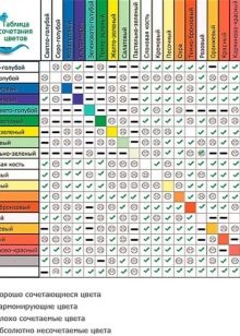
- Do not forget about the color of the floor, ceiling, walls. About the color of the walls during the repair they think much more often. But they forget about the floor and ceiling. To prevent this from happening, we suggest using color matching tables, with which you can choose not only the primary color, but also shades. In addition, starting a repair, you can predict how the kitchen space will change if you use dark and light shades of the floor, walls, ceiling and furniture.
shade of the floor | shade of walls | shade of the ceiling | shade of furniture | change of space |
dark | light coloured | light coloured | light coloured | increases volume |
dark | light coloured | dark | neutral | increases the area, lowers the ceiling |
light coloured | dark | light coloured | dark or neutral | raises the ceiling, narrows the space |
dark | dark | light coloured | light coloured | well feeling |
dark | one dark wall | light coloured | light coloured | walls move apart relative to the dark wall |
light coloured | one dark wall | light coloured | dark | reduces the length of the room, increases the space |
light coloured | dark | dark | neutral | compresses the area, the feeling of overhanging the ceiling |
- Know basic color combinations. All colors are divided into chromatic (color) and achromatic (black, white, all shades of gray). Any achromatic color goes well with another achromatic. And this is an ideal tool for beginner designers.
When choosing other colors, the following combinations are most successful:
- classic triads (in Itten's circle): orange - purple - green; burgundy - dark blue - olive; light green - lilac - bright peach, etc .;
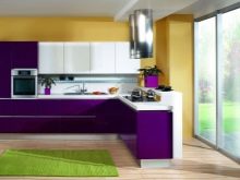
- contrasting colors that need to be used with great accuracy, making one color primary, and the second complementary: orange + blue, green + red, purple + olive;
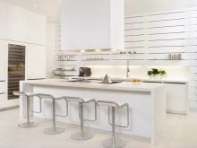
- any color combined with white, black or gray.
Features emphasis
Experienced designers recommend choosing an object in the kitchen space that will become the most attractive. Very often they focus on furniture, but this is not necessary. After all the most vivid impression can be given not only by furniture, but also by unusual wall decoration or curtains, ceiling or accessories.
Wall decoration
If you decide that the walls will have a bright finish, then the rest of the elements of space will have to be muffled: neither furniture, nor the floor, nor the ceiling should have a bright color and artsy appearance. White, black, gray or pastel shades of the colors used in the wallpaper will be the accompanying colors for bright photo wallpaper or color print.
If the walls are just a calm background, then they will well emphasize the rest of the decor. Especially harmonious look white walls with natural wood (furniture, floor) and a bright accent spot.
Stucco walls are suitable for a large area. To emphasize the beauty of the pattern, gold, silver, and bronze are often used. But you can highlight the picture with a darker shade or, conversely, make the wall darker.
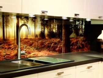
Work apron
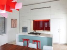
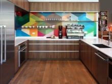
The emphasis with a working apron is an amazing opportunity to make the kitchen attractive and bright. After all, here you can use a huge amount of materials that will play not only in shades, but also in texture. Bright monophonic color will emphasize the beauty of furniture or attract attention from not so attractive elements. But such an apron is not bad to choose a companion - a lampshade of a chandelier, a flower pot.
Do not forget: this is an emphasis, and it should be no more than 10%.
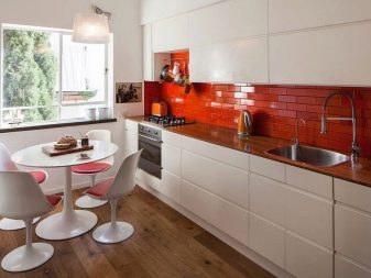
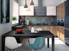
A multi-color apron also looks interesting, but in this case the walls, floor, furniture should be monophonic, muted shades. Although in the modern world motley aprons and bright furniture in tone are quite popular. But here you need to have good taste in order to find a balance between all shades, lighting and take into account the footage of the kitchen. Therefore, it is much safer to use a bright apron against the background of pastel furniture and walls or a bright kitchen against a pale apron.
Tabletop tone
Horizontal surfaces automatically attract the eye as soon as we enter the room. That is why you need to decide for yourself: whether you want to see a bright spot before your eyes constantly or is it better to dwell on something discreet. After all, this is not only a matter of beauty, but also practicality.
When choosing the tone of the countertop, it is recommended to make it different from the apron and walls, so that the horizontal does not merge with the vertical.
Also, the countertop needs to pick a companion. For example, a wooden table - wooden frames for paintings or crafts, window frames, chairs. To the bright plastic tabletop, you can pick up the curtains with floral print, sofa upholstery, choosing other shades or adjacent colors.
Shades of kitchen furniture
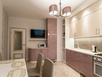
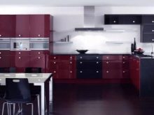
If the kitchen is the starting point, then most likely its color will be primary or secondary, that is, 60% or 30%. And very often these are shades of brown. Creating a kitchen design for brown furniture is a blessed business. After all, here the background will be beige, milky shades, khaki and olive. But brown furniture needs a bright floor. But other colors in the design should be used with caution. Calm gamut for successful people.
Although modern industry makes extensive use of MDF and other materials in different colors. At the same time, the furniture can be so bright that its color must be compensated by pale walls, otherwise the kitchen will turn into kitsch or boho.

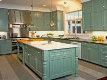
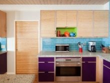
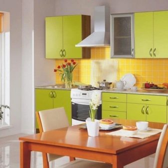
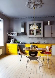
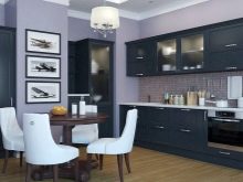
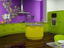
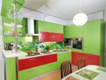
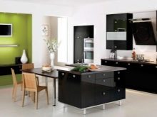
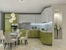
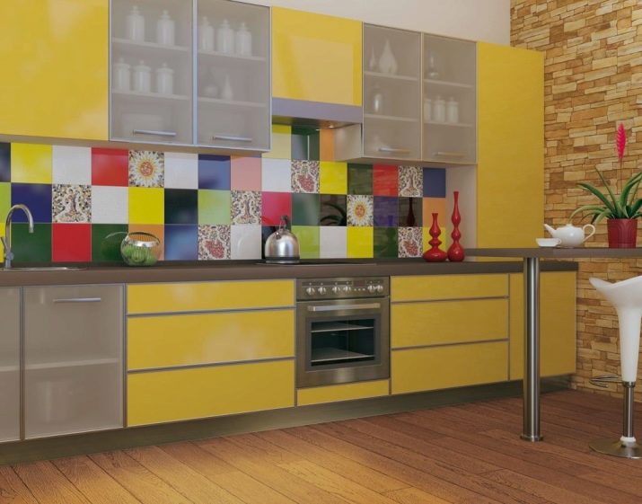
Green, yellow, orange - frequent guests on the kitchen facades. But here it is important to choose the right shades so that the colors do not turn into poisonous. But the blue color is used more often as an accent. If you decide to choose blue furniture, then the walls are best made plain, soft (pale blue, gray, white).
Accessories and Textiles
If the kitchen space allows you to take a walk and acquire cute little things in the form of wall plates, panels, paintings, photographs, bonsai, flowers, toys, pillows, rugs, then this will be a good option to focus on these items. Properly selected curtains, towels, mittens will become a godsend for decoration in ethnic styles. But the background for these items should be neutral. Not necessarily white, but plain.
Again for immersion in style accessories and textiles should be made in one scale. A variant is possible when objects will be monophonic, but of different colors. For example, thoughts of contrasting colors on the sofa, drawings on the wall.
Professionals Recommendations
For our attitude, it is very important to be in comfortable conditions. This is especially true of the place of eating. Therefore, professionals recommend using the following tips.
- Repair should be started from the drawing, which will indicate the length, width of the kitchen, ceiling height, dimensions of windows and doorways.
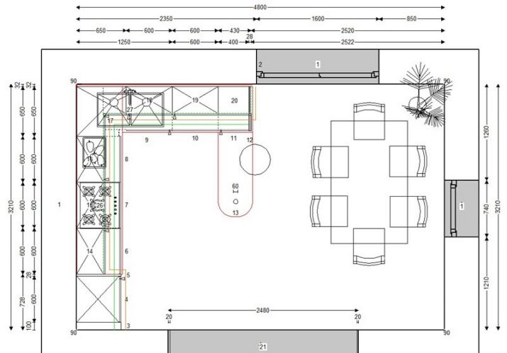
- Color the picture (manually or with the help of special programs), not forgetting that besides walls and furniture, the color has a floor, ceiling, appliances, dishes, curtains, lamps, etc.
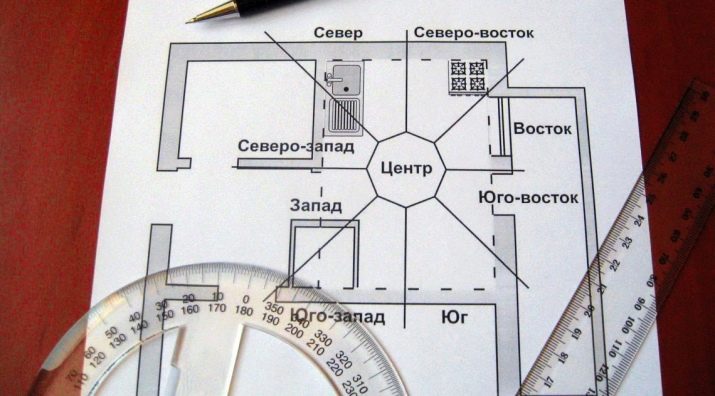
- Mark on the drawing which side of the world the windows face. This will remind you that the northern cuisine should be brighter than the southern one.
- Specify the material of furniture. Do not forget: reflective surfaces will make the kitchen brighter, matte - darker. A variety of textures of one color will make the kitchen more interesting due to the depth of the texture.
- If the kitchen is a place of night work, then you need to make it much brighter.
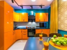
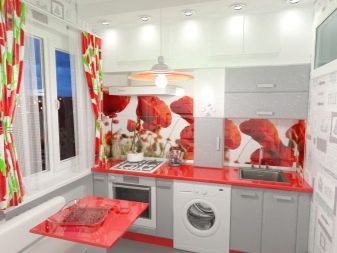
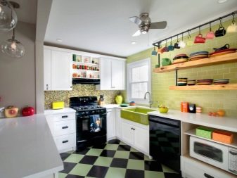
- Raspberry, orange, green, pistachio, yellow, eggplant, caramel - “edible” colors that increase appetite. The use of these colors, as well as pictures with products, is undesirable for those who seek to control their appetite, or use them in a very metered way.
- Any muted shades will act relaxing and contribute to relaxation.
- Light shades visually increase the space, dark shrink it.
- In a multi-color kitchen, a maximum of 5 shades is allowed in the design of the space and no more than 2 in furniture.
- Monochrome walls should be a few tones lighter than the headset. The color of the floor and ceiling is recommended to be different.
- For a smooth emotional background of bright elements should be no more than 10% in the form of accessories.
- Using the services of professional designers, remember that you live in this kitchen: no matter how unusual the project is, it should be liked first of all by you, not by the designer.
- Sometimes intuition works better than any recommendation. Listen to yourself and spontaneously sweep options that the soul does not lie to.
Beautiful examples
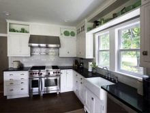
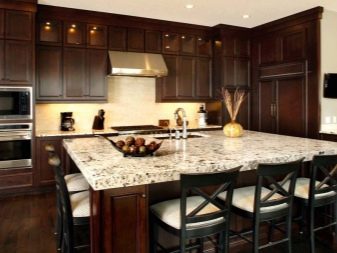
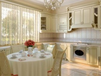
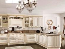
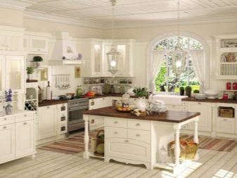
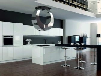
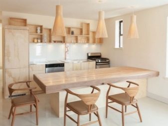
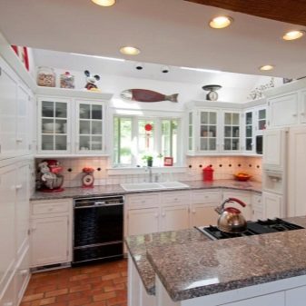
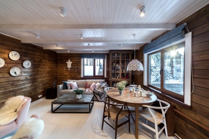
Time-tested classics - a wooden kitchen framed in white. Due to the competent lighting, the floor and ceiling do not merge, but emphasize the texture of the tree. Calm brown and white make the space harmonious, although somewhat cool due to the large amount of white.
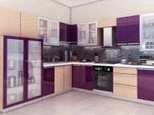
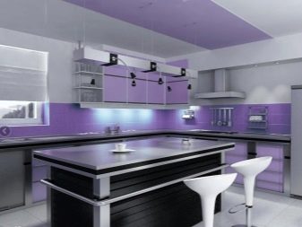
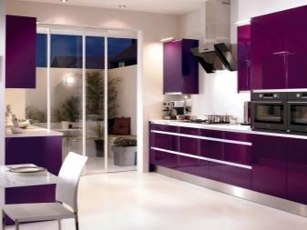
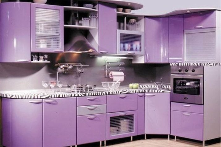
The last few years, the purple-lilac range is very popular in design. It is important to choose the right shade, otherwise it can crush its depth. Despite the monochrome, the kitchen does not look monotonous due to a lighter wall and an original countertop.
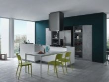
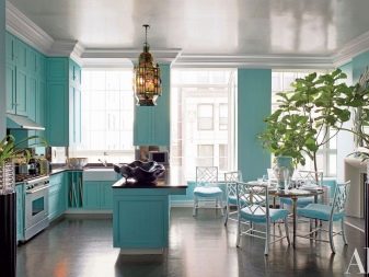
Blue color refers to cold. But how pleasant it is to be in such a kitchen in hot weather! Green palm trees balance the shades of blue, so the kitchen does not look cold.


