For a long time, white and pastel colors were considered the traditional color for the bedroom. However, this is not the only solution. What shades are recommended for a bedroom, how to choose suitable and to combine them among themselves? Let's try to figure it out.
Features of color design
The color scheme of the bedroom leaves a significant imprint on the attitude, well-being and life rhythm of a person. And all because it is the color of the bedroom that a person perceives before falling asleep and waking up. Today it is already scientifically proven that colors have a huge impact on human life. That is why it is so important to choose them correctly.
The bedroom palette should help to relax, relieve stress and tension. Color should not irritate, increase brain activity. It should contribute to a deep and calm sleep.

Calm muted colors are suitable here, and brighter additions will help to avoid boredom and monotony.
Color psychology
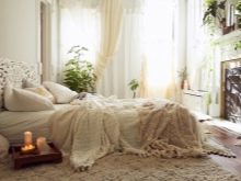
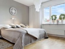
White color in the bedroom is considered psychologically neutral, not causing negative changes. However, some people believe that the bedroom in perfectly white colors is associated with the hospital. This can be avoided if you do not use cold tones of white, but give preference to pastel, marshmallow shades.

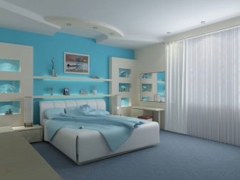
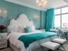
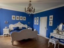
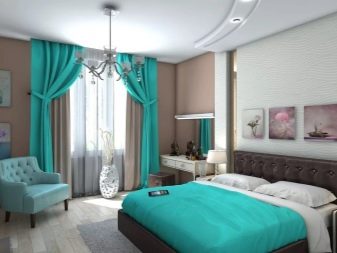
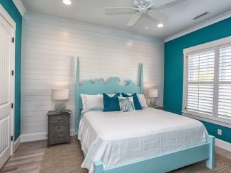
Favorable for a healthy sleep - blue and blue colors. It is proved that people falling asleep in such a bedroom sleep in a deep and calm sleep, and wake up in a good mood. This is due to the fact that the blue-blue gamma helps to slow down the heart rate, as well as normalize blood pressure.
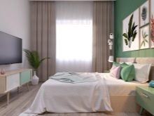
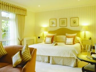
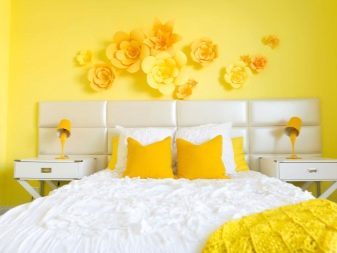
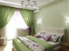
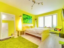
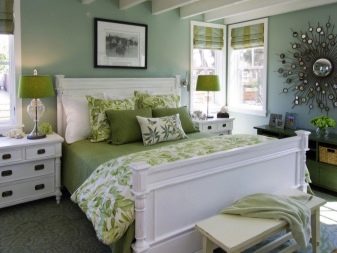
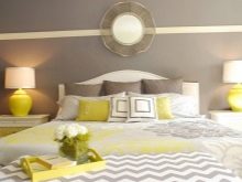
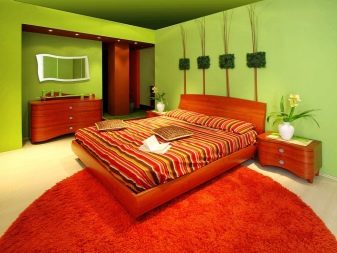
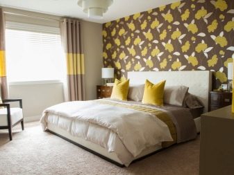
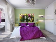
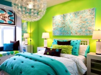
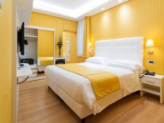
No less useful for sleep are sunny warm shades of green and yellow. Green color reduces anxiety and saves from stress, and yellow - improves mood. An important condition - the colors should be calm, warm colors.
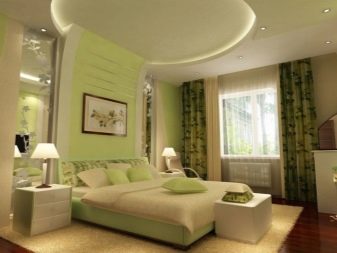
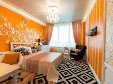
Yellow and green will fit harmoniously into the country interior.
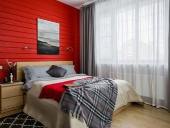
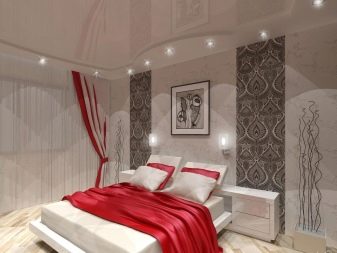
Red color is undeservedly considered the least suitable for the bedroom. But experts note that such a design will give bright and interesting dreams, and waking up in such a room will be easy - red gives energy. Many courageous and extraordinary personalities choose the red bedroom as a way to draw energy in their personal space.
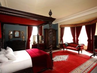
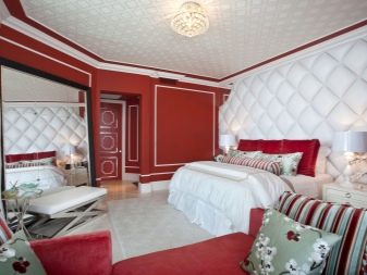
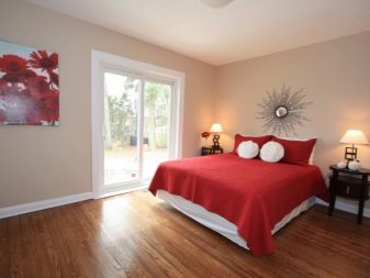
No need to turn the bedroom into a kind of red casket, you need to dose the color. It is better to combine it with beige, gray shades.
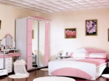
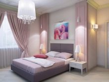
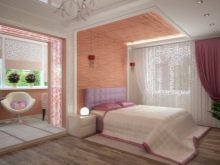
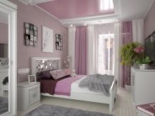
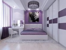
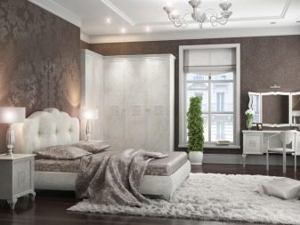
Pink is usually chosen by those who love lightness, dreams, fantasies. It is associated with lightness, femininity, carefree. However, it is important to use pink in moderation so that the bedroom does not turn out to be overly infantile and childish.
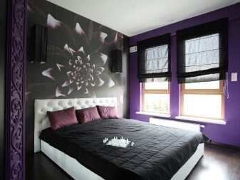
But it is better to refuse purple in the bedroom, since it activates brain activity. It will be difficult to fall asleep in such a room, and dreams will be restless and even nightmare.
Many myths revolve around the idea of using gray in the bedroom. It is believed that this is a neutral shade that soothes. However, psychologists say that gray on average reduces the duration of sleep by an hour. As a result, a person sleeping in such a bedroom may feel exhausted, tired. If you still like gray, you can think about combining it with other shades or using gray as accessories.

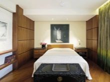
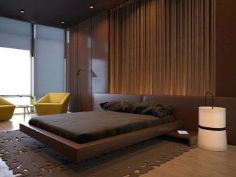
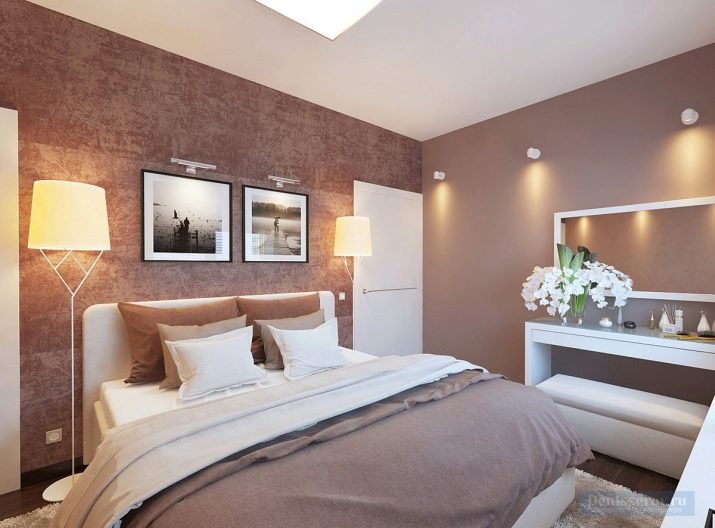
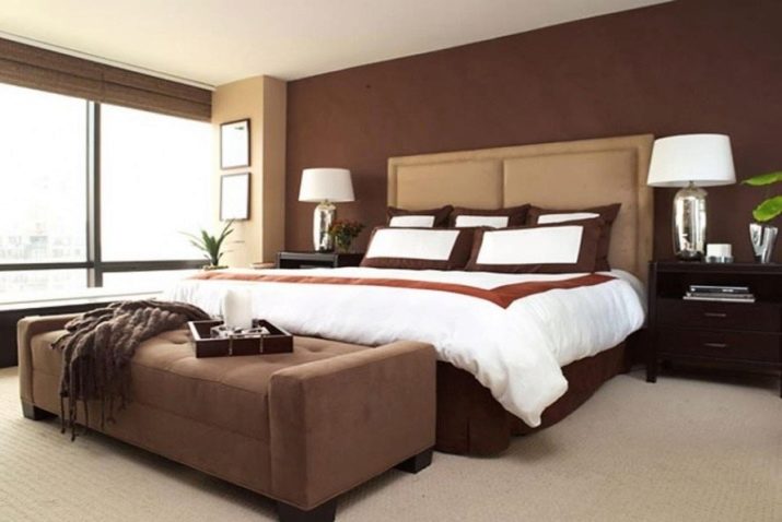
The bedroom in brown tones is associated with calm, comfort. However, it is better to avoid too dark colors or dilute them with pastel. Otherwise, the room may turn out to be too gloomy.

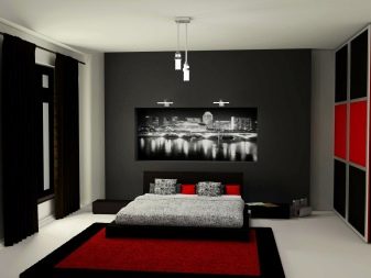
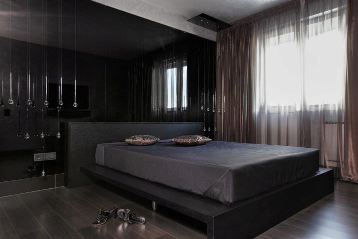
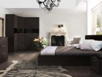
Black is also considered beneficial for sleep., since it contributes to the production of melatonin (sleep hormone). Often he is chosen by stronghearted, purposeful people. If the black bedroom seems gloomy, you can dilute this color with more calm shades - white, pastel.
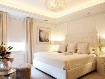
In order for the bedroom to energize, increase efficiency after waking up, it is worth using a white-beige palette, combinations with gray (in small quantities), ivory.
Always wake up in a good mood help orange, sunny yellow, yellow-sand colors. For relaxation, recommended blue, blue, turquoise, green. The same range is recommended for rooms that are too hot from sunlight. (for example, go south). They give a feeling of coolness. You can get rid of stress in the bedroom in beige shades.
Blue is recommended for melancholy, phlegmatic for green and all its shades. Sanguine will be comfortable in the bedroom in yellow shades. However, this type of people is distinguished by a stormy temperament, so yellow in the bedroom can be balanced with purple. Choleric will be comfortable in the bedroom in a green, blue hue, you can also use red, but in soft colors.
Feng Shui Rules
Feng Shui philosophy proposes to abandon excessively bright and bold colors. If they are still used, then let them be in the form of small accents or original patterns. In any case, the bright color must be balanced more calm and restrained.
Not the best option for the bedroom are animal prints. It is believed that they do not allow a person to completely relax, they can provoke emotional stress, anxiety.
Feng Shui also takes into account the location of the bedroom. Green is suitable for bedrooms facing southeast and east. South-west and northeast imply the design of the bedroom in shades of the Earth, primarily in brown. Feng Shui experts advise decorating the southern bedroom in red, and the northern one in blue. However, both red and blue should be diluted with pastel.
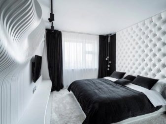
All shades for the bedroom should be muted, be sure to find a place for the details of the red tone. According to the interpretation of the Chinese sages, it symbolizes marital harmony. But the combination of black and white in the bedroom, so fashionable in modern interiors, should be abandoned.
How to combine tones?
In order for the bedroom to look harmonious, you do not need to use only one color. It is important to correctly combine several shades that will complement and emphasize the characteristics of each other.
There are 2 main color options - a combination of contrasting shades or the use of 2-4 close in tone.
Even monochromatic interiors, where the same tone is used, are never monochrome in the full sense of the word. Usually several tones and midtones are taken within the same color.
With a mixed type of interior, one color is taken as the basis, to which another 2-3 shades are added in the form of parts. Usually, the main color takes up 3/4 of the room, about 20% comes from an additional tone and 5% from brighter or darker accents.
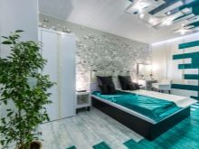
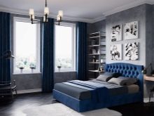
One of the most successful combinations is a mix of white with pastel, cream, gray, black, golden. Gray, as already mentioned, is better to combine. An excellent “partner” for him will be the cold gamut of green and blue, warm yellows and oranges, as well as black and white colors.
Black, despite its beneficial effect on sleep quality, is also recommended to be combined with other shades. It can be pastel, white, gold, purple, green. Red is not recommended dominant, it can be diluted with brown, gold. Orange can be mixed with brown, blue, white, green, pink. Yellow looks good with brown, light green, white, purple, brown, gray.
For green in the "companions" you can take pink, black, white, pink, yellow.
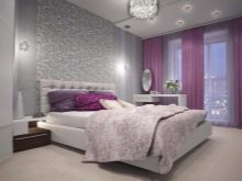
Pink looks harmonious with white, blue, purple. Blue can be considered the most universal color in terms of compatibility, it is combined with all colors. However, in terms of the effect of color on the psyche, it is better not to use blue with purple or black at the same time.
If you like purple, you can dose it by combining it with green, white, yellow, orange, beige. Brown looks good with beige and black, orange and yellow, green and turquoise colors.

If you like more contrasting combinations, then the basis should be more calm shades. A combination of green and turquoise, beige and turquoise, gray and purple, blue and red are considered harmonious. No less attractive is the tandem of brown with orange, green with yellow, blue with red, black with white.
Patterns also help to emphasize. However, it is important to remember the rule - a more complex pattern requires a more subdued color. As a rule, one of the walls of the bedroom is distinguished by a pattern, usually at the head of the bed.
Selection recommendations
When choosing a shade for a bedroom, one should take into account not only the influence of color on the sensation and psychological state, but also the size of the room. Intense dark colors can be used in large rooms.
In smaller rooms, it is better to use lighter options that will help visually expand the space. If you want something more vibrant, then you should choose yellow, green, orange. Beige and blue, blue will also bring color to the room, making it visually more spacious.
To create a more harmonious bedroom, it is recommended to take into account the direction of the exit to the room. If south, you can use both warm and cold colors. But for bedrooms looking north, you should choose only warm ones.
For rooms with low ceilings or poor lighting, dark shades are contraindicated.
Speaking about the color palette of the bedroom, they mean not only the color of the walls, but also furniture, textiles. In a room with light furniture, you can use a more saturated and darker shade of the walls. A dark set requires lighter, softer shades. Dark brown, almost black furniture blends well exclusively with the pastel range of walls.
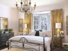
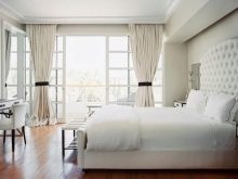
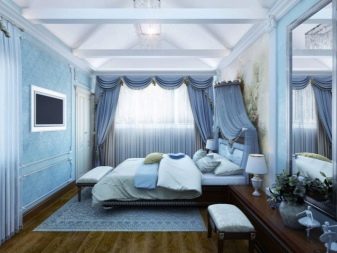
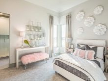
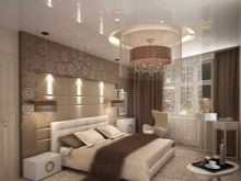
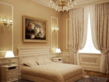
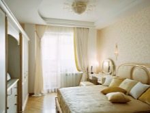
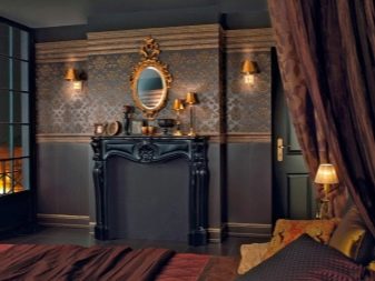
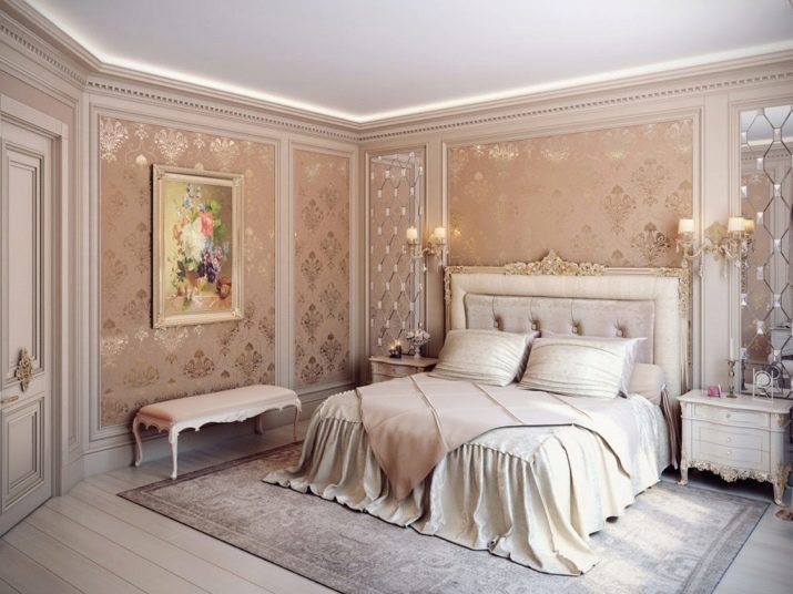
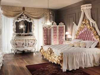
It is important to consider the style of the room when choosing the color of the bedroom. For classic interiors, they usually choose a cream, white, pastel shade. Golden shades help add room to nobleness and elegance.
By the way, the white color is universal, it is suitable for most interiors - from classic to modern style rooms. Gray, brown, pastel shades are best suited for bedrooms in the style of minimalism, hi-tech, loft.
For ethnicity (African, Indian) the basis should be beige, pastel, light brown, calm green. Complement them with darker brown details, original paintings and details.

For the floor, you can choose the rugs that mimic the skin of an animal.
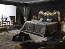
The country style has brown and pastel shades. You can add bright accents with the help of warm yellow, green, orange shades. Baroque bedrooms require light shades, especially the colors of champagne, gold.

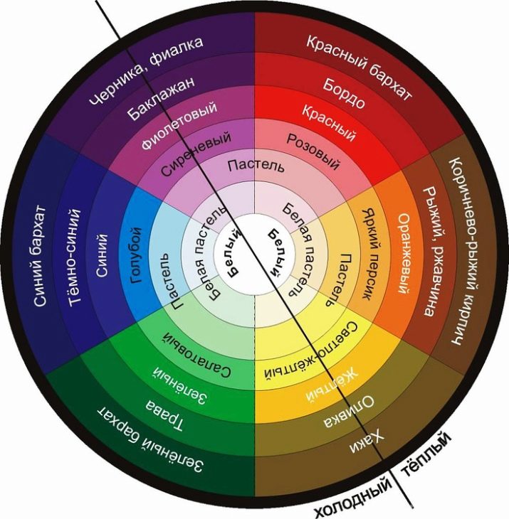
It is most convenient to use the color wheel method to create a harmonious interior. It is a circle with 12 zones, each of which is painted in a particular color. Opposite colors form contrasts, to create a more relaxed interior, you can choose one color and add shades to it (up to 2-3) located in the neighborhood.
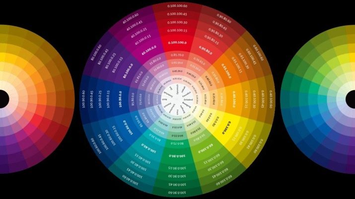
For convenience, below is a table of the most popular combinations in the interior according to the color wheel.
Main color | Colors that match the primary |
Red coral | Green, Blue, Mustard, Brown |
Orange | Pink, brown, purple, green, white, yellow |
Blue | Wine, red, gray, blue, white |
Burgundy | Green, Gray, Pink, Blue |
Yellow | Terracotta, brown, green |
Grey | Black, Red, Blue, White, Yellow, Cyan, Pink |
Blue | Red, Blue, Brown, Terracotta |
Good examples
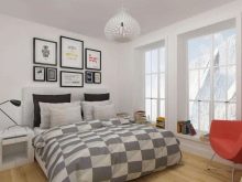
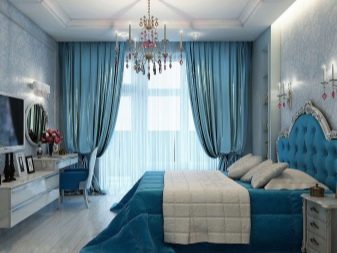
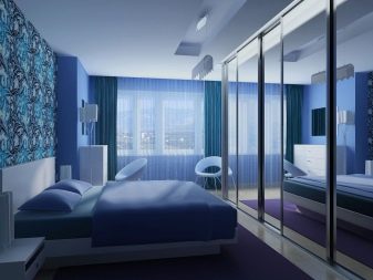
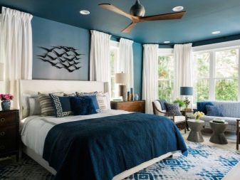
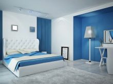
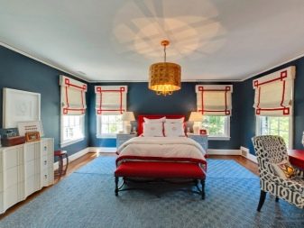
Bedroom in classic blue color. A deep shade promotes relaxation, calms, is associated with rest, sleep. However, blue itself is too dark and deep, it can cause a feeling of gloominess, therefore it is diluted with blue and white. The same combinations (blue and white) are repeated in the textiles of the room.
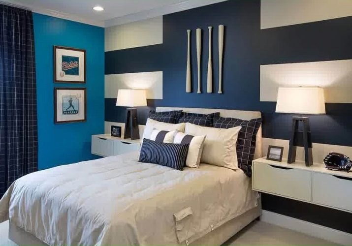
And the use of a calm and concise cell makes the room less strict, official, brings notes of home comfort.
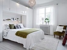
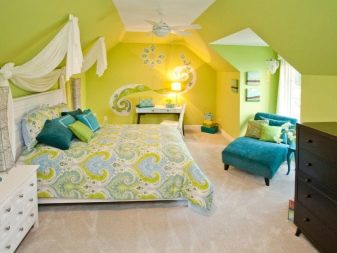
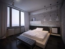
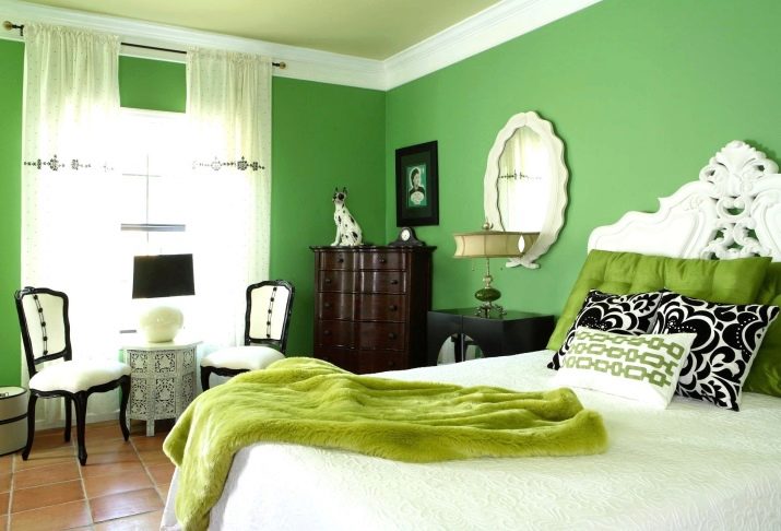
The following interior is built in a similar manner. True, instead of blue, the main color is green. It is combined with light green, white, dark brown. The result is a very light, relaxed atmosphere.
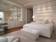
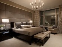
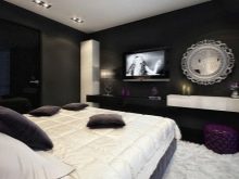
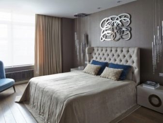
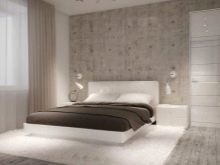
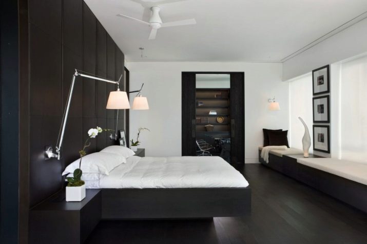
An example of a laconic and original bedroom design. Primary colors are black and white. The room is made in the style of minimalism, which is only emphasized thanks to the selected colors. However, thanks to soft wall panels and noble materials of furniture, a special luxury appears in the bedroom, one can say aristocratic simplicity.
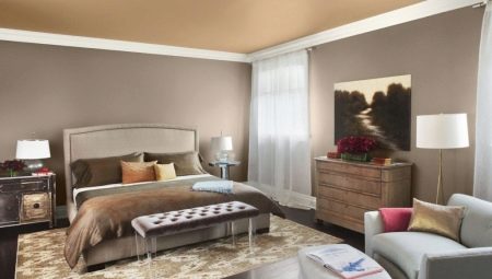
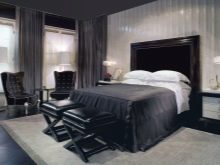
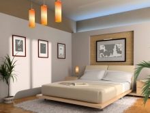
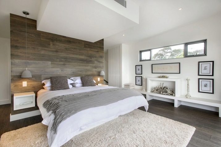
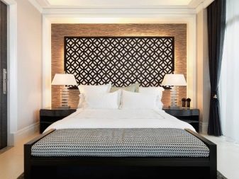
Monochrome version of the bedroom. A brownish-muted shade and several of its tones and subtones are used. The most striking color is the decoration of the walls, the foot of the bed. A few tones are lighter - the elements of the wall and the head of the bed. The transition between them can be considered the color of the sofa-pouf. White color in this case plays the role of contrast, allowing you to consider the bedroom and all its shades.
In the next video, look at how to choose a color scheme in the interior.


