Each specialist must draw up a document - a resume, which is mandatory for professional life and career growth. First of all, it is useful when finding a job. When writing this document, the focus should be on the meaning and content. However, the document is no less important.
What are the rules and requirements for writing and writing a resume? What mistakes should be avoided by young and inexperienced professionals? In the article you will find the answers to these questions. And also we will present you examples of paperwork for the device to work.
Basic rules and requirements
For a job, you need to correctly compose and fill out a resume. There are several features of the design of the resume, which we will consider in our article.
- Clear and clear structure. You cannot write a resume in solid text (such as an essay). This format is more suitable for a document such as a cover letter. As for the resume, it should contain strictly defined sections and columns: name and contact details, education, work experience, professional skills, achievements, hobbies, personal qualities, recommendations, additional information.
Depending on the scope of your activity, as well as the requirements of the employer, the number and content of the blocks may vary. One way or another, all information must be clearly structured so that it can be easily perceived.
- Business style. Currently, many companies and specialists are abandoning the classic resume and are choosing more modern options for its design. This is not prohibited, and in some cases even encouraged.One way or another, but even in the case of manifestation of your creativity and creative abilities, it is worth remembering that a resume is a business document, on the basis of which the employer evaluates you as a professional, so you should not use inappropriate pictures or symbols in its design.
- Uniformity. When writing a resume, you need to adhere to a single design style: the same font and padding, alignment style, and so on. If you use too many elements, you create a resume that will not be perceived as a single neat document, but as a chaotic combination of facts about you and your professional life.
- Color combination. Traditionally, it is not customary for a resume to use any colors other than black and white. However, you can move away from this rule and show your artistic skills. But even in this case, you should make sure that all the shades you use are combined with each other. Otherwise, your creative will be perceived negatively. A good move is to use colors that match the shades of the photo attached to your resume. Thus, you will create a single individual style of your resume.
- The advantage of meaning over design. Despite the fact that the design of the resume can distinguish your document from a large number of resumes from other applicants, it is important to remember that the semantic content of the document is of more importance. In this regard, do not hide the lack of work experience or relevant education behind vivid pictures and flowcharts.
Adhering to all the standards described above, you will draw up a document that will surely attract the attention of even the most demanding employer.

How to draw up?
When hiring a specialist, the employer pays special attention to the resume of the applicant. That is why it is important to correctly compose it not only from a semantic point of view. The document should also be beautiful and aesthetically pleasing, accordingly, it is important to take care of its design. To date, specialists from the human resources department, as well as employers, divide all resumes that come to them into 2 large categories. Let's consider each of them in more detail.
Classic resume
This is an option that has been used for quite a long time, while it is suitable for almost any field. At its core, this type of resume is a strictly defined form, sections, blocks and columns of which are to be completed by the applicant.
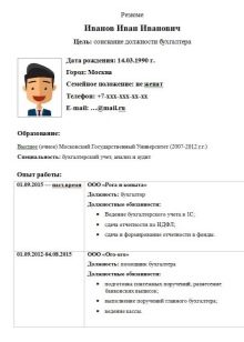
The most important rule for writing a classic resume is correctness and correctness (that is, the absence of grammar, spelling and punctuation errors). The classic version of the resume consists of photos and standard sections that were mentioned above. This option does not allow the use of additional colors, as well as any graphic images.
Fancy options
Many employers will prefer not the specialist who strictly and accurately fill in the columns of the classical resume, but the person who sent the stylish and non-standard resume. And there are a huge number of options for compiling such a document. For example, so-called video resumes are becoming increasingly popular. They are especially relevant for media professions, for those posts where your appearance, ability to keep yourself, style, speech are important.
Often, employers ask for a video summary of actresses, journalists, models, and so on. but even if you decide to choose this option, then a small printed document is also worth attaching to your video.
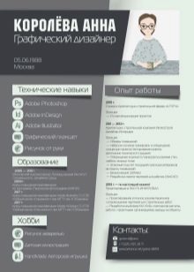
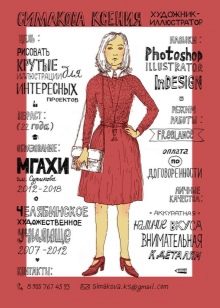
Representatives of such creative professions as a photographer, designer or architect can attach a portfolio of their work to their resume. Thus, you immediately prove to the employer your professionalism.
Common mistakes
Even the applicant who correctly composed the resume and designed it beautifully, will not receive the desired position if he makes one or more mistakes.
- Grammar and punctuation errors. Before sending your resume to the employer, it is important to make sure that it is absolutely correct from a language point of view. In this sense, there should be no typos, misspelled words, or missing commas. All these shortcomings adversely affect the overall perception of the document.
- High volume. Brevity is the sister of talent, and the good should be in moderation. It is these principles that should be followed when writing a document for employment. Often, applicants try to include as much information as possible about themselves in a document (this applies both to personal data, as well as data on education and work experience). The result is quite detailed documents on many sheets.
Remember that no matter how beautiful and stylish your resume is, if it is very large, no one will read it. A standard resume should contain no more than two pages (or better, one).
- Discrepancy to the chosen sphere. Creativity and creativity are those traits that are inherent in every person. Many of us try to manifest them in all areas of our lives. However, this approach is not always true and all the more necessary. In this regard, when preparing a resume, it is worth starting from what specific area you are looking for a job. For example, it’s inappropriate for a doctor, lawyer or politician to use colorful emoticons or pictures when writing a resume.
But a document drawn up with excessive rigor will not play into the hands of an artist, designer or musician.

Examples
In order to qualitatively compose your professional resume, as well as competently format it, you should focus on samples and resume templates of experienced professionals. Let's look at a few examples.
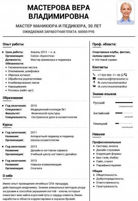
- Master of manicure and pedicure. This example is not classic, but at the same time, the document is designed in a strict and business style. There are no bright colors and patterns. The photograph of the applicant is professional.
The summary is written quite briefly, but it contains all the necessary blocks and sections.
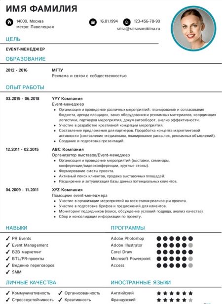
- Event Manager This example is similar to the previous one, but contains several expressive elements. For example, you can see tick marks that help structure text. In addition, there are graphic elements of the diagram in the block "Programs", which makes the perception of the document more convenient and comfortable.
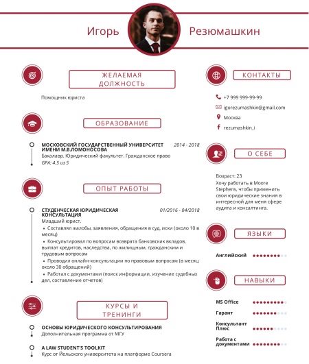
- Assistant lawyer. This summary differs from the options discussed above in the presence of a bright and unusual color. Traditionally, it is believed that for placement in positions in large companies it is allowed to compose only traditional resumes without using bright colors or symbols. However, you yourself can make sure that today this rule is not true.
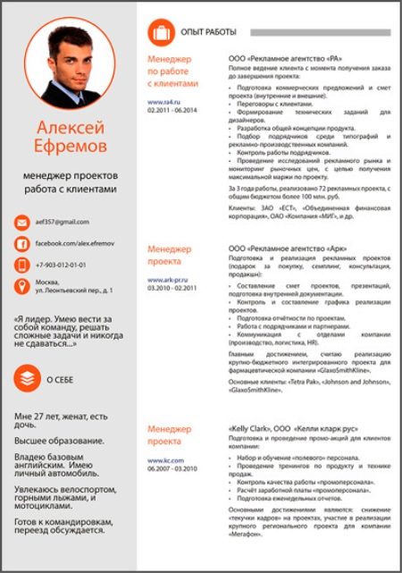
- Account Manager. The peculiar division of a resume into 2 parts using color is a profitable move when compiling a resume. Thus, you correctly distribute and focus the attention of the employer on the most important points. In this example, the name, contact details, as well as personal information and photos are located on the left side, while information that is directly related to professional activities takes up much more space on the right side of the resume.
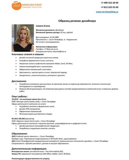
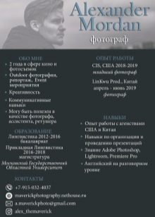
- Designer. This example is the most classic in terms of design in comparison with all the options that were described above. You can make sure that the resume is well structured, so the information is pretty easy to perceive visually.
But the lack of additional design (schematic drawings, symbols, and so on) puts this candidate with his resume in a less advantageous position compared to other candidates.
