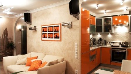
The combination of kitchen and living room does not cease to be the most popular option of redevelopment in the apartment. And if we are talking about Khrushchev with its small-sized rooms and a sense of compressed space, it seems that there is simply no other option. With a small kitchen with low ceilings, the apartment is definitely losing something. Trying to combine the two territories, the owner of such a home gets the feeling of expanding space. And this is even a psychologically competent move.
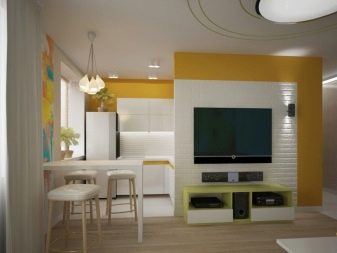
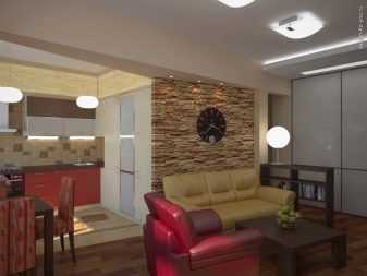
The pros and cons of combining
Before making a radical change in the apartment, check yourself again if you are ready to join the rooms. Obviously, the kitchen in Khrushchev’s is not the place where a large company can gather. Even households rarely sit at the dinner table all at once. This disconnecting factor favors a shared room. In the kitchen-living room, everything is in sight: while one is cooking dinner, the other at home are resting, chatting, and maybe help someone who is busy with culinary affairs.
In a small kitchen, this is difficult to do - it is difficult for one to turn around there, the company only interferes.
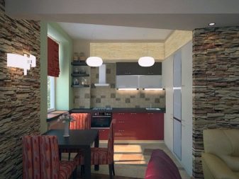
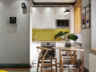
Finally, space itself is the room becomes open and wide open. It often seems that there is much more light in the room combined with the hall. The effect of novelty is also important - just repairing a small-sized kitchen is not perceived as dramatically as the redevelopment of space. Without moving, you are as if settling in a new apartment.
Cons are also worth noting.
- Inability to retire. In such a kitchen you will not hide from everyone, you will not fence yourself off.Therefore, those housewives who are interested in cooking without witnesses should seriously think about the need for combination.
- When combining two rooms, they turn into one space, which should be stylistically unified. And this means that the repair will have to be done in fact in two rooms, which increases its price.
- So that furniture and textiles do not absorb kitchen odors, will have to get a powerful exhaust system.
And of course, the redevelopment must be documented: any redistribution of the apartment project that violates the law, at least threatens with fines.
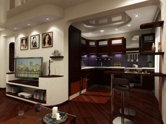
Layout Features
The bearing wall is not demolished - it simply will not be given permission: the risk of a collapse is very high. But the layout can be changed in several ways.
- Demolition of a whole wall. If the controlling organization gave the go-ahead, the wall between the kitchen and the hall is dismantled. The area can be increased due to the corridor adjacent to the room (but this is a rare case). The workplace falls on an alcove niche, the dining area is located between two windows, and the living room is where the hall was in Khrushchev.
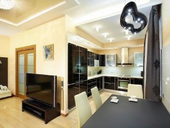
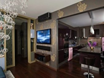
- The wall is where the doors were. This means that the doorway in the kitchen is blocked. Entrance to the kitchen means a path through the living room, the working area becomes larger due to additional meters of the wall.
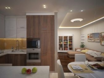
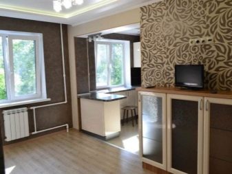
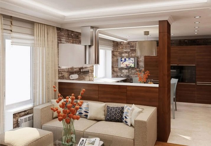
- Demolition of a fragment of the wall. Half or 2/3 of the wall is demolished. The working area is located around the perimeter of three walls, a partial wall is also taken into account. The dining room can also be placed between the windows - this is the most popular option. A wide window sill can be replaced by a bar counter.
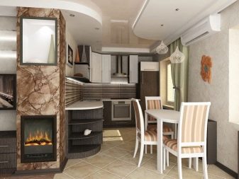
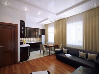
- Additional partition. The connecting wall is completely demolished, a partial partition in the center is erected, running in parallel to the windows. This lengthens the working area.
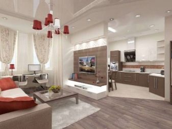
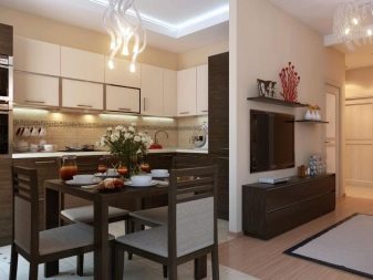
Each option is good in its own way. But most often only a fragment of the wall is demolished, this is in many cases a compromise option.
Zoning space
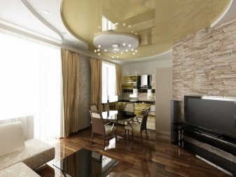
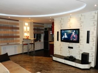
Correctly designating space is an important element in arranging a combined territory. There are several successful design techniques that help make visual and functional zoning. Ceiling and lighting - a frequent option for the division of territories. Chandeliers and sconces in the living area and spotlights in the kitchen are very comfortable. Spotlights are harmoniously placed over the entire surface of the ceiling.
Each functional section may have its own local lighting. The shape of the ceiling also works as a separator, if complex structures are used.
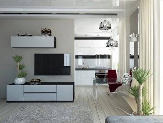
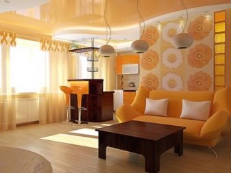
Other methods also help to zoning a room in an apartment.
- The difference in finish. If you just play around with color and textures, the rooms will already visually differ. For example, in the kitchen, the floor is represented by tiles, and in the hall - by a laminate. If the wall is completely demolished, the difference in floor coverings can be made at a slight angle that does not repeat the line of the former wall.
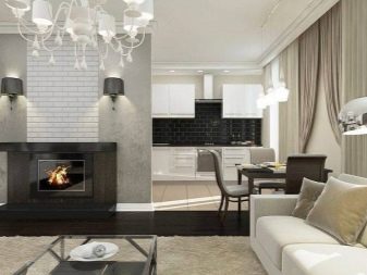
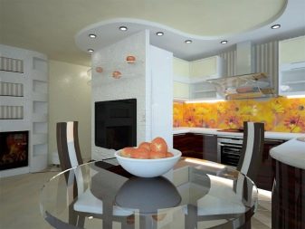
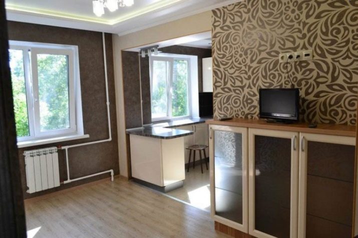
- The color of the wallpaper. They do not even have to be “partners”, the main thing is that they “do not conflict” with each other. Since the combined area is still not very large, it is more profitable to use light shades, but bright accents are possible.
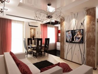
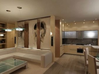
- Sofa. A classic example - the sofa is turned back to the kitchen and by itself serves as a separator. Behind it can be a small island or a rack of the same height with it.
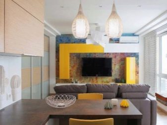
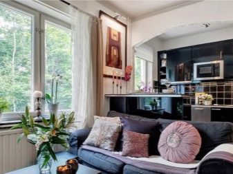
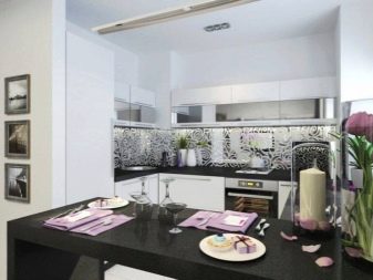
- Canteen. Sometimes this third zone wedges into a section between two main ones. This is good if there is no opening, no arch (open space).
Curtains and decorative bead curtains can also act as a zoner. But they are usually bright, textured, can lead to the opposite effect (space weighting).
Style solutions
Choose those democratic styles that do not make the main requirement a large footage, because in the "Khrushchev" even the combined room will not look huge.
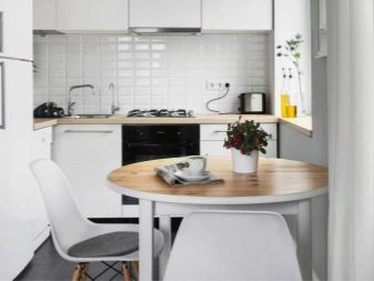
The most preferred today is the Scandinavian style and its variations. And there are many variations, meanwhile.There are examples when the style draws inspiration from the past, from the interior fashion of the 70s. Therefore, those who still have furniture of those times are desperately restoring it and returning it to the interior.
Together with modern decoration, decor, textiles and household appliances, this looks interesting and stylish.
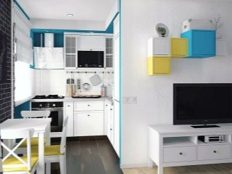
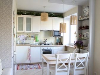
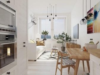
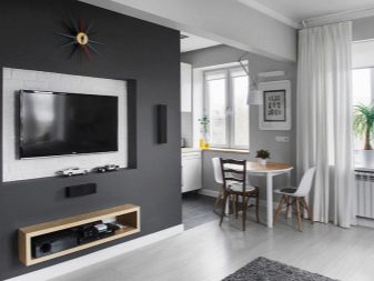
The Scandi version is good because it has a lot of light, a lot of naturalness and elegant simplicity. It does not require huge expenditures and is quite compromising on inclusions from other styles (if they are not very intrusive). For a limited means of repair, for a small room, for the desire to bring fresh air and good daylight into the space, the Scandinavian style is ideal.
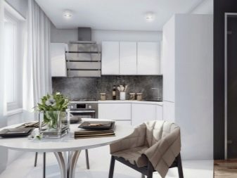
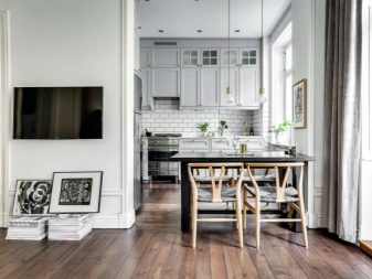
Minimalism will also be appropriate. This is the most concise style that does not tolerate special embellishment, complex prints and color combinations. It is suitable for those who are tired of living in crowded conditions and things accumulating in it. Minimalism cuts off all unnecessary, leaves only basic and irreplaceable objects. It will not annoy with bright finishes and decorative details.

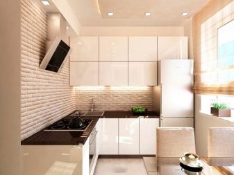
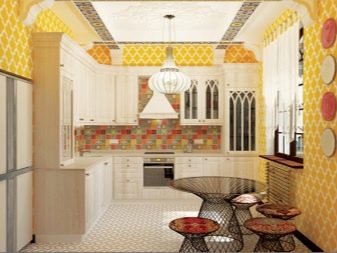
You can experiment with ethno-style. The main thing is not to flaunt it, not to compliment the direction on every meter of the room. To withstand colors, textures, the decor is very limited in presentation - and in the combined room there may appear sultry Moroccan notes or the beauty of the African continent, and maybe the aesthetics of the heritage of your homeland.
Color spectrum
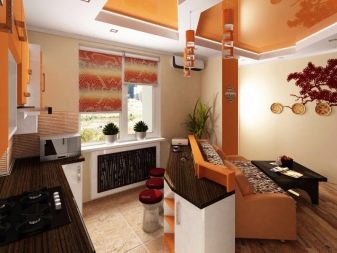
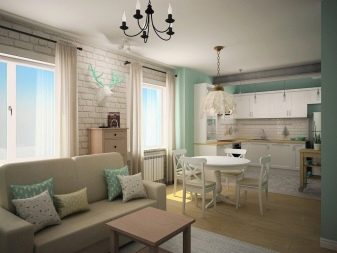
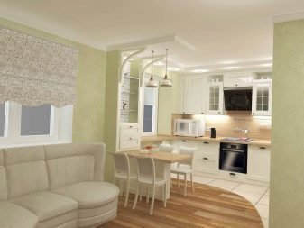
Despite the main advice - use only light colors, consider any options that you like. If you gravitate to motley, darkish wallpapers, you should not refuse them immediately. But you need to understand that the expressive design of the walls require a less expressive atmosphere. But against the background of white wallpaper, you can equip anything - this neutral base “unties the hands” of the owners.
Trendy colors today:
- spiced honey;
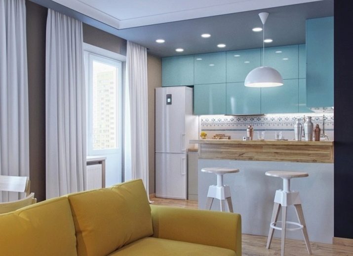
- sky blue;
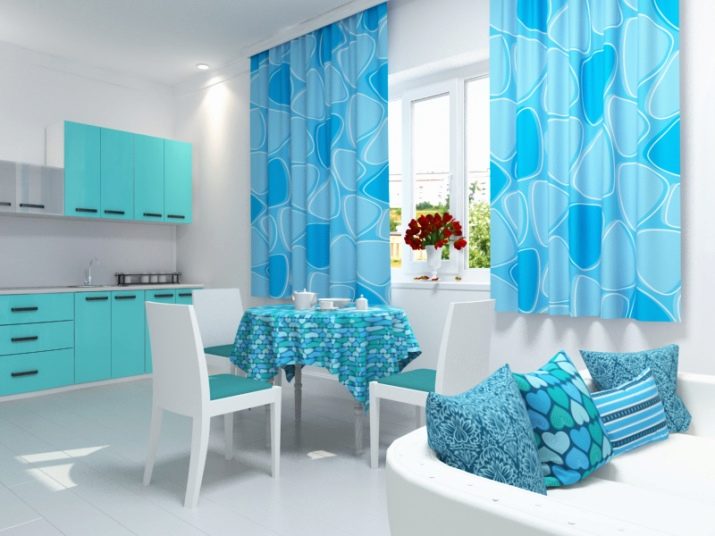
- turquoise with ice;
- caramel summer;
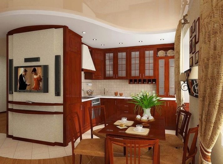
- cocoa with milk.
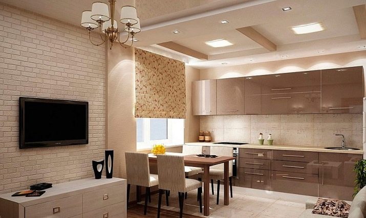
If you decide to highlight the accent wall with dark, then Choose bright wallpapers with a very large (but rare) print. It looks solid, stylish. For example, the central wall is chocolate-colored with huge stylized colors or abstract geometric patterns, the rest of the walls are shades of coffee with cream, smooth and plain. The interior will turn out to be warm and fashionable.
Finish options
It all depends on financial capabilities, of course, but even democratic projects today look no less inspiring than repairs at high cost. Those who are familiar with the concept of "hugg" and have read books about the Danish phenomenon know that in Scandinavia it is considered indecent to repair expensively and deliberately rich furnishings. This philosophy is slowly moving into Slavic interiors.
Therefore, it is quite true that people began to abandon gilding and furniture with a claim to modern or renaissance in small rooms. Xochitsya simplicity and conciseness, devotion to things that may not be perfect, but durable and beloved by all households.
If you want the same affordable and popular repair, remember:
- well, if the wallpaper serves as a base, and not an independent part of the interior;
- flooring made from natural materials is always a priority;
- the ceiling can be simply painted - the tension options do not comply with the principles of environmental friendliness;
- Smooth walls in a small room are preferable to textural ones.
And if it seems that the finish is rustic, the quality of lighting will help to distract attention from this.

Lighting organization
In the center of the living room is a chandelier. Ideally, it should illuminate all areas at once. But due to the local illumination tied to the headset, there will be no problems in the dark, when the chandelier gives general light, and not enough local.
In the living room near the sofa there may be a floor lamp or a table lamp on a pedestal, on a chest of drawers, on a shelf. Such simple solutions are once again in demand.
And while the hostess is cooking or cleaning the kitchen, the rest of the household can watch TV under the dim light of the local lamp.

The choice of furniture and appliances
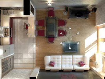
If you choose exactly low and compact furniture, due to its space it can look like a puppet, not very solid. Of course, bulky and massive things should be avoided, but you should not try to choose mini-furniture.
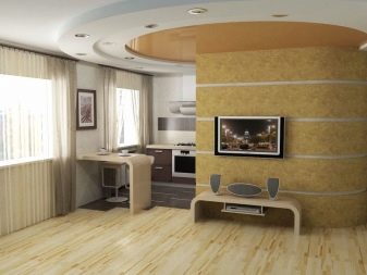
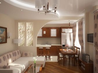
If it is possible to move the cabinets to other parts of the apartment, free up space from them. Think about what you can easily refuse in favor of, for example, a spacious dining table. Perhaps the wall-slide will be superfluous, and the library will not be its shelves, but niches in the wall. Try to take the sofa lighter: it always looks solidly indoors. Being very dark, a little change in visual perception is not for the better.
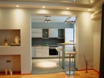
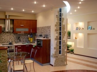
Textiles and Decor Elements
With decorative design you need to be careful. Try not to have endless figurines and paintings, but a more functional decor. For example, napkins, tablecloths, paths on the table - these are already strong decorative accents that do not require reinforcement. A good decor can be sofa pillows that play around the style of the room.
If there are vases in the room, then transparent ones that play with light will be the best choice.
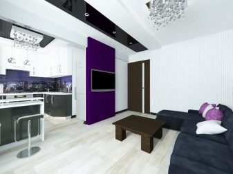
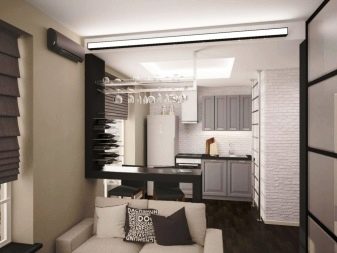
You can do without a carpet, but why do it if it helps the space to become cozier and warmer. If the sofa has a low table, let the carpet not be very dark under it. But the option in the whole living room will be superfluous. You can make several sets of covers for chairs at the table, which will change the mood of the room.
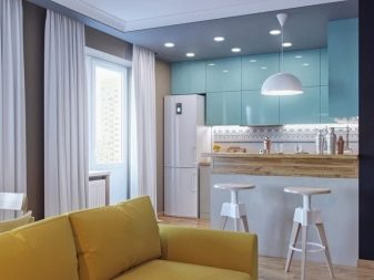
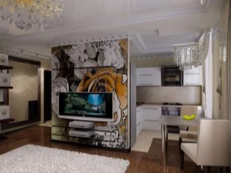
Good examples
And finally, some successful and beautiful examples confirming that a stylish interior design can be in the "Khrushchev".
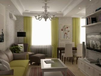
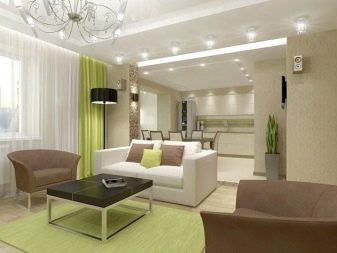
- Bright space with a warm accent of burnt grass.
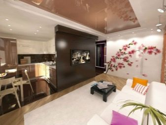
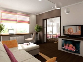
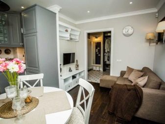
- A room with beautiful chocolate accents.
- Without a wall, but with high-quality zoning in the form of a difference in floor coverings.
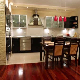
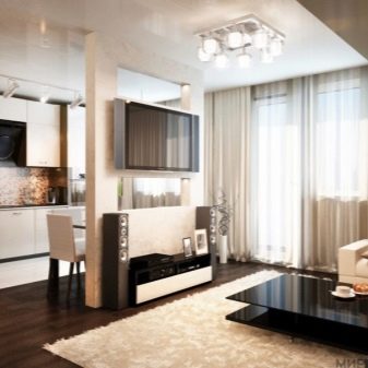
- The mood color is black ... or is it still blue? The kitchen-living room is a real hit.
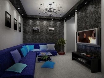
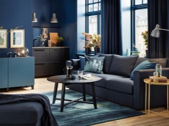
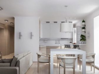
- Nice looking minimalism with a Scandinavian mood.
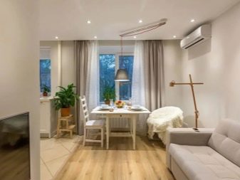
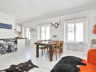
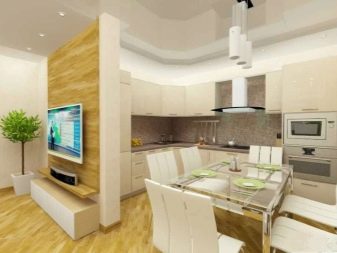
- Laminate on the wall - and it's really fashionable.
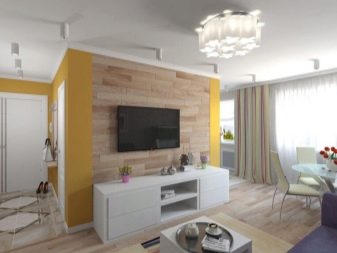
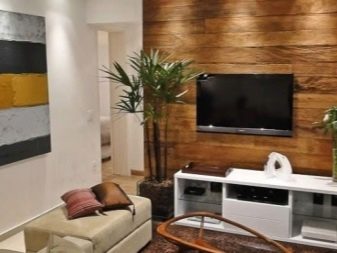
- Modern, graphic and dynamic.
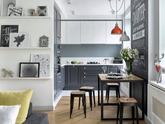
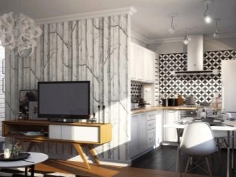
Khrushchevka cannot be compared with modern apartments, in which one kitchen seems to allow playing football. But this does not mean that a small area is not suitable for creating a stylish and very modern interior, especially if it will decorate the combined rooms.
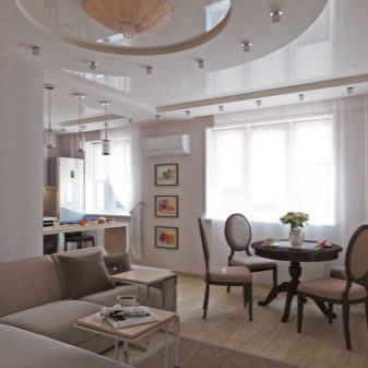
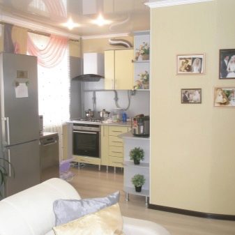
See how to arrange furniture in the kitchen-living room in the next video.
