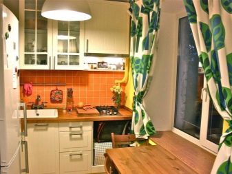
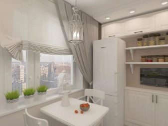
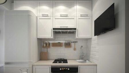
Small-sized kitchens rarely please the owners - even the most cozy and dear little kitchen, most people would exchange for a larger room. But if the reality is that your kitchen is a space of 6 squares, you need to accept the situation and try to squeeze the maximum benefit out of it.
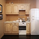
Basic Rules
A small room, whether it is a kitchen or a bedroom, puts forward special design requirements. What is permissible on 10 and more square meters, it is impossible to allow on 6 square meters. m More precisely, you can allow it, but the result will be far from optimal.
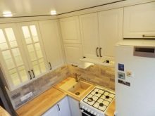
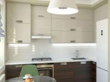
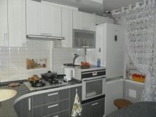
Experts identify 7 main rules for arranging a small kitchen.
- Light color. It is commonplace, and it has already snapped up, but no more confident and competent solution can be found: light color visually expands the space, dark - makes it visually even smaller.
Choose from a rich palette of light: beige, cream, milk and many other colors.
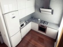
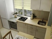
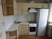
- Moderation of a print on wall-paper. The design of the kitchen on 6 squares, involving the gluing of wallpaper, excludes options with a large pattern, as it excludes options with a small print. Choose either a blurry middle pattern, or samples without it - plain, with not the most expressive texture.
The task of wallpaper is to make space easier, more airy, to “expand" the walls.
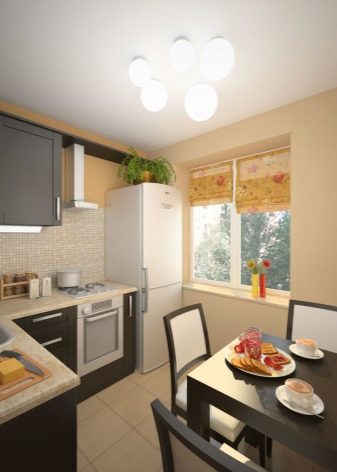
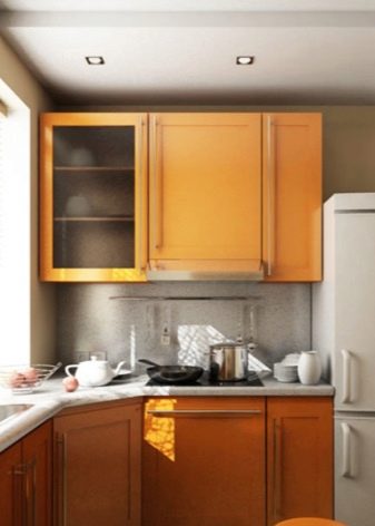
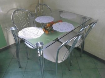
- Light and mirror surfaces. Any surfaces that have reflective properties will help in the design of a small space. The only question is practicality - whether the stretch glossy ceiling will not be uncomfortable, and whether permanent fingerprints on the glass dining table will not annoy.But if you are not afraid of the need to care for such surfaces, then a headset with expressive glass display cases, a glass table, and glossy worktops will help to make the interior more interesting and visually spacious.
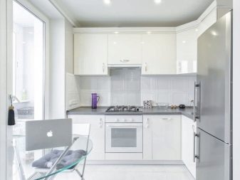
- Unload the window. If you can completely abandon the curtains, then do it. It will be a little Scandinavian, and will definitely add light to your kitchen. There are plenty of examples that an open window does not make a room uncomfortable or rude. If there are no curtains, let it be light and airy curtains (maybe a very laconic tulle).
Do not clutter up the windowsill - if its countertop is filled with all sorts of little things, chaos will make the room visually even smaller.
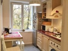
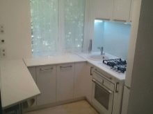
- Practicality and minimalism. An empty kitchen and a kitchen where there is nothing superfluous are two different things. Think about how to equip a storage system for packages, vegetables, various household appliances. Often all this is constantly in sight, which makes the kitchen seem disordered and even cluttered. It should not be in it at all that is rarely used. And even more so, do not overload it with decor, souvenirs and other things.
Leave what is cute, valuable to you, and in which the aesthetics of laconicism will be clearly visible.
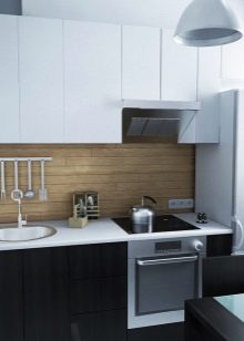
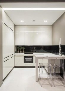
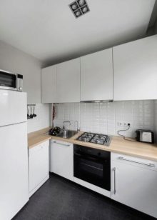
- Do not overdo it with textiles. Many people love cozy kitchen spaces, where there is a beautiful tablecloth, and pillows on dining chairs, and some unusual curtains. But at 6 meters it will be an unambiguous search. Have a removable decor - get some modest paths on the dining table, make chair covers for the seasons or holidays. Leave a lot of open space, against the background of which the same napkin or path on the table will be noticeable. Pay attention - noticeable, not intrusive.
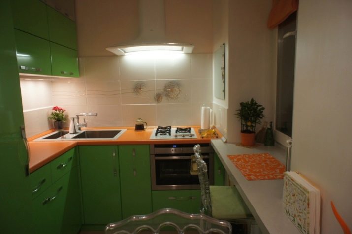
- Think over options with a refrigerator. For example, the metallic color technique will also be an object with a reflective surface that is valuable for a small kitchen. And if the headset involves a cabinet for the refrigerator, and all this does not look bulky, this is a sensible decision. And yet, do not place it so that it blocks the light stream.
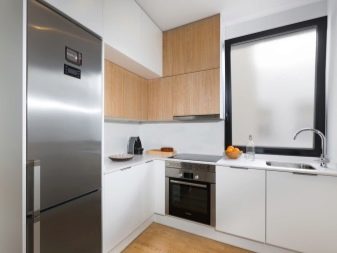
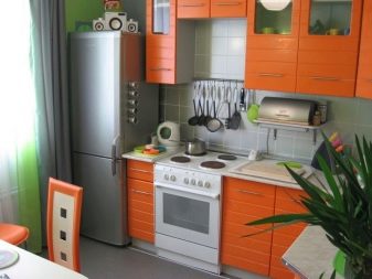
A bit about taboo. In a small kitchen there should not be massive heavy furniture. There is no place for heavy long curtains and curtains with complex decor. The colored ceiling is just a knockout for the interior of a small kitchen, only plain, preferably milky white.
Finishing Features
Usually, repairs begin with wall and ceiling finishes. False plasterboard ceilings for a small room are certainly not an option. They do not just make the space heavier, they “steal” it, which is unacceptable in the case of a 6-meter-high kitchen. White monophonic ceiling is a classic, nothing can be more appropriate than that. Washable wallpaper or decorative plaster in delicate shades may be on the walls.
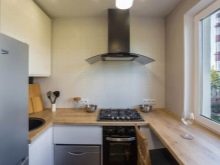
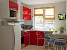

For flooring, ceramic tile or laminate with moisture resistant characteristics is suitable. Large prints on the floor, of course, will be superfluous. It makes sense to arrange the floor covering diagonally, visually it improves the interior, makes the room a little more visual.
Beige, white or light brown - these are three colors that are perfect for a small kitchen.
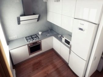
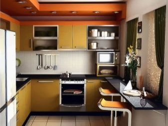
Arrangement of furniture and appliances
You have several kitchen layout options. It cannot be said that one of them is more advantageous - all schemes can meet the task of convenience and visual expansion of space. The arrangement of doors and windows is taken into account.
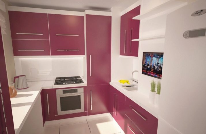
A planning project can be one of the three most popular.
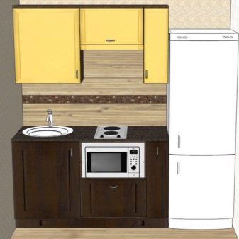
- Linear - the kitchen comes in a row along one of the walls. The main emphasis in such a kitchen is on the dining area.
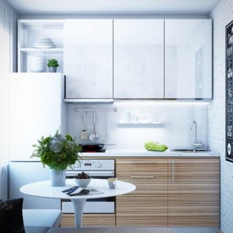
- Corner - the headset is placed near two perpendicular walls. This option is more common, since usually the corner headset is more capacious than the option that involves placing it along one wall.
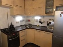
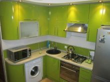
- U-shaped - the headset captures three walls. This is a good way to lay out a square kitchen. But there is no more space left for placing the table.But this is not a problem if the tabletop-windowsill replaces a small table, and a full-fledged dining area is taken out into the living room.
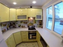
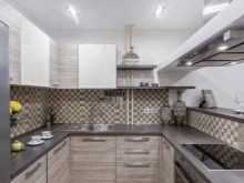
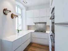
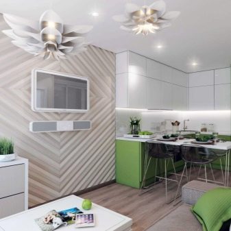
Finally, the option of combining rooms can always be considered. Most often, the kitchen is combined with the hall, sometimes it is enlarged, "sawing off" part of the corridor or hallway. It is also possible to expand the space by a couple of squares due to the balcony or loggia.
Shade selection
And now more about color. The pastel gamut has long been firmly in the lead in the color issue, and modern fashion does not argue with this. White scandi-style kitchens are also quite relevant, and they always provide many opportunities. You can use furniture of different colors in the kitchen with white trim. For example, in a white kitchen, a white table looks interesting, with different chairs behind it, one in wood tones and the other in blue, red or yellow.
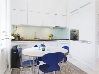
If you do not want a white kitchen, take a look at the following shades:
- the color of herbal tea is very light, in which the green color “drowns” very gently, this option is especially good for southern cuisine;
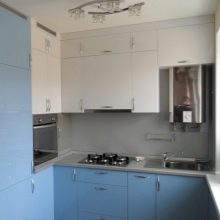
- blue - the room becomes cooler (this is the psychological effect of color), but it refreshes the small kitchen;
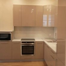
- cocoa with milk - the quality of this shade is that it is calm, cozy, and quite strict;
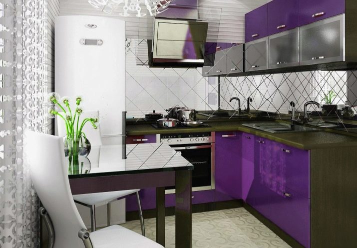
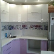
- light purple is also a good option for a kitchen that faces the sunny side.
You can also combine colors - white with pale blue, olive with the color of light wood, faded lemon with faded grass.
Style solutions
It would seem that the most convenient option for a small kitchen is minimalism. But trends in the world of interior fashion come down to the fact that people are gradually starting to abandon strict minimalism, resorting to eclecticism, a bright personality in the interior. There is even a well-known expression that style is favorite things and colors brought together.
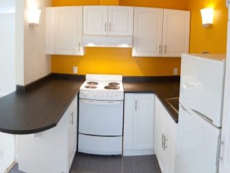
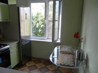
Introducing the top 5 styles for a small kitchen.
- Scandinavian - it is impossible not to mention it, because today it is the most democratic, universal, actively used option, indeed, meeting the demands of practicality, comfort, beautiful simplicity.
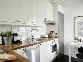
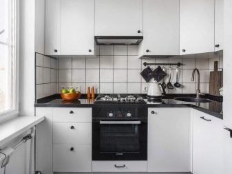
- Boho - A trendy interior story, in which there is something from hippies, something from the maximum environmental friendliness of design, a lot of floristry, calm sand-beige shades and a very nice texture.
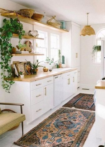
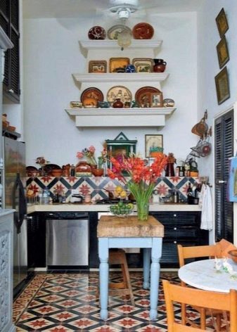
- Country - This is a many-sided style, in which there can be the beauty of a Russian estate, and the Provencal aesthetics, and a rude rustic style.
But a kitchen in this style should not conflict with other rooms in the house that may look different.
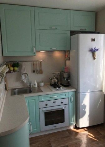
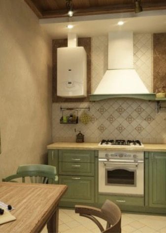
- Shabby chic. A style celebrating luxurious aging has not yet fully taken root in Slavic interiors, but numerous Instagram pages about Shebby Chic break through this wall and show how gorgeous it is.
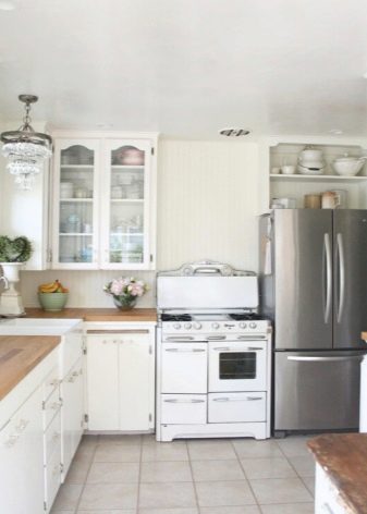
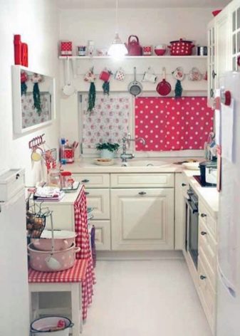
- Neoclassic. This option is more suitable for combined rooms, but if you are just thinking about combining the living room with a 6-meter kitchen, the style is worth considering.
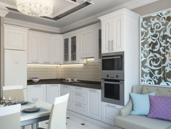
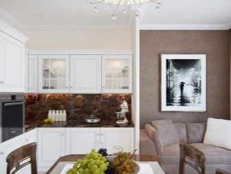
Other styles are no less interesting, but require a more detailed approach and, in most cases, the work of the designer.
Useful Tips
The most obvious option for the most practical arrangement of the kitchen is the manufacture of a headset for a personal order. So it will be easier to adapt to already existing furniture, make a niche or cabinet for the refrigerator.
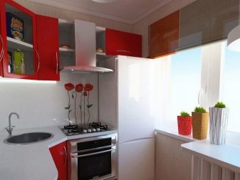
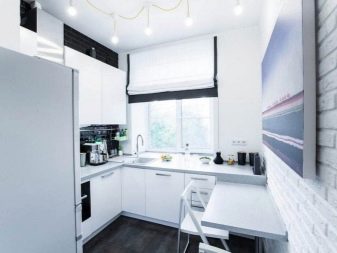
Small tips for the owners of a small kitchen:
- on the wall near the dining table you can make a mirror fake, which gives an interesting effect and works great on expanding the space;
- do not make the refrigerator a board for magnets - this is already unfashionable, and most importantly, it also works to visually reduce the kitchen;
- use railing systems, they are practical and can eliminate the need to order a very large headset;
- variegated floor mats will fit only in a plain, preferably white space;
- use side tables that are round when unfolded, and when folded - half the circle, if the family is small, then for everyday use the unfolded version is not needed;
- if you decide on a photo wallpaper, they should not be very motley and depicting a perspective.
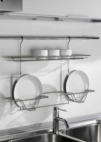
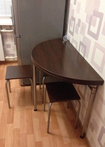
Moving the dining room to the living room is an option that many people like, but excessive conservatism does not allow people to decide on this.
If you never have dinner with the whole family in the kitchen (as there is not enough space), boldly take the table out to the living room and do not deny yourself the pleasure of family meals.
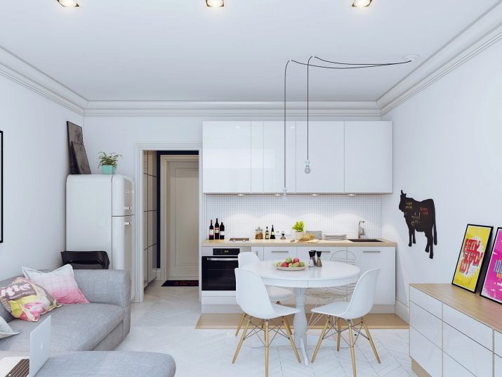
Beautiful examples
And in conclusion of the review of 8 very successful examples of arranging a 6-meter kitchen with a refrigerator. Perhaps in one of them you will find a source of inspiration for your repair.
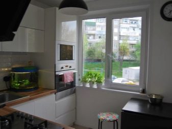
- The working area is brought to the window, and this is indeed a good solution, although it requires some trouble.
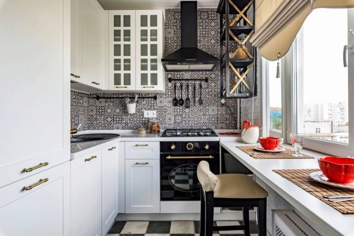
- In this embodiment, the dining area by the window, which also looks nice and fashionable.
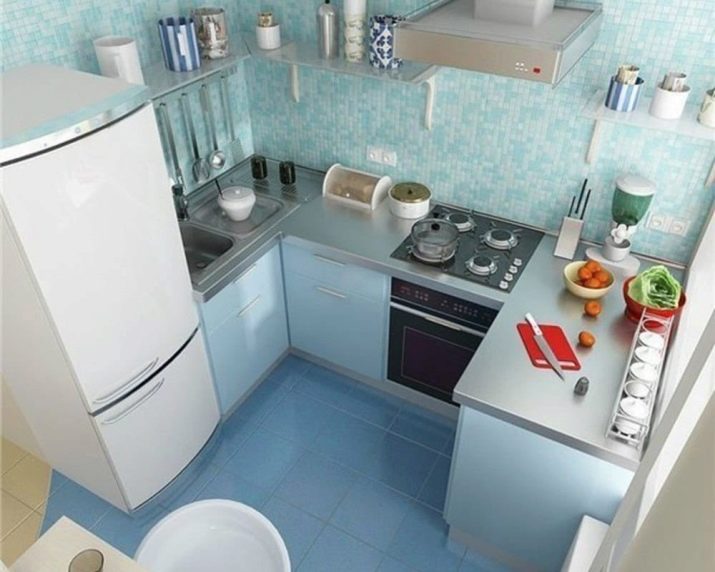
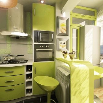
- An unexpected solution with rounded shapes and vibrant colors. Brave and fresh!
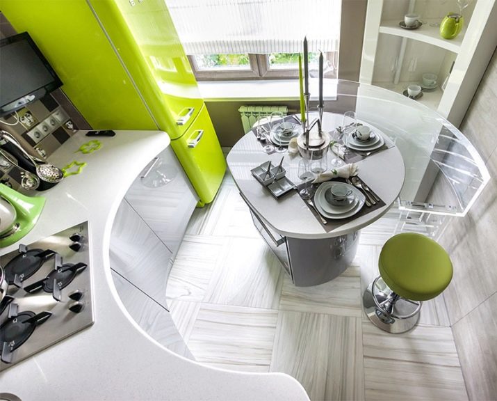
- The story of the cool and austerity of blue. And here everything is very minimalistic.
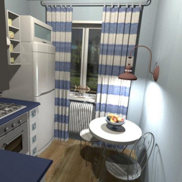
- A bit retro, but very cute and cozy. And the budget for such a repair with a nostalgic touch will be small.
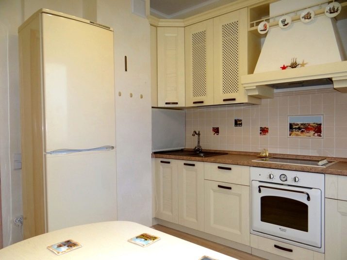
- Again, the zone at the window is involved, and this is done very competently. Nice and cozy decoration, a little natural greenery enliven the space.
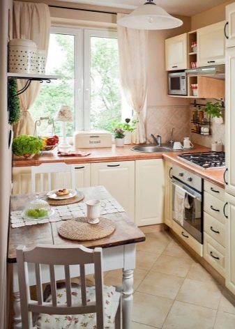
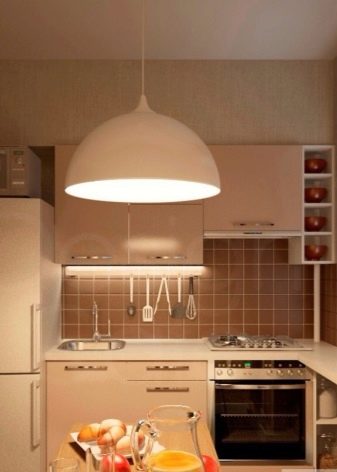
- In this interior, minimalism, form and white savior reign.
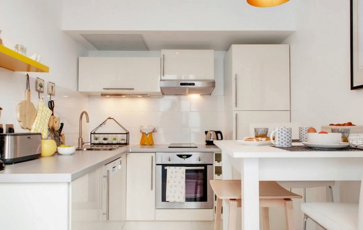
- Narrow kitchen option. And the refrigerator is hiding in the closet.
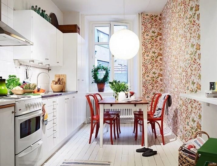
Do not be afraid to deviate from patterns, violate styles a bit. In all true beauty there is a small attractive gyrus. It’s better to slightly break the style than live in a faceless cold interior that does not fill you with energy and that never becomes truly native.
