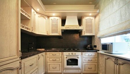
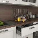
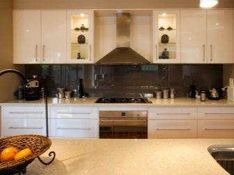
Choosing a dark apron for your kitchen is a rather unconventional and bold decision. At the same time, the apron can have very noble shades of wenge and cherry, which look great on a light background of the kitchen. To design a dark apron, a white kitchen is perfect as a background. Also, interesting options can be selected for placement in beige, gray and orange tones. The dark design of the apron allows the use of interesting details in the form of marble, suitable for glossy, matte kitchen sets. Introducing dark colors competently quite difficult, you must consider the size of the room, the overall style. At the same time, organically placed accents will make the kitchen bright, expressive and respectable.
Application rules
To correctly introduce a dark apron into the overall picture, it is important to determine the shades of the main background. This determines how a similar attribute will look. A dark panel can be contrasting against a light background, and can smoothly transition into a similar gamut of shades. It is very important to choose the halftones of not only the walls, but also the headset itself. Designers propose to rely on the basic rules of the combination of shades in the kitchen interior.
In one key. In this embodiment, the shade of the apron is selected exactly or similar to the tones of the headset, walls. This solution is not suitable for dark and small rooms, as it visually reduces the space. So that such a kitchen does not produce a depressing gloomy impression, it is necessary to organically select materials, texture, lighting, details.
Accent tones should be selected in light palettes. The same applies to appliances, dishes, dining furniture, textiles.
In similar tones. This is a very diverse design method, there are many variations in it. An apron in a dark shade is perfectly complemented by other tones when decorating walls, choosing furniture within the same color scheme. They can be repeated, intertwined, differ in temperature.
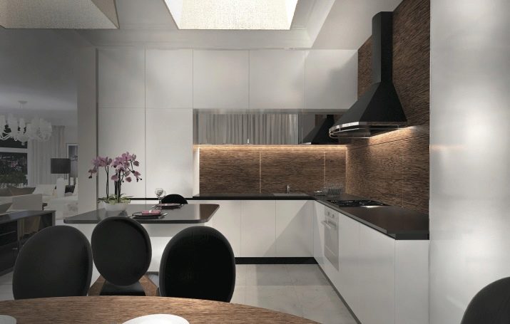
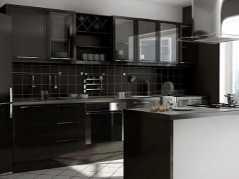
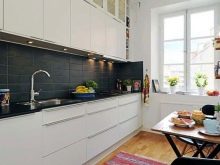
- Contrast solution. This method is the most common and is perfect for both small and large rooms. It uses shades located in the opposite palette of shades. Typically, a dark panel contrasts with light walls and furniture. The emphasis in this case can be varied. In addition to light, contrast can be achieved with varying degrees of juiciness.
It should be borne in mind that overly sharp, conflicting color combinations are not recommended for use in classical and close to stylistic directions. Such design methods look more adequate in modern interiors.
Which style is right for you?
Achieving an organic overall picture is very important. This is one of the main goals of any design project. The dark color of the apron fits well in different stylistic forms, but there are certain limitations. Knowing them, you will avoid mistakes when choosing a color.
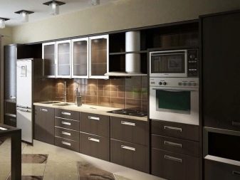
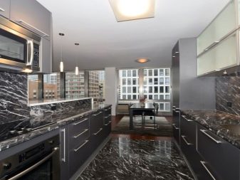
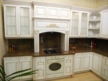
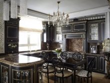
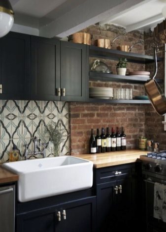
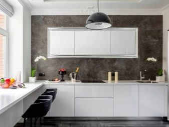
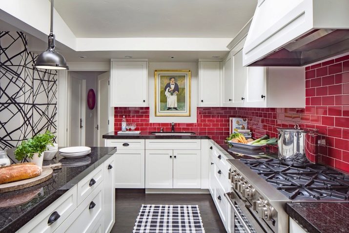
- Classic. Here, the dark and light panels of the working area will look quite harmonious. If you make a choice in favor of the dark, you can safely choose monochrome options, panels with images of suitable subjects. Perfectly fit in the composition of brown, blue, emerald, wine and black aprons.
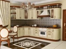
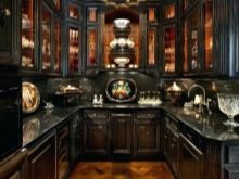
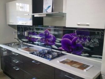
- Baroque. Luxurious style is especially effectively emphasized by dark panels with the correct pattern, bright or similar in tone color. Here marble with light impregnations will be appropriate. A panel with an image that matches the style is perfect.
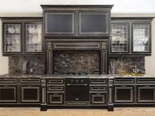
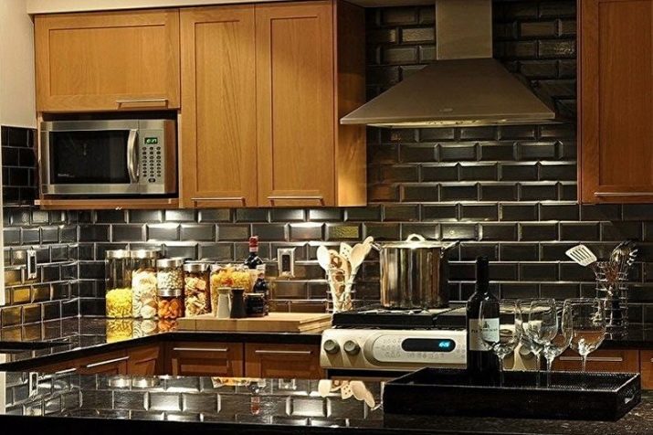
- Gothic. This is a very effective option, which is appropriate only in large rooms. Moreover, gloominess in the Gothic style is an indispensable condition. Therefore, a black apron that smoothly transitions in shade into the walls is an ideal option. Perfectly fit into the interior panel color cherry, dark lilac. Often use tiles, mosaics, stone and imitation.
- Art Deco. This is a style of wealth and luxury, in it black and dark shades look more than appropriate. As a material, you can use tile, ceramics.
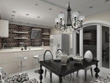
- Retro style. Dark aprons in this design look very beautiful, and not only in monochrom, but also textured, with a photo print, ornaments, white inscriptions.
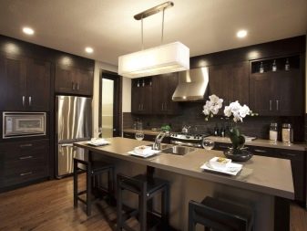
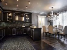
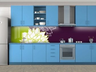
- Modern. This style loves contrast, beautiful combinations, so the dark panels in it blend perfectly with light walls. In addition to black and brown, you can safely play with hints of ripe cherries.
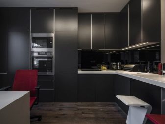
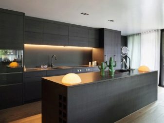
- High tech. In this style, a lot of ebb, gloss, metal. It focuses on the technical component. Dark tones of gray, black when designing the work area will be more than appropriate. As for the images, they may not be there, the gloss itself will be self-sufficient. Adequate photo printing, abstraction.
Light shade combination
This is a very popular solution, universal both in style and in size of the room. In this situation, the panel above the work area plays the role of a catchy accent with walls and / or a headset. Designers offer the following harmonious compositions with a dark apron:
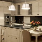
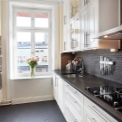
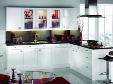
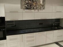
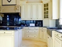
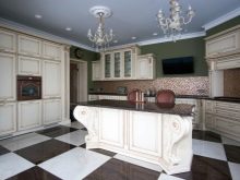
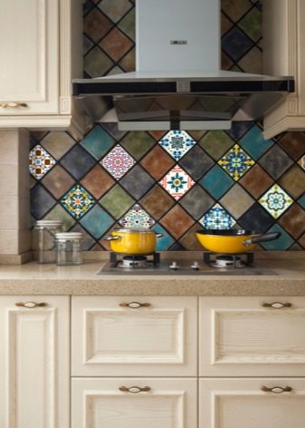
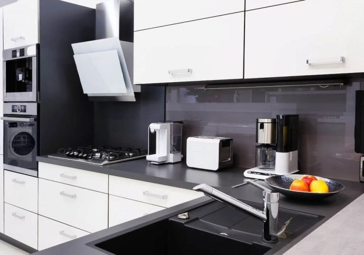
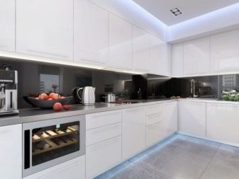
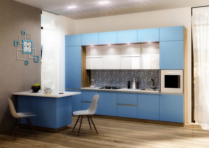
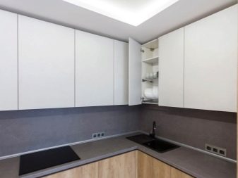
- with a white kitchen you can’t be afraid to choose the wrong tone of the dark, as this versatile color is ideally combined with almost all palettes
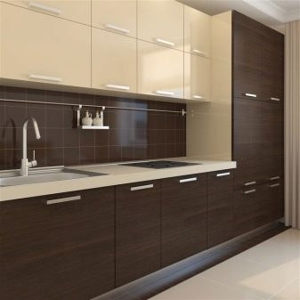
- a panel of black, brown, dark green, gray, wine shade looks great with a beige kitchen, but blue is contraindicated;
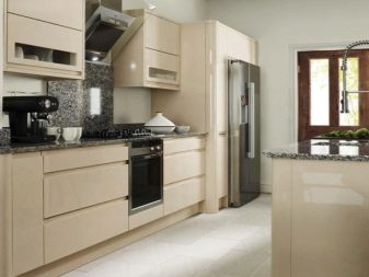
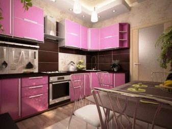
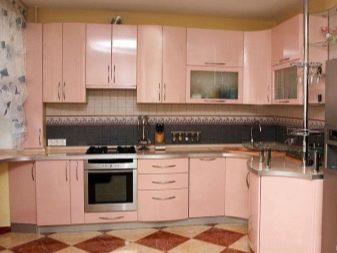
- with peach-pink kitchen panels of black, gray, brown, wine, lilac tones are perfectly combined;
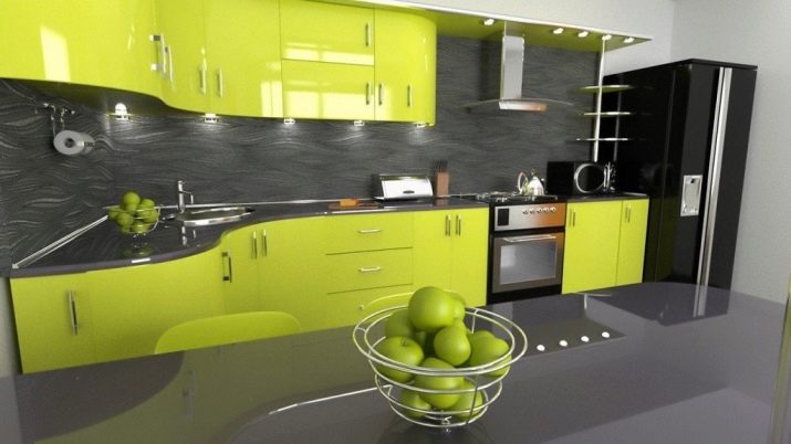
- the light green kitchen blends perfectly with the dark panels of green, black, gray, brown;
- the blue kitchen is perfectly complemented by a blue, black, cold-lilac apron;
- light lilacs look best with the same gamut, but in a darker version, or cherry, blue, depending on the temperature of the general background.
Pros and Cons of Dark Shades
A black apron is quite easy to combine, however, there are some nuances. Among the advantages:
- universality;
- elegance, status;
- the ability to create a spectacular contrast;
- perfect background for a picture;
- Looks good with any backlight.
Disadvantages:
- may look gloomy, especially if the general background is incorrect;
- not the best material for the invoice;
- very easily soiled, requires careful cleaning;
- reduces space.
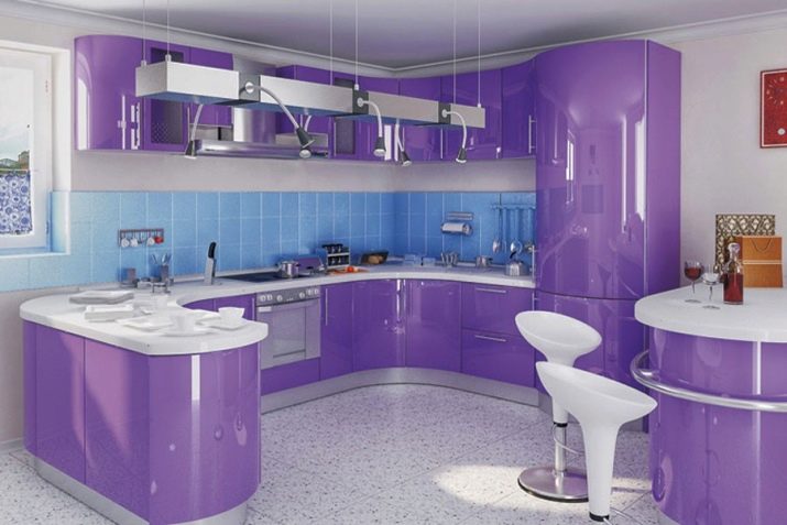
Dark lilac and violet do not look very interesting in monochrom, but images on the surface stand out very expressively.
Advantages:
- originality;
- relevance in different styles;
- perfectly combined with different scales;
- It looks spectacular with backlight;
- creates a feeling of infinity, cosmicity.
Disadvantages:
- it is important to correctly determine the temperature of the shade;
- to choose a partner well in the composition, you need to know the basics of coloristics;
- fits poorly into retro stylistics;
- can create a gloomy impression.
The dark gray apron is very original and fits well into the kitchen interior.
Benefits:
- perfect for all styles;
- status, respectable;
- perfectly smoothes bright combinations;
- creates a blurry contrast;
- ideal for textured surfaces.
Minuses:
- if there is a lot of gray, then the interior becomes dull;
- requires brightness in detail;
- may create a depressive mood.
Wine gamut is not a very common option for the design of the working area.
Among the advantages can be identified:
- non-triviality, brightness;
- gives the impression of luxury;
- goes well with warm colors;
- Looks good in different styles;
- relieves the room of gloom.
Minuses:
- aggressive
- Tires the eyes;
- depresses the psyche in large quantities;
- visually makes the interior heavier.
Browse the kitchen with a dark apron, see the next video.


