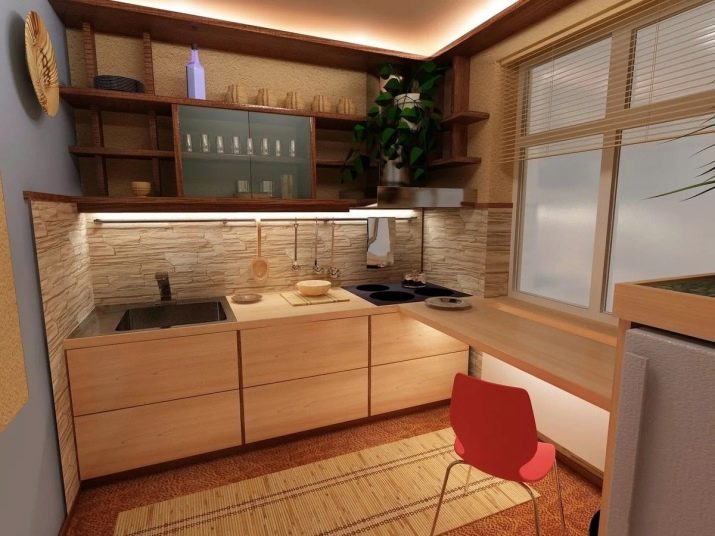
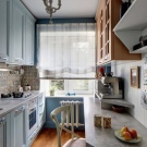
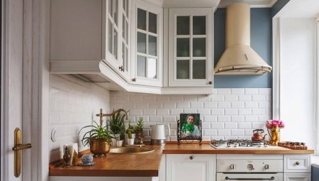
A spacious kitchen is a blessing for the owners, but such chic layouts are more likely to be found only in new apartments. “Soviet” kitchens rarely boasted a decent footage, which provided considerable opportunities for arranging the premises. But to say that a small kitchen cannot be cozy, functional and stylish is impossible. True, it turns out that not everyone has a small-sized kitchen.
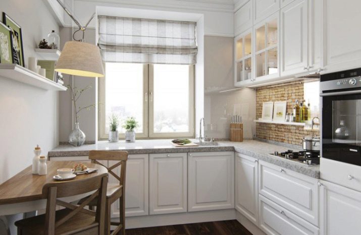
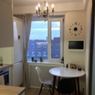
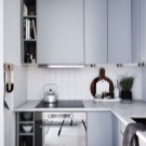
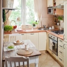
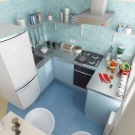
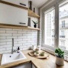
Layout Features
Even if the landlord enlisted the help of a designer, the design features of the "small size" can cause a feeling of compactness and cramped space. As a rule, designers offer clients to work with color and texture, with windows and surfaces to create the widest and most open interior in a small area, but the owners do not always agree with experts on everything. The point is in some well-established idea of how the interior of the kitchen should look, as well as about stereotypes associated with its size.
Many owners want to make a big kitchen, and for this they have to change the layout of the room. For example, you need to tear down a door and make an arch. Or even tear down the wall to combine the kitchen with the living room.
The last project must necessarily be coordinated with regulatory authorities, any initiative is dangerous.
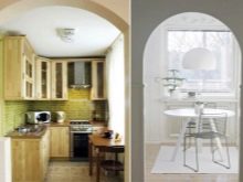
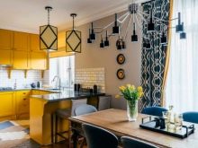
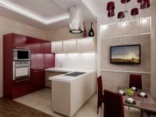
But there is a category of people who are satisfied with small-sized kitchen. They think it is cozy, compact, and they are not going to organize a studio in the apartment.If you also have a very small kitchen, and you don’t want to demolish the walls and doors, you can make the mini-room stylish and modern.
You need to move a little from the standard (and often just old-fashioned solutions), look at the interior design with a fresh look - you can make square and rectangular kitchen in a new way. It is even possible to psychologically rearrange the size of the room in the right direction.
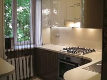

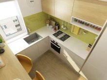
Secrets of visual space increase
In "short films" the topic of visual increase in the interior becomes especially relevant. And cunning tricks, indeed, work - they control the look, create small necessary illusions of the perception of the room.
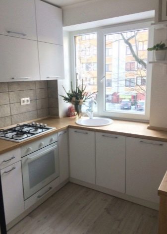
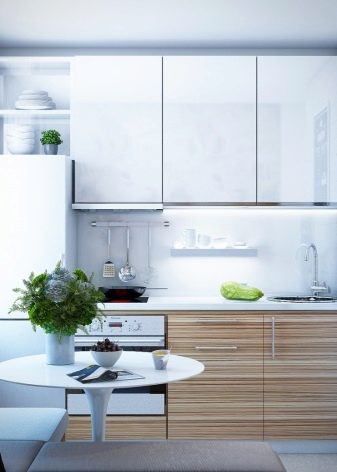
Let's consider how to increase visually small kitchen.
- Cold colors - that’s what you should definitely give preference to. Violet and violet blue, white, gray are colors that can add space to the room.
The cold gamut should not be made very dark and saturated. Warm colors can be included in the interior, but minimally.
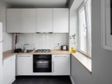
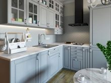
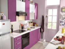
- Smooth wallpaper without relief. The same rule applies to paint and plaster: if there is any pattern, embossing, texture, the space visually shrinks.
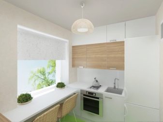
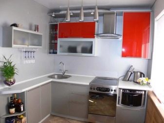
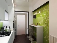
- Wall mural on one wall. Not all murals will work, we need exactly those that represent the future. For example, an alley or window extending along the park from which the sea is visible. Such a decision seems to paint on the continuation of the kitchen.
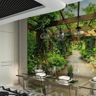
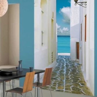
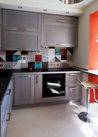
- Light and plain flooring. Squares, saturated color inserts, print, decor should not overload the view. If you are laying parquet or laminate flooring in a rectangular kitchen, stack the modules from the door or diagonally.
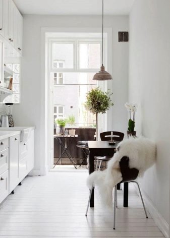
- Ceiling. The ceiling in a small room is best done white, it can be glossy - any reflective surfaces work to expand the space.
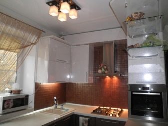
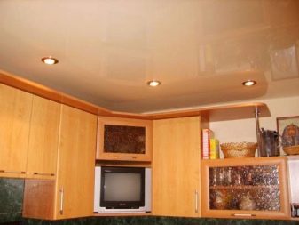
- Glass furniture. Another popular way to give space expressiveness is to create a light interior that will not burden the image of the kitchen.
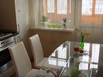
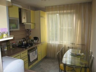
If you can implement all (or almost all) of the above in your kitchen, you will definitely correctly manage a small area. But the main secret to increasing the premises is the rejection of all unnecessary. No need to litter the room in which every centimeter is expensive. Take everything that is not used outside the kitchen. Some owners do this even with the upper cabinets of the headset, believing that you can do without such a weighting.
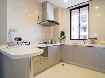
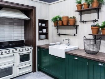
Free window area: if the window sill is stuffed with things, the gaze necessarily catches it, and the room visually narrows. That's what really can stand on the windowsill - these are glass vases of cold tones. One will be enough.
Minimalism is the main concept of very small spaces, and almost always it is winning.
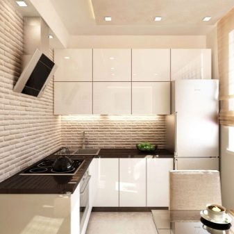
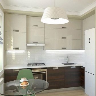
Style solutions
Style streamlines the interior. It seems that it is difficult to maintain the room in one style: on the contrary, the concepts of direction suggest color, shape, decor, and do not allow unsuccessful combinations to be made.
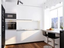
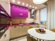
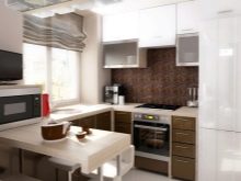
Many styles are friendly with the interior of the small kitchen.
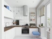
- Scandinavian. Of course, it must be put in the first place, since this direction of design implies freedom, space, light, and refusal from excesses. It is also a very democratic style, it allows you to operate with those who are constrained in the budget.
A simple and concise set, bright surfaces, comfortable and space-free decor - these are the main advantages of the scandy style.
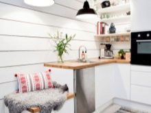

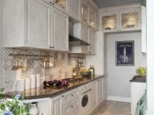
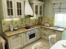
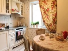
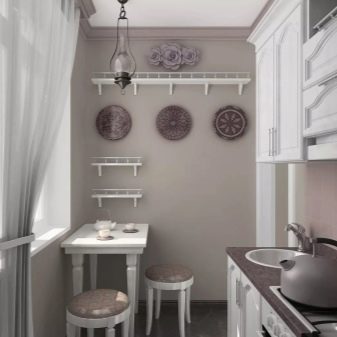
- Provence. Speaking of Provencal style, spacious kitchen-diners are presented somewhere in a private house in the country. But if this country direction is close to you, you should not refuse it even with a modest footage of the kitchen. The walls can be done in soft olive tones, the set itself will be white, as well as the dining group. But textiles will become a sign of style, they will maximally embroider the room.
Style can be guessed at the expense of beautiful wooden tabletops, home-made tablecloths and paths, window decorations.
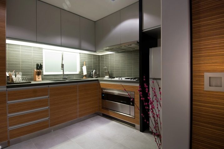
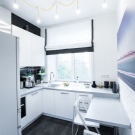
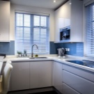
- Modern style. This is a conditional name, national team. It is understood as a combination of high-tech styles, both techno and minimalism. Often in such a room strict and concise lines prevail, a lot of metal and glass, basic colors, one of the walls is “brick-like”. There is practically no textile, because there will be a lack of special comfort in a small kitchen.
Although, if you follow the minimalist principles, and pay attention to the design of the window, the kitchen will turn out to be very pretty.
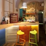
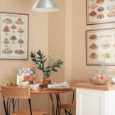
- Coffee shop style. This direction is especially in demand today. The kitchen can turn into a mini-coffee shop, and, copying this image, other requirements are put forward to the room, rather than open space and open space.
Often in such a kitchen there is a very small table for two, the walls are decorated with posters and signs, attention is also paid to lighting.

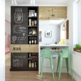
Styles do not end there, but, for example, for the classical style there is still not enough space, country also requires additional meters. Bright fusion and ethnicity can not do without bright colors, which are difficult to operate in a very small kitchen.
Color spectrum
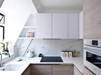
The undisputed leader is white. It, like nothing else, is complementary to small rooms where you need to let in light and fresh air. Many owners are afraid of white kitchens, because they are very easily soiled. But the fee for visually enlarged space is not the biggest - high-quality washable wallpapers, which can also be tinted, will be a good help.
White kitchen always looks fresh and elegant. And if it is still located on the sunny side, then there are more and more arguments in favor of white.

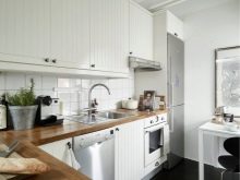
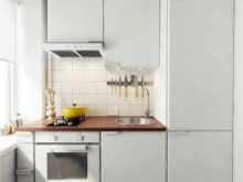
In addition to white, they can represent the coloristic concept of the kitchen and other colors.
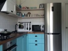
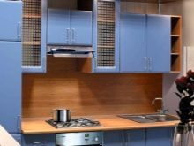
- Blue. Cool color with shade options. It goes well with white, wood and sand tones. Perfectly aligned with gray.
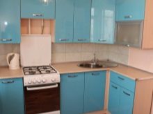
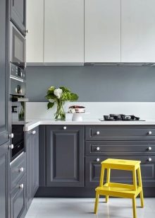
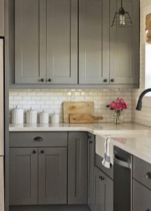
- Grey. In combination with white and black (this color will be less active in the top three) is able to create a concise, attractive design in a small room.
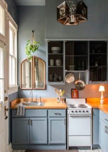
- Faded mint. Very delicate, refreshing color. It is able to make the room softer, introduces some delicacy into the interior.
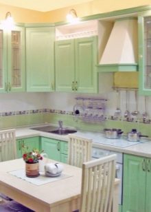
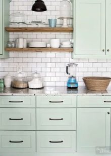
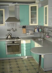
- Purple. It goes well with white and gray. Try to use this color on glossy surfaces.
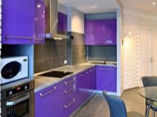
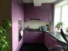
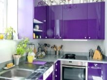
- Sand. Warm color is suitable for those who like beige and chocolate gamut with a tendency to lighten.
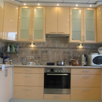
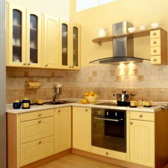
Bright colors are a danger to the "short film". They squeeze the space, can darken it. You won’t spend much time in such a motley kitchen. The kitchen is still considered a hot zone, when the stove or oven is working, it is hot there. From the bright colors around it will seem that it’s not just hot, but unbearably stuffy.
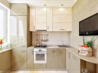
That is why in a small kitchen the interior is often chosen calm, Nordic.
Finish options
The role of the finish is not only great, it is often crucial in the repair. Here, functionality and decorativeness are not inferior, both requirements must be observed.
Walls
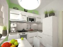
You can simply paint the walls with high-quality moisture-resistant compounds. If the surface is flat, the method is more than suitable. Latex and acrylic water-dispersion paints, which must include anti-mold elements, are suitable. Fiberglass, washable wallpaper and even plastic panels can be useful.
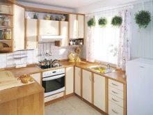
The area above the sink, stove and countertop is usually protected by ceramic - the apron is laid out with tiles or smooth artificial stone. It is also possible to use tempered tinted glass.
Floor
This place is intensively exploited, because the flooring must be very strong and wear-resistant. And also it should be easy to clean, but not sliding. Usually, owners choose coatings with characteristics similar to these requirements: linoleum, porcelain stoneware, tile or even a self-leveling floor on polymer resins.
Laminate is much less commonly used in the kitchen, since it does not like to wash frequently. The tree will also "get tired" of moisture.
Try to make the floor covering monophonic, consisting of large glossy elements.
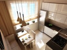
Ceiling
The most popular option is a light stretch ceiling or ordinary painting. But of varying complexity, drywall constructions are best used in other rooms. The kitchen is so small that such a complex ceiling “steals” it, even if not meters, but no less valuable centimeters.
Do not be afraid to turn to budget options, such as wallpapering, plastic panels. Not all cheap options are environmentally friendly, but their aesthetic requirements and affordability are very good.
Different decoration of the ceiling (levels, beams) in a small kitchen may be superfluous.

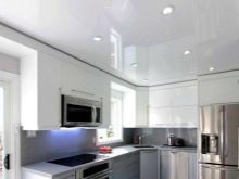

Lighting organization
Even a small kitchen is no reason to leave only one central lighting. Mortise point diodes, which are economical in terms of electrical costs, can be useful, they last long and quietly tolerate high humidity. LED lights fit well into the kitchen (under conditions of reliable wiring insulation).
And the pendant chandelier can be completely abandoned. If you can’t imagine how this kitchen is without a chandelier, imagine that visually it is indeed an object of interference. If the headset has its own lighting in the zone, and a sconce hangs above the dining table, is it really necessary to have a chandelier? If you still decide to leave the so-called central lighting, take a look at the light, and even completely elegant frame models. The main thing is not to buy very massive, overly decorated chandeliers.
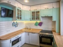
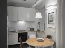
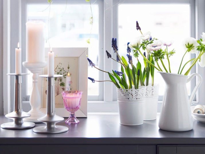
A small kitchen is often associated with comfort, warmth, and cohesion of all households. Therefore, candles are so consonant with the kitchen, which serve both for local lighting and for general psychological comfort. Today there are so many candle options on sale that you can choose them for a long time and with great interest.
But remember that this is a fire hazard, do not leave candles lit when there is no one in the kitchen, use protective candle holders.
Furniture selection
Usually, the owners pose the question only this way: you need to choose a convenient and compact headset model. And such owners of small kitchens do not even look at other options for arranging space - for example, abandoning a headset in favor of a kitchen cupboard or cabinet. Or - the rejection of the upper cabinets in favor of open shelves.
If you still decide to purchase a headset, the requirements for it are as follows:
- neat, without reliefs and crevices;
- light, plain facades (preferably without handles);
- the device is such that behind the doors you can hide the hood, overall household appliances or pipes.
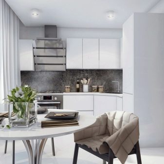
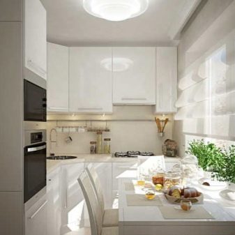
Very often today, owners of modest-sized kitchens choose headsets that are more like a blank wall with small divisions. They are actually solid, without visible fittings, very concise and geometric.
But to someone this option will seem boring. In this case, think of the cabinets only at the bottom and a couple (no more) open shelves. If you haven’t completely saved up on the headset (or don’t know which one to choose), build frame structures with shelves as lower cabinets. Instead of doors, there will be light curtains. But don’t stint on a good countertop. The ideal option is a tabletop made of light wood or caramel, amber color. On the top two open shelves, place only what, indeed, often should be at hand.
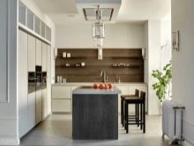
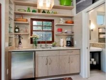
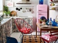
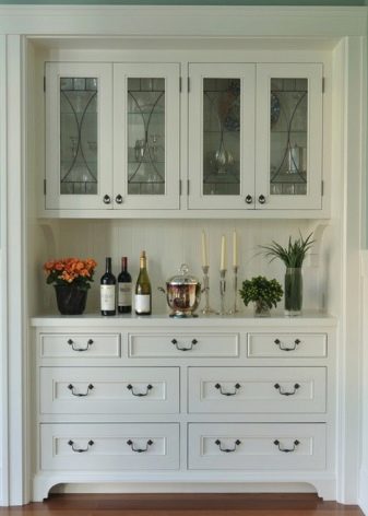
A cupboard and a buffet are not the most frequent occurrences in the kitchen, but time shows that trends are changing. It is difficult to imagine a kitchen without a headset, but a beautiful roomy sideboard, indeed, can replace a headset.
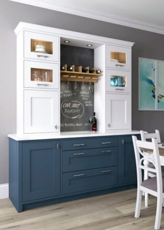
It is good if the place for a full dining area remains in a small-sized kitchen. This is not always the case, because instead of the table, the hosts leave the bar counter or turn the window sill into a countertop.But nevertheless, this is not the most convenient solution, because three people at such "tables", as a rule, cannot sit at the same time.
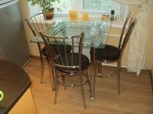
A good option would be a glass table. It looks weightless and light, which is necessary for cramped space. Transparent chairs will be good helpers to him.

Appliances
If possible, try to remove everything from the eyes - if the microwave is built into the headset, this is not bad. If the refrigerator gets into a special cabinet in the headset, this is just fine, but for small kitchens such modules are rarely developed.
Choose a not very wide light plate. Various food processors, blenders, crock-pots are better to clean somewhere inside the cabinets, getting only as they are used.
Try so that the color of household appliances does not stand out too. One or two bright objects (kettle and toaster) can even be in a small kitchen, but when it comes to a large technique, it is better for it to disguise itself as a space.

Textiles and Decor Elements
Designers advise not to overload the kitchen area with decorative design. Many small and colorful things visually make the room even smaller, and this is a fact. But for those who do not think of space without decor, there is good news - now it is fashionable to change it to suit the mood, season, holidays and more.
For instance, you can change the tracks on the dining table - keep 3-4 options of different shades for such a case. You can change small vases on the same table, candle holders. In spring, you can put light ceramic birds on any comfortable surface, in summer you can change flower arrangements in a vase, in autumn you can decorate space with leaves, acorns and chestnuts, and in winter with snow decorative sets (cones, candles, souvenirs).
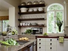
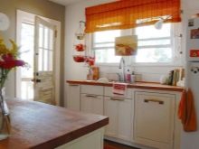
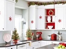
The intricate decor in the small kitchen just does not matter. Why not decorate the room with one seemingly random touch - variegated sweets in a vase, fruits and berries in a two-story fruit bowl, a beautiful teapot and sugar bowl. Change the decor, and so it will not bother.
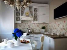
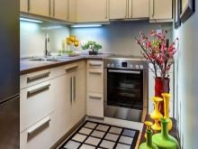
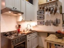
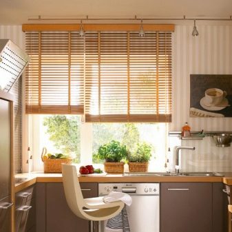
As for textiles, light and visually weightless options are preferred. It is best to hang a light, almost transparent tulle on the window. Blinds in each case create their own impression: somewhere they make the interior heavier, somewhere they look modest and discreet. If chairs are textile upholstered, it should not be large print. Carpets are appropriate, but light and light. Although usually a small kitchen does without them.
Good examples
Beautiful designer interiors are impressive - not all of their contemplators are able to translate magazine ideas into reality. But it’s not necessary to do everything like a carbon copy: look and notice the lines and shapes, details and tricks, color schemes. Simple and tasteful - this is possible even with modest wealth.
When choosing examples for inspiration, designate with three adjectives which one you want to see your kitchen. For example, practical, roomy, bright. Or - unusual, with non-standard furniture, stylish. This will allow you not to be distracted by other options.
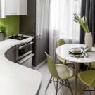
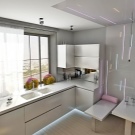
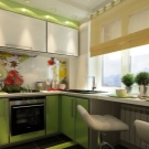
We offer 7 inspiring little kitchens.
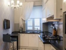
- An example that will surprise. it a kitchenette, the footage of which does not leave many options. But the owners found a great solution. Despite the ban on the abundance of things and details in a small space, they pretty much accommodated in the dining area. Nevertheless, it turned out very well. White color, glossy surfaces and accuracy affect the perception - the kitchen seems cozy and stylish. And most importantly, she is not boring.
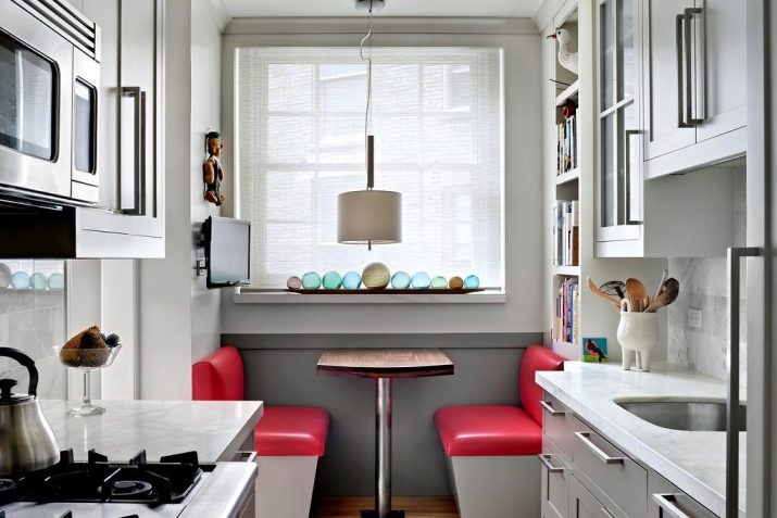
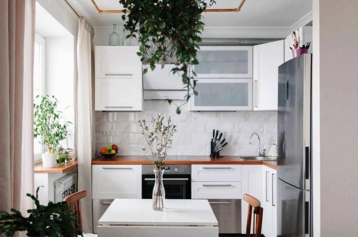
- A simple option where only 3 colors are active - white, sand, green. But they fit so well together in space that a massive dark refrigerator remains almost invisible. The white table is very in harmony with wooden chairs that did not change the natural color.
Combining white with white is no longer a strict rule; combine white with wood - it is very cozy.
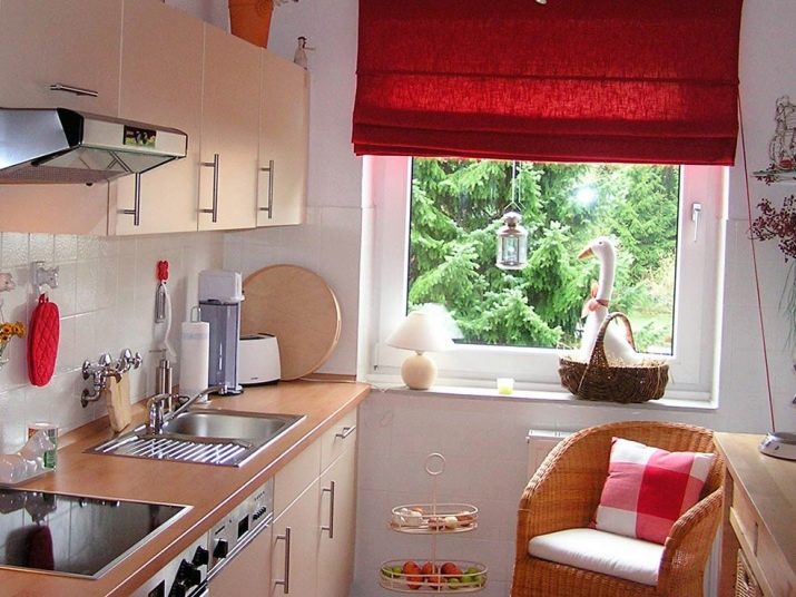
- It seems that summer lives in such a kitchen all year round. The space is narrow, but the white color of the walls partly solves the problem, it also looks refreshing. A set of pleasant wood shades. The decor is red, which sets the dynamics of the room.
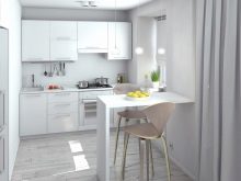
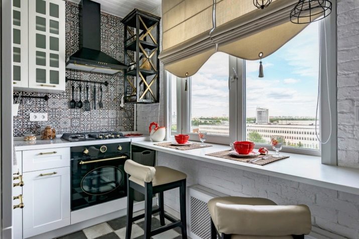
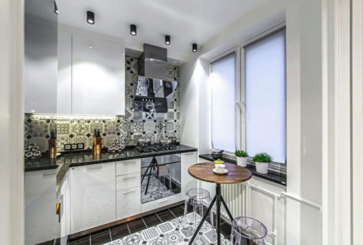
- Another interesting option, which combines what at first glance should conflict. The idea with transparent stools is well beaten, the combination of a worktop and window sill seems interesting. Glossy facades greatly affect the visual perception of the room.
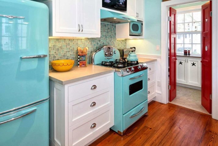
- And this story is about how retrostyle with its brightness and nostalgic mood distracts attention from a small footage. It is very interesting to combine colors, the choice of which is correct. Although this is somewhat eclectic, one can recall the direction of fusion, in this case, a bold choice is justified.
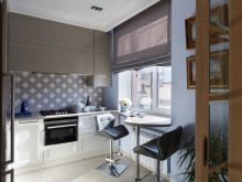
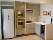
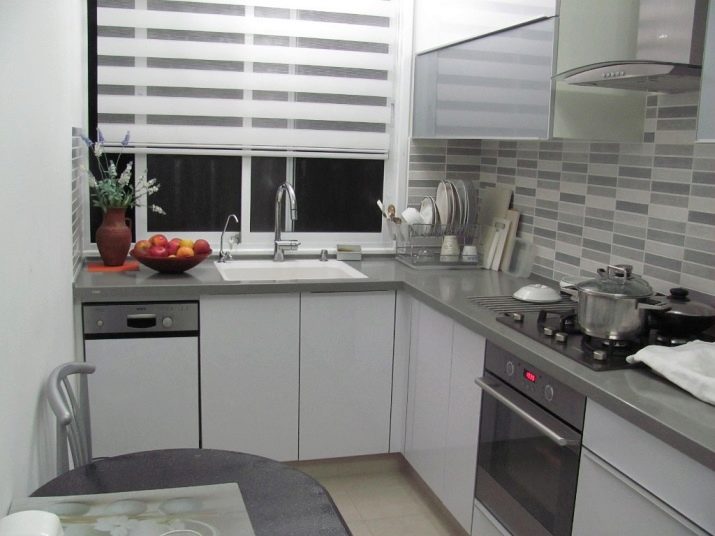
- Laconic gray kitchen - strict lines, correct geometry, emphasis on metallic. Suitable for those who do not work in the office, where gray may prevail.
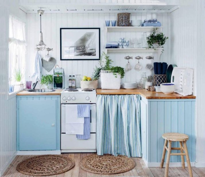
- White + Blue. In this kitchen, the owners dispensed with a standard headset. The light paneling looks simple but pretty. The kitchen imitates a rustic style that many people like.
Go beyond your ideas of what a kitchen should be like. Do not be afraid to repeat the option from your favorite movie or abandon something familiar (for example, the upper lockers). A small kitchen is not a sentence, but an interesting task that can be solved brilliantly.
