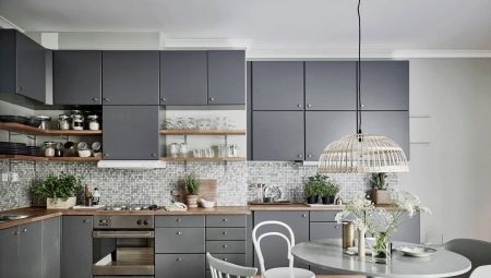
Gray color combines the qualities of two polar colors - white and black. This is the color of stability, harmony, orderliness. It becomes an excellent background color and rarely claims to be the first violin. The use of gray in the interior is now experiencing a new wave of popularity. For some time, color was undeservedly considered gloomy, office, but modern concepts of using different shades of gray have shown what rich possibilities this coloristic solution has.
Advantages and disadvantages
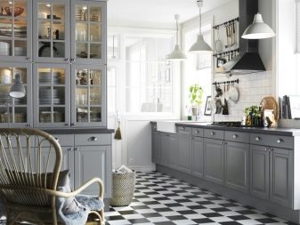
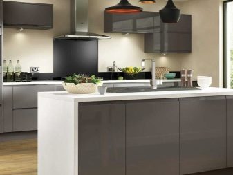
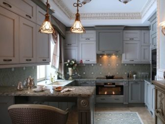
The kitchen in gray tones can be both elegant and faceless. A successful decision depends on the exact shade chosen, the right selection of furniture, partner colors and much more. The same kitchen set will look completely different in different rooms: size, layout, decoration play along with the furniture.
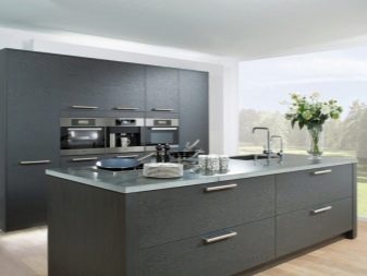
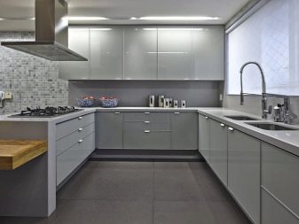
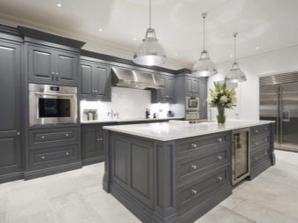
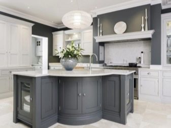
We list the advantages of gray in the interior of the kitchen.
- Neutral color, does not cause obvious antipathy, looks in the interior for granted.
- If these are light smoky shades, they are able to visually expand the space. With a small footage of the kitchen, the walls and gray furniture do not absorb light, visually push the walls apart.
- The shade looks great with furniture and wood trim. Gray and wood - a perfect combination of warm and cold, this is the perfect compromise.
- Suitable color for design experiments. Gray will be a great backdrop for incorporating vibrant colors into the interior.
- Gray kitchen is always more practical than, for example, white. The smoky color hides the dust, which can not be said about white.
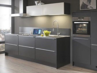
- Gray will be a great base for creating a minimalist or hi-tech style. It is easy to add home appliances with a steel design, as well as chrome accessories. It is difficult to choose a different color that would not argue with the presence of chairs and tables on metal legs in the kitchen.
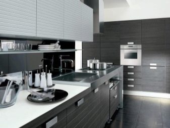
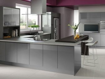
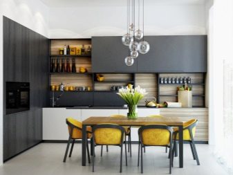
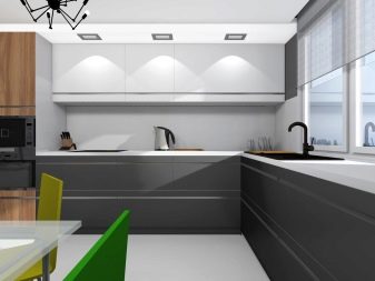
If we talk about the shortcomings, there is an opinion that psychologically gray color can attack a person. Some people say that it causes them to feel depressed, worsens their mood, provokes a feeling of confined space and even some hopelessness. But still this characteristic is quite subjective, Yes, and gray has gained a reputation for status, stylish, elegant. Again - it all depends on the exact shade chosen.
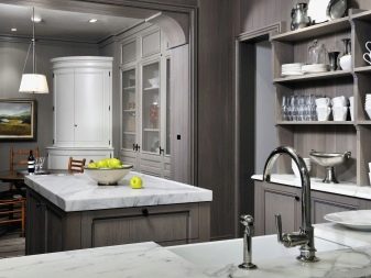
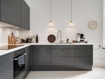
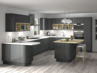
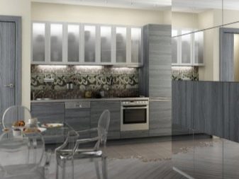
And it’s also important that you simply make out the kitchen or the kitchen-living room, in which the elements of the hall should be combined with gray.
Location and types of headsets
The layout of the kitchen is not just the arrangement of furniture and appliances. This is actually a project of everyday life, a significant part of life for every person. Therefore, the logistics of designing the kitchen space is clearly important and should not be built on the principle of "like everyone else" or "as it will, so it will be." Even in a small room there are at least 2 layout options.
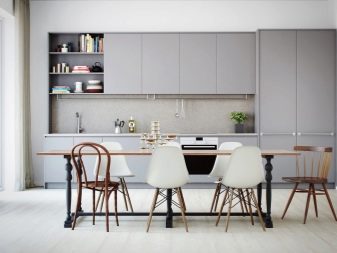
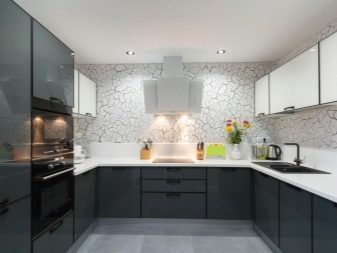
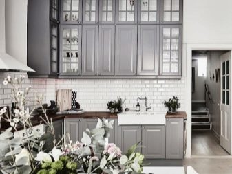
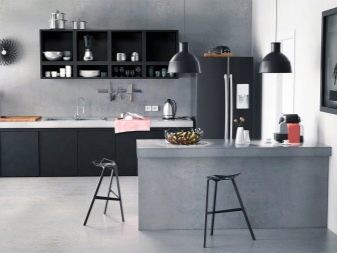
The first rule that is taken into account is called the working triangle rule. This means that the sink, stove and refrigerator should not be in the same line, they should form a triangle. Operating points should be near. This allows you to make a rational kitchen scenario: we take products from the refrigerator, carry them to the sink, then cut / process, send to the stove.
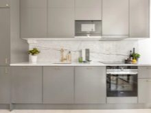
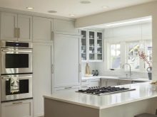
Layout types 6:
- single row or linear;
- U-shaped;
- L-shaped (angular);
- double row parallel;
- island;
- peninsular.
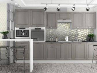
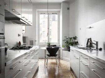
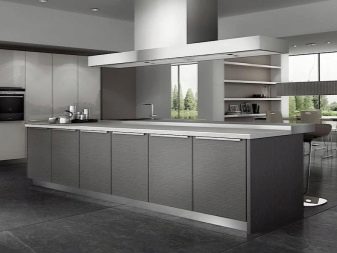
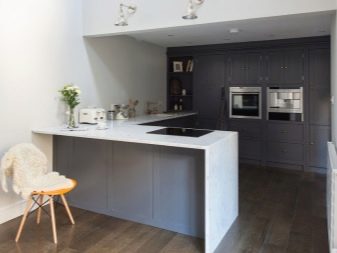
The most compact is a linear circuit, it is universal, beautiful, winning. There are no angles in this scheme, which is certainly very convenient. But the rule of the working triangle violates the linear single-row scheme. This is a good option for small and narrow kitchens, for walk-through kitchens, as well as for those rooms in which owners rarely visit.
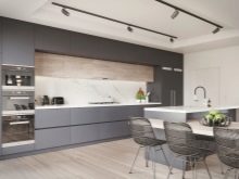
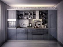
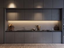
More popular in the conditions of not the largest apartments L-shaped layout. Due to the angle that does not remain out of work, this layout is more spacious and rational. But the angular set usually costs more than the linear one, since the angular module requires special accessories - a carousel, whatnot or a drawer. A good option would be a corner set for rectangular rooms, small and medium kitchens.
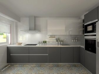
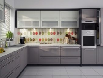
In the corner, either a sink or a stove is usually built in, which builds a diagonal with a refrigerator.
If you use a two-row scheme, the working triangle can be organized in perfect form. If the room is elongated and narrow, a two-row gray kitchen will be very successful in its design. This is the western version, which is not so actively involved with us. It seems to many that the kitchen will be narrower, but the dining area by the window and the very convenient logistic contact work area in practice are incredibly comfortable.
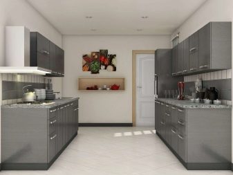
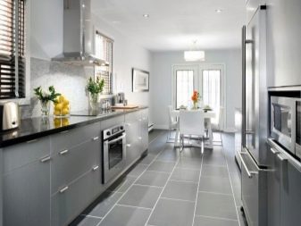
In this case, it is convenient and safe to plan a two-row kitchen so that the stove and sink are in the same row, and the refrigerator in the other. If the kitchen is very small and narrow, then there is an option to leave only a two-row set in such a room. The dining area is brought into the living room. For a snack and tea alone in the kitchen, you can also have an extended window sill, which serves as a countertop.
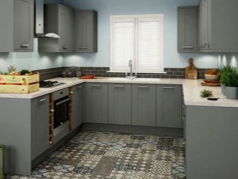
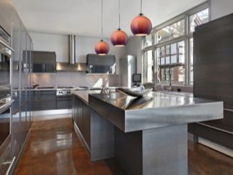
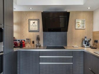
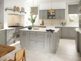
Certainly the most convenient layout option is a U-shaped headset, but it is only possible in spacious, roomy kitchens. How this happens in cases of island and peninsular planning. The larger the kitchen area, the more choices you have.
Shades and Combinations
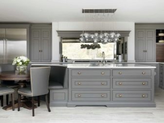
Gray is neutral and its temperature characteristics may vary.A warm shade of gray can be obtained by adding a yellow, red or greenish tone to the color. A cool shade of gray is obtained with a mix of blue, blue or purple.
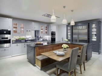
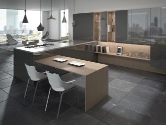
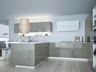
We will figure out which shades are most in demand.
- Silver gray (silver) - This is a rich, not without elegance shade that makes the room more elegant. Both light and dark walls and the floor will be equally good for him. Combines silver with any texture.
- Gray beige - a very subtle, very popular shade (especially in matte variations). Ideal for small kitchens. It will be combined with any other neutral color.
- Black gray - rich, expressive, “tasty” color. Need in a room that requires expression of the depth of space. But color requires space, because in a small kitchen it is practically not used.
- Gray Yellow - it is a warm shade associated with home comfort. Suitable for kitchens of any size, for matte and glossy surfaces. It looks good with graphite household appliances, and with a steel texture, and with a metallic.
- Blue gray - this color is rightly called fabulous, as it gives a feeling of subtlety, grace, it is very atmospheric and bewitching. But it requires a kitchen with a large window.
- Pink gray - in the dark gray version is not as good as in light gray. Suitable for small kitchens.
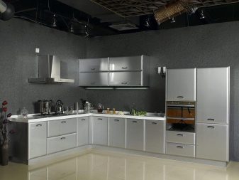
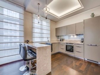
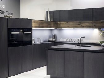
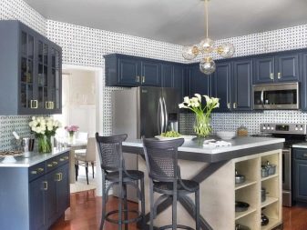
If you list fashionable shades of gray, then this is, without a doubt:
- slate - a completely boring color with a noble foundation;
- monsoon - compromise option;
- stone - gray with brown;
- zircon - a very light variation of gray.
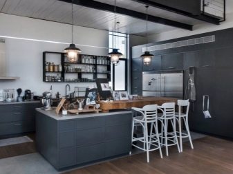
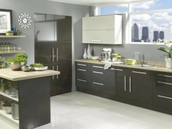
Gainsborough and silver are considered familiar shades.
Styles
Undoubtedly, the kitchen should be organic in color and in accordance with the declared style. The severity and lack of errors in the consistency of style today are no longer such stringent requirements. You can slightly deviate from the stylistic line, add something individual. But in general, the style should still be recognizable.
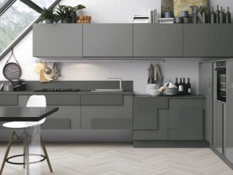
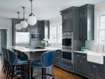
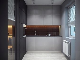
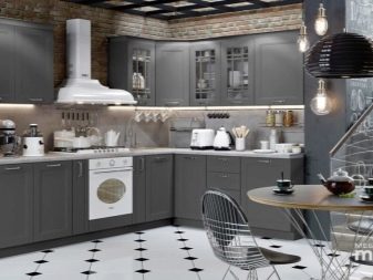
Consider the basic styles for gray kitchen.
- Classic. In this solution, gray color will add elegance to the interior, set the right balanced mood. Smoky furniture in a classic style will find a good addition in the form of cream, white or light gray walls. Using elements of natural wood of valuable species, as well as silver, you can make the classic kitchen more luxurious.
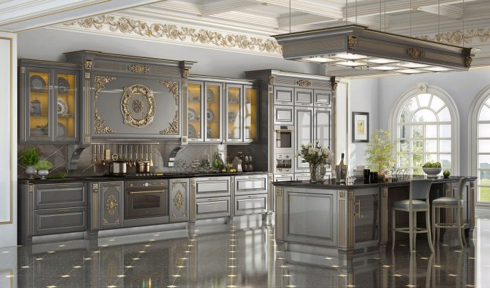
But for such a room, the strict requirement will be its size - the classic requires space.
- Provence. A style originating from the south of France can also use shades of gray. But it is important that these are exactly the light shades. The flooring should also be light. The decor of Provencal cuisine has a lot of textiles, there are embroideries and appliqués, pottery and porcelain, panels and mats. Furniture is usually wooden.
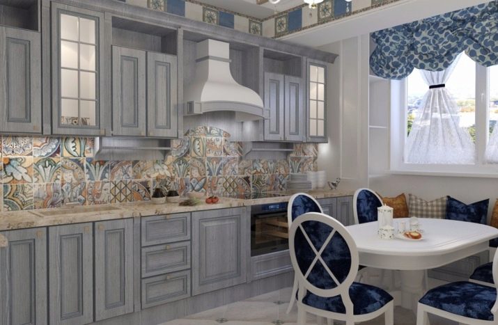
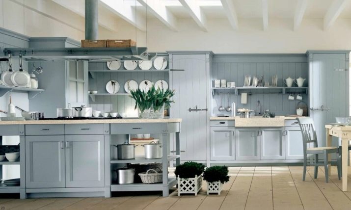
- Country. At its core, Provence is the same country, but French. Country is a rustic style based on the use of light colors and natural wood. Furniture can be artificially aged, fittings are selected mainly from yellow materials. This means that the kitchen should be in warm shades of gray. Country is a massive style, so in small rooms it is not even considered for implementation.
- High tech. This is a direction celebrating high technology. Style is one of the branches of late modernism. It actively uses metal and glass. Unobtrusive style, requiring straight lines, clear proportionality. But this is an expensive direction, as it focuses on technical innovations, on the most modern solutions in decoration. Only two colors can be used here, one of which dominates.
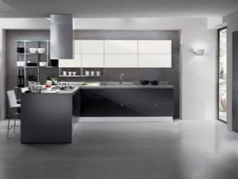
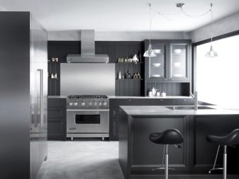
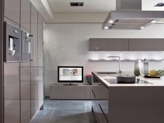
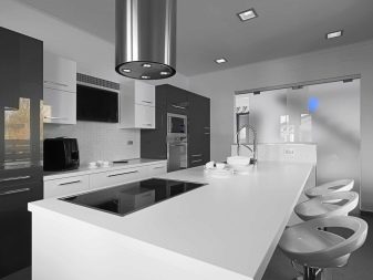
The perfect combination of high-tech - cold gray and steel.
- Minimalism. This is a style about rigor and geometricity, about monochrome and correct shapes, about the almost absence of decor and conciseness. In such a kitchen there is a lot of light, open space. Glossy furniture is used mainly with perfectly even surfaces, in the style functionality and ergonomics are necessarily tracked.
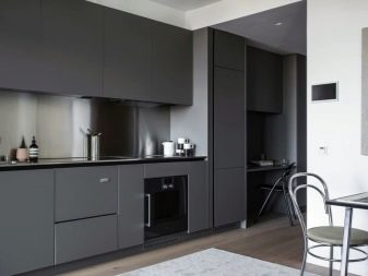
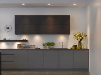
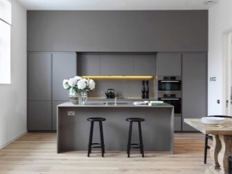
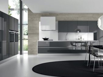
- Eclecticism. And in this style, on the contrary, there is a lot of decor, it is intrusive and original. This is a combination of several styles based on the unity of color and texture. Comfortable, soft and plastic style.
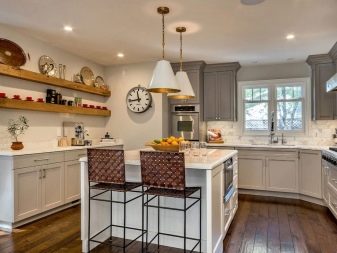
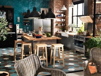
- Modern. In a modern style, smooth lines and bold colors are combined, the filling of the interior should be functional, and the space should be used with maximum utility. Unusually shaped metallic accessories are used.
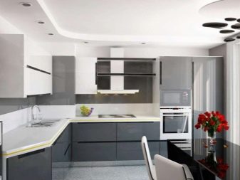
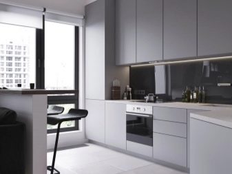
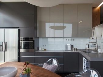
- Scandinavian. This is the style of maximum convenience, white color is undoubtedly larger, but gray is not offended by percentage inclusion. Walls are usually decorated with stucco, bleached wood or light wallpaper. The furniture is mainly wooden, natural textiles, curtains are rarely used. The interior of the room is decorated with pillows for chairs, accessories made of wood, potted flowers.
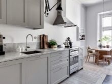
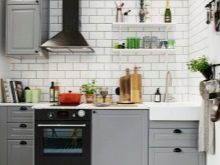
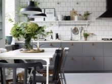
Very often the set in the Scandi kitchen is minimalistic.
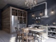
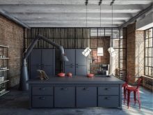
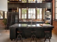
These are not all styles, but only the main directions that are most in demand. Here you can mention brutal loft, but it is maximally revealed in a large room, in a studio interior.
Contrasts and Combinations
Room design options either a plain design or a combination of two primary colors. If it is monochrome, then the light gray kitchen will be the best option. It uses matte surfaces that adjust to a calm mood. There is not much emotionality in such a space, since the main task is to emphasize the functionality of the kitchen. Usually, this is the design of a kitchen, which is not so often used for its intended purpose.
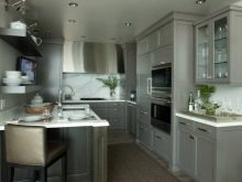
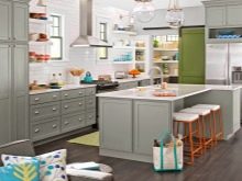
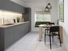
If a woman, like Kerry Bradshaw, has sweaters in the oven, then the gray range is the most suitable for such a kitchen.
But the option, when gray is diluted with a different color, is not inferior in popularity to monochrome. That's just what color it will be, the most important point of the question.
- White. White in this case will be a strict and fresh color, and gray - refined. Several trends with white and gray are fashionable: if the kitchen has a lot of chrome and silver, this gives the room a certain attractive mysticism. If you are closer to the patriarchal way, it should be a kitchen with dull surfaces, milky whiteness and smoky-graphic, calm variations of gray.
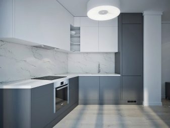
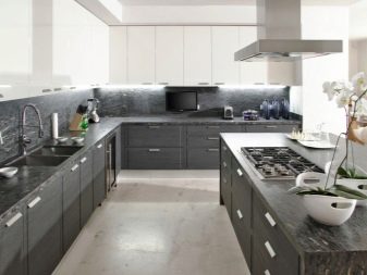
- The black. This is the option in which the perfect combination of black glass technology, dull steel surfaces and chrome shiny details. Contrasting black spots seem to be scattered throughout the kitchen, against a neutral gray-ash background, they look stylish, convincing, self-sufficient. Gray in this case should not be very dark, silver should be felt in it.
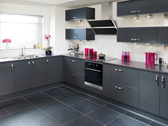
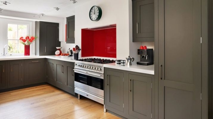
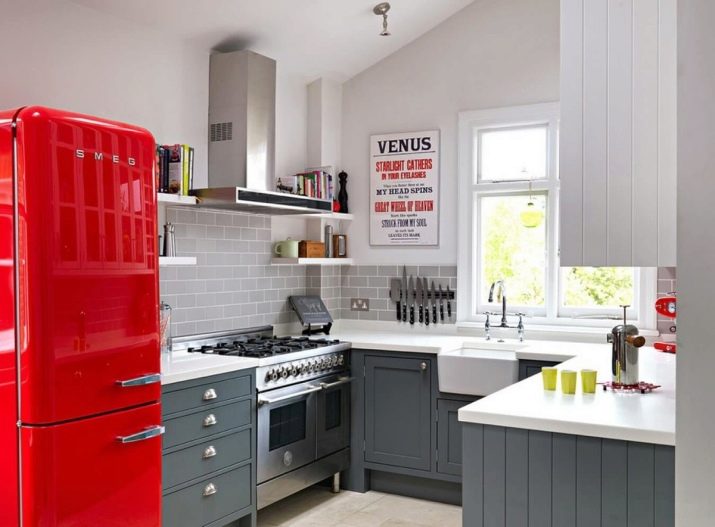
- Red. With such bright accents, the kitchen will be vibrant and upbeat. If you take it bright red, the most saturated, and even glossy color, then emphasize its smoky version of gray. It is very important to balance the two colors, so do not duplicate a lot of red. For example, sometimes a red refrigerator and the same roof rails are enough to make the kitchen a gray-red one.
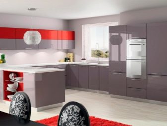
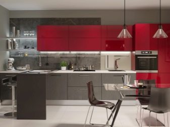
- Orange. This season is interesting and popular version of gray with peach. But if there will be a lot of orange tone, it will be difficult to stay in such a room for a long time. Color is very active, oppressive, can become a psychological irritant. Therefore, there should be definitely more gray, and apricot color is used only as an accompanist to gray.
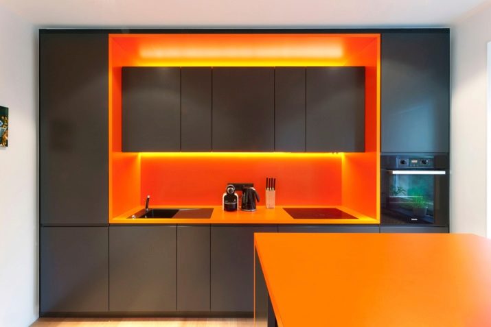
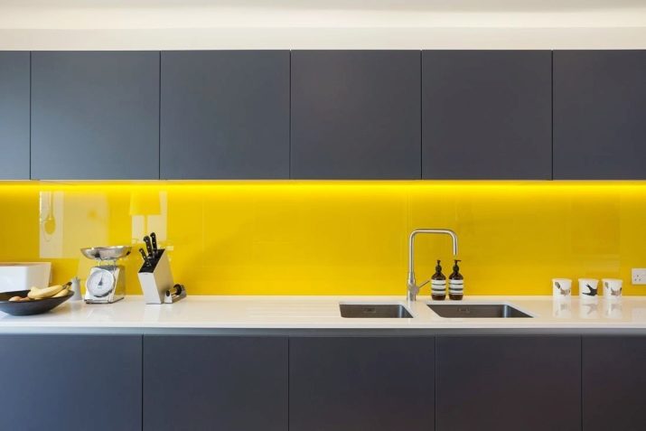
- Yellow. Often in fashionable interior magazines, on sites you can see the gray-white-yellow kitchen. Very often it is presented in the Scandinavian style, and it looks not only beautiful and juicy, but also incredibly modern.Yellow with silver is an unexpected interesting, pleasant combination, but a lot of yellow spoils the whole picture. But the moderate use of yellow to a greater extent in decoration and decor than in the headset is able to create interior hits.
- Blue. Blue is considered a very straightforward color that needs to be softened. And the pearl shade of light gray is able to cope with this task.
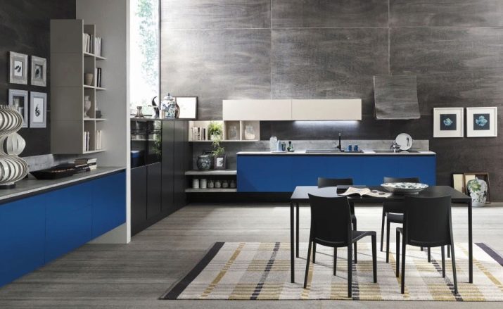
Such a kitchen will look noble, but this option can be called successful if the room is quite spacious and has enough light in it.
- Blue. If the kitchen is with southern windows, then the feeling of coolness will definitely not hurt. Dark ash plus blue creates a very pleasant, comfortable color combination that opens in a medium-sized kitchen and in spacious rooms. The third color may be white.
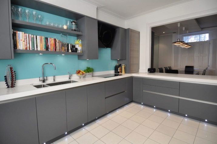
- Green. Steel color will make the green tone more calm and rich. Chrome shine will emphasize shapes and lines, enhance the optimism of green. If you combine herbal and pearl, the kitchen will turn out more elegant and festive. Matte silver makes the green color noble and calm.
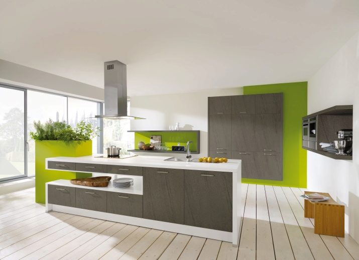
In a large kitchen, aspidno-dark colors with small interspersed green are appropriate.
- Beige. One color will suit another, since both tones are neutral. But the kitchen can turn out boring if you do not saturate one of the colors in temperature. As soon as gray is made to be very warm, or beige to add coolness, the interior becomes incredibly stylish.
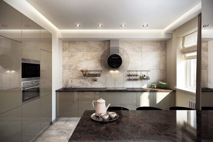
It is still impossible to say which of the following options is most successful without subjectivity. Focus on the location of the kitchen (north or south side), on its size, on your expectations, on attachment to a particular color. If among all the combinations you have not found the ideal one for yourself, and you are not sure that the gray color basically needs a coloristic partner, there is always the option of creating a monochrome kitchen. And such a decision is often the most successful.
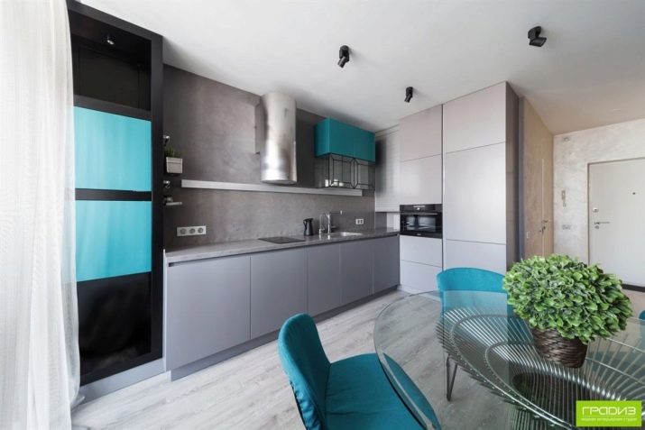
Design features in monochrome
If combination with other colors is excluded, then to make a kitchen in monochrome is a feasible task, but not the easiest one. Furniture and kitchen facades occupy most of the area of the room, because their color will set the mood for the entire kitchen. But you still need to correctly select the wallpaper for the headset so that the walls remain an impeccable background, beautifully design the floor, guess with curtains and a wall panel.
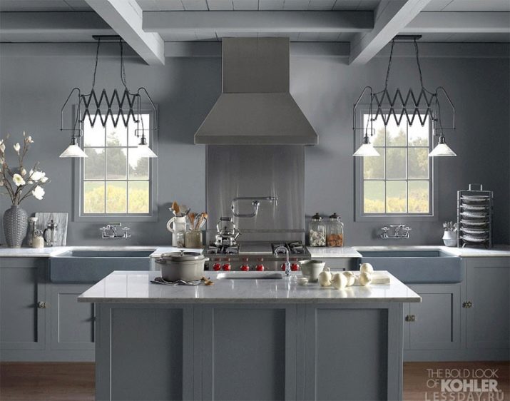
In a monochrome gray kitchen, there are still several shades, usually three of them. The background is the lightest, the countertops and the dining table are darker, and the headset is the darkest. But this is only one of the options for the distribution of shades, however it is the most popular.
A light gray kitchen with a pearl apron, light gray chairs at the graphite dining table is a very elegant solution. But you can vary the shades and planes. Although, it is worth noting that it is rarely possible to apply a different color at all. Usually, although in a minimal amount, gray is still added to gray (albeit in the form of a boar tile in the apron area).
Beautiful examples
There are a lot of successful options for gray kitchen - from small and cozy rooms to large spaces with an accent brick wall. Let's look at beautiful examples in 10 diverse photos.
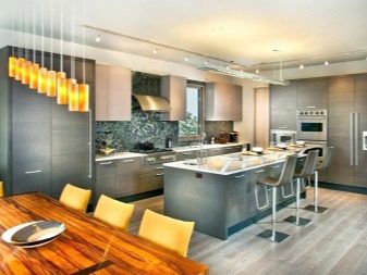
- Monochrome kitchen, but still with the presence of white. The solution for lovers of conciseness, clear lines, lack of intrusive decor. The emphasis in this space is on a rather large dining area, and the kitchen itself is very simple, but roomy.
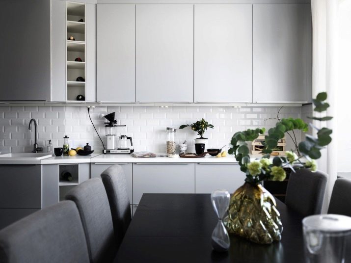
- This is not the largest kitchen, and the gray color does not prevent the space from being warm and cozy. The combination of gray and brown turned out to be friendly, and a light countertop does not allow the room to visually decrease. The fittings are very well chosen, and a beautiful curtain makes the kitchen dynamic.
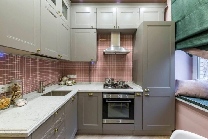
- A very elegant solution for a large room. The kitchen is almost monochrome, shades of gray are used in the right combination, nothing more, nothing conflict.
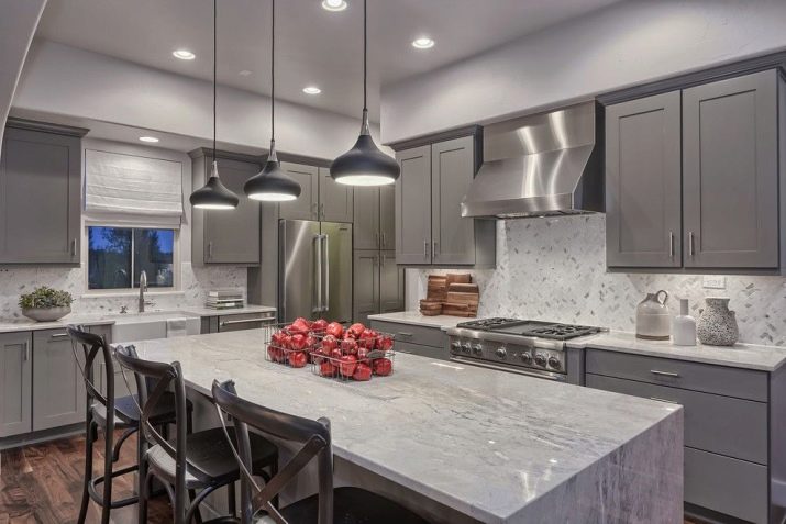
If you want bright accents, it will be a "lively" decor (like apples in baskets).
- Here is the kitchen combined with the living room. Gray plus white plus yellow is the most fashionable combination that is actively used today. And the fourth color - black - is so appropriate that it does not seem too much. But there is not much black here, he looks natural and conciliatory.
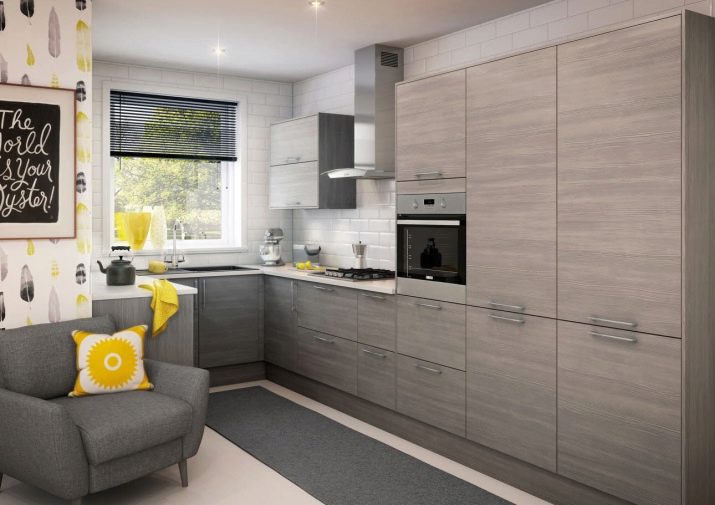
- Taupe with red accents. Fresh and fashionable solution that will look good in a spacious bright kitchen. The dining area can be virtually any color, even just woody shades will look good in such a bright kitchen.
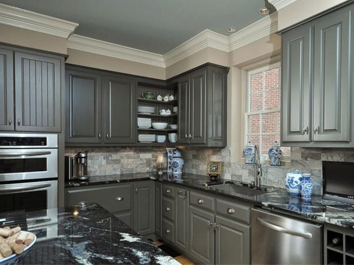
- Beautiful gray kitchen with marble island. Elegant design for a large kitchen in a country house. But the owners of small apartments can also see the successful color of the headset and an interesting arrangement of the apron area.
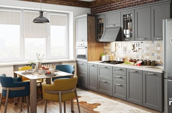
- A kitchen with a brick wall is still relevant. Perfect self-contained headset shows how boring gray can be. Very nice dining area. Good solution for combined rooms.
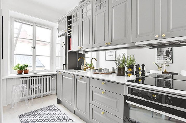
- Light gray kitchen with white. The design combines classic, more relevant to art deco, but there are many modern inclusions. White background trim is ideal for such a headset.
- Non-standard premises, the owners of which rightly abandoned the upper lockers. The red refrigerator ideally accentuates the bright in the kitchen, but the white walls and the laconic gray suite balance the space and do not reduce it.
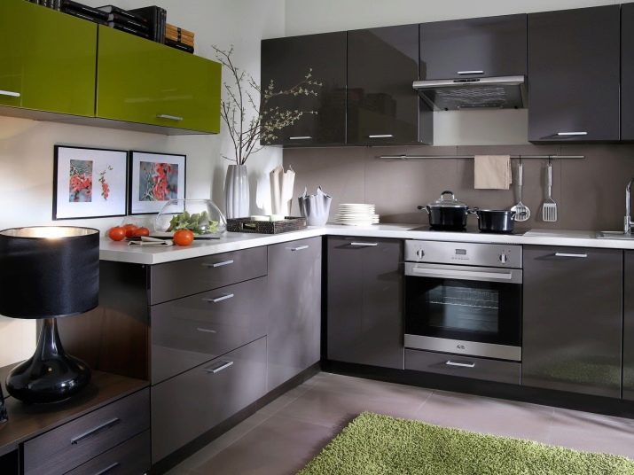
- Another variant of the combined space shows how interesting the kitchen area can flow into the living room. Pleasant graphite, appropriate green, perfect lines - it is very modern and will look convincing even in small rooms.
Gray is no longer considered a mouse color, it is not associated only with offices and boring concrete walls. The above examples show how gray can appear in the interior of the kitchen, it remains only to choose your own option and successfully implement it.
An overview of gray kitchen see below.
