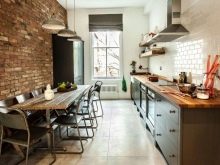
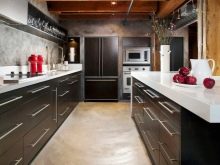
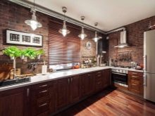
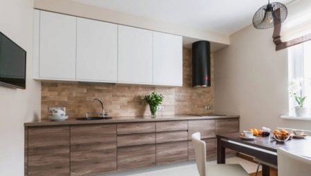
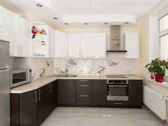
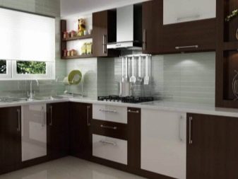
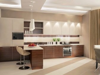
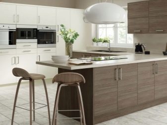
White design is extremely popular. It is used very often in the interior of the kitchen and kitchen-living room, especially in combination with other colors. Designers recommend necessarily combining a snow-white gamut with other palettes so that the composition is not too sterile and uncomfortable. White usually selects the main background, for example, wallpaper, and as an additional (kitchen, other furniture) more saturated colors. White and brown kitchen is a very common combination, which looks great in different styles, matte and glossy textures.
Advantages and disadvantages
Such an interior will be not only exquisite, but also spectacular. Due to the versatility and neutrality, these tones are perfectly combined not only with each other, but also with other shades. You can safely add bright or pastel accent details to the design. Despite the traditional nature of such a combination, the correlation of shades should be correctly maintained, otherwise the picture will turn out gloomy, uncomfortable, inexpressive.
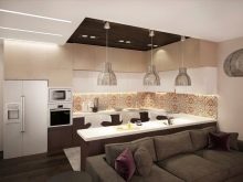
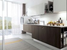
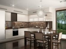
Among the advantages, the following can be distinguished:
- brown gamma in small quantities does not tire and acts favorably on the mood;
- a huge selection of shades makes it possible to choose a tone for every taste and for any style;
- in this color combination, flowers, plants, any decor and expressive textiles look great;
- It is well combined with other scales.
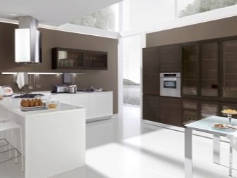
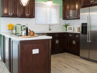
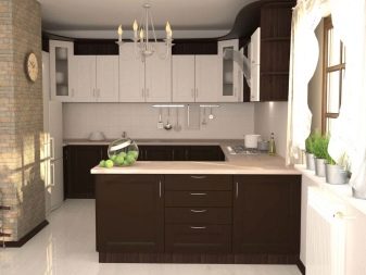
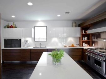
However, you must consider the cons:
- an excess of chocolate tones helps to reduce the space visually;
- white color is not suitable for work surfaces, as it is too easily soiled;
- a large amount of white also does not benefit the interior; it becomes uncomfortable;
- too much brown depresses, gives the room a gloom.
It is very important to maintain the correct color balance. White and brown design will look best in a room with a large area.
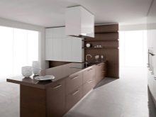
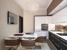
Interesting combinations
It is very important not only to choose the right shades, but also to correctly distribute them. Only in this case the composition will be organic and aesthetic, not to tire, not to irritate even with a long stay.
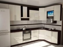
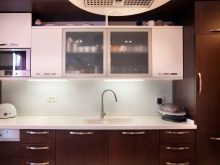
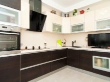
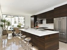
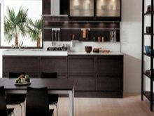
White walls and brown furniture
A harmonious way of decorating the kitchen is a light overall background and an additional brown. This is an extremely comfortable combination, optimal for rooms of any size. White wallpaper, decorative plaster, paint are perfect for wall decoration. Remember that wallpapers must be washable.
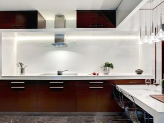
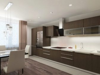
A coffee set against such a background will look especially successful, and the room itself will not acquire a gloomy mood.
It is very important to think over lighting, not stopping only on the central top. It is better if the headset is equipped with a backlight around the entire perimeter of the work surface. To make this interior look complete, add gray, black, dark brown shades to it. So you can arrange skirting boards or use patterns, ornaments in similar colors. The floor should be darker than the headset, and the chairs and the table in about the same colors.
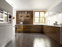
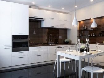
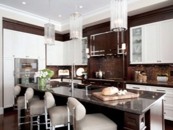
Brown walls and white furniture
This is a very extraordinary decision, requiring a certain amount of courage. A dark background and light complementary color in the design is permissible only in a very bright and large room. Otherwise, the risk of being in a small dark and gloomy room is too great. If you decide to try to decorate the kitchen in such a combination, bet on light tones of brown. This will allow you to expand the space visually and save you from the feeling of a box of wood.
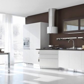
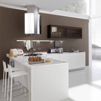
You can use brown only on one or two walls, it can be present as a pattern. It is better to equip a white suite with a dark working area so that the furniture stands out effectively against the background of the walls. It is still better to leave the ceiling as light as possible, but a brown chandelier is acceptable.
Two-color headset
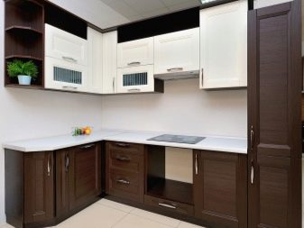
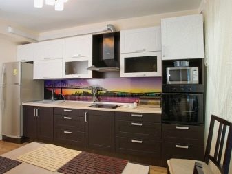
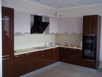
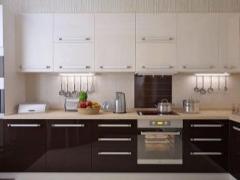
This is a very effective solution, most often it is recommended to make light up, dark bottom. Such furniture looks less bulky, lighter, while the boundaries of space are clearly pronounced. If you decide to choose such furniture, be sure to arrange the work area in a darker range. You can use black or brown darker than the bottom modules.
Decoration and decor
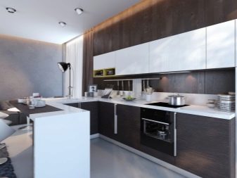
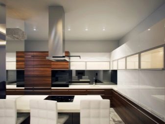
It is very important to correctly select the materials and decide on the decoration of the white-brown kitchen. All elements should look like a single composition.
Materials
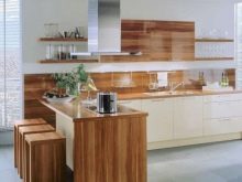
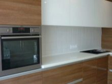
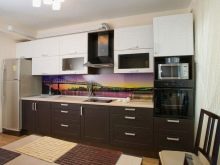
First of all, wood is associated with brown. Natural wood looks extremely impressive and status in the kitchen interior. You can choose different shades - from the lightest to the darkest dark, different textures. It is important that the wood is quality processed, otherwise, due to moisture and temperature extremes, it will quickly lose its visual appeal. An array will be quite expensive. If you need to keep within the budget amount, you should consider chipboard, MDF. Here, the choice of colors and textures is even more diverse, it is possible to imitate any shade of wood.
The ceilings
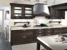
If the ceilings are not too high, do not actively use dark brown tones. Otherwise, the optical impression will be gloomy, cramped. Ideally, the ceiling should be left snow-white by adding light brown furniture to light walls. If the ceilings are high enough, you can even use very dark furniture, combine shades, highlight the silhouettes with black.
Work zone
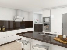
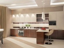
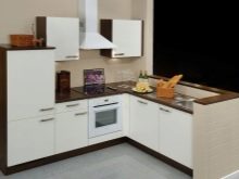
A white headset with a dark brown working area looks very impressive. It is not only beautiful, but also very practical. The countertop can be made of different materials. Stone and its imitation, wood are very popular. Particular attention must be paid to the apron. It can be decorated with ceramic tiles, glass, metal, wood. Sometimes an apron is the only, most catchy accent in the kitchen.
The main thing is that it is combined with the general style of the room.
Accents
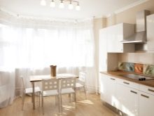
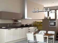
Despite the spectacular effect, a white-brown kitchen cannot be imagined without decorative elements. This gamut will fit perfectly:
- flowers and plants;
- shades, chandeliers of green, orange, blue;
- chocolate textiles;
- tablecloths in white or brown;
- dishes made of clay, wood, chrome.
Style solutions
Regardless of the color complement, it is necessary to design the kitchen taking into account the general style. Shades, decor and all design elements are selected taking into account the direction that you have chosen.
Minimalism
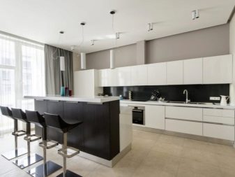
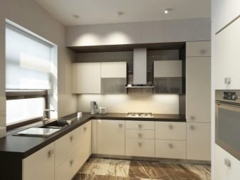
Distinctive features of this style are the contrast of white with dark color, interspersed with black, gray. Universal neutral shades are ideal for this direction. It is recommended to use wood, tile, chrome, glass, plaster, brickwork, wallpaper. The ceiling is best done on the same level in a white or cream shade. It is better to exclude the chandelier from the design, replacing it with spotlights. The floor can be laid with linoleum, laminate, tiles in dark colors. Choose furniture simple, with a minimum of accessories, without decoration. Open shelves, decor, plenty of textiles are prohibited.
Modern
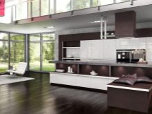
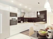
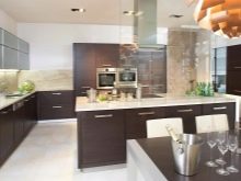
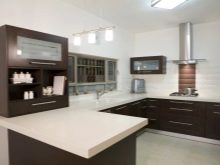
White-brown combination is very important for modern. Bet on horizontal silhouettes in brown tones, fancy patterns, custom details. As for the working area, it is made darker than the background. Both matte and glossy surfaces are welcome. Shelves can be left open, but the furniture is bought expensive, practical and functional.
Art deco
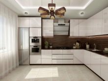
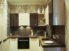
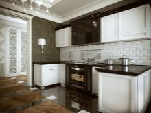
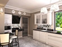
A very successful combination of white and chocolate, because in the direction of art deco it looks very expensive and presentable. Traditionally, the bottom of the kitchen set is made brown; it is left for a dining table, chairs. The walls and top of the furniture should be white or cream. The floor is often laid out with light ceramic tiles, alternating it with the same brown shades that were found on the furniture. White and brown curtains will help to create a certain highlight to this style. Their length should be maximum, which will significantly increase the height of the ceiling.
Country
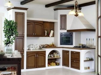
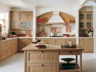
The ideal solution for a rustic eco-style - brown tones. Natural colors and materials are welcomed in this style. Add to the composition of landscapes, greenery. Choose furniture with artificially created scuffs. An abundance of open shelves, brick, white plastered walls, clay dishes, and wooden decor complete the picture.
Loft
This is an industrial style aimed at creating a rude interior in a neutral range. White and brown shades are great for this area. Beams on the ceiling, brick, bleached walls, a minimum of furniture and several bright spots will allow you to create an interesting and unusual interior.
