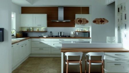
A white kitchen with a tree is the most popular design option for modules and headsets today. Despite the apparent dimness, the acquisition of such a kitchen becomes a very practical solution: the kitchen will shine with cleanliness, and its color palette helps to streamline the organization of space. However, even in such a simple solution, many mistakes can be made.
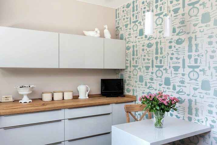
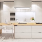
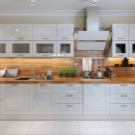
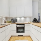
Headset combinations
White with a tree is the safest option, which allows you to prevent color errors. But annoying misses do happen. And they can be expressed in some nuances.
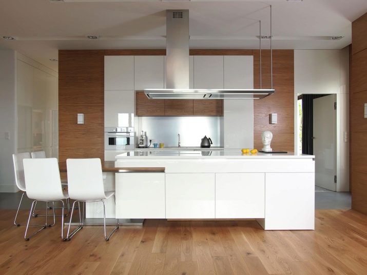
- A lot of wood. There should definitely be more white in the kitchen, otherwise the airiness and attractive beauty of the interior are hidden behind a massive wood pattern.
- Tile "under the tree" in the design of the apron. If you still have a wooden countertop, then ceramic material with a wood pattern will be completely inappropriate. And visually it is far from ideal, and imitation of a tree in this case does not convince.
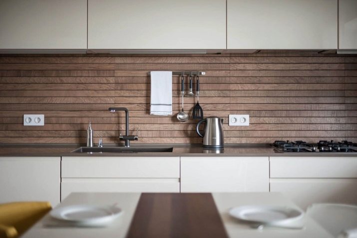
- The combination of different types of wood. In furniture, this will not be logical if, for example, the countertop is made of light wood, and the inserts of the hanging cabinets are made of dark. There is a color dissonance.
But regarding dullness / glossiness, the kitchen can be any. The matte version is more popular with those who like democratic Scandinavian cuisines, but in this case it is very difficult to deal with fingerprints on the surface. It would seem that this is a gloss problem, but a matte finish in this sense can be more conflicting.
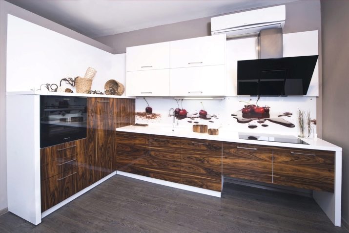
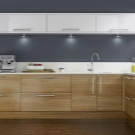
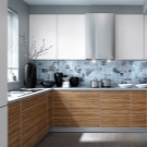
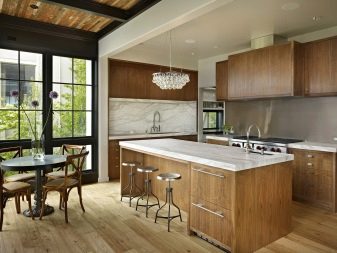
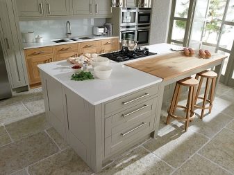
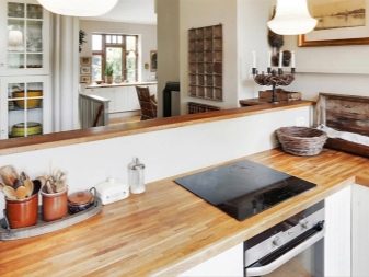
Wood in the white kitchen is usually represented by countertops and some inserts, they occasionally can decorate both the top and bottom of the headset. Completely the same wooden bottom or top is less common. If you like just such a separation, give preference to the wooden bottom and white top, the opposite option is rarely successful.
How to combine with other colors?
Include in the decoration of the room a different color should be as delicate as possible. He should not overload space and lay claim to the main coloristic roles. Its task is to emphasize an existing plan - a bright solution in combination with a natural wood texture.
And what color may be the third, we will examine in more detail.
- Grey. The choice is perhaps the most frequent. But gray to gray discord.
If a gray table flaunts a headset in your kitchen against a white and wood background, you need to be a born designer in order to be able to balance the three colors in space.
Therefore, gray is usually used for decoration. - a rug by cupboards or a stove, gray napkins or a path on the table, a white picture in a gray frame, a gray lamp of an interesting shape, gray flower pots on the windowsill.
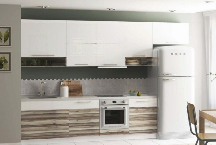
- The black. Usually he is involuntarily present in the design of the kitchen: black stove details, black household appliances or accessories may be present initially. Do not buy other equipment now simply because it did not fit the new kitchen in color! Large black inclusions will not be a good solution.
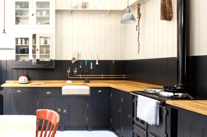
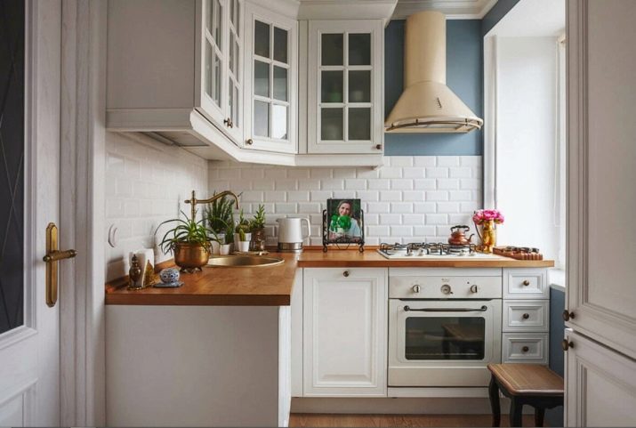
- Green. And this color will most naturally fit into a white kitchen with wood. And it’s wonderful if it is represented by natural greens or artificial succulents or grass in neat flowerpots.
Green mirit is sterile white and natural wood, it makes the interior more lively, natural, adds the necessary dynamics to it.
In winter, owners often exclude green from the interior, so that the vegetation does not diverge from the aesthetics of a winter fairy tale. But a compromise is possible in the form of spruce branches or garlands.
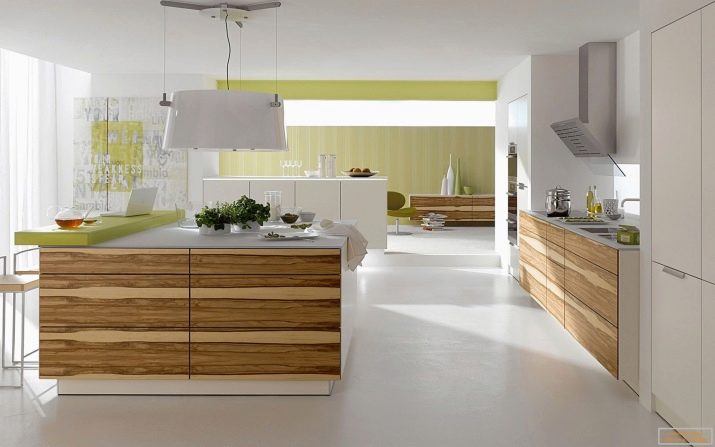
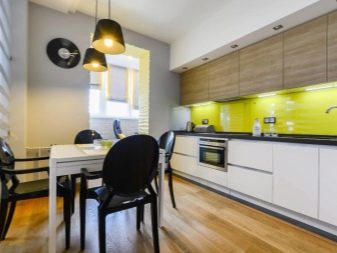
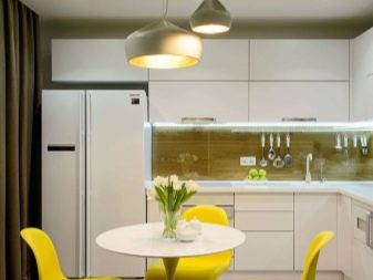
- Yellow. Positive color, often present in modern kitchen design solutions. Usually yellow is one or two inclusions in the interior. For example, a chair or lamp, a path on the dining table, a kettle or a vase on the windowsill.
And this is a really good solution, since color is perceived as vibrant, invigorating, associated with youth and dynamism. In interior magazines you can often see photos when apples or even lemons in a fruit bowl are the only representation of the third color in the design of the kitchen.
- Red. If you like red in the interior, but are afraid that you will get tired of the bright color, make it seasonal.
From the end of November and almost until the end of winter, red textiles, dishes, decorative trifles can become the active third color in the kitchen.
You can sew red covers on chairs, lay a red rug, and with the advent of spring, replace them with a more refreshing decor.
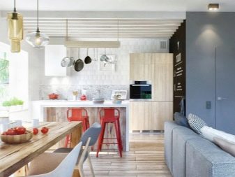
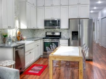
The principle does not change: any third color in a white kitchen with a tree should not be as active in its intensity as the two leading colors. And in order not to get tired of it, change the colors by changing the decor. In this sense, nothing is better than textiles, vases, and also products (fruits, sweets).
Materials of manufacture
Countertops or other elements of wood for the kitchen are expensive and economy class. The first include models from a solid array - beech, ash, oak, larch. Dense wood is not in vain so expensive - it will last a long time. Pine and spruce for these purposes they are used less often, since they lose their attractive appearance faster if they cook in the kitchen every day.
But not everyone can afford a slab, because they order it less often, but the glued massif option is used more often.
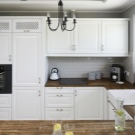
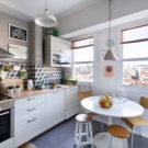
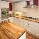
This is a stacked array, in its production thin lamellas of high-quality drying are used, they are glued together with resin under high pressure.Glued countertops are cheaper, but the gap in quality with a solid array will not be huge. Pleasant is the fact that the glued surface has enviable moisture resistance characteristics.
Glued countertops can be made of:
- solid lamella - when the strips are glued in width;
- spliced - gluing is carried out both in length and in width.
The color of wood itself is often left natural, just the surface is treated with a composition in which wax is present. Then comes the varnish coating.
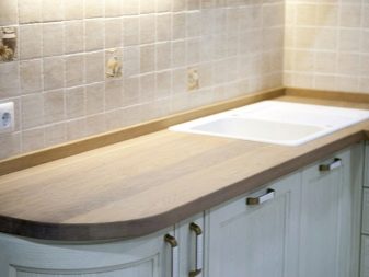
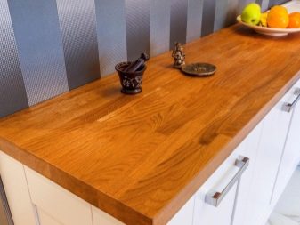
If you prefer the tabletop made of tinted wood, then you can order this option or you can tint the tabletop yourself.
This is done with a stain, the assortment of which in construction markets today is impressive. The most popular stains of wood stain include beech, walnut, bleached oak, wenge, gray oak and cherry.
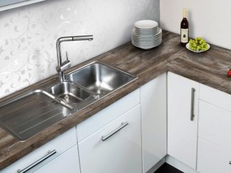
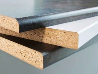
If we describe the economical variant of wooden countertops for a white kitchen, then postforming technology is used here. Outwardly, it looks nice, but the use of plastic cannot be masked. The material imitates not only the color of the tree, but also its texture. Such a coating has a significant drawback - the gaps and joints will have to be covered with an aluminum insert, since the surface can be deformed under the influence of water.
Sizes and shapes
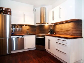
This is not to say which kitchen unit will be the most convenient. Seems to be better linear The shape of a large headset is difficult to come up with. But many owners prefer him angular (L-shaped) kitchen, which fits in the space as rationally as possible.
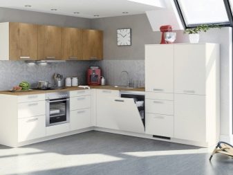
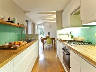
Two-row kitchens are also gaining fashion. For a rectangular space, this can be a pretty good option. In the post-Soviet territory, double-row kitchens are still rare, but in Western interiors this option has long taken root. The kitchen in this case is clearly divided into a cooking zone and a dining-dining area, which will be located at the window.
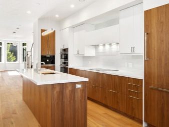
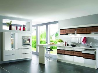
As for the sizes, there are no problems with the advent of firms that make custom-made kitchens. The kitchen can be adjusted to the most non-standard layout. Experts advise not to oversize the headset, today is a priority – functionality and profitability. If you can leave the space bright and free, slightly reducing the headsets, do so.
Suitable styles
White and wood - a business card of Scandinavian cuisine. And this modern style is worth considering first. It is simple in reproduction, if you are doing the repair and arrangement of the kitchen yourself, not counting on the help of a designer. Here you need to focus on simplicity, concise decisions in choosing furniture, on the importance of light and spaciousness in the room.
In addition to the Scandinavian style, a white and wood kitchen can be made in the following styles:
- country;
- Provence
- shabby chic;
- neoclassical.
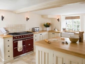
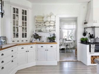
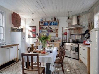
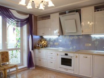
Appeals and references to retro-kitchens turn out to be very fashionable today: the 60s and 70s are guessed both in furniture design, and in the layout of space, and in geometry.
So, in the modern kitchen more and more signs of another, long gone time appear - radios and radio sets, old-style straw baskets, as well as vintage refrigerators.
How to make an apron?
As already mentioned, the apron area, decorated with tiles “under the tree”, can be considered unsuccessful. A white boar tile, a soft gray medium-sized tile, a white glossy finish without a pattern, and fine white-gray mosaic would be a good option.
What will be the controversial decision:
- large tile with a colorful print;
- wooden panels;
- large flowers and other intrusive floristic solutions in the design of the apron;
- tiles with twisted, complex elements in a simple minimalistic kitchen.
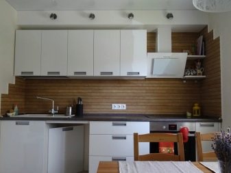
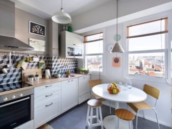
If you are for brevity, then the apron should be white and glossy, if you want a little shine in the interior - stop at the white-gray fine mosaic.
Good examples
It is also important whether your kitchen is a separate room, because it can be combined with the living room or dining room, and these are other requirements for the design of the space. The kitchen-living room should be represented stylistically by a single interior. Let's look at successful examples of what a white and wood kitchen might look like.
An interesting layout that preserves light and space as much as possible. The cooking area is separated from the dining area, on a large free sector, you can arrange holiday gatherings with a large company. This is a convenient option for a young family - you can put the playpen in the free sector, and mom will always see what the baby is doing while she is cooking.
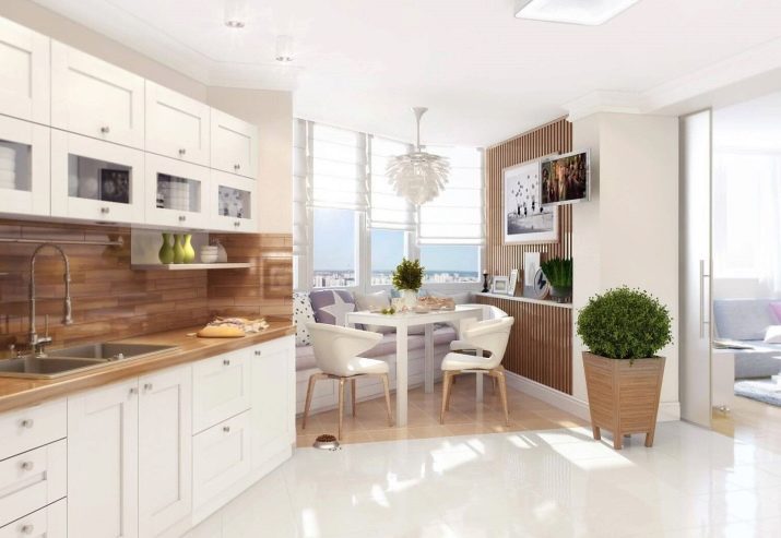
The geometry of this kitchen is perfect. If you don’t like excess decor, if you value brevity and rigor, you will like such a room. Very roomy and functional kitchen.
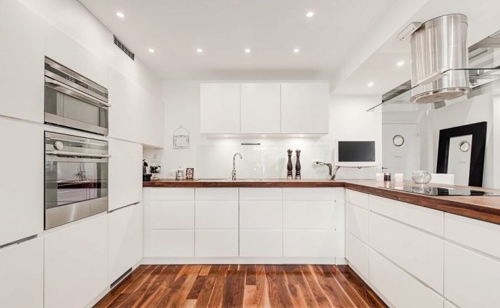
Favorite Scandinavian style once again proves that it is the most democratic and comfortable. Pay attention to the open wooden shelves, as well as the yellow tops of the chairs. A boring and modern interior for all lovers of scandi aesthetics.
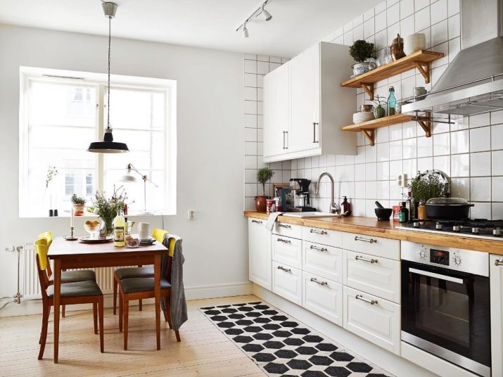
A linear layout kitchen with a very dark floor and completely white walls. The upholstery of the white chairs balances the darkness of the floor. The space would look unnecessarily cold if it were not for the warm wood of the countertop and the high shelf on the dining side.
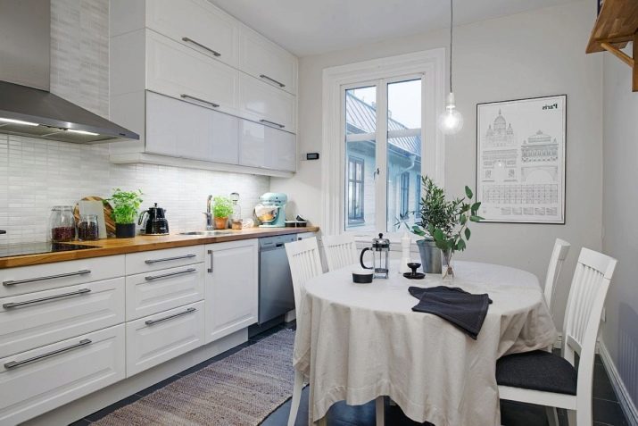
A very comfortable kitchen with a laconic L-shaped set, a chic retro-table and a convenient layout. Very well thought out lighting in the work area.
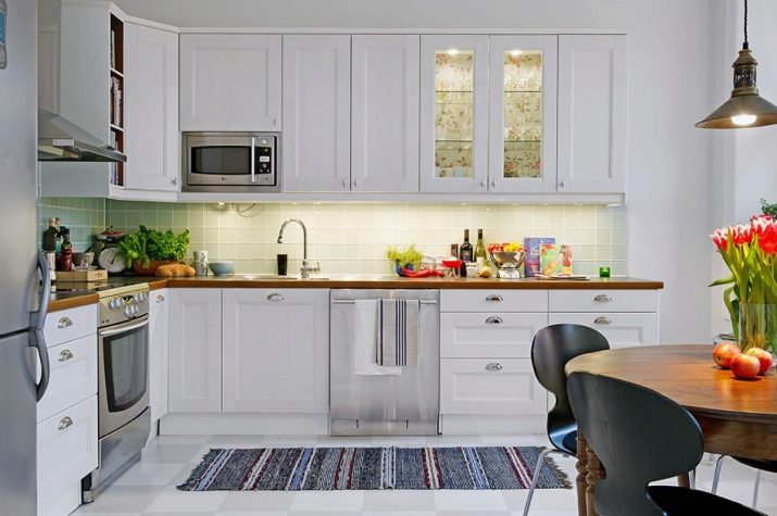
Kitchen with a chessboard floor. This is a classic solution that makes space dynamic, not “sleepy”. Wood is only in the tabletop, but white shelves with decor could also be wooden.
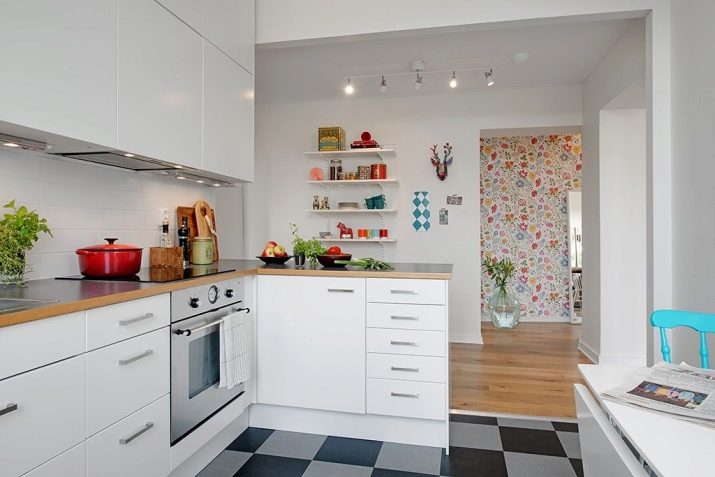
This option describes the kitchen-living room, in which yellow and gray harmoniously added to white and wooden.
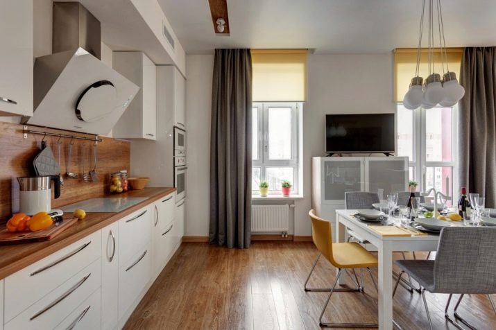
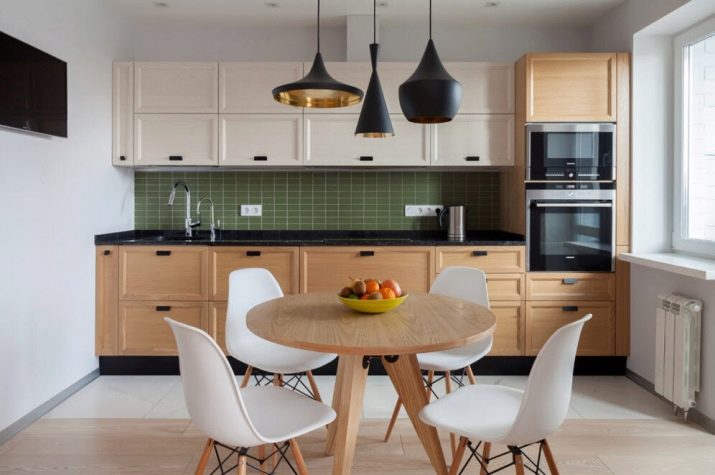
A white top, a wooden bottom and a green apron are a little cheeky, but the result is convincing. Black lines in the decoration of the headset beat the inclusion of black household appliances well.
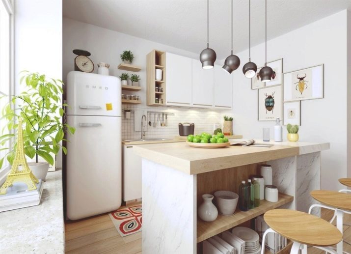
Either a bar, or a mini-island instead of a table. Vintage interior for a little cute kitchen.
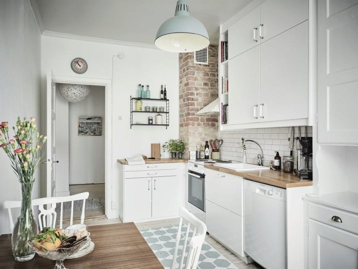
In this interior a brick fragment looks interesting, But only the countertop headset and dining table could be the same.
Browse the glossy white kitchen below.
