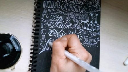
Lettering, despite its novelty (and for many incomprehensibility), surrounds us in everyday life. This word means a beautiful label, and an unusual sign in a coffee shop, and a menu in a cafe, written in an original font on a blackboard. It includes greeting cards, prints, logos and more.
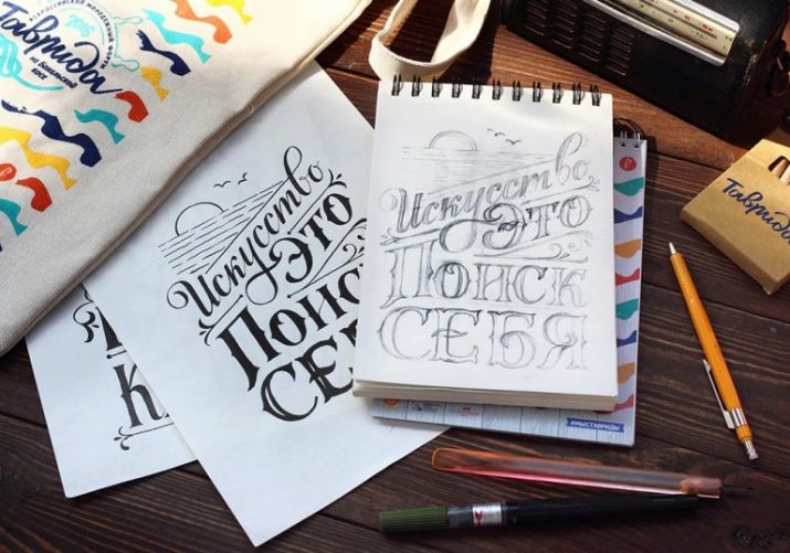
What it is?
Lettering - it is a drawing, neat and beautiful style of letters. Many people compare lettering and calligraphy. In fact, there is a similarity - this is the originality of writing letters, reflecting the mood and emotional state of the writer, emphasizing his personality and identity. But lettering is usually called art, more inclined to drawing.
For a long time, lettering was considered a simple direction in creativity. However, in the 2000s it became an independent, demanded and very well-paid type of activity.
The need for original fonts and typography is extremely high, and letterpresses (those people who are involved in their writing) are necessary in everyday life.


History
Lettering has a rather long history equal to the history of writing. In the III century. n e. after improvements by the ancient Greeks, the Phoenician alphabet contained vowels and consonants. In writing them, there was a tendency - they consisted of clear lines of the same thickness, each element had a simple geometric shape: round, triangular or the shape of a segment.
In the VI century, a new style in writing appeared, which was called unzial. Now the ends of the letters began to protrude slightly beyond the upper and lower boundaries of the rows.In the period from the 11th to the 12th centuries, Gothic and Round Gothic writing gained popularity.
In the period from the 13th to the 14th century (Renaissance), an antiqua font appeared, as well as the first treatise (the author was Luca Pacioli) on the construction of letters on the basis of a square and its diagonals, as well as a circle inscribed in it.


In the future, the development of fonts only gained momentum, because they began to be created for various needs: advertising, books, newspapers. An improved Egyptian font appeared, the difference from the authentic one was that the thickness of all lines and serifs was the same. Then the grotesque font appeared, in which there were no serifs at all.
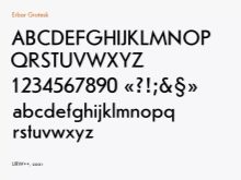
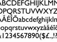
In the 20th century, a series of fonts was developed on the basis of the grotesque: futur, erbar grotesque, gill grotesque and others. Then lettering began to develop simultaneously in all directions, gradually acquiring the features that can be observed today.

Comparison with calligraphy
A person engaged in lettering is not required to have an art education, but he must have a desire to do it. It also takes time for this - about half an hour every day.
Of course, the drawing skills available to a person will help to achieve success much faster, and knowledge of color, composition, prospects will be a huge plus in the study of lettering. But do not be sad if this is not, because it is quite possible to study them, including on your own.
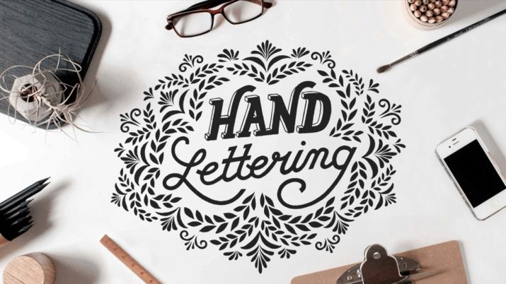
Lettering is suitable for beginners for several reasons. We will talk about them below.
- No need to wait for decades to achieve visible results.
- No special skills are required to learn. Composing beautiful letter compositions is still easier than portraying flying birds or sculpting gypsum heads.
- If you learn the rules for writing compositions from letters, it will be much simpler, since these rules are the basis for work.
- If you practice daily for two months, you can achieve success.
Stefan Kunz and Lauren Hom are just one of those who have achieved world fame without a special education. Their example can and should be inspired by those who are tormented by doubts about their own talent.


What is it used for?
How much lettering is successful is determined by the money that it brings. Surprisingly, the commercial success of letter compositions depends not only on beauty, but also on demand, following new trends.
The main principles of commercially profitable lettering are:
- concise composition;
- the predominance of minimalism;
- being in a trend.
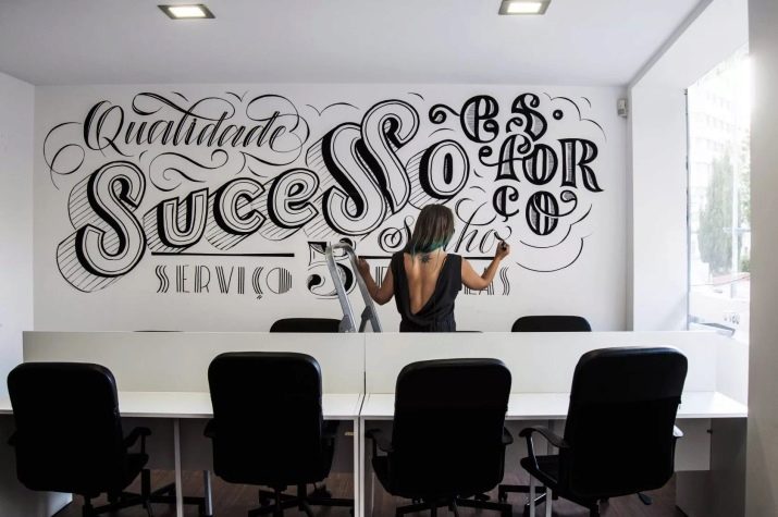
To adhere to the first two principles, you need experience, constant work. And the third factor is developed only in the process of a thorough study of the most popular works and analysis of which compositions are most in demand on the market.
In order for works to be sold, it is important to know how any market functions, including the lettering market. For this reason, perhaps the beginner's advantage will be the availability of financial, economic or advertising education, rather than artistic skills. Knowing how advertising works, the market, how services are sold, it is much easier to attract customers and sell your work for a higher price.
How to sell work?
You can go in two ways:
- submit work on your pages in social networks or on your own website;
- sell them through microstock - platforms where everyone can lay out the work that he created.
Both methods have their pros and cons.
If it was decided to sell the work through social networks or a site, you need to consider that a person will need to be more active in terms of their promotion. To do this, a number of requirements must be met.
- Decide who will be the target audience. To find out, you need to decide on the area in which you want to create compositions: write inscriptions on sweatshirts and T-shirts or create logos for brands.
- Create the so-called UTP - a unique selling proposition. In the USP should be something that distinguishes the artist from competing creators.
- Create an image. This may seem unimportant, but it is worth declaring itself by participating in marathons, events on selected topics, master classes, which will positively affect the impression of the performer. You can start your online course, conclude an agreement on cooperation with popular instablogers: a person presents a product (for example, a T-shirt with a slogan), and a blogger talks about it. This will attract a huge number of new customers.
- We need to constantly work on expanding the portfolio. For potential customers, the opportunity to get acquainted with the work should be simple - no complicated links. You must post your work in any social network where you are. It is definitely worth making a section with a portfolio on your website, regularly replenishing it - customers should see that a person is constantly working.
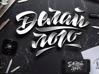

The advantages of this method of self-promotion is that there are no intermediaries between the contractor and the customers - people agree directly. If you correctly set up advertising on social networks, correctly choosing the target audience, then the popularity growth is ensured.
Among the disadvantages of the method include the need for financial investments in the development of pages in social networks and the site, as well as a certain moment of luck - the profile should be designed in a stylish and attractive way, from the point of view of a potential client. The page needs to be updated constantly, it is impossible to throw it, it is necessary to keep it periodically, otherwise the coverage will fall and the person will not be visible in the feed.
As for microstock, this is a great way to sell the results of your work, because they cover the entire range of letters: both eminent masters and beginners of this business.
Microstocks do not set high demands on how the work should look - this is the reason why you can sell your work there to beginners.


To start, you must adhere to some recommendations.
- Accounts should be registered on the most popular online sites. It is necessary to study the rules on the basis of which the work is placed.
- Then you need to upload your work and wait for the appearance of buyers.
The main advantage of this method is that a person does not need to constantly be on the site, invest in promoting yourself as a brand, buy advertising. In addition, each work can be sold many times to different customers. From here the drawback is also clear - the competition is very high, so the portfolio needs to be constantly updated, study trends and do work in accordance with them. You still have to think about your own author's style.
Ideally, you can develop sales simultaneously in both directions, then the pros and cons will balance each other and will allow you to get a stable income from lettering.
Whatever a person chooses, you need to understand that the instant result is fantastic. It is necessary to invest time, finances, work on the portfolio, and over time, the result will certainly appear.
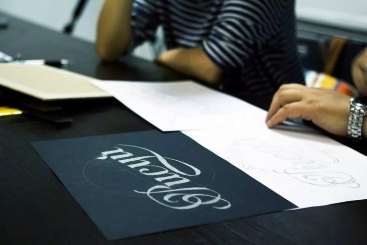
Kinds
There are a lot of types of lettering. We will talk about them below.
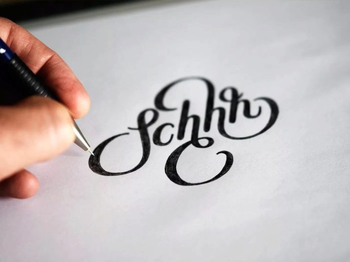
- Handlettering. Drawing letters with hands (in the literal sense of the word), more precisely, with pencils, markers. No gadgets are used.
- Brushlettering. Brush or brushspray.
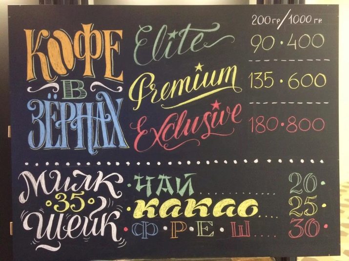
- Cretaceous lettering. This is a chalk drawing letters on a black chalkboard.
- IPad lettering. Drawing on the tablet.

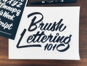


It should be noted, and modern calligraphy - in it the drawing of letters occurs with the help of a pointed pen. This species requires large reserves of patience from the one who deals with it, as well as a calm, balanced nature. Choleric, wishing to see the result of their work quickly, calligraphy, with a high probability, will be difficult.
To choose your type of lettering, you should look at the pictures for each of the species and understand which one is closest to the person. It is worth trying each of the techniques - this will make it clear which of the tools a person is easiest to work with, and what is completely impossible.
Lettering is used in branding, advertising, printing, wedding services, decoration of bars and restaurants, packaging of goods, interior decoration, slogans on clothes and in many other areas of life.
Branding and advertising are, first of all, logos designed in an original, in no way similar way to anyone else. This is a very large market, because, in addition to newly emerging companies, the old players in the business also need to rebrand and brand new lines.

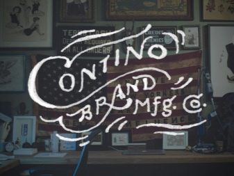
Bright and unusual packaging of goods is another very large “section” of lettering, because there are a lot of goods produced, and each of them needs the right design, attracting attention among analogues.
Wedding lettering has its own characteristics, because basically it includes the design of invitations, although this also includes photo zones and a seating plan for guests. For wedding lettering, execution is possible not only on paper - it can be mirrors, glass, wood or slate.


In bars and restaurants, with the help of beautifully written letters, the walls and the bar zone are most often drawn. Menu design written in chalk on a black board is also very common.
As for the interior, Lettering is popular both in the design of apartments and offices. Most often, black letters are used on a white wall, but they can be multi-colored.
Once a person has decided in which area he wants to develop in lettering, he will immediately understand his target audience and where to look for potential customers.


Tools and materials
When choosing tools and materials, you need to think about why lettering is needed. If a person just wants to draw fonts for himself, for friends, then immediately buy expensive tools for professional artists to anything. If he plans to earn this, then it makes sense to fork out.
However, those who have at least once worked with professional tools note how convenient they are. The result is better.
What a beginner needs to work is described below.
- A simple pencil of increased softness, for example, 2B. If a person is used to putting strong pressure on a pencil, then it is worth taking HB.
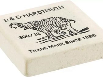
- Soft eraser which you need to choose so that he erases the pencil lines with high quality without smearing them.
- Scrapbook or paper for drawing - to taste.
- Felt pens, colored pencils or a set of pens. They need to indicate the outline or color the letters.


If a person has set out to monetize a blog, then it is better to acquire a professional set. It includes the items described below.
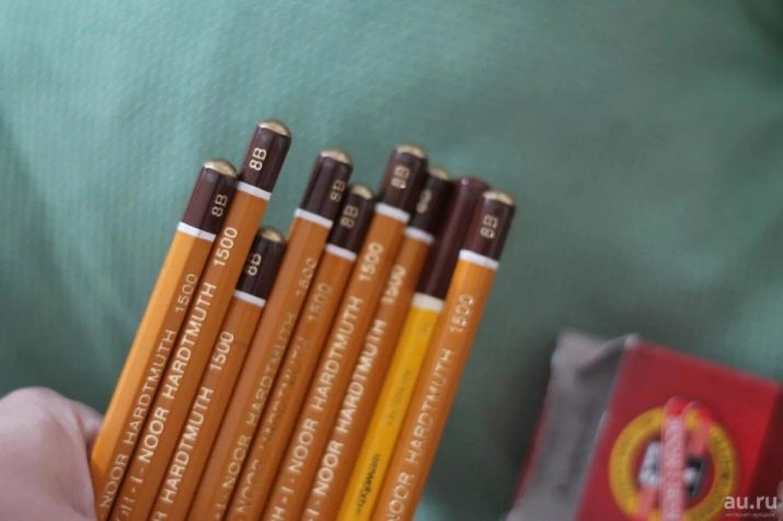
- Soft pencils.
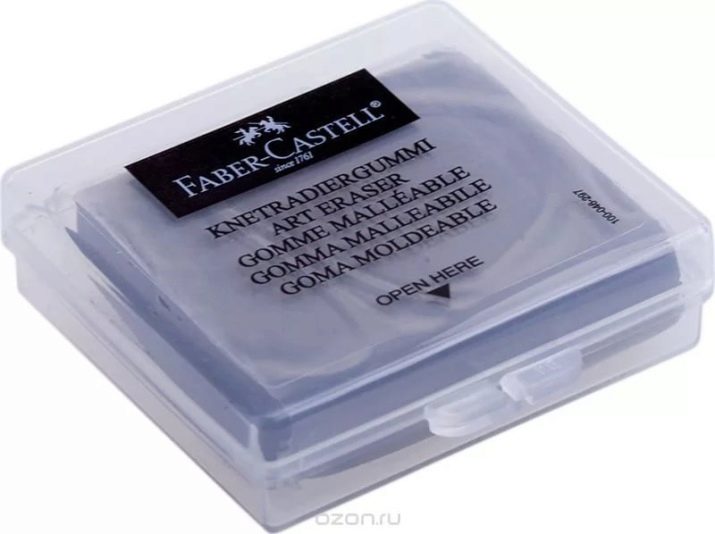
- Soft and stain-free eraser.
- Set of liners for contouring. They are selected according to preference. You can draw with thick or thin lines.
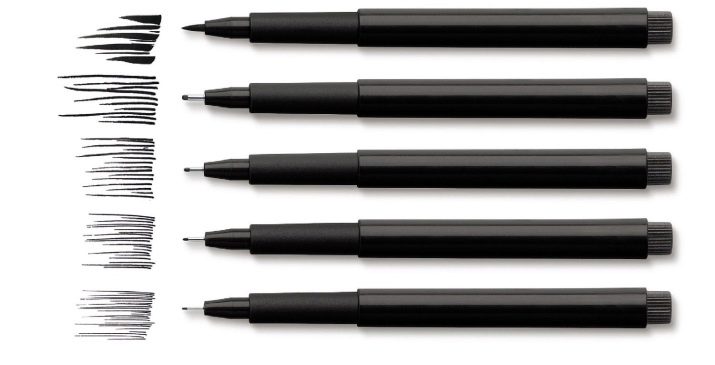
- Brushpen. This tool has two tips: a felt pen on one side and a brush on the other. The first is suitable for contouring or painting letters, and the second is for brushing.
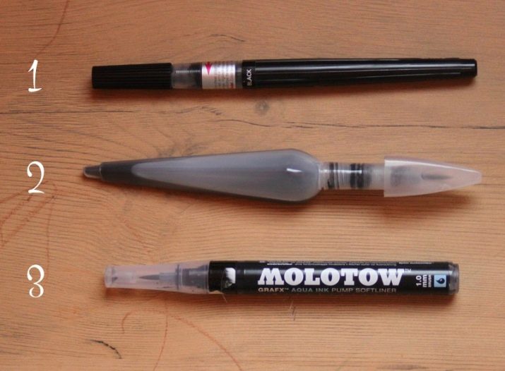
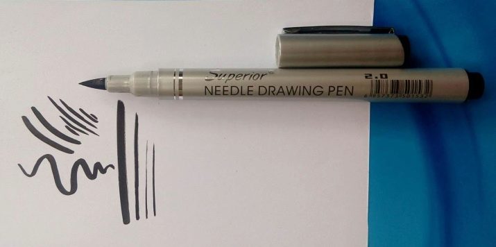
- Brashpen with only one brush, without felt-tip pen. It is much more difficult to master, it is not suitable for beginners. However, it is with its help that the most trendy fonts with different lines are created.
- Plain paper for office printing, but not thinner.

For starters, this is enough, and with experience a person will understand what tools he needs in addition to existing ones, and will assemble a kit that suits him.
How to learn?
The difference between lettering and calligraphy is that in the first case, the design of letters is created, invented and drawn, and in the second, it is simply accurately and carefully written. To create a font design, you need to come up with not only the alphabet, but also numbers and other signs.Lettering is an exceptionally creative and laborious affair.
Experienced letterers recommend studying theory not before practice begins, but mixed with it: you need to learn some concept or technique, and then immediately fix it with a picture.
The theoretical basis for self-study looks as described below.
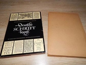
- The history of the development of writing, the basics of calligraphy, the history of fonts. As part of this section, the works of Will Toots, Leonid Pronenko, Vladimir Favorsky, Albert Kapr are studied. As an additional reading - work on paleography.
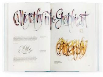
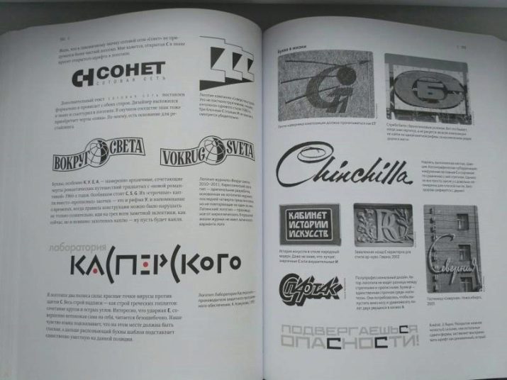
- The study of the structure of letters. On this topic, the work of Alexandra Korolkova, Yuri Gordon.
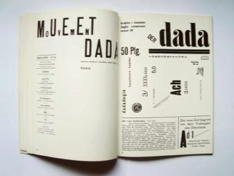
- The study of form and typography - the work of Johannes Itten, Emil Ruder.

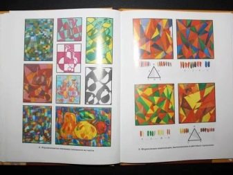
- Basics of composition - work of Galina Logvinenko "Decorative composition".

Many mistakenly believe that in the absence of 3-4 hours a day for lettering, you should not even start. Regular classes, even for half an hour every day, will certainly benefit. But a lesson once a week will not be effective, even if it lasts several hours.
To start practicing, prescriptions are suitable - they are ideal for “stuffing” your hands. But these are not the copybooks for first-graders that everyone saw at school, but special ones for lettering - there are quite a lot of them on the Internet. In lettering, the ways and means of writing letters very often differ from the classical ones, each of them should be compositionally attractive. It is necessary to prepare for the fact that a person will exhaust many notebooks before something starts to turn out well.
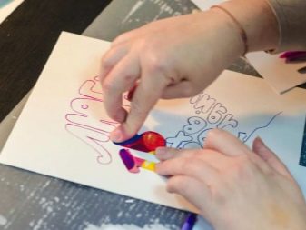

Self-study is not bad, but to get feedback, exchange experiences and, of course, improve the quality of work, it is better to enroll in courses. If they are not in the city or there is no time to visit them, then you can sign up for online training courses. You need to choose a practicing educator who has a solid track record of selling his work and an excellent reputation among letterers.
In addition to teaching the art of lettering directly, it makes sense to listen to or watch lectures, seminars, webinars on composition, color, shape, typography, as well as sales and advertising.
Developing your own unique style is a matter of time and practice. The more people practice, the more interesting and better the work becomes.
See how to learn how to draw lettering.
