Each of us would like to learn how to write in beautiful calligraphic handwriting. However, have you thought about the history of calligraphy, its origins, founders and features of the very first fonts? In this article you will learn all the useful and interesting information about calligraphy, its types and features of teaching the basics of such a letter.
What it is?
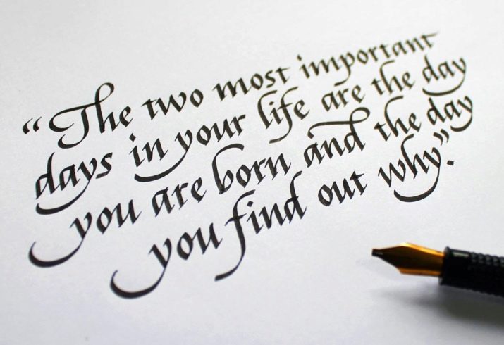
Literally, from the Greek translation, calligraphy translates as “beautiful to write”, a little later a more popular definition of calligraphy appeared - the art of correctly and beautifully writing. The key word in this definition is precisely art. In every nation, calligraphy was inextricably linked with something sacred, sacred, which is the basis for all artistic and vocal activities.
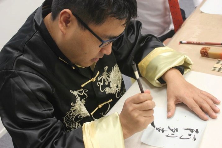
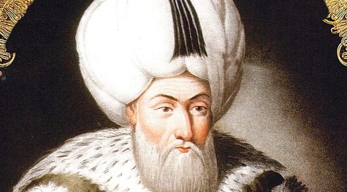
Calligraphy received the greatest connection with art in the East - in Japan, Korea and China, where it is closely intertwined with nature, folklore, religion and traditions. In many countries where Islam is considered the main religion, calligraphic writing is almost the only means of expression.
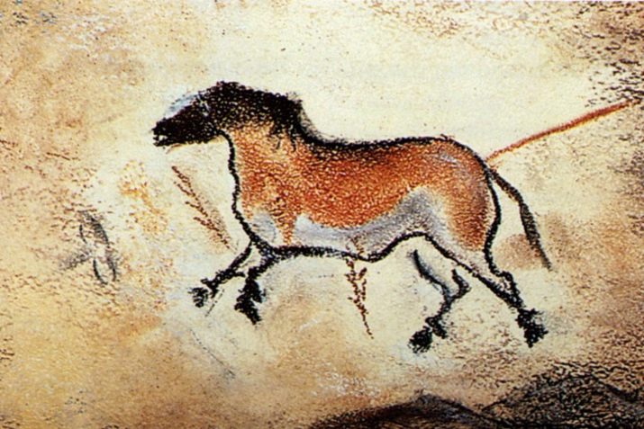
The development and rooting of calligraphy is directly related to the general history of the development of writing, the introduction of new fonts and the appearance of paper. Therefore, the very first prerequisites for the emergence of calligraphy arose even during cave painting, having gone through a huge time period from cuneiform writing to creating a complete alphabet.
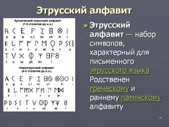
Initially, all pan-European writing developed on the basis of the Greek and Etruscan alphabets. Moreover, different interpretations of fonts existed long before the Greek empire itself.Two types of ancient handwriting are well known - the first was used exclusively for decorating monuments, architectural buildings and documents, the second was simpler, more everyday and was used in writing books, letters, manuscripts and posters.
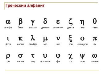
Interestingly, the Greek alphabet reflected in different religions and nations in different ways. For example, the Romans sought to simplify this font to make it more practical and useful in everyday life. At the same time, Christianity contributed to the expansion of the images of the Greek alphabet, making its proportions more variable and individual in the process of rewriting the Bible.
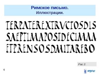

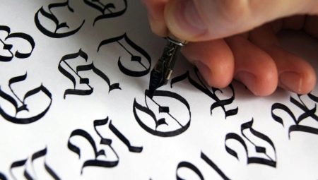
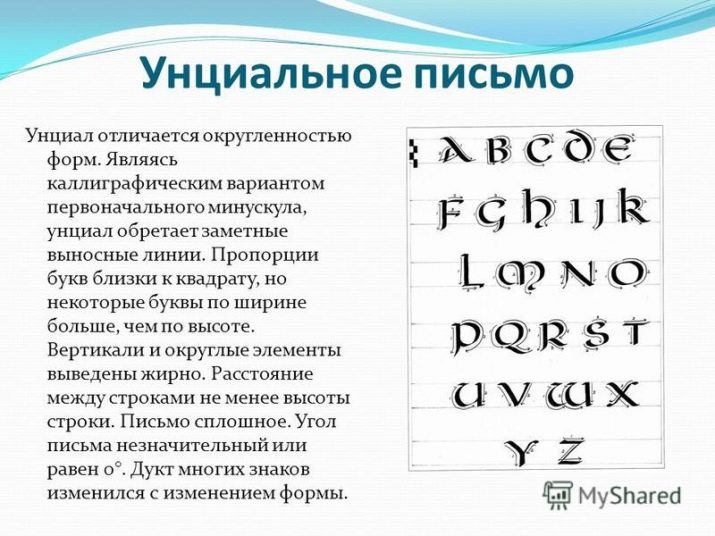
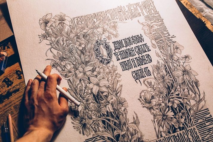
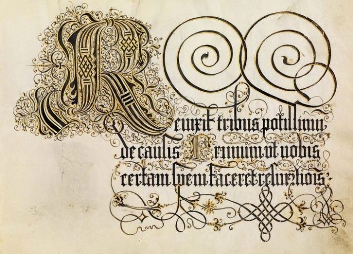
In the V century of our era, the so-called uncial font began to develop actively, which was distinguished by the fact that all the letters in the text or phrase stood separately and had no contact with each other. So-called initial letters appeared here - capital letters at the beginning of the whole paragraph, which in height occupied from 2 to 5 lines. Soon, this version of the font began to spread throughout Europe, which led to the creation of its many variations based on local traditions and rules.
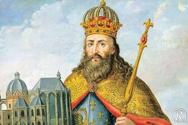
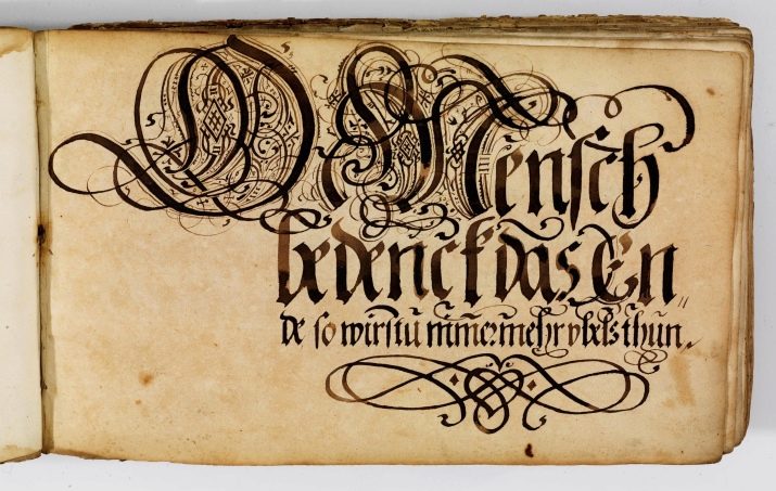
A significant influence on the formation of fonts of the time had Karl the Great. It was he who, approximately in the VIII century, made the decision to create one common font with uniform rules and functions of the main and small letters. This decision also suggested that the letters in words and phrases would be written together - this was the first attempt on the way to simplify the connection of letters and words, as well as the letter spacing. Such a font received a symbolic name - Carolingian minuscule. It is noteworthy that some of the rules in writing this font have been preserved to this day in our written speech.
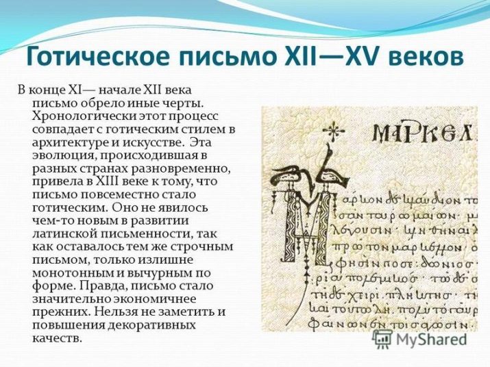
Since the 11th century, the so-called Gothic style has gained wide popularity in almost all of Europe.who became the "father" of the gothic font itself. This new font offered hitherto unknown uncial proportions and shapes, replacing all the angularity and directness of Greek symbols. These forms lasted until the Renaissance, where they were replaced by the already classical Greek. Petrarch, who is considered the initiator of European calligraphy, called these characters antiquated.
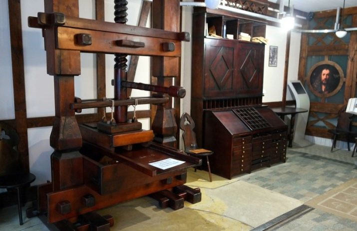
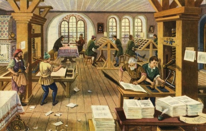
Some might think that the creation of a printing press in the 15th century inevitably led to a decrease in the popularity of written fonts and calligraphy itself., However, this is not quite true. The fact is that all the tools and prints in the machines were created exclusively on the basis of printed letters. At the same time, printing presses were not immediately popular - such a letter was not affordable for everyone and took quite a lot of time.
Around the beginning of the XVII century, when printing presses gained great popularity in Europe, calligraphic fonts began to gradually move away from its direct function. They became a tool in the design of elements of writing and decor. Handwritten books of the time, created thanks to calligraphic fonts, were more original and expensive - they were bought only by wealthy and wealthy people who were eager for art.
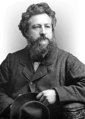
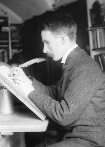
Calligraphy did not disappear in the XVIII-XIX centuries, with the help of its fonts they continued to write official documents, love letters, decrees, invitations, cards, posters of theaters. At that time, there were still people who considered the revival of calligraphy to be their vocation. A striking example of such personalities can be considered William Morris and Edward Johnston.
If, until the 17th century, calligraphy remained the art of self-expression, not only through the text itself, but also through how it was written, today this function has almost disappeared against the backdrop of the creation of high technology. Nowadays, when any computer program for working with text can create beautiful fonts, calligraphy has become a kind of beautiful cover, in which the text is worn.

Despite this, even today there are still people who are ready to defend this art. Moreover, many experts compare each artist with a calligrapher, since these types of art are extremely tightly connected with each other. In addition, there are special writing styles of paintings in which not certain specific images or images come to the fore, but brushstrokes, patterns and symbols with deep meanings - just like in calligraphy.
What is it used for?
For people who were born in the twentieth century, a beautiful, competent and harmonious style was the standard of a healthy and healthy person. Already then there were a large number of professions that required the performer not only perfect literacy, but also a beautiful calligraphic handwriting. Every year, interest in these professions faded away, some of them completely lost their need due to the development of the machine industry and computer technology.
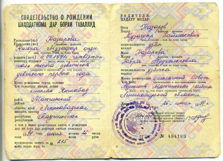
If even before the beginning of the XXI century, all documents in the institutions of the CIS countries were written out and issued in writing (where the calligraphic handwriting at the heart of the document was part of the ceremony - the issuance of marriage documents or passports, birth certificates), then very soon printed documents with fancy digital fonts won the market.
Based on this, one would think that calligraphy has completely lost its relevance in the modern world. However, it is not. For experienced and talented calligraphers, there is work to do today. They are asked for help in composing romantic letters, decorating postcards, creating letters, posters, even in home decoration and official logos. Modern technology has allowed many calligraphers to enter the digital market - today they have become graphic designers and architects.
Each of us meets with calligraphy every day. Most of the religious writings were composed precisely with the help of the works of calligraphers, the historical manuscripts that we see in museums and exhibitions are also restored by experienced calligraphers. Even contemporary youth graffiti art often bears the beginnings of calligraphy.
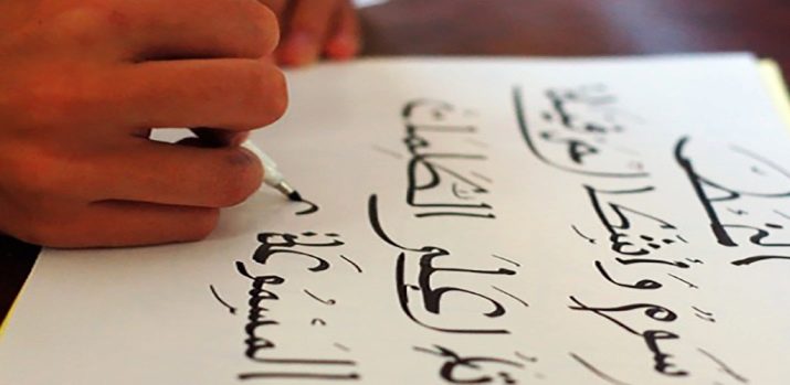
Despite the fact that today most of the documents are made using the computer, some of us still have to deal with written papers. It’s worth saying right away that calligraphy implies not only beautiful, but also correct writing - Thus, any text written in any type of calligraphy will be a priori understandable and legible. This issue will be especially relevant for those specialists who have constant contact with people and numbers: doctors, police, commodity experts, accountants, accountants. The correctness and legibility of handwriting in these professions directly affects the overall performance.
Experts are sure that calligraphic activity stimulates brain activity, developing mindfulness, multitasking and concentration in a person. In the case of writing with a regular ballpoint pen, we practically do not need to think about its movements - it slides on paper, depicting symbols and letter combinations that are already familiar to us. But, when it comes to calligraphy, a person has to follow every movement, stroke and directionto achieve the perfect result. Some experts assure that calligraphy fosters discipline and pedantry in a person, helps to bring things to the end. The impact of calligraphy on the human brain is compared to playing the violin, but the latter requires talent, and almost everyone can learn the former.
The education of discipline and perseverance are not the only tasks of calligraphy. In order to portray a beautiful and unusual pattern, you need to have a significant share of imagination and imagination.Thus, calligraphy training also develops creative abilities, which is why in some foreign countries it is introduced into school and student programs.
Experienced calligraphers note that calligraphy helps them relax and distract from anxious meditations and experiences. The maximum level of concentration of attention makes a person immune to external and internal stimuli during the entire work procedure.
Calligraphy means not only the correctness and beauty of writing, but also accuracy. This is especially true for adolescents and schoolchildren who leave a bunch of blots in their homework or class work. Work with ink organizes young people to more accurately handle brushes and feathers, which will favorably affect the further handling of an ordinary pen.
Calligraphy also influences the development of fine motor skills. It requires strict adherence to a certain writing style, in which the hands must clearly follow pre-defined lines. Calligraphy helps to monitor each movement, completes the movement of the fingers to perfection, copes with trembling hands.
Kinds
Today in the world there are several types of calligraphy, they differ in writing style, scope of use, as well as sacred meaning embedded in written symbols.
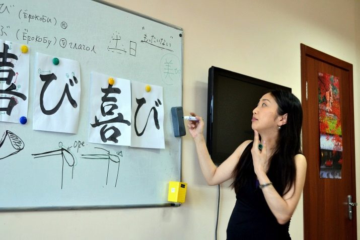
Japanese
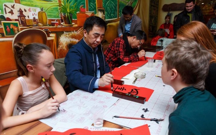
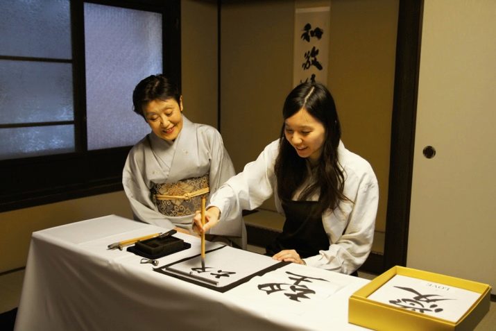
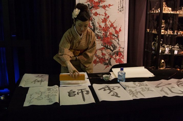
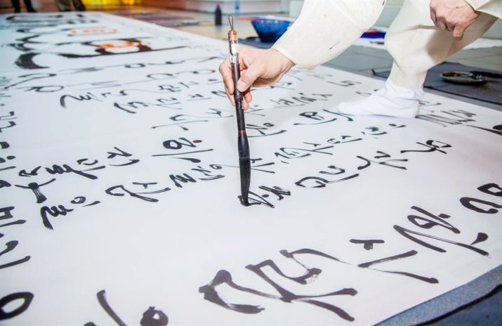
It is considered to some extent the standard and inspirer of all modern calligraphy. In Japan, this art appeared at the beginning of the VII century. On the basis of some characters borrowed from China, Japanese masters created several of their own unique styles. The created styles were much more expressive, expressive and simple. The Japanese sought to bring their sacred deep meaning into these styles, which would symbolize not just words, but whole concepts, images or meanings.
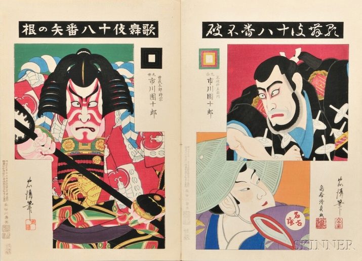
From the 17th to the end of the 19th century, new writing styles were actively formed in Japan - kabuki-moji and jo-ruri-moji. Initially, they were used only for compiling and decorating theater posters of the same name theaters - Kabuki and Dzeruri. Gradually, both styles also took root in Japanese culture and became part of the history of their writing.
The secret of Japanese calligraphy is that at the same time it requires its masters to be completely focused, but also relaxed at the moment of execution. To put it simply, the masters should be focused internally while writing, but the movements of their hands and brushes remain smooth and soft. Zen Buddhism was of great importance for the development of calligraphy, some of which techniques were based specifically on calligraphy. It was believed that it allows you to meditate more effectively and faster to know yourself.
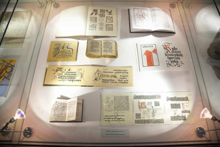
It is noteworthy that today has not had a negative impact on Japanese calligraphy. All their modern culture is based on ancient symbolic writing, which, in turn, became the basis for the creation of new styles and trends. For example, in the mid-twentieth century, the Association of Masters of Contemporary Calligraphy was registered in Japan. This organization is successfully doing its job today, every year demonstrating ancient and modern examples of calligraphic art at its exhibitions.
In the second half of the twentieth century, a new stage in the development of calligraphy began in Japan. This trend appeared due to the creation of many abstract styles in which the hieroglyphs lost their original meaning. Abstract stylistics allowed Japanese calligraphers to find more creative and unusual approaches in displaying their thoughts and images. The peculiarity of such techniques is that, despite their eccentricity, they retained the traditional methods of using brush and ink.
For many contemporary masters, Japanese calligraphy is a cherished goal, to achieve which they have been going for years.
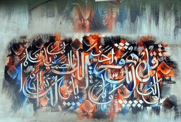
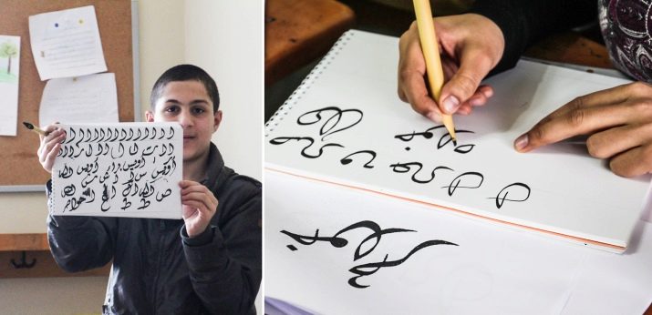
Arab
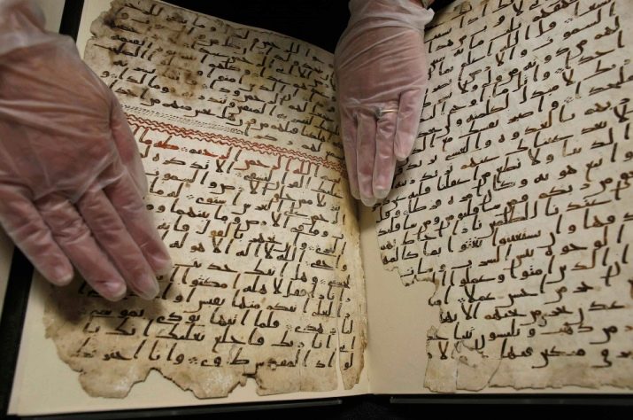
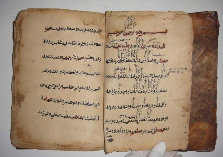
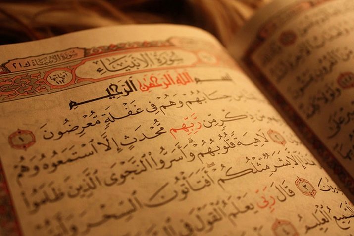
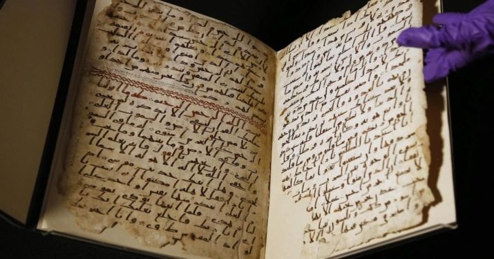
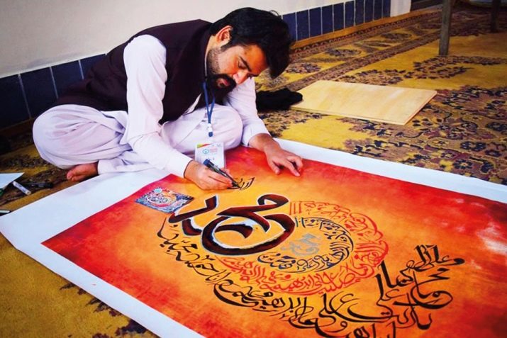
In Arabic, this art is called "Hutt" or "Hutut." Just like in Japan, Arabic calligraphy is one of the key values in Arabic culture and art. The very first attempts to root calligraphy were made solely on the basis of copying the Koran after replacing parchment with a more dense and high-quality material - paper. Almost all manuscripts corresponded in that era, and the most important - the Koran - in the forefront.
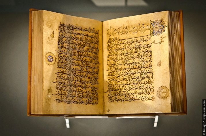
The noble art of calligraphy endowed with special and even sacred meaning all the signs and symbols written with the help of it. In the Middle Ages, many of the Arab rulers of that time took the liberty of writing the Koran for their lives, but before that they had to learn the primary rules of calligraphy.
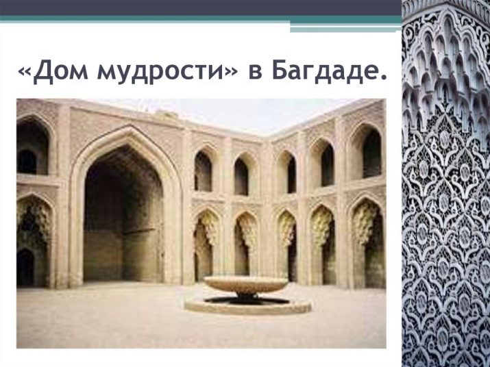
Already in the 9th century, these rulers gathered around themselves and their palaces real libraries with thousands of books, thereby trying to join the divine. Such libraries or centers came to be called “houses of wisdom” or “Dar al-hikma” - hundreds of translators, calligraphers and scribes worked daily on the census and writing of books. Thanks to the close connection of the Qur'an and calligraphy, the Arab people believed that this work exalts them over other people and forgives serious sins.
Together with the census of the Qur'an using calligraphic fonts, Arab masters began to census books and teachings in medicine, history, and military affairs. A little later, the first collections of poetry and prose appeared, written in beautiful calligraphic handwriting. In addition, with the help of calligraphy, drawings, drawings, maps and charts were already created in books.
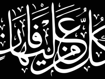
Arabic calligraphy has its own characteristics. - for example, the Qur'an, or the main holy book of Muslims, directly prohibits images of people, animals, and also Allah himself. It is believed that this encourages people to worship non-existent or alien gods, as all strangers do. That is why any images of living beings, even if they are in no way related to religion, are strictly prohibited in this culture. However, if calligraphy uses only symbols or words that are combined into some kind of a common drawing of a living creature, this will not be prohibited.
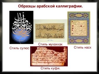
Briefly about the Arabian styles. At the beginning of the calligraphy in the Arab territories, there was only one style of writing - “hijazi”. Over time, this style has undergone modernization and changes, thanks to which there are 6 modern writing styles, which are also called the "big six". Each of these styles has been used exclusively in a specific area of life: for example, the “divani” style was involved only in writing important diplomatic papers and documents, the “nastalik” style is better known as a religious writing style - it was used by a narrow circle of people who have access to the Quran supplement with explanations. The most common style is “rikaa”, which is used only in the domestic sphere.
The handwriting style of a particular person could depend not only on the scope of its use, but also on other important factors. The choice of style in this case could be based on the place and time of writing the text or symbol, the color of the ink, as well as on the well-being or belief of the master himself. For example, some calligraphers preferred to use only the mascara that visited Mecca - it was considered sacred and obligatory for the holy pages of the Koran. With the distribution of books in the territory of the Arab states, there was a need for a faster census of books. That is why preference soon began to be given to fast writing styles, such as “hands”.
Of great importance in Arabic calligraphy were the proportions of the written characters. The fact is that in this culture the art of calligraphy was perceived with the same accuracy as physics or algebra.When writing any words or characters, a strictly defined height of letters and whole words in a line was calculated. So, depending on the letter used, its length could consist of 2 to 3 rhombuses.
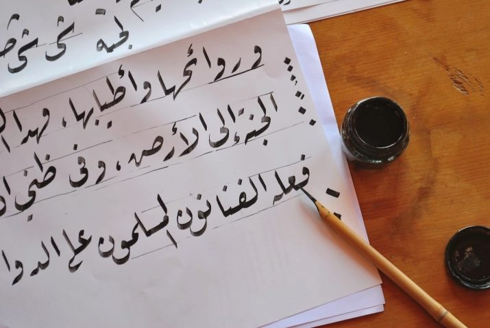
In order to clearly control the size of letters and words, a special algorithm was developed by Arabic calligraphers, according to which the length of the entire letter was calculated. The first letter of the Arabic alphabet, aliph, served as a standard and basis for writing words. Outwardly, it is a clear vertical line. The minimum unit of measure in Arabic writing is considered to be a point, at the same time, the height of the aliph is an average of 12 points, and the width is about 1 point. Also, the height of the aliph is used to draw a circle in which any letter of the Arabic alphabet should fit. From the described it can be understood that all the proportions established by the Arabic calligraphers depend on three quantities: the width, height of the aliph and its circumference.
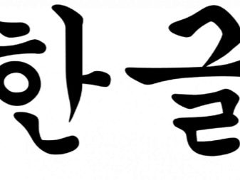
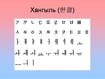
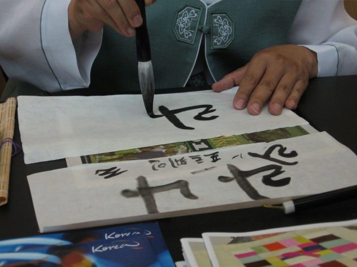
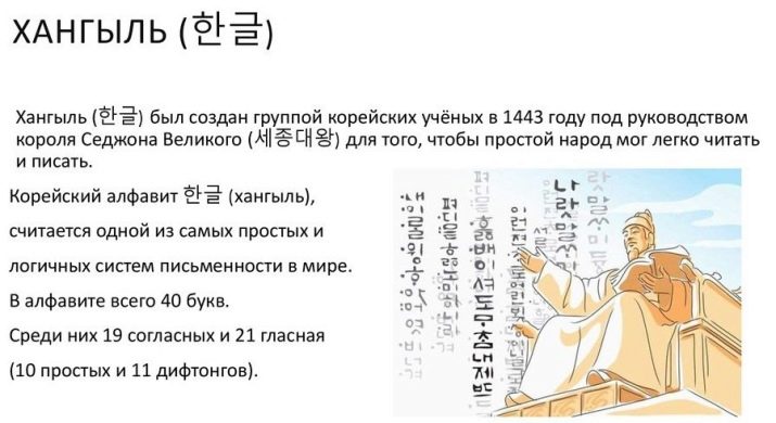
Korean
In many countries of the East, calligraphy was a real art that has been passed down from generation to generation for hundreds of years. And Korean calligraphy is not an exception at all - here the masters use the so-called Hancha (hieroglyphs) and Hangyl (phonetic alphabet) to create their own masterpieces.
Just as in Japan, calligraphy appeared on Korean lands around the 3rd – 4th centuries AD thanks to the widespread distribution of Chinese writing throughout the eastern territories. At the moment, the system of Korean writing is significantly different from the Chinese, but only one thing is known for sure - here each sign, symbol and dash also carries a deep meaning and significance.
As early as 1,500 years ago, a couple of centuries after the introduction of Chinese writing, by the manner of writing of ancient Korean calligraphers, it was easy to understand what kind of activity they were engaged in. For scientists, the symbols of the language were strict, consistent and restrained, they symbolized practicality, completeness and regularity. DFor artists, the characters of the Chinese alphabet were a bridge between the physical and inner world, which allowed them to create bizarre, light and laid-back characters and words.
Excellent knowledge of calligraphy and writing spoke not only about the education of a person, but also about his status. To study this complex art, it was often required not months, but whole years, which only wealthy members of society had in abundance.

It is worth saying that calligraphy plays a very important role in Korean history. Almost immediately after the creation of the first higher education institutions, calligraphy was introduced into the compulsory curriculum. And then, back in the early years of the existence of the Three States, in order to be accepted for public or military service, a number of certain tests had to be passed. Depending on the type of service and position held, Korean residents had to show their knowledge of Chinese literature and poetry. In particular, the examiner was required to compose a poem on a certain topic, while it was necessary to choose the handwriting that would be more suitable for its subject.
The introduction of such strict standards for entering the civil service prompted many wealthy Koreans to study calligraphy closely. In addition to the main exam, additional writing exams soon began to be held for those who wish to engage in the census or writing of texts (scribes and clerks). Thus, in fact, knowledge of calligraphy allowed people to gradually achieve certain heights and move up the career ladder.
It should be said that the Chinese alphabet has long been a part of Korean written culture, even despite the introduction in 1446 of its own national alphabet called “hanyl”. Until the end of the 19th century, Chinese writing was used at the highest level. - in the preparation of official state and legal documents. In addition, from the Chinese alphabet, Korean calligraphy has adopted the most important thing - the deep contextual meaning of symbols and letters. It was among the Korean people that calligraphy was able to reveal its potential as an aspect of art.
Some experts believe that young and inexperienced Korean artists were sent to primary education specifically to calligraphy masters. It was believed that such training would not only discipline young people, but also inspire them and develop creativity in them. There, students also passed certain exams, during which it was required to write a specific character or group of characters. Evaluation of the written was made according to the same requirements as the evaluation of a full-fledged picture: composition, selected shades, saturation and beauty of the smear, individuality of images. Here, the beauty did not consist in strict observance of any dogmas or formulas, but in the overall picture of the written and harmony of all the images that were part of it.
If we talk about the technique of Korean calligraphy, she gives more preference to the creative principle in the letter: the ability to correctly prioritize images, choose an interesting composition and shape of the symbol. Despite the fact that some calligrapher students represented ideally written characters and images, they were often not allowed to the desired position solely because of the “emptiness” and mediocrity of what was written.
Do not think that the technical component of Korean calligraphy has fallen into the background in the compilation of texts - not at all. An ideal knowledge of the laws of arrangement and proportions was considered a priori mandatory, after which the master set to work on endowing his writing with images and individual beauty. To achieve such a technique, some had to study the art of calligraphy for more than a dozen years. The most important thing in this technique is the philosophical awareness of the written, which comes only with extreme concentration and discipline.
Like many other forms of Korean art, all calligraphy of this people is based on traditions, folklore, as well as on the traditions of the power and might of nature. The most experienced ancient calligrapher masters have always believed that any brushstroke, any stroke and symbol should carry a part of something alive and harmonious - whether it is a bird feather, a tree branch, a sea wave or clouds. This is precisely the main difference between Korean writing and modern typographic writing - the machine will never be able to fully convey any image or idea. The abstraction inherent in Korean calligraphy has made it an unlimited source of imagination among masters and artists.
Turkish
Before the advent of book printing in Turkey, the main way to design and census text was calligraphy. The history and culture of this people are closely connected with this art - it symbolizes the freedom of expression, flight of thought and beauty. As in many other countries, Turkish calligraphy in the Middle Ages became a full-fledged academic discipline, the knowledge of which was necessary for many professions.
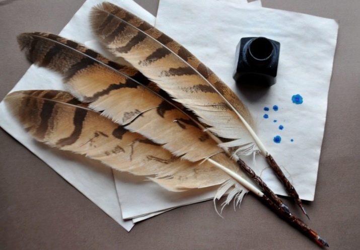
The history of the development of calligraphy in Turkish lands is primarily associated with the improvement of calligraphy tools and writing techniques. Initially, bird feathers and brushes were used for writing, then it was the stylus’s turn, and a little later, the fountain pen.
The first attempts to create individual calligraphy on Turkish lands appeared back in the 7th-8th centuries of our era, however, sheikh Hamdullah (1429-1518), one of the most experienced calligraphers of that time, had a major influence on its development.
Until the end of the 19th century, Turkish calligraphy played a huge role in the whole picture of Islamic art.However, with the introduction of educational and written reforms and the transfer of the bulk of books to the Latin alphabet, some originality of this art was lost.
Like many Asian countries, Turkey is incredibly careful in its history and traditions. Since calligraphy has always played a significant role in them, Sultan Beyazit II decided to create the only museum of calligraphy in Turkey in Istanbul. After that, Istanbul became the unofficial capital of all Islamic calligraphy. In the museum you can find old installations, scrolls and manuscripts, monograms symbolizing the spirit of medieval calligraphy. You can also find hundreds of unique calligraphy tools there.
Initially, an ordinary cane feather served as a tool for calligraphy, a little later wood and metal at the base of the tips and holders were introduced into the production of such feathers. Today, most of these tools have been replaced with more modern feathers, as well as all kinds of pens (fountain, ball). It was with the advent of ballpoint pens in Turkey that calligraphy became widespread among ordinary people. These pens were cheap, easy to operate and quite flexible. Fountain pens became the property of wealthy people, acting as a kind of business accessory, without which it was impossible to go out.
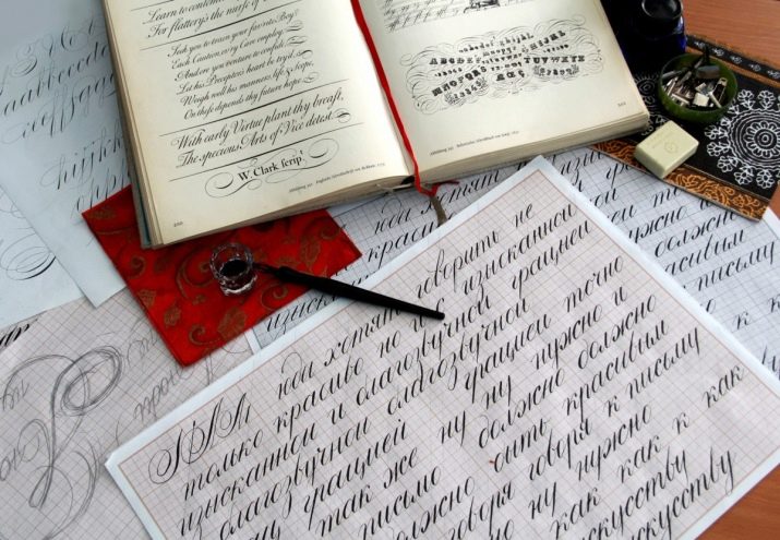
European
This type of calligraphy will combine several directions at once, which, however, are united by a common feature - all these styles began their development with the advent of Christianity in European lands. The first calligraphic texts concerned the census and translation of the holy texts of the Bible and the holy scriptures.
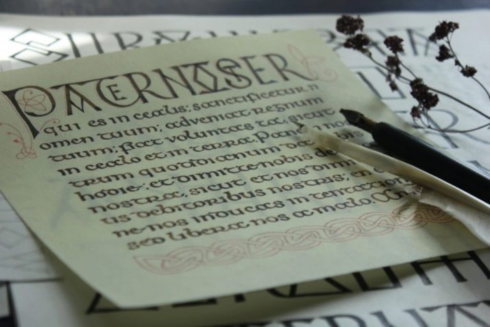
The peculiarity of this calligraphy was that it did not require any inspiration or imagination from its owner, here the beauty and value of the writing directly depended only on the skill of the calligrapher. Since the Bible needed to be rewritten and copied as soon as possible, the masters did not need anything other than perfect mastery of grammar and calligraphic dogmas.
The most striking examples of European calligraphy can be found in the ornament and scriptures of religious books, in the painting of temples, icons, attire of clergy, as well as other religious accessories. The peculiarity of such calligraphy lies in the extreme rigor to the proportions of symbols and signs. Unlike East Asian calligraphy, additional author's ornaments and images are rarely allowed here in compiling books and painting icons.
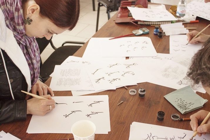
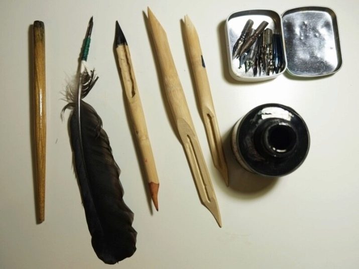
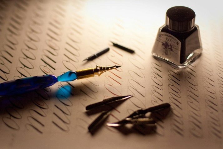
Tools and materials
To achieve certain heights in calligraphy, you will need many expensive tools that will not be easy to find in the city. Below you can find a list of items that will be needed both at the training stage and to achieve high results in calligraphy.
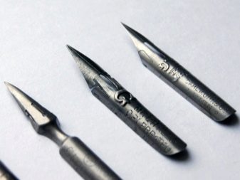
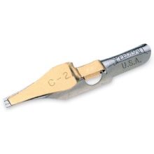
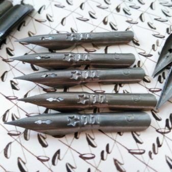
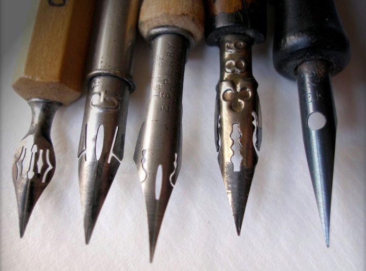
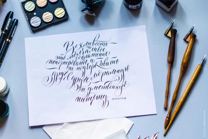
Feathers are divided into two separate groups: pointed and broad-pointed.
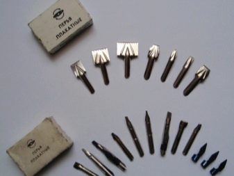
Shirokonechnye feathers are usually sold immediately with a lamp holder (a kind of plate of metal or plastic over the pen itself). If it is not there, then the car holder can be made independently from improvised materials. The most famous brands of wide-pointed feathers are the following.
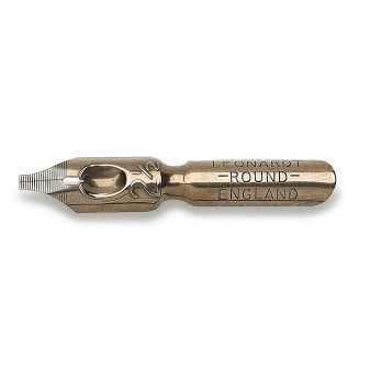
- Leonardt - considered the most budget and easily accessible version of feathers. Sold in stores for artists, calligraphers, and on the Internet.
- SpeedBall is a more expensive version of high-quality feathers with two handhelds. Differ in convenience, plasticity and a long service life.
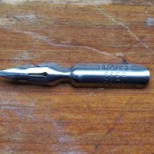
- Brause & Co - professional stiff feathers with a hanger. The most expensive and high-quality from this list due to the unique rigidity and durability.
Calligraphy, just like other forms of art, opens the door not only to right-handed people, but also to those who are better at owning the left hand. In these models, the bevel of the cut goes right to left, and not vice versa.
There are also universal wide-nib models of feathers for right-handed and left-handed people, for example, the Pilot Parallel Pen model. These Japanese-made feathers are automatic and have a dense, wide cut. The size of the slice may vary depending on the writing style, you can find these feathers with sizes from 1 to 6 millimeters.

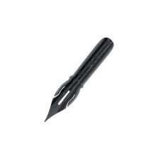
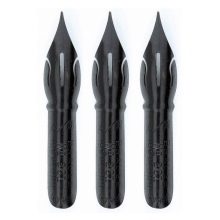
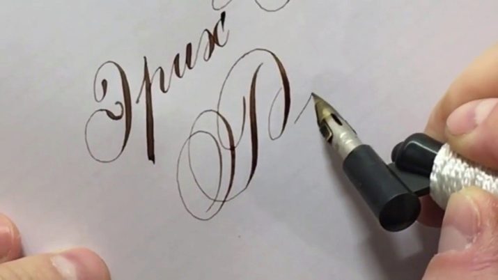
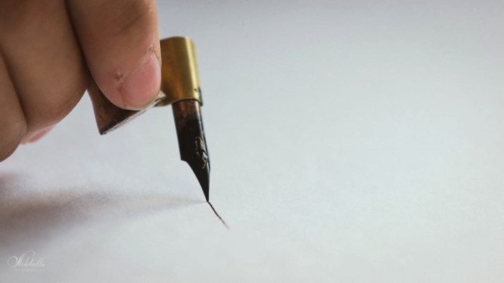
Pointed pens require a certain writing style with pressure. Such feathers have a special cleavage or splitting, which expands under the action of pressure, with the help of which wider or thinner lines are formed.
The most budgetary options are feathers "Asterisk" and Leonardt. They are not particularly plastic, however, they serve and support most carcasses for a long time.
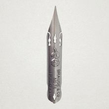
Ideal feathers for inexperienced calligraphers are the Brause Steno, Brause Rose, and Brause Extra Fine 66 models. These are pointed, comfortable and inexpensive feathers with a small split.
For those who want to get from work not only professional, but also aesthetic pleasure, special vintage feathers are sold. In structure, they are more plastic, soft and comfortable, with the help of them it is easy to learn how to write beautifully. Also, they are often decorated with many bizarre signs, serifs and prints, which seem to carry you to the Middle Ages. Such feathers, due to their delicate and soft structure, often break and are very expensive in themselves.
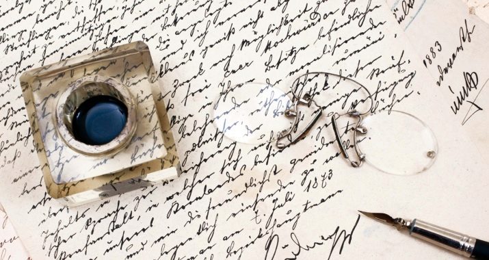
After you have acquired feathers, paper and other tools, you can start refueling them. Surely many of you have seen such feathers refill in films - the actors simply lowered them into the inkwells and immediately began to write. However, modern experts in calligraphy recommend refilling them by soaking the tip of the pen with a brush or cloth - this way you can accurately track the amount of ink that gets into the pen. This will protect you from unwanted blots and burrs.
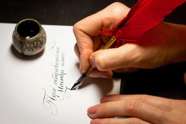
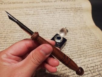
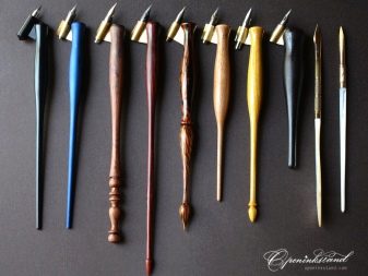
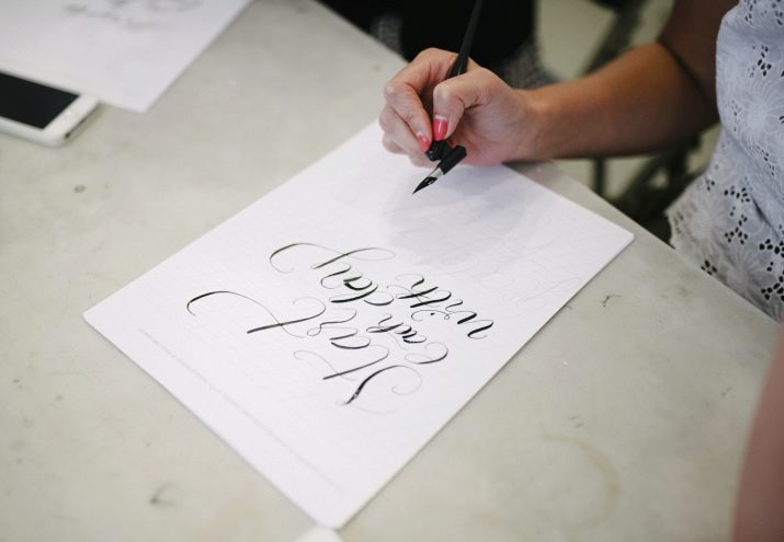
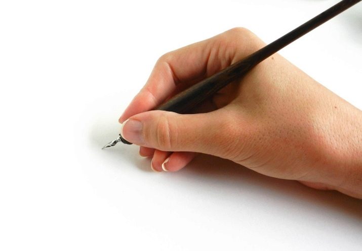
Holders are divided into straight and oblique depending on the style of writing and pen. So, slanting holders are used in conjunction with pointed feathers. In this case, it is easier for calligraphers to observe a tilt of 55 degrees, while not turning the sheet of paper. Direct holders are most often found - they are cheaper, it is easier to put feathers in them and clean them.
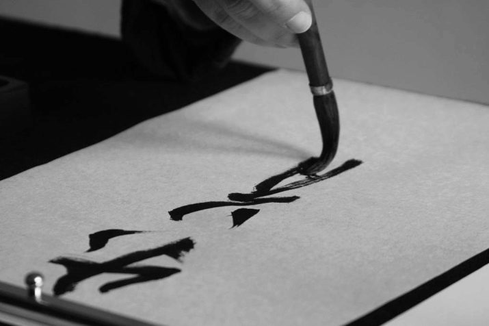
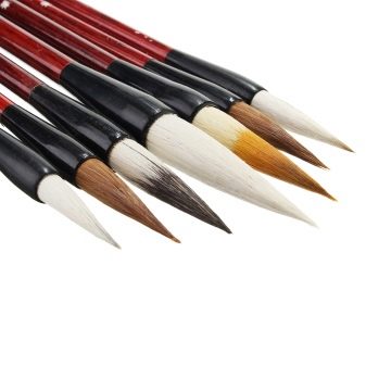
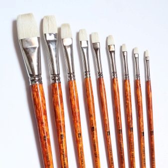
Brushes are considered a cheaper, but less reliable and durable replacement for the feathers; they are also used to refill the feathers themselves. By analogy with feathers, they are divided into two types: pointed (brushes with a round base) and broad-pointed (brushes with a flat base). The advantage of brushes is that they are easier to control than feathers, they are more plastic, they easily follow the movements of the master. They also have their drawbacks - from repeated use, hairs drop out of the brushes, because of which the tools have to be changed regularly. The best brushes for calligraphy are considered to be Chinese natural hair brushes.
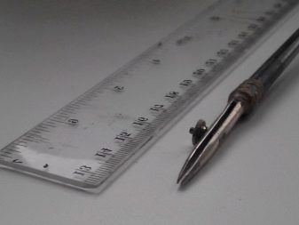
The officer line is a necessary tool for writing. Calligraphy strictly monitors the proportions in the letter, so for beginners, for the first time, they will have to carefully lined the paper for future patterns. In addition, we can find on sale albums for calligraphy with ready-made ruler.
Not only the harmony of the drawing itself, but also the convenience of calligraphic writing depends on the right paper. On thin, loose, and fragile paper, mascara can spread and leak out. Since quality calligraphy paper is quite expensive, beginner calligraphers can practice on regular office paper. For more professional work, you will need paper with a density of at least 120 grams, and preferably 130 or more. Some craftsmen prefer extremely thick paper to achieve the unusual effects of “torn” and “broken” lines.
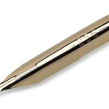
Buying an expensive carcass does not guarantee you an accurate and correct letter, but will make it more beautiful and harmonious. The classic version of the carcass for beginners is the product of the brand "Gamma" - It is sold in many stores in the CIS countries. A little later, you can switch to more expensive carcasses, such as Koh-I-Noor. Some beginners immediately buy professional expensive carcasses, but the latter are usually very thick, which is why feathers need to be cleaned regularly and the mascara itself should be diluted.

Water will help you quickly clean the pen of excess paint, as well as dilute too thick ink. After washing the pen, wipe it thoroughly with a cloth so that water does not get on the paper or in the inkwell. Changing the water in the mug costs about once every 10 minutes.
To date, there are many third-party tools that allow you to make lines in the letter more clear, unusual or smooth. A common element of such tools is an ordinary drawing chair - it is often used by architects to create drawings. For colorful and creative calligraphy, some masters prefer to use special wide felt-tip pens. The advantage of such tools is that you do not have to deal with the preparation, cleaning and filling of feathers.
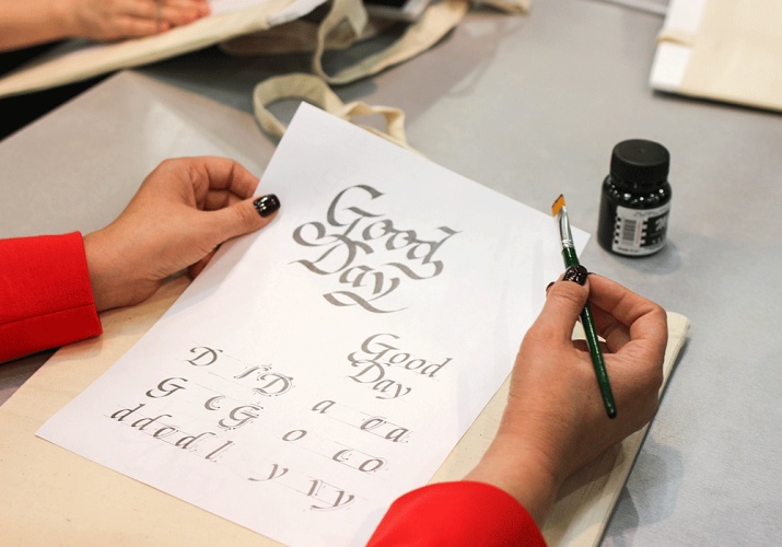
For more creative and unusual drawings and symbols, calligraphers can use a variety of tools: charcoal, pastel, watercolor, gouache, ink and even spray cans.
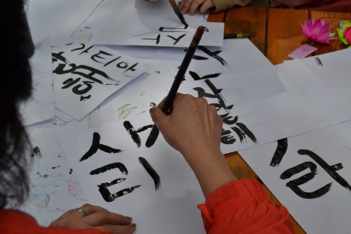
How to learn?
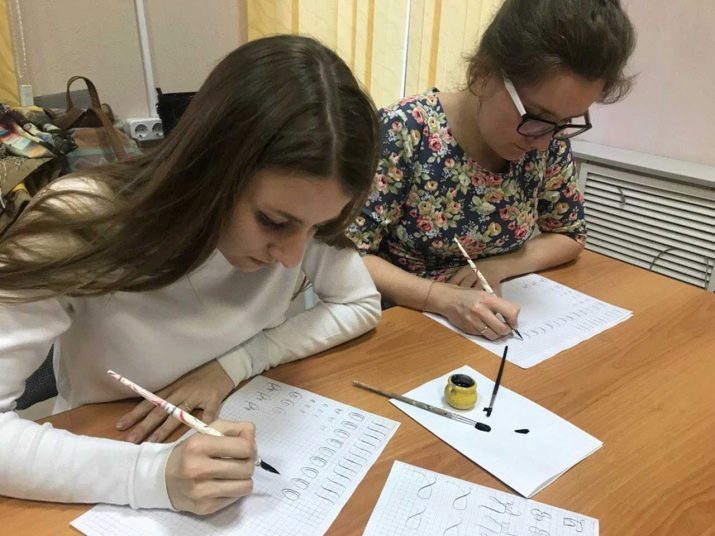
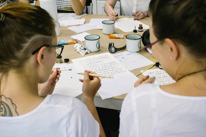
There is a widespread belief that calligraphy requires a person not only some skill, but also talent. Experts fundamentally disagree with this statement and tend to think that this art is more dependent on skill and experience. Hence, even people with the most terrible, in their opinion, handwriting, are able to learn the basics of calligraphy. Contemporary calligraphy is especially popular today - it does not require any clear rules from the beginner or master and opens up spaces for imagination and individuality.
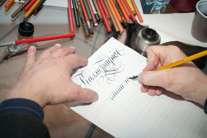
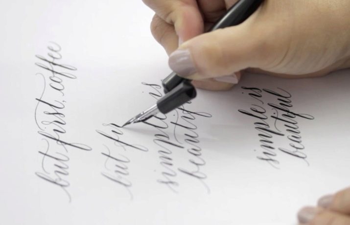
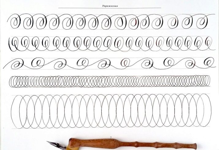
The first step towards learning calligraphy is the so-called “fake calligraphy”. This is a kind of introductory lessons in calligraphy that will help you competently hold a pen and understand the very essence of such a letter. It got its name “fake” because it does not require either a fountain pen or expensive carcass from the master - work can be done with a regular ballpoint pen, felt-tip pens or pencils. It should be noted right away that this writing technique can help not only beginners, but also experienced calligraphers - you may have missed something from your first lessons.
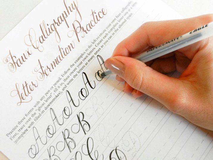
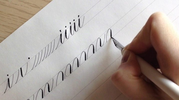
Unfortunately, this method of training will take longer than if you practiced using a regular fountain pen, however it will seem more fun and will clearly show what is the peculiarity of calligraphy writing. Below you will find step-by-step instructions for creating the very first calligraphic phrase or word.
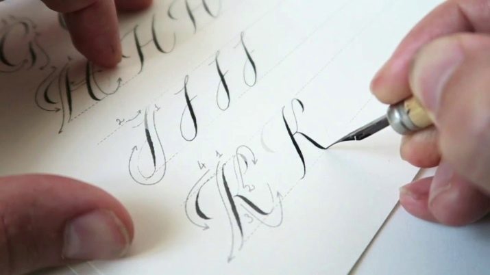
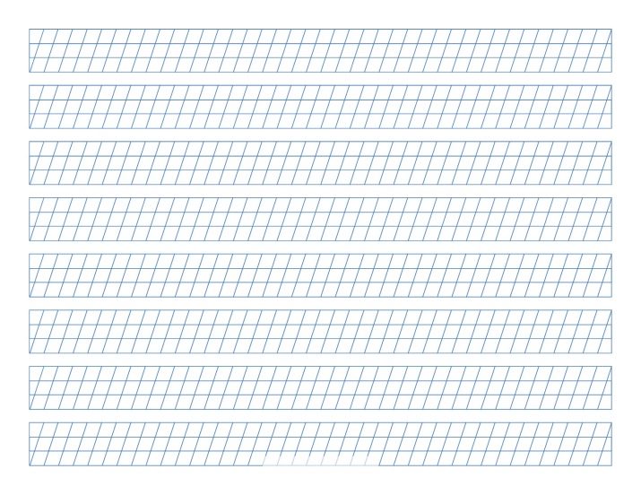
- Take an ordinary sheet of A4 paper, and then write in a neat handwriting on it some phrase or word in italics, leaving a small distance between the letters. Try to keep the proportions of letters in the word approximately the same - for convenience, you can draw a sheet with a ruler.
- Then it is necessary to indicate in words the lines that will succumb to thickening. Typically, these are left or right sides in italic letters that appear when you move down while writing a letter. Move slowly, trying to leave strictly symmetrical and parallel lines. Make sure that the lines of the bulges do not differ in size in the same letters.
- After each letter has been marked with its thickened lines, simply fill the resulting empty space as carefully as possible and without leaving the edges. You can paint over with a pen, felt-tip pen, brush or pen.
- Try not to dwell on a single phrase or word.As soon as you understand that you have learned to write and fill in the selected phrase, turn to more complex words with the contents of previously unused letters.
- Complicate tasks by trying to thicken the whole text, turn to new methods of italic writing, change the style features of the selected type of calligraphy, try to add additional graphic elements in the form of squiggles, fancy commas, patterns, elegant underscores.
- If the first training should be carried out exclusively with large italic letters, then with the complication of the entire course it is worth switching to medium and small print. The smaller the words will be in size, the more difficult it will be for you to follow the movements, the more attention will need to be paid to a particular letter.
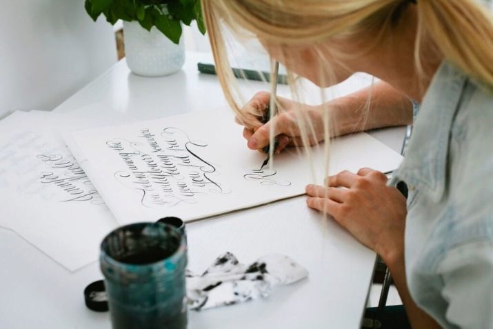
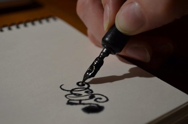
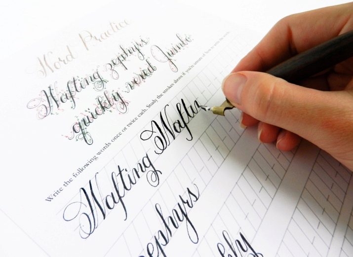
- Once you understand that calligraphy with a ballpoint pen is easy for you, you should switch to more professional writing tools. First of all, it is worth acquiring pen holders - they help to fix the pen in the right position, as well as more effectively fill it with paint. For starters, plastic holders are suitable, which you can make yourself. Beginners should choose a direct holder, for more experienced calligraphers oblique ones may also be suitable. Note that the feather in the holder is not in the middle, but between the upper metal petals and the rim.
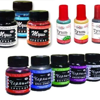
- After this, consider getting high-quality ink, ink, or ink. At first, it is better to choose convenient and practical products rather than professional and expensive ones.
- The selection of professional paper for calligraphy is the next important stage in learning. Please note that on ordinary sheets with a density of not more than 80 grams it will be much easier for you to write than on professional canvases with a density of 120 or more grams. Such sheets are more rigid, durable and do not lie well at the hand of an inexperienced calligrapher. To determine the quality and density of the paper, just make a couple of strokes with a pen on it. If oa is strong and of high quality, the strokes will be clear with strict boundaries, if not, ink and ink will spread throughout the paper and leave characteristic cobwebs.
- The pen holder should always be held in the middle, while trying not to touch the tip itself - there is a great chance to get hurt or get dirty. There is nothing complicated in holding a calligraphy pen correctly. Modern standards allow masters to hold it in the same way as a pen - with the index and thumb, where the middle finger and little finger perform a supporting and fixing function. The difference between writing with a ballpoint pen and a pen is that ballpoint pens require a certain amount of pressure to leave a mark on paper. The pen should be kept at ease, and the movements of the hand with the pen should be smooth, fast and soft. Excessive pressure can cause the tip of the pen to catch on the paper, causing splashing, or even bend.
- There are situations when ink or ink does not want to go from pen to paper. This may depend on the quality of the ink, improper refueling, and the quality of the paper itself. To outwit the system, simply lower the tip of the pen into the water, after which the ink should slide freely on the canvas.
- After each workout, try to thoroughly rinse and wipe the ink from the pen, do not allow the ink to dry out or the pen to rust. To clean and dry the pen, use linen cloth or any other without fluff or thread.
Some experts recommend that beginners train on calligraphic scales. Most often, they are presented in the form of albums with tasks for writing or coloring certain characters. Many disdain these exercises for beginners, which will pay in the future. As a rule, insufficient preparation and unfair study of the basics lead to crooked fonts, an incorrect rhythm and a disproportionate distance between letters.Learning on scales teaches calligraphy, starting from the very beginnings - from symbols and dashes to whole inscriptions and texts.
Typically, these scales are used in the training of novice musicians - this once again proves the creative nature of calligraphy and the importance of self-organization to achieve the highest level of writing.
Basic calligraphy exercises in the video below.


