The color scheme of the bathroom should be harmonious. It is important to choose shades in such a way that the atmosphere inside the room seems comfortable and cozy. From the material of our article you will learn how to set the desired mood in the bathroom using color. In addition, we will tell you how to choose the right shades for a specific interior style.
Main shades
All paints in the color palette used to design the bathroom can be divided into 4 groups. Each of them has its own perception and has the ability to visually change the space. You need to choose the main and auxiliary tones correctly, given their emotional coloring and choosing harmonious contrasts, not exceeding their possible number.
Neutral
This category includes white, black, gray colors. In addition, these include metallic as well as silver tones. By themselves, they do not have any emotional coloring, but can take on the mood of those contrasts with which they are combined. Their excess is far from always good, as this makes the interior faded and boring. It is necessary to choose contrasts to them deliberately, since the inclusion of a particular color radically changes the atmosphere of the room.
Bright
The group of light colors includes shades of pastel colors and whitened tones. These include: ivory, light pink, pale blue, lilac, mint, caramel. In addition, this group includes light turquoise, dairy, creamy, beige.
A distinctive feature of light shades is the ability to visually increase the space.They erase rigid boundaries, create the effect of air even in a small bathroom. In addition, light shades distinguished by visual nobility. Thereby they enhance the status of any interior.
Dark
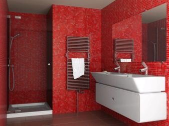
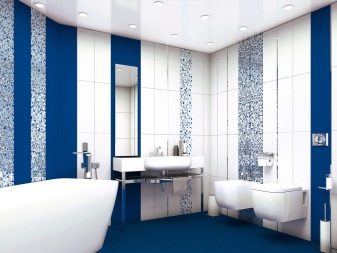
Often in the interior use dark shades of the color palette. Moreover, among other colors stand out dark blue, chocolate, dark emerald, black brown, burgundy, purple and the color of wet asphalt. Unlike light shades, these tones are quite sharp emphasize the boundaries of the room. In addition, they visually reduce the space, and therefore are not suitable for designing small bathrooms.
They must be used in the interior in a dosed manner, since the abundance of dark color can make the atmosphere oppressive and heavy. A feature of dark shades is the need for light contrasts. At the same time, for a better perception, at least three shades are included in the color combination. More often, such tones are used to highlight any functional area.
Bright
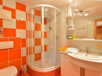
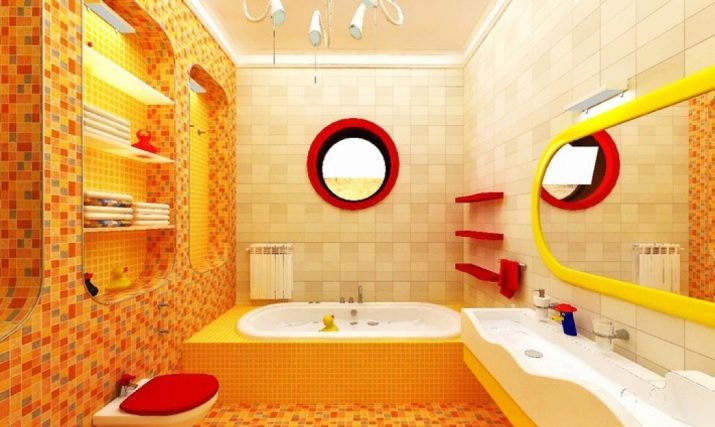
Along with light and dark shades in the design of bathrooms use and dynamic tones (for example, green, bright turquoise, red, blue, purple, orange, yellow). Like dark paints, they need color softeners. However, you need to use them in the interior of the bathroom, so as not to spoil the atmosphere of the room. Wrong choices can cause user discomfort.
Create mood
No matter how many shades there are in the color palette, each of them is able to create a different mood. This is achieved by using harmonious contrasts, the choice of style, type of cladding and furniture elements used. In addition, the effect of color on the body is also taken into account.
For example, the same violet color is perceived very differently by young and old households. He invigorates some, while others cause depression. In order to create harmony in the bathroom, you need to start with the desired mood.
Comfort
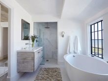
The easiest way is to create an atmosphere of home comfort using light shades. In a bright room, a person feels relaxed and calm. Ideal tones will be beige, milk, creamy, their combination with white. It is they that people associate with comfort and harmony, inner peace and warmth.
However, it is desirable that color tones prevail. White is best used for decorating the ceiling.
So that the design does not seem too simple, you need to add another 1 or 2 to the two shades. For these colors it can be light gray, silver, pistachio, brown.
Can be combined in the design of 2 shades of the same color. So it will be possible to achieve the versatility of the interior. For example, you can combine white with two shades of peach or woody color.
As for pink or lilac, these colors are by no means universal.
At the same time, each member of the family will like to be in the bathroom, decorated in natural or natural colors (the color of wood, greenery, sky). But you must not forget that the abundance of color entails a change in perception from relaxed to annoying. For example, the same woody color of all the walls will turn the bathroom into a wooden box.
Freshness
You can create an atmosphere of freshness using white, mint, turquoise, as well as cyan or smoky blue tones. However, they can be used not only in the color of the ceiling, wall or floor cladding. You can use color in the shade of a glass sink or countertop under the washbasin.
The colored ebbs of the glass elements of the arrangement are like ice cubes or a refreshing fresh. The abundance of bright color is an erroneous approach to creating the right mood. Lightness should be felt in the interior, and therefore white or light color should prevail. Bright colors are needed only as finishing touches.
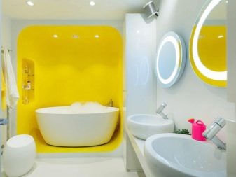
Pep
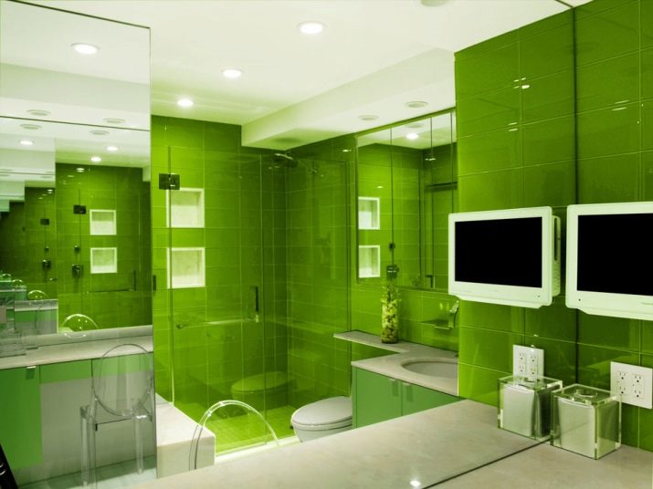
You can create an atmosphere of a positive or cheerful mood in the bathroom through bright colors.This can be the use of various shades of green, burgundy, blue. To achieve the desired effect, nIt is necessary to use bright, but muted tones in the interior of the bathroom. Acid and harsh paints are excluded.
For example, elements of furniture for the wash basin (table top with hanging cabinet, front of a cupboard, pencil case, hinged shelf with a mirror) may be colored. Someone prefers to buy colored plumbing. Others order bathtubs painted in burgundy, green, blue tones.
How to choose a color for the style?
When choosing a color scheme for the bathroom, the choice of style is also of no small importance. Each of them is characterized by its own shades that make the design recognizable. For instance:
- avant-garde priorities - unusual bright contrasts (blue with mustard and red, lilac with wood and turquoise, lemon with blue and terracotta);
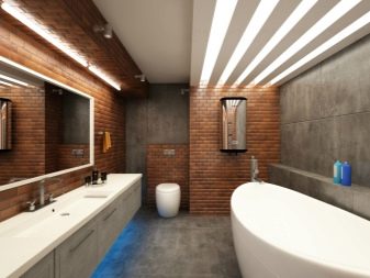
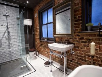
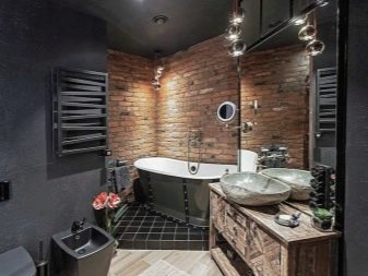
- loft resources - concrete, brick, brown and metallic colors in combination with bright burgundy, mustard turquoise, black touches;
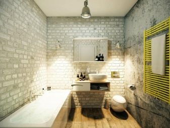
- minimalism often expressed using neutral tones, as well as milky, creamy, black-brown, yellow colors (white is predominant, graphite is also relevant);
- characteristic resources of modern they are ash pink, pearl, sky blue, muted lavender color, in addition to them, a combination of white with beige and brown, bleached-marsh and gray, red-brown and green is relevant;
- scandinavian style bathroom differs in the use of light shades (a combination of white with creamy, forget-me-not, sand, pastel colors of the palette);
- in the interior of art deco in addition to gray, brown and cream tones, they use shades of metal, wood and leather, less often they add purple, gold, green or burgundy contrast.
Combination Rules
The combination of colors in the interior can be analog, complementary and traditional. Analog implies the use of several shades that flow smoothly into each other. With a complementary emphasis is placed on the contrast of two tones. In traditional use 3. In addition, you can combine in the interior of the bathroom and 4 shades.
Based on this, there are several basic rules for a harmonious combination of shades:
- in the color scheme, you can use tones of the same color, not forgetting to dilute them with neutral contrasts;
- when choosing shades, it is better to choose those that are in harmony with each other;
- it is advisable to use shades that are harmoniously combined with others (white, beige, gray, milk, cream);
- complex colors create visual tension, it is better to avoid such contrasts;
- no more than 4 colors can be used in the interior (75% of the background, 25% for 2 companions and 5% for bright accents);
- transitions between tones should not be too sharp.
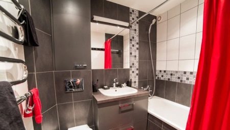
As for complex combinations, contrasts must be selected in such a way as not to disturb the harmony of the interior. So, to make the interior of a red-white or blue-white bathtub harmonious, you need to choose a muted color tone and dose it. For example, hanging shelves or floor cabinets can be red.
If color plumbing is chosen, the furniture should be white. In working with color, a sense of taste is important. Somewhere, it’s more important to make small details bright than to make an entire wall a bright spot.
So that the contrast does not seem sharp, it can be diluted with a creamy or woody shade.
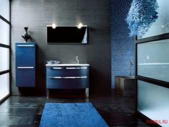
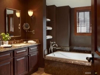
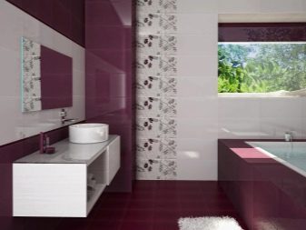
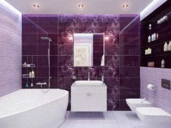
Beautiful examples
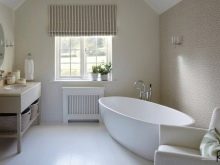
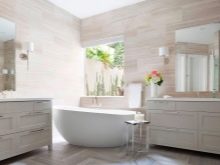
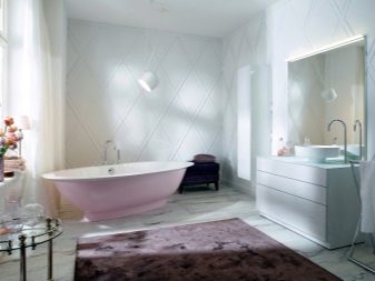
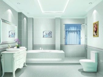
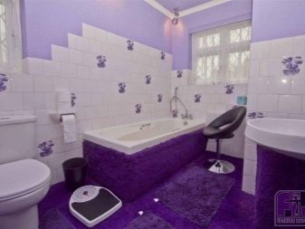
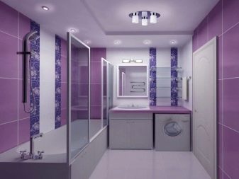
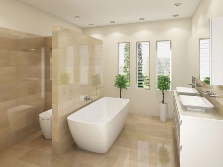
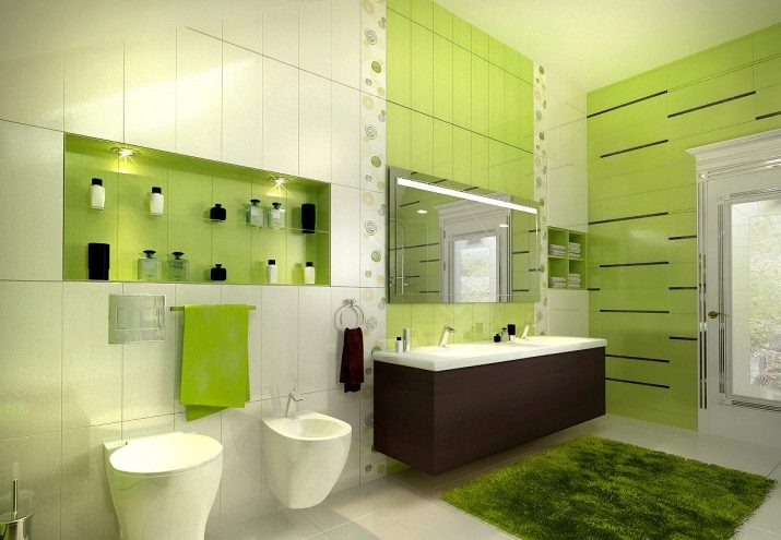
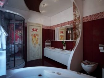
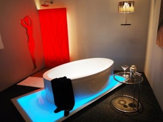
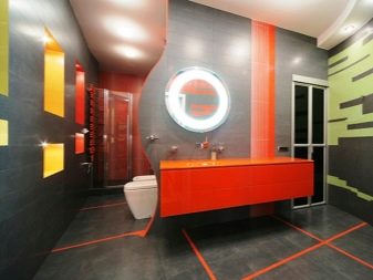
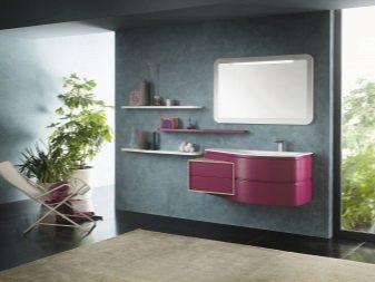
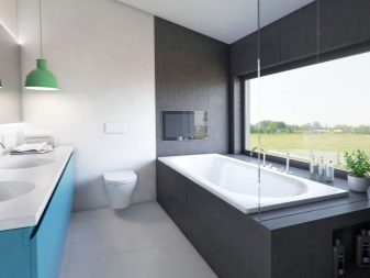
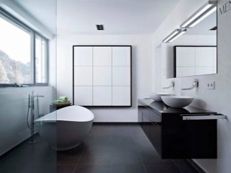
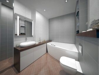
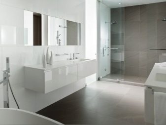
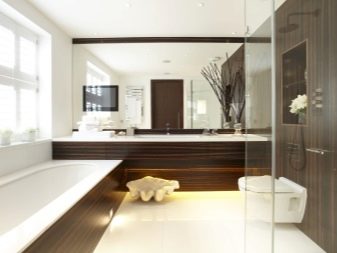
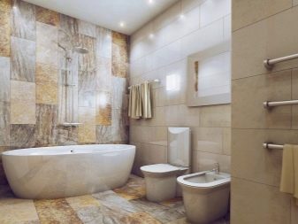
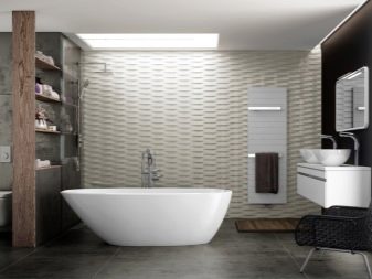
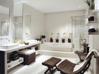
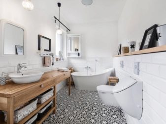
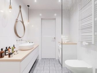
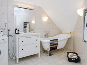
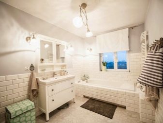
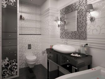
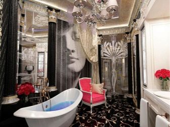
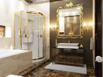
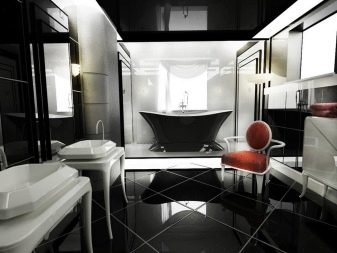
We offer 12 ideas for choosing colors to create an atmosphere of comfort in the bathroom:
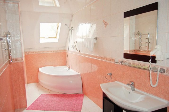
- harmonious selection of shades to create an atmosphere of comfort and freshness;
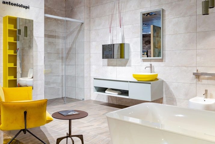
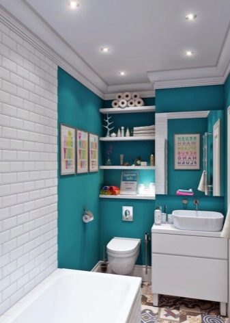
- the use of soft contrast with emphasis on the washbasin of the bathroom;
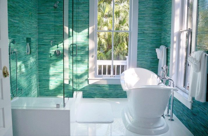
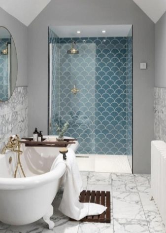
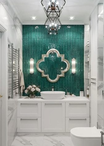
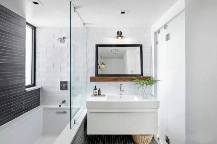
- a combination of white with a hint of sea wave, accentuation of the walls of a small bathroom;
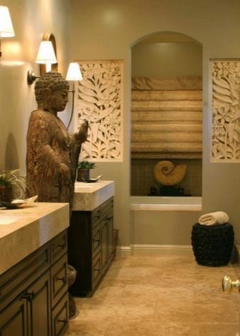
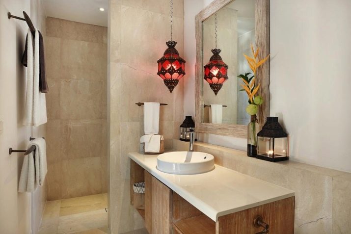
- the choice of color scheme to create an atmosphere of comfort in an ethnic interior;
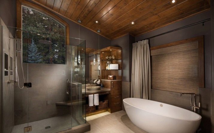
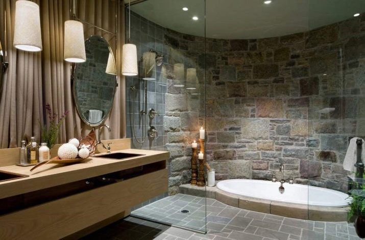
- the use of shades of natural gamut to create an atmosphere of comfort and unity with nature;
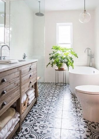
- bathroom design using gray-white contrast, selected for minimalism style;
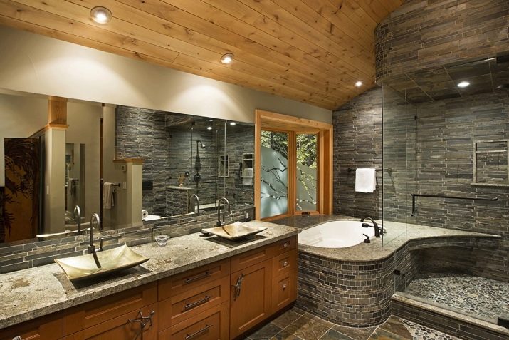
- the interior of the ethnic bathroom using gray, wood and gold shades;
- the choice of soft contrasting combination fills the atmosphere of the bathroom with cosiness and special aesthetics;
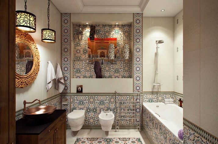
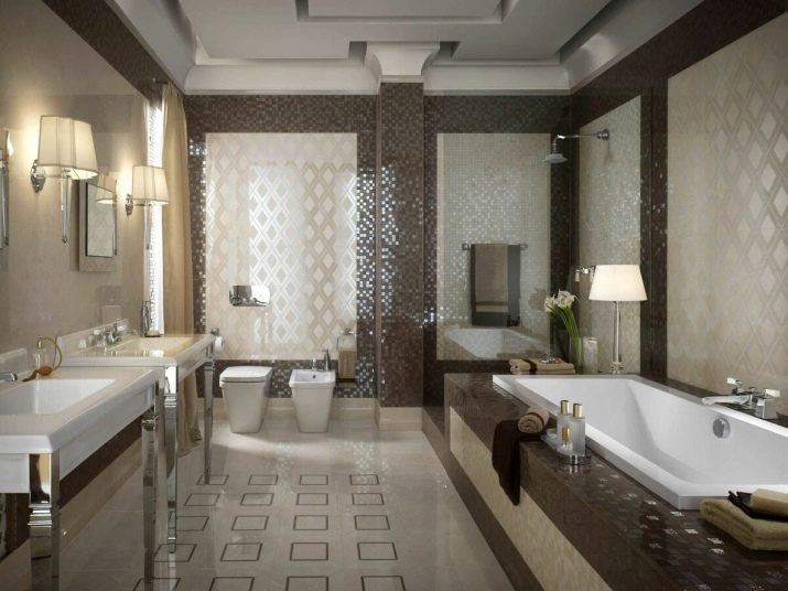
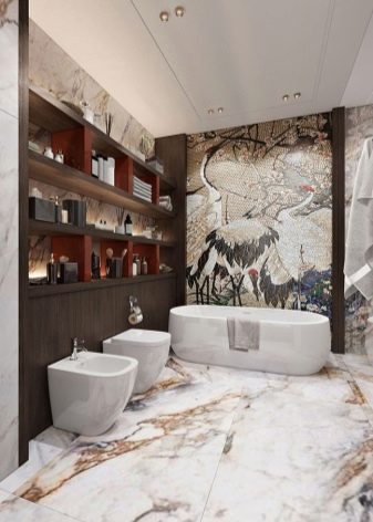
- a successful combination of natural tones with white, chosen to design a modern oriental style;
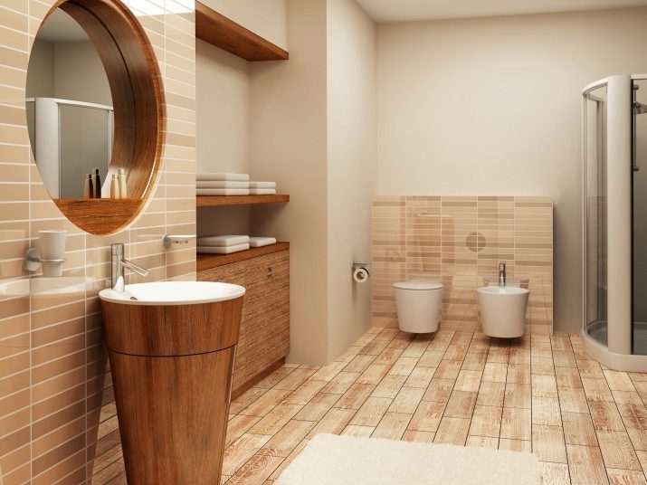
- an example of adding bright strokes to the contrast of white with beige and light wood;
- an excellent choice of shades of blue to embody the atmosphere of a rustic style;
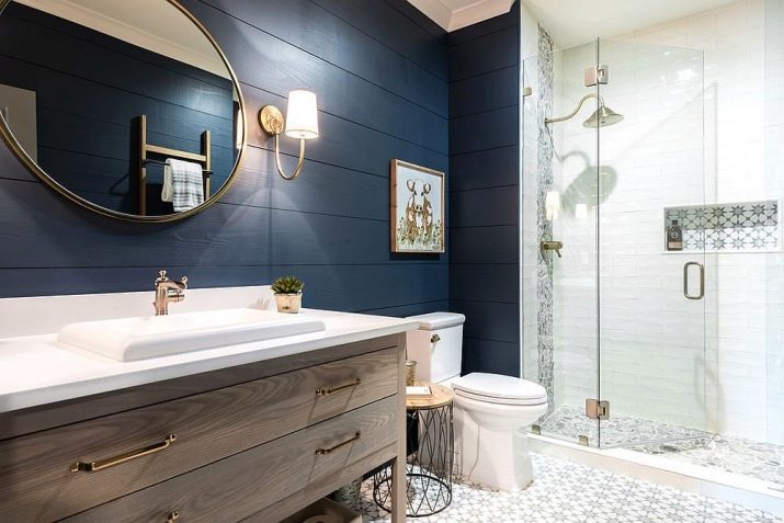
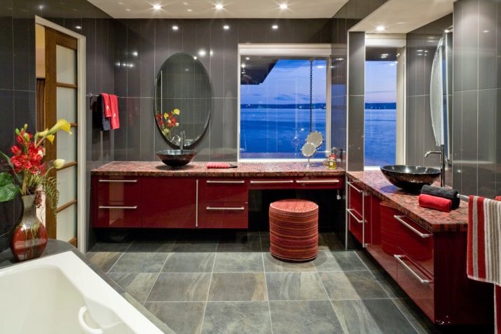
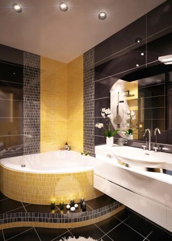
- harmoniously selected contrast of wine-red with gray and white, chosen to design a small bathroom.