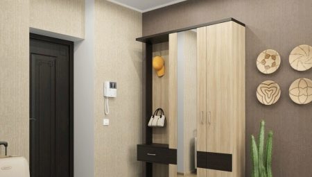
Color for the hallway in the apartment and the house plays a huge role. First of all, this room is a peculiar face of the house, so its design forms the impression of housing as a whole. In addition, small parameters of the corridor are very common. Therefore, the color scheme and design are primarily aimed at correcting the visual flaws of a small room. The lack of natural light is another feature that requires the competent selection of color combinations in the interior.
It is very important to choose the optimal range for decoration, furniture and decor, especially if you want to make a design in an original style, in unusual colors.
Successful combinations
First of all, it is necessary to decide in which direction you will form the composition, to make it classic light or non-standard dark. If the first option is closer to you, designers recommend taking into account the following nuances.
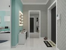
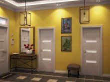
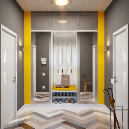
- The lack of natural light requires the use of not too bright, but expressive tones. Suitable yellow, mint, pink. They look best in a company with a snow-white range, especially since this combination will visually increase the room.
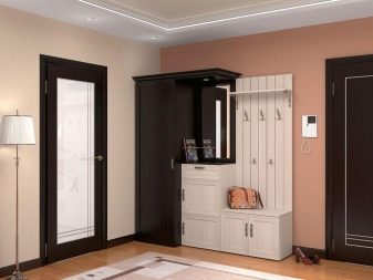
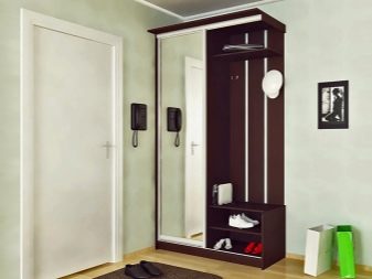
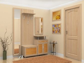
- Furniture in a soft monochrome is a very effective solution for a bright hallway. And the beige-milk range in the wall patterns will hide the imperfections of the surfaces. In addition, this is a very sophisticated design option.

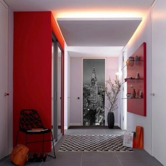
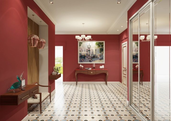
- Red and gray combined look very dynamic, relevant and non-trivial. This trend is at the peak of popularity because gray perfectly balances the fiery red or orange. At the same time, the whole composition looks worthy and not at all vulgar.This combination works especially well for visually correcting proportions. For example, if the far wall of the narrow hallway is decorated in red, the room will become more square. Redness can be successfully replaced with a shade of cherry and wine and berry gamut.

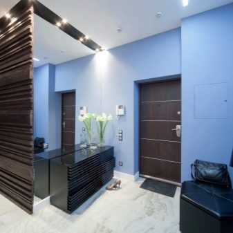
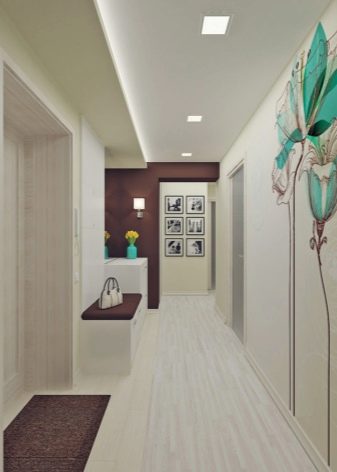
- Very rarely in the design of corridors they use blue shades, but in vain. Turquoise, celestial scales are capable of introducing freshness, freedom and a lot of air into the cramped interior.

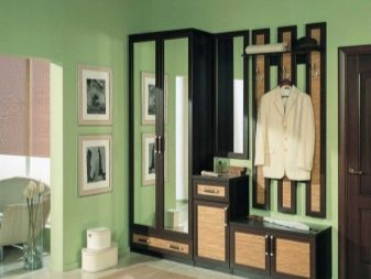
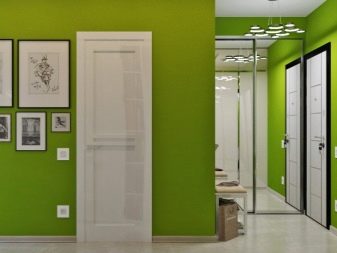
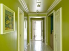
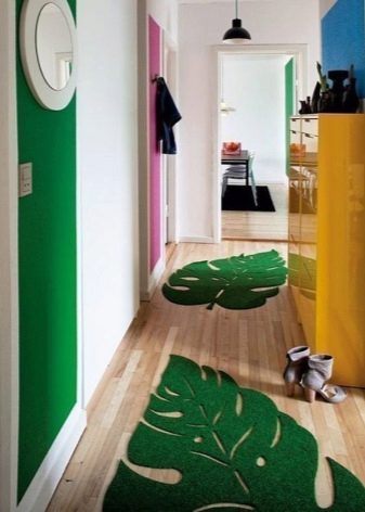
- Bright greens are ideal for many styles. The most trendy shades: pistachio, olive. They look great in company with a coffee range, such as latte.
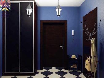
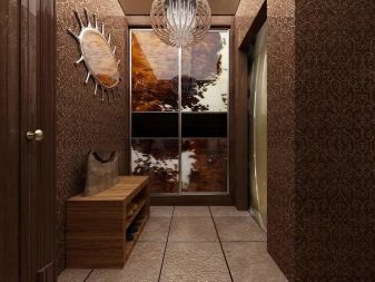
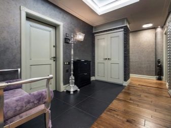
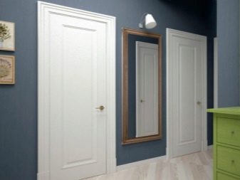
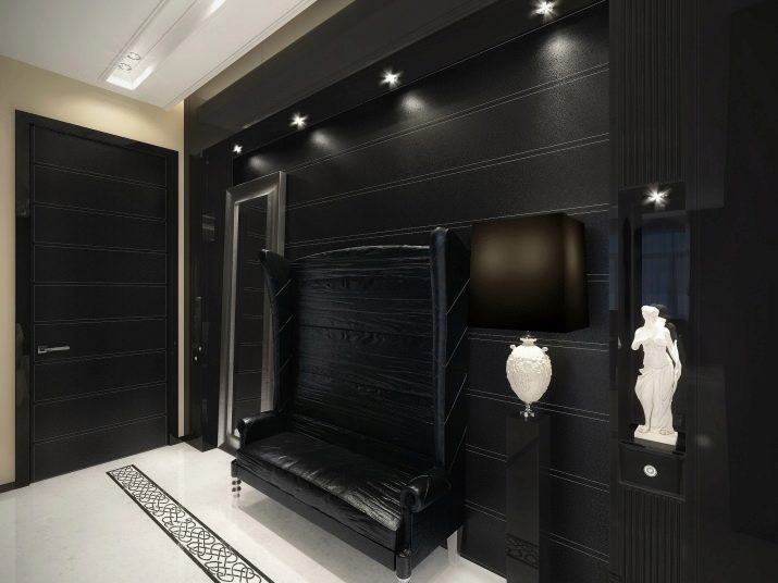
If your goal is a dark hallway, you should consider these points.
- Dark color options in the hallway are not such a frequent choice, since optically they make the room smaller.
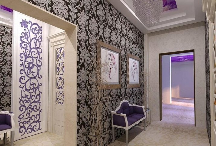
- Always combine dark shades with light ones. For example, combine violet with lilac, decorate the brown hallway in chocolate and milk tones.
- The light floor and decor details look great on a dark background.
- Refuse the dark hallway if the room is small.
- The same applies to the classical style - dark tones do not suit him, be sure to consider the overall style mood and color in the apartment.
Color and style selection
Not only the shades of the selected furniture, decorative elements and finishes should be harmoniously combined. All these details should make up a single stylistic composition, fit and match each other.
Before you finally decide on the color, choose a style that suits you. And as part of the concept, make a decision on color. Almost all existing styles are suitable for a hall.
However, there are a number of areas that should be considered first of all..
- Classic, modern. These styles are similar precisely in color. First of all, these are light shades: white, sand, beige, cream and brown gamma. If you want a universal picture - choose white, for the corridor this is a great option.
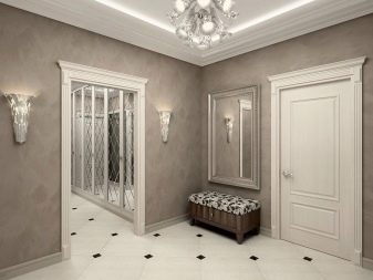
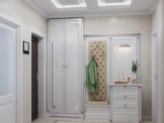
- Baroque. This luxurious style is suitable primarily for a large room. Saturated shades are its integral part, especially pink gamma in combination with white and gilding.
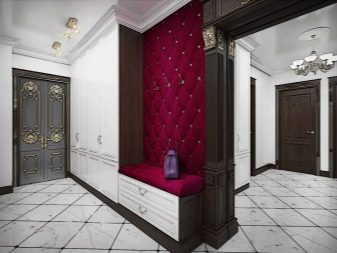
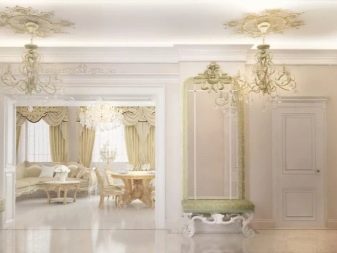
- Rococo. This concept also emphasizes the elitism of interior items. But the color in it is more calm - a brown palette, beige, cream. Perfectly complement these shades with golden decor.
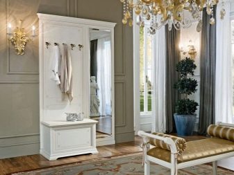
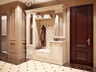
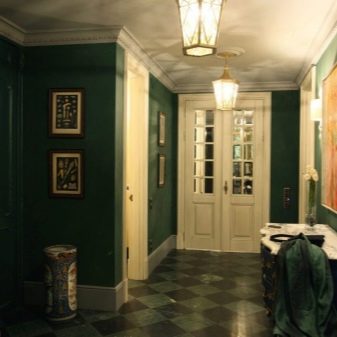
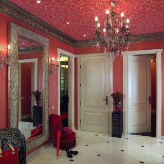
- Empire. This style does not tolerate halftones, based on bright shades. It is best to opt for greenery, red, blue. Gold is simply necessary.
- Minimalism. The most concise and strict style, the decor of which is completely absent. The color scheme matches the concept: neutral, concise. It is optimal to use a combination of white, black, gray, brown, cream.
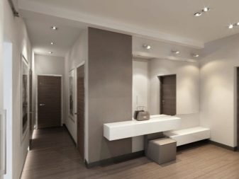
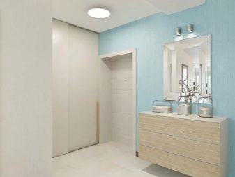
- Pop Art. A bright extraordinary direction in which calm tones are inappropriate. Catchy, flashy, juicy shades of sand, yellow, orange, pink are perfect.
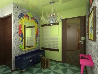
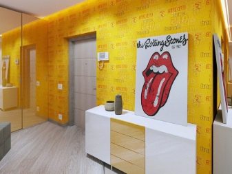
- High tech. A style in which functionality comes first. The color scheme is restrained, mostly gray. Metallic luster and gloss will complement this direction well.
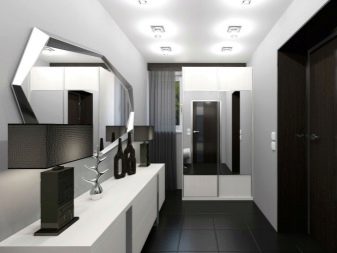
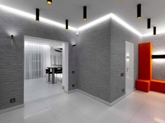
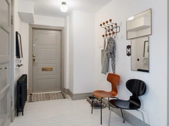
- Scandinavian. A very popular style, which is distinguished by the simplicity of forms and softness of the selected palette. White, gray, blue with bright rare impregnations form the basis of the style.
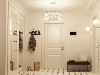
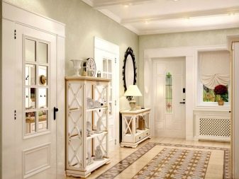
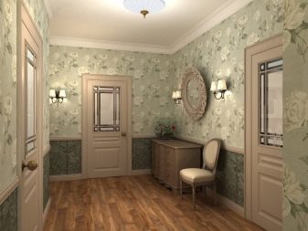
- Provence. The style of the French province is distinguished by elegance, freshness, floral motifs and pastel color combinations.
Feel free to combine beige or white with mint, lavender, faded lemon, light blue and pale pink.
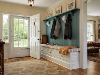
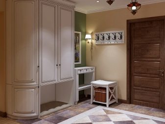
- Country. Another rustic style in which the main core is naturalness and naturalness. The priority is natural shades: greens, blue, brown, all shades of wood.
Finish
The ceiling in the hallway is optimally designed in a snow-white range. Gloss is better suited for modern styles, a matte finish will give the classic design status and respectability.Sophisticated ceiling structures, bright color tones are not recommended for the hallway. To cover the floor, most often choose ceramic tiles or porcelain tiles, high-quality linoleum. You can use parquet, laminate or a combination of them with tiles. The color of the floor should be either darker or lighter than the walls, not merge with them. As for wall decoration, there are many good options.
- Wallpaper. The most universal solution. Choose moisture resistant wallpapers that are easy to clean. The color scheme should be selected in accordance with the style.
- Paint. The most practical option, updating this coverage is very simple.
- Water-based coating - quite persistent. Most often, such a paint is snow-white, but with the help of a tint it is easy to fix it.
Remember that the color of the walls should not be darker than the furniture, the walls are the background for the rest of the items, so to make them profitable, you need to make the walls a little lighter.
Narrow and small hallways
This is a common layout problem, but visually, many flaws can be fixed with color, light, and decor:
- organize the right lighting system, which is not limited to one chandelier;
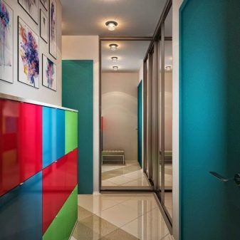
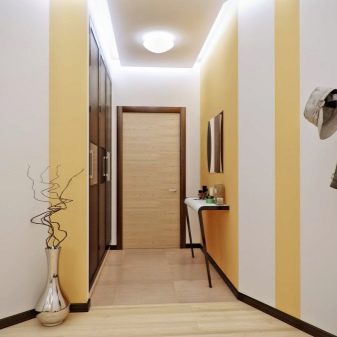
- Choose simple shades for decorating walls, abandon complex combinations, large patterns and ornaments;
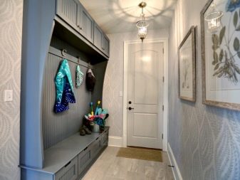
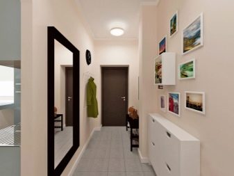
- Monochrome is an ideal solution for any style, but you shouldn’t design everything in one color;

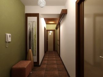
- cold pastel visually expands the space;
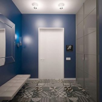
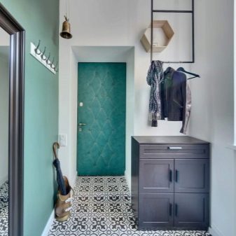
- a dark decorative surface with a white pattern will perfectly enliven the interior;
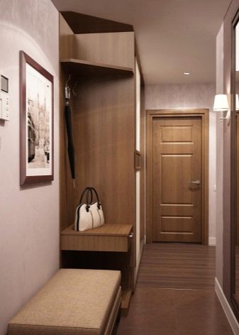
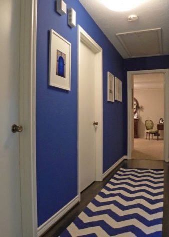
- do not strive for monotony, such designs are very tiring, be sure to dilute the composition with interesting bright details;
- use a gradient - a smooth transition of shades in the design;
- horizontal lines make the room wider;
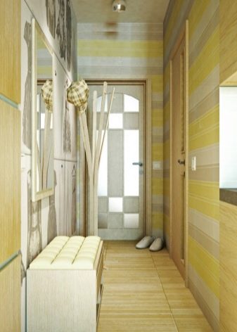
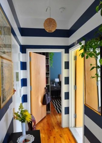
- vertical lines visually raise the ceiling;
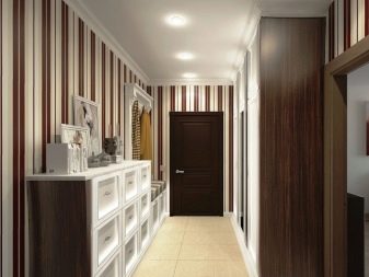
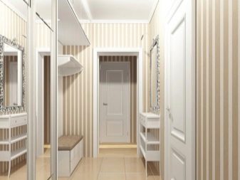
- it is not necessary to use a strip; a correctly directed pattern or ornament acts in exactly the same way;
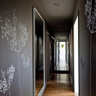
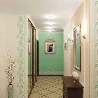
- gloss visually adds space, do not skimp on mirrors and reflective surfaces;
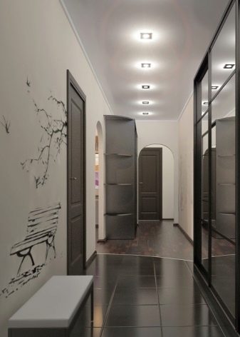
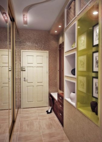
- the dark range narrows the room, so use such tones as accent, for example, brown furniture on beige furniture;
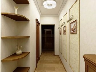
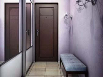
- the monochrome interior perfectly enlivens the color lighting: green for relaxation, pink and gold for mirrors.

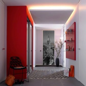
Beautiful examples
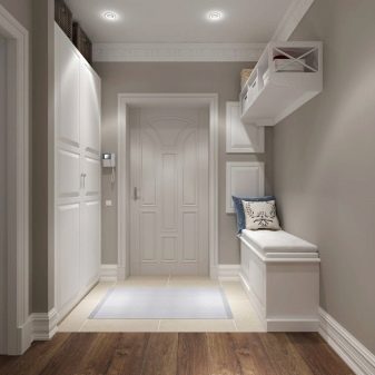
The white entrance hall is a universal solution.
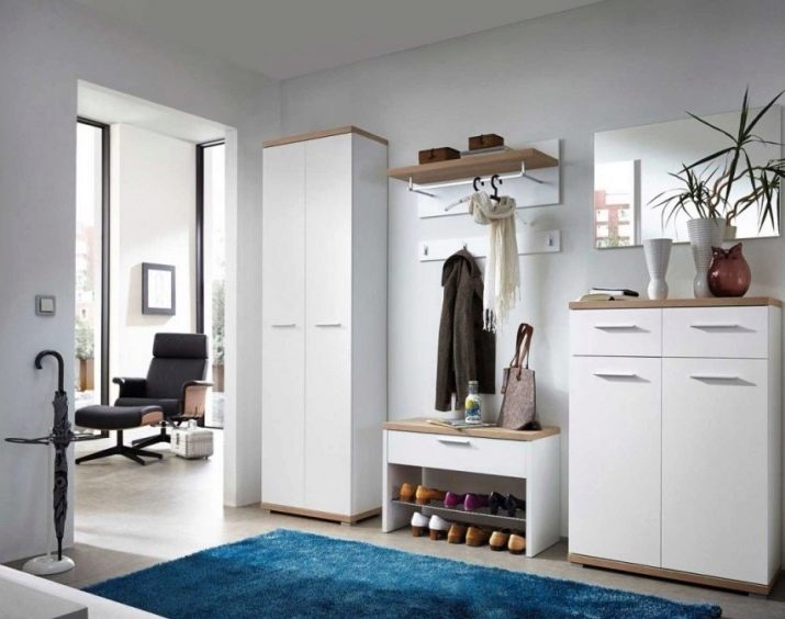
Black is an unusual and luxurious choice.
Yellow elements are very refreshing design.
Red and wine shades are well suited for an expressive interior.
Lilac and violet in combination create a mysterious and magical decor.
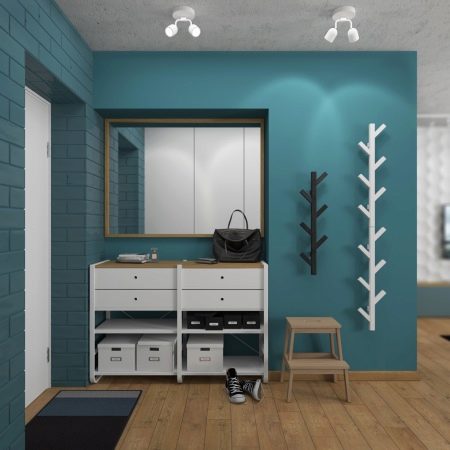
All turquoise tones form an original sophisticated design.
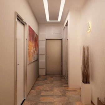
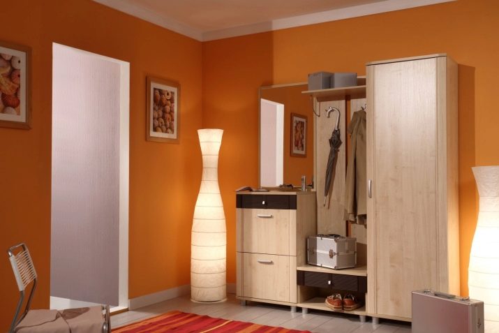
Orange is best combined with a neutral beige palette.
Useful tips for repairing the hallway and living room see below.
