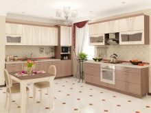
The contrast in the interior fills the room with energy and dynamics. Not always contrasting combinations can be sharp as a black and white combination. There are soft, gentle variations, for example, beige and chocolate, gray and blue. Contrast kitchen sets in which the top is lighter than the bottom is a very popular design decision. The combination can be selected for almost any mood and style.
It all depends on your taste preferences and the size of the kitchen.
Features
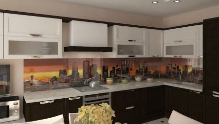
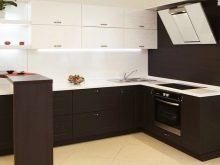
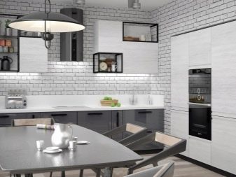
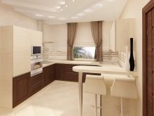
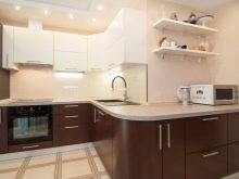
Kitchens with a white top and a dark bottom in the interior are used very often. A variety of combinations of shades in the kitchen set allows you to create a composition for almost every taste. You need to know some features of color combinations. For example, a dark color is not suitable for a small room, while a light color will make the room more spacious visually.
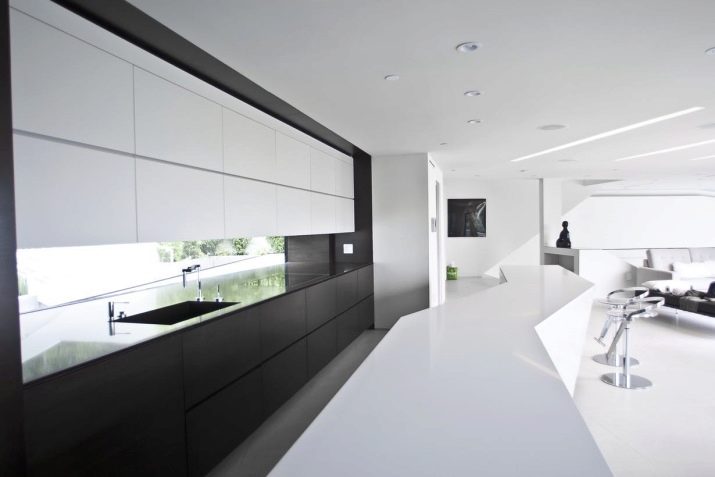
If you really want to use a darker shade, a combined kitchen will be the perfect solution. The top of the kitchen can be any shade of snow-white scale, the bottom - from beige or cappuccino to any darkest tone. In large kitchens, you can safely use chocolate, black, dark blue and blue, all shades of dark wood. They blend perfectly with white, so such a duet will not cause problems.
Color is of great importance in design, and not only the basic, background colors, but also additional accent tones. If you use only dark shades, the room will turn out gloomy, monochrome light will make it boring. A two-color headset is a very interesting solution.It will give the interior originality, non-triviality.
The combination of a light top and a dark bottom is visually very harmonious, soft, comfortable.
Colors for the kitchen
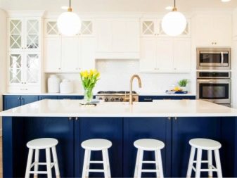
The choice of colors when creating a design project is based not only on your own taste, but also on the requirements of style. It is very important to consider the size of the room. The light top of the headset does not have to be boiling white; soft shades of beige, cappuccino, cream, ecru look great. As for the bottom, you can go beyond black and brown and consider wenge, blue, emerald, wine tones.

Be sure to consider the overall style orientation of the room. Modern styles of technological mood look better in a cold palette. Country, Provence, shabby chic are good in pastel-warm combinations of a neutral character without catchy details. Retro and classic are organic in combinations of pure white with cherry, wine tones, burgundy, gold. In addition, each color has its own combination features.
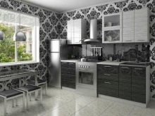
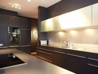
- Grey. This is a neutral, restrained range, it is classified as universal, as it goes well with different palettes. A pure gray headset will look dull and gloomy, but in combination with white it will be fresh and interesting. This combination will perfectly take root in any modern style: high-tech, loft, industrial, futuristic. Effectiveness perfectly emphasizes the glossy surface.
Be sure to add bright details to the composition, such as red or lemon tones.
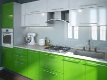
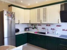
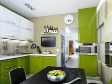
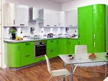
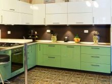
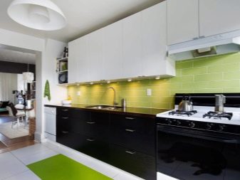
- Green. This is a very fresh palette of a natural type, the dark shade of which is appropriate in different styles. A great addition to such a kitchen will be wooden floors and the corresponding decoration of the room. You can add gray, pistachio, yellow to the overall composition, depending on the style and desire. Perfectly emphasize the combination of metallic luster: appliances, accessories. White-green kitchen will be able to decorate the kitchen in eco-style, Japanese, modern style. Matte facades will look softer than a strict gloss.
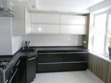
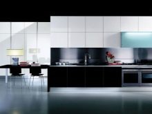
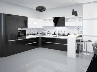
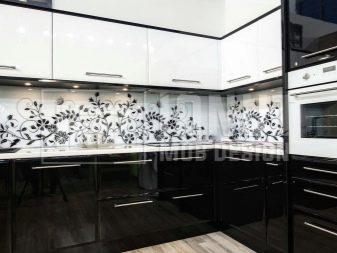
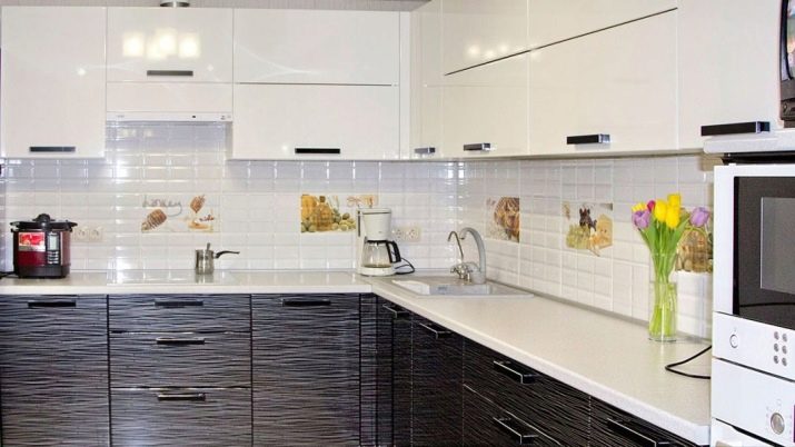
- The black. This color in a duet with white always looks win-win in terms of composition. But such a chess kitchen can be too strict and gloomy if you do not add catchy details to it, bright or soft. Remember that a glossy black surface is very easily soiled.
The slightest flaws will be visible on it, and the cleaning will be quite thorough.
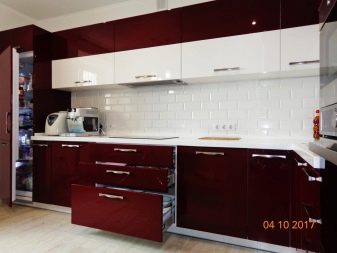
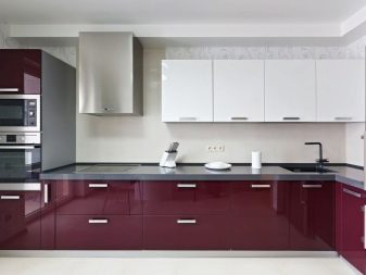
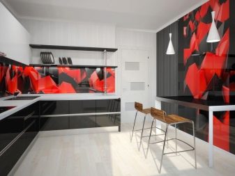
- Red. In this gamut, dark tones are considered all the tones of the wine palette. It perfectly combines with almost all shades of white. This solution will perfectly complement the gilded fittings and spectacular details in retro style. A tandem of white with a Bordeaux, cherry emphasize the luxury of Art Nouveau, classics. Very interesting fit in the details of green.
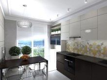
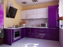
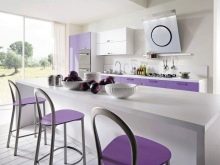
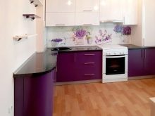
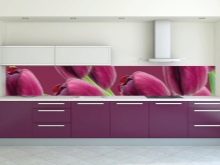
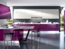
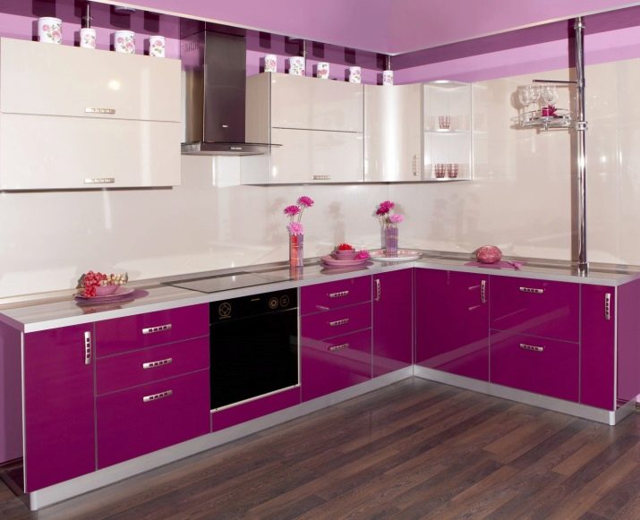
- Purple. Purple-violet palette is very often used in the design of kitchens. This direction is quite relevant. However, this gamma is quite difficult to combine. White color is one of the few with which purple does not look elaborate and not gloomy. White perfectly balances and softens, adds air and freshness. The composition will be complemented by either close light lilac, pink tones, or the opposite - pistachio, yellow, blue. In the first case, the kitchen will turn out to be as romantic and gentle as possible, in the second - technological and catchy.
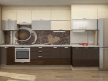
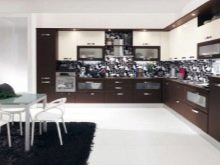
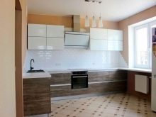
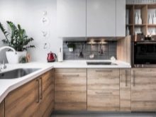
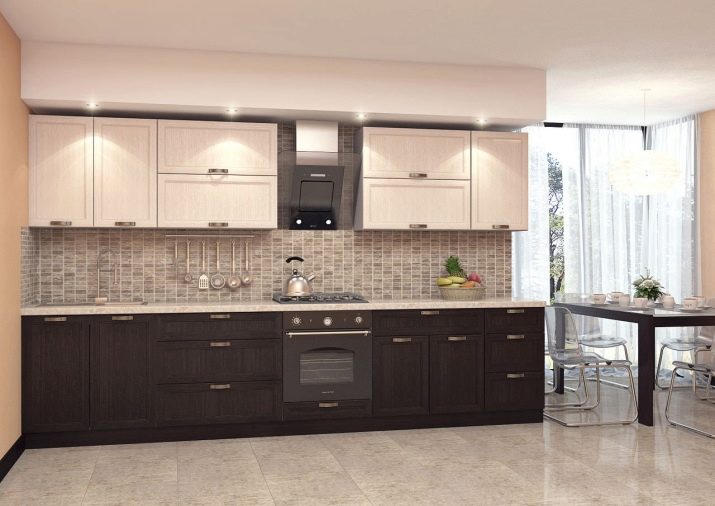
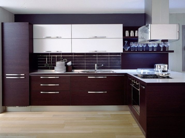
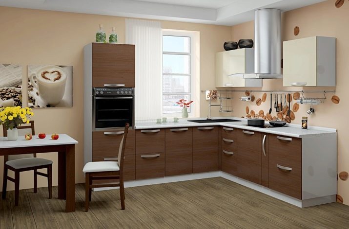
- Brown. This is perhaps the most common palette in the design of kitchen sets, because brown is a natural shade of wood. The range of brown is very diverse: chocolate, coffee, wenge, sepia, black-brown, oyster, red-brown, copper, clay, beige-brown. This is a great outlet for classic styles, baroque, retro, country. Brown gamma goes well with warm shades of white. A very popular solution, which is appropriate not only in classical but also in modern styles - wenge and cappuccino. These duets are suitable for rooms of any size.Perfectly complemented by details of green, yellow, gold, olive flowers.
How to combine with the interior?
Very popular combinations of white with black and white with gray are quite universal. From the point of view of psychology, they can cause depressive thoughts, so it is worth using not only the achromatic palette in the design. Chromatic shades can be used as complementary or accent. In order for the headset to be an organic combination with wallpaper, floor, ceiling, other furniture, it is very important to think over the composition as a whole. There are certain combination rules, the knowledge of which is useful when choosing a two-color headset. Color combinations may be as follows:
- monochrome - monochromatic or with a small inclusion of similar shades;
- contrasting tandems - connect the colors of the opposite palettes;
- triad - combines three harmonious in palette, but contrasting in tone colors;
- combinations of adjacent tones - when they bring together in one composition close tones and colors in the color wheel.
It is very important to observe proportions, the main color occupies most of the space, the additional color emphasizes it, and the accent color adds catchy details. In any case, do not use more than 5 tones in the design of the room. If you have already chosen two colors for the kitchen, everything else should be designed in harmony with these palettes. The composition itself with a white top and a dark bottom is quite organic, it increases the visual space, so it can be used indoors of any size.
Apply this rule not only when choosing furniture.
A dark floor, lighter walls and a lighter ceiling visually make up the perfect combination with a two-tone headset. Remember that the furniture should stand out against the background of the walls, that is, be at least a little bit darker. Avoid too dark walls, otherwise even a large kitchen will become gloomy and cramped. Use dark and bright colors to emphasize, highlight zones.
Angular headsets should not be made too dark, this will aggravate the feeling of blackout in this area.
An important role in the interior is played not only by the correct arrangement of color accents, but also by the combination of textures, surfaces of materials. For example, not a monochrome surface, but decorated with a pattern, image, ornament will look more interesting. Matte facades and gloss also look different. However, you should be careful and restrained, you can not combine in one composition a lot of colorful things.
Interesting Design Ideas
Wenge and cappuccino - one of the most popular and status combinations, is appropriate in almost any style incarnation.
To black and white kitchen was not too strict, you can use textured surfaces. In addition to aesthetics, it is also practical.
Bordeaux and white - an incredibly juicy and bright combination that allows you to embody the most interesting fantasies in design.
Brown and white are classics of kitchen design, so this is one of the most common variations.
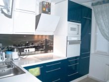
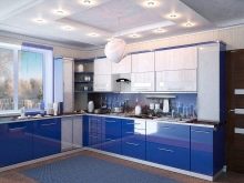
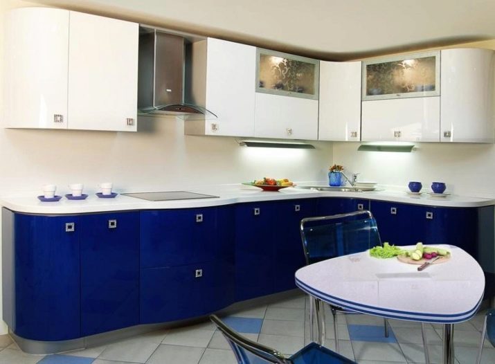
Blue and white are very noble shades, while restrained and non-inviting. Neither allow you to use the most diverse decor.
Violet and white is a trendy modern tandem. It can be conservative or romantic depending on the shade and decor.
In the next video, look at a kitchen with a white top and a dark bottom.


