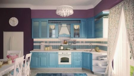
The corner layout of the kitchen is a very common design option. Its popularity is due to its versatility for any area, ergonomic use of space, stylish appearance, spaciousness. The corner kitchen is perfect even for small spaces. Most often, a sink is placed in the corner, so the ergonomics of the kitchen triangle are most effective. Moreover, the transfer of communications in this case is practically not required or becomes unproblematic, such as, for example, taking out a sink under a window or in an island module.
Advantages and disadvantages
The prevalence of corner modules in the kitchen is very high, while most consider them very versatile. Unfortunately, if you incorrectly calculate the capabilities of the premises, do not weigh the pros and cons, you can get uncomfortable space.
Before making the final choice in favor of the L-shaped layout, you need to evaluate the shape of the room, size, degree of illumination, try on other variations.
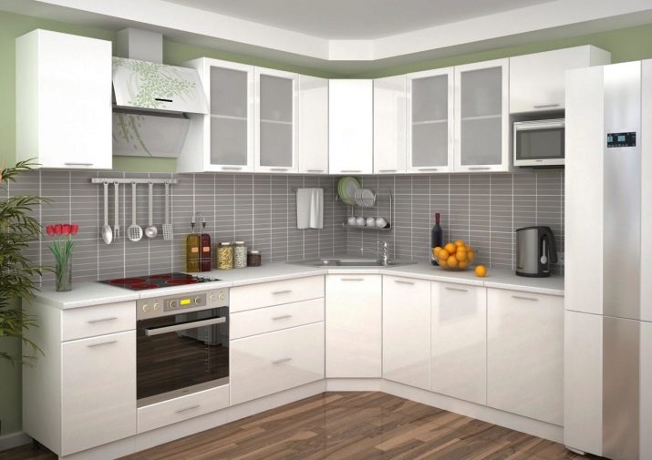
For example, the corner module is completely unsuitable for a narrow, elongated room.
Among the advantages of a corner kitchen with a sink in the corners, the following are distinguished:
- the angle makes it possible to most comfortably place the working triangle, to make the kitchen as functional as possible;
- one of the corners of the room is fully involved, expanding the possibilities of arranging the space, making it practical;
- the depth and spaciousness of the corner kitchen set allows you to correctly equip storage sections;
- spectacular appearance, suitable for many style decisions.
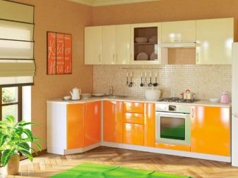
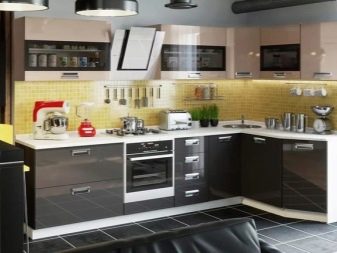
There are also disadvantages that need to be considered at the stage of project planning:
- if the walls and floors are uneven, it is rather difficult to design the corner module, especially when there are ledges in the wall;
- by placing the sink in the very depths of the corner, you can get a not-so-comfortable working place, it is better to shift it a bit, leaving the corner empty;
- if the room is dark, it is necessary to qualitatively organize the lighting of the corner, to choose light colors for the headset, otherwise it will be too gloomy and uncomfortable to work in this area.
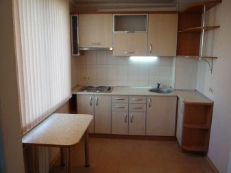

Layout options
There are several designs for a corner kitchen with a sink.
- Classic corner. Here the headset is placed on both walls perpendicularly. It can be used in rooms of any area.
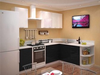
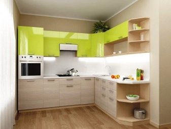
- Peninsular layout. In this situation, the modules are placed on one of the walls, and the angle is placed across the room, the peninsula. This option is only suitable for large rooms in the shape of a rectangle. The peninsula in this case separates the dining group from the working area. It can end with a bar counter.
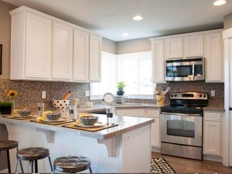
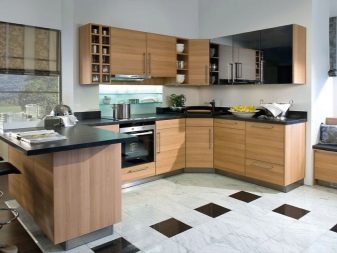
- Layout with a bar. More reminiscent of a P and F-shaped arrangement, when the bar is not only the right or left side of the headset, but also placed in the middle of the headset. This option should not be considered in a small kitchen, if it does not become a complete replacement for the dining area.
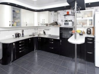
Thinking over the variations of the layout, it is necessary to take into account the location of the working triangle in it. Angles 1, 2 and 3 are the vertices of this functional triangle - stove, sink, refrigerator.
Remember that the sink should always be located in the middle of the triangle, and angles 1 and 3 can be interchanged. Therefore, if the sink is installed in the corner, then the vertices 1 and 3 are located on the right and left sides of the equilateral triangle.
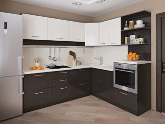
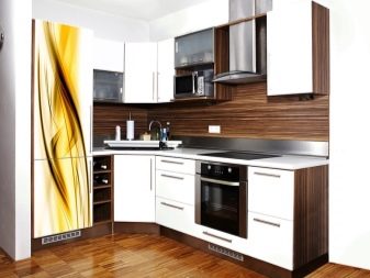
The corner module can be beveled and straight type.
- Beveled allows you to get easy access to the inside of the module, it is roomy, looks spectacular, slanting frees access to the sink. But if it is too deep, the flaws become palpable, since it is difficult to reach the wall.
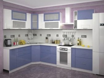
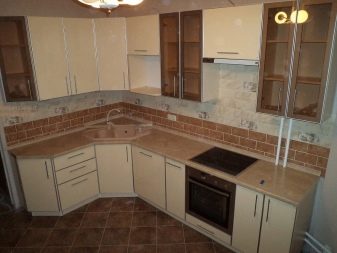
- Right angle Looks good in modern style solutions, for example, loft or minimalism. In addition, if the area of the kitchen is small, this option is preferable, since it takes up less space. But access to the contents of the module may not be too simple. You can make a folding module, in which two facades are connected by loops. If the module is deep, roll-out sections and drawers work well.
Selection of materials
Corner headsets are made from a variety of materials, you can choose both budget and expensive. It is important to consider the chosen style of the room. The most common are several options for facades.
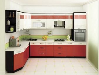
- From chipboard. They are affordable, easy to use, do not fade, are not afraid of detergents, a large selection of colors, textures. At the same time, they are not too environmentally friendly, if the coating is broken, they emit harmful substances. Easy to damage mechanically, short-lived, hardware loosens quite quickly.
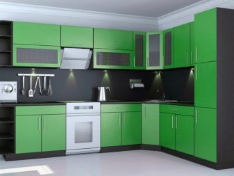
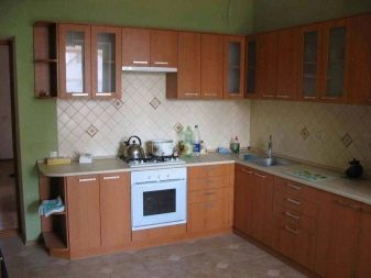
- From MDF. Eco-friendly and safe, it is difficult to scratch, damage mechanically, serve for a long time, budget. It is necessary to equip the joints with quality protection.
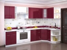
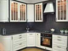
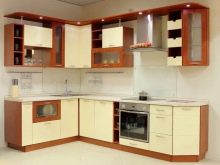
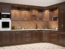
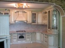
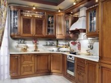
- Array of wood. They are completely safe, look status, spectacular, they are durable, they last a very long time. Demanding in care, are expensive.
Style solutions
As for the style, the L-shaped headset easily fits in almost any direction. There are the most relevant options that designers recommend considering first.
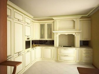
- Classic. Only natural materials and neutral colors are used here, the silhouette of the headset should be clear, but smooth. It is better if the technique is hidden by the facades.
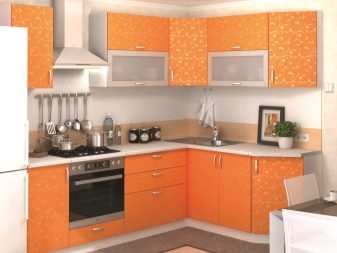
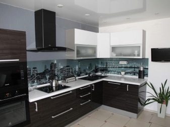
- High tech. The lines in this style are more strict, the emphasis is on functionality and simplicity, the decor is as concise as possible. Metal elements, synthetics, gloss fit well.Neutral tones are used: white, black, gray and bright - red, orange.

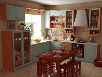
- Country. Ideal for a country house, it is a style of rustic motifs. The furniture is made only of natural wood, natural shades, landscape motifs, floral decor, and a cage are welcome.
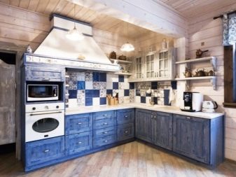
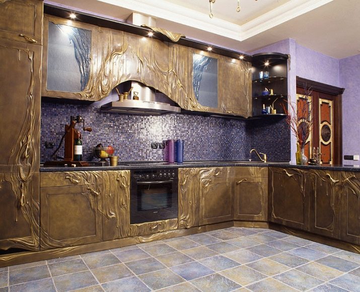
- Eclecticism. It looks good in both large and small kitchens. In this style, you can combine different materials, colors and textures. However, you must have knowledge of color and artistic taste, so that the composition is harmonious.
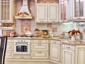
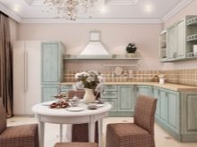
- Provence. A style that embodies the spirit of the French province. It uses white or light furniture, often artificially aged, many floral motifs, textiles, elegant decor. The color scheme is pastel, soft, unsaturated.
How to choose a color scheme?
First of all, the choice of color should fully correspond to the chosen style direction. In addition, it is necessary to take into account the size of the room for defects that can be visually corrected. We must not forget about how this or that color affects the human psyche. There are light, dark and bright colors.
Light shades are considered easily soiled, but they look very impressive. In addition, their impracticality is rather relative; on light surfaces, streaks and rubbish are less noticeable than on dark ones. The bright range works great in small kitchens, visually expanding the space, raising the ceilings. You can use white, beige, ivory, cream, cappuccino. In addition, the pastel palette looks great in the interior of certain styles: lavender, mint, light lemon, delicate blue, pale pink. Neutral light tones of white and gray are perfectly combined with other palettes.
Light colors can be cold and warm, it is very important to choose the right temperature, taking into account the characteristics of the kitchen.
If the room faces north, it is better to increase the degree of gamma. Almost any decor looks great on a light background.
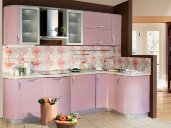
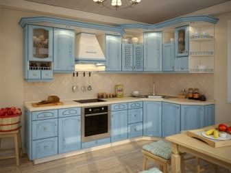
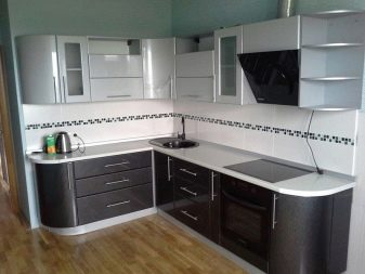
Dark palettes are most often used as an additional or accent color, since a gloomy background can not only make the room visually cramped, but also oppress the psyche. Dark tones do not bring light into the composition, so use them in a corner kitchen with caution. It is very important to consider competent coverage of all areas. Darkened tones make things heavier, so it's better to abandon the complex decor in such kitchens. Very often, corner headsets are made in the colors of chocolate, gray, violet, metallic, blue.
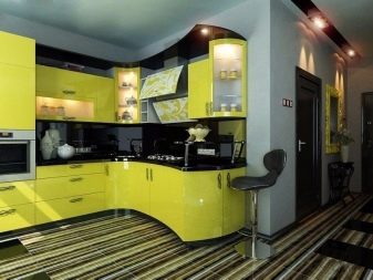
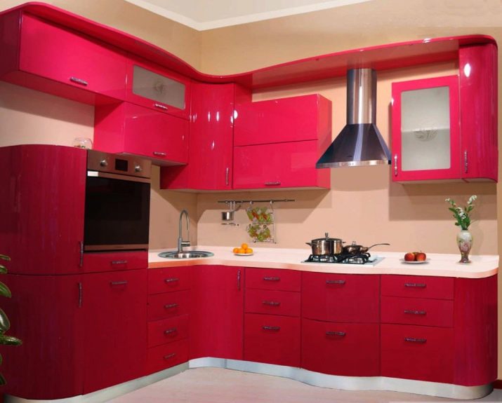
Saturated shades organically look like accent spots. And also they fit perfectly into creative, non-standard style directions. In the kitchen, you can safely use green, red, yellow, orange, wine tones.

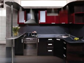
It is important that the composition does not have more than three shades, otherwise the interior will be overloaded, loud.
The main bright background looks a bit heavy.
Beautiful examples of interior design
Consider a few Interesting examples of corner kitchen design:
- bright colors are very effectively combined with a light gamut;
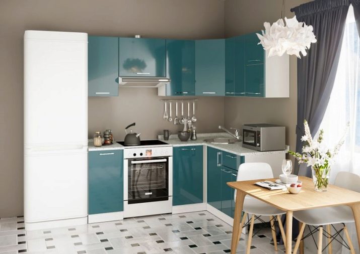
- the corner set looks great in a discreet color;
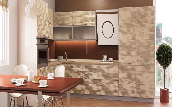
- the laconic design of the L-shaped kitchen is emphasized by a neutral palette;
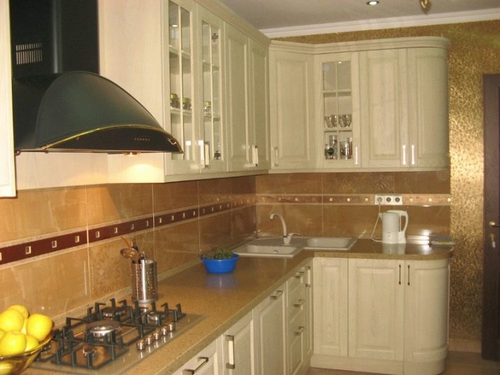
- the approach to the sink located in the corner can be facilitated by slightly moving it;
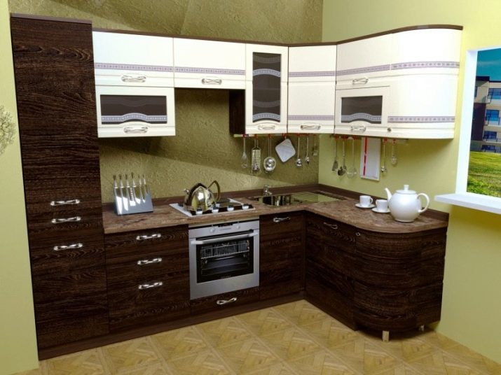
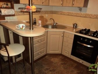
- even a small L-shaped set with a sink in the corner looks practical and aesthetically pleasing;
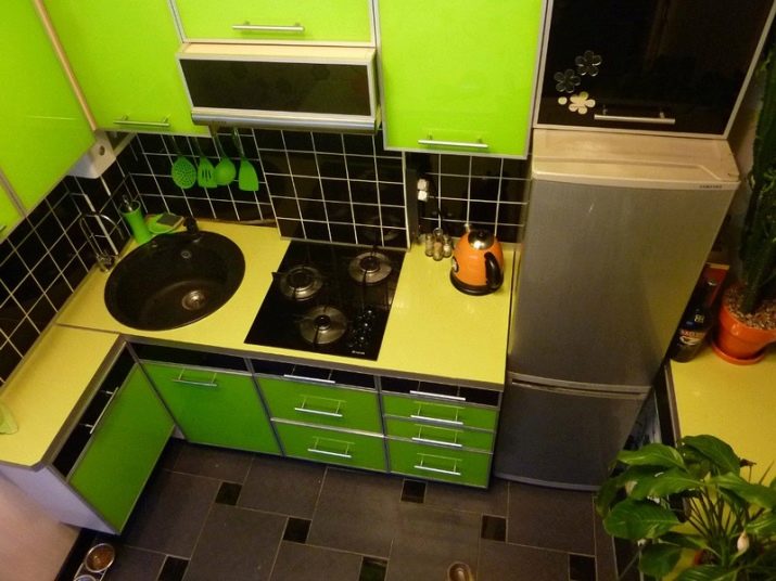
- the sides of the corner headset do not have to be equal in length.
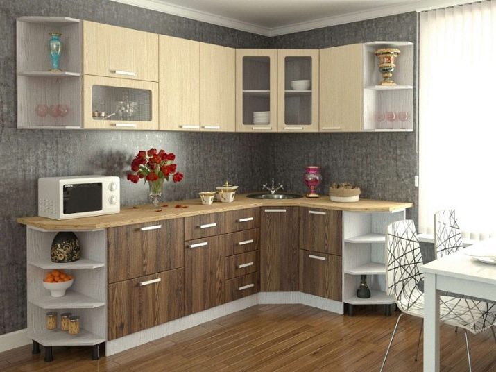
How to choose a sink for the kitchen, see the next video.
