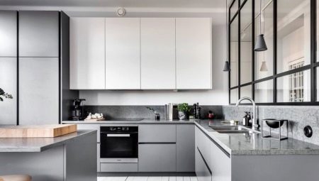
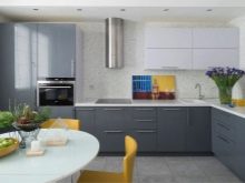
The choice of a kitchen set is a serious question, because it is the main element of the situation. In addition to functionality, you need to carefully consider furniture design, choose a style and color. Recently, many choose a laconic version with a white top and a gray bottom. Let's consider how to harmoniously fit these tones into the interior, as well as what the headset itself made in this palette can be.
Features
To many, the gray-white gamma seems boring and faceless. However, gray color includes a rich spectrum of shades of varying intensity and warmth. This allows you to create both a strict and quite comfortable interior. Consider other advantages of choosing such a headset.
- Relevance. The combination of gray and white always looks elegant and stylish. It does not go out of fashion and does not bother.
- Versatility. These tones can be entered into almost any interior style from classic to hi-tech.
- Creating a neutral foundation. The texture of wood and stone, metal, glass and plastic of any shades are perfectly combined with these colors. You can emphasize the individuality of the room using colored furniture (for example, chairs), accessories. Warm colors will add coziness to the kitchen, and juicy will make the atmosphere dynamic. At the same time, you can easily change the environment by introducing new touches.
- Optical effect. The gray bottom and white top visually increase the height of the ceilings. If you choose light gray as the shade for the bottom row of cabinets, this will also visually make the room more spacious.
- Mood creation. The combination of these shades creates a feeling of perfect order, purity and freshness.
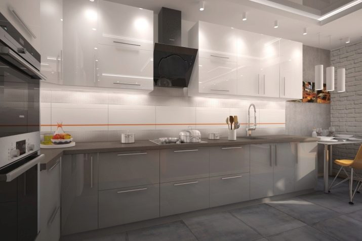
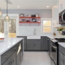
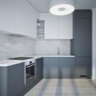
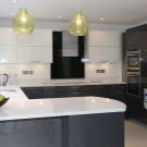
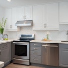
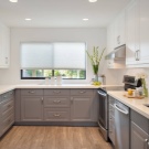
As for the shortcomings, they are few.To some, this gamut seems too cold and unpleasant. You can correct the situation by adding light warm tones, living green plants to the interior. However, if you choose dark gray as the color for the bottom row of cabinets, the headset may seem gloomy and heavy, and the room in which it stands is dark.
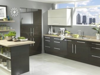
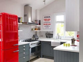
This option is only suitable for large kitchens with good natural light.
The material of the facades of the headset can be any. The cheapest option is chipboard. Medium in price - MDF. Both options can have a laminated matte or glossy finish. More expensive models are made of natural wood (veneer). As a decor, metal, mirrors, glass are used. The countertop can be made of natural or artificial stone, wood, chipboard, MDF. Materials are selected based on the budget, as well as furniture design.
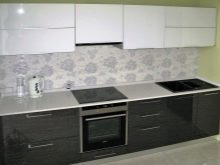
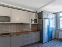
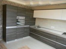
A few words are worth saying about the shade of the countertop. It can be made in the same color as the lower cabinets. In this case, a light apron is preferred. A white countertop will look great. It will make the headset visually lighter and more airy. With black it is worth being careful. Such a solution can only be successful if there is a light apron and a not too dark shade of the lower cabinets. In some styles, a beige table top with a wood texture (retro style or Scandinavian direction) will harmoniously look.
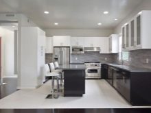
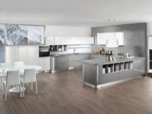
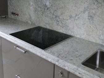
If we consider the issue of practicality, The best solution is to choose a matte white or light gray coating with a pattern for the countertop (granite, marble texture). On such a surface, minor scratches and specks will be less noticeable.
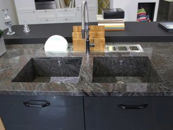
Difficult to care for are white and black gloss.
The form
The set can be located in the kitchen in different ways.
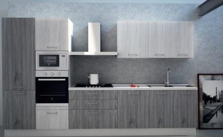
- Linear placement in one line - classic version.
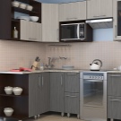
- Corner model - practical solution for small rooms.
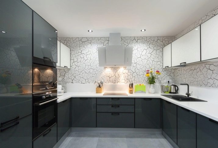
- For U-shaped version it is better to choose light shades of gray, because in this case the headset will occupy three walls.
- Model with bar or island only relevant in a large kitchen, like a U-shaped solution. In studios, the rack is often used for zoning spaces.
- In two rows. On opposite walls, cabinets are placed in narrow and long rooms. Light colors that visually expand the space are preferred here.
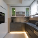
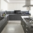
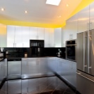
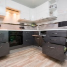
Stylistics
The kitchen in gray-white tones will fit into many styles.
Modern
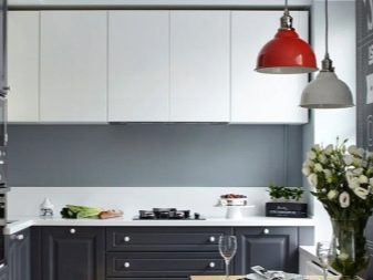
Minimalism and hi-tech technological. Cold shades of gray are relevant here. These are light ash tones and dark colors of the palette (asphalt, graphite). Such headsets are laconic, have no decorations, and often accessories. Instead of handles, a system with a push mechanism is used. The lines are clean and straight, surfaces are usually glossy.
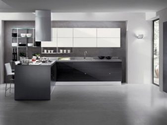
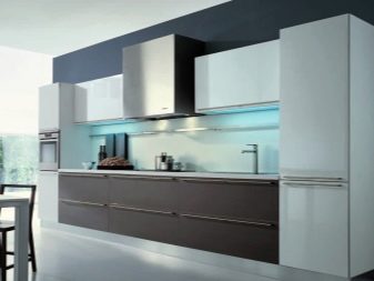
Smoothness and brilliance allow furniture to harmoniously flow into space, often “dissolving” in the shade of walls and surrounding objects.
The gray-white gamut in such interiors is usually present not only in the headset, but also on the apron, floor, other furniture. As accents, the decor of bright colors (red, yellow, orange, turquoise) is sometimes used. For the floor, choose a tile or natural stone in cold tones. The walls are painting.
Modern
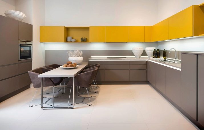
More emotional style. Curved facades, unusual shapes are acceptable here.. Surfaces can be matte or glossy. Sometimes a flickering shine is used, making the headset "smart". Shades of gray can be both cold and warm. Often used texture "under the tree." Here, the white-gray range can be “revived” with an interesting apron with a picture or softened with warm tones (for example, parquet flooring or wallpaper).
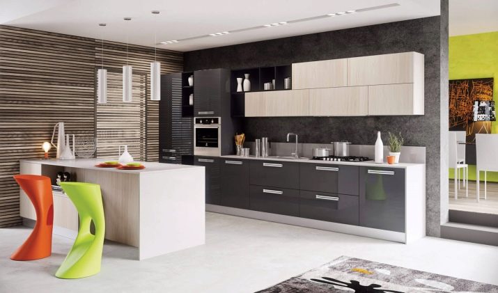
Bright additions are acceptable.
Classic
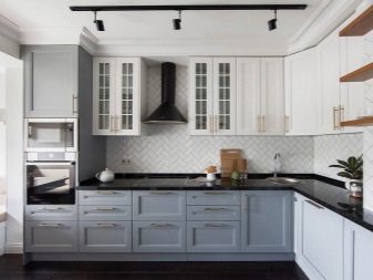
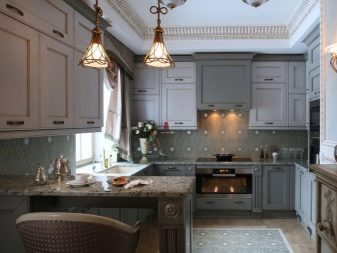
In the classical direction, this color palette is rarely used. In “royal” interiors warm colors prevail in combination with gilding, patina and other decorative elements.But in a strict variation of the classics, gray-white gamma is sometimes found. This combination makes the interior restrained and neat.
Classic headsets are made of wood, painted in gray and white or imitation of natural material. Cabinets have paneled facades of a rectangular shape. Furniture can be decorated with beautiful vintage accessories in silver, glass inserts. The interior is complemented by elegant curtains, beautiful lamps, elegant furniture. The color scheme of the atmosphere should include calm, muted shades.
Scandinavian
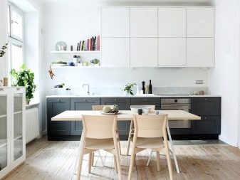
This style involves an abundance of whiteness, light and free space. The headset here should be simple. Straight lines, matte surfaces, uncomplicated fittings, combination with wood texture of natural warm shades (tabletop, floor finish, other furniture) – Here are the main features of the style. An apron is usually made snow-white. This is usually an imitation of masonry.
Provence
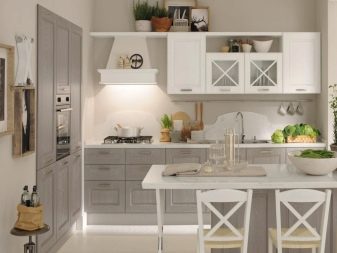
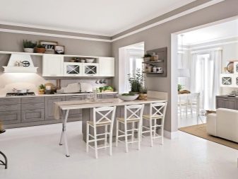
This retrostyle also involves an abundance of natural materials, simplicity and ease of design. Such a kitchen set has rectangular facades under a painted tree with vintage fittings without unnecessary decor. Sometimes apply the method of artificial aging of surfaces. A white ceramic sink, an apron made of square tiles or a “boar” will perfectly fit into such a design.
Browse the kitchen with a white top and gray bottom, see the video below.
