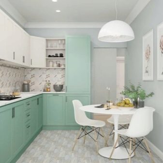
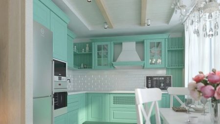
Spectacular and original design largely depends on the choice of color. It matters not only from the point of view of aesthetics, but also from the point of view of psychological impact on a person. Mint cuisine is a very unusual and beautiful solution. Peppermint colors are pastel colors, they are very delicate, soft, non-irritating. The combination with other tones of the menthol shade is elegant and refined. This color can be considered for walls, floors and even ceilings. Mint kitchen, textiles, decor - a very effective way to design the composition.
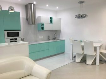
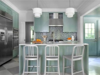
Characteristic
The pastel scale itself is unobtrusive, light and gives a feeling of spring freshness. Peppermint associative carries a person in the cool of a summer evening. It has several different shades: menthol, mojito, mint. All of them bring some weightlessness, calmness, peace to the interior. This color is bright, but unobtrusive. The positive energy emanating from the mint composition has a beneficial effect on the psyche. In this palette, you can safely make out the kitchen-living room, in it you can get a sense of serenity, a good rest.
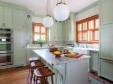
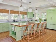
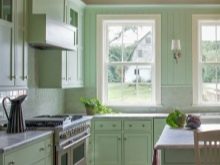
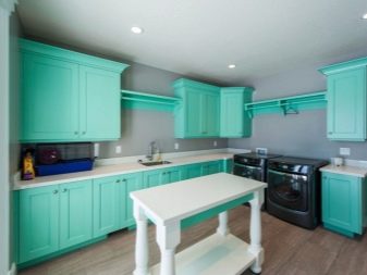
In addition to pastel colors, mint can be present in the interior in a rich variation. These are more catchy shades, they are more aggressive and require a neat combination with other tones. Bright mint looks better when used on glossy surfaces, but wallpapers of this kind can be tiring.

Advantages and disadvantages
Among the pros can distinguish:
- elegance, originality;
- naturalness, freshness;
- invigorates, gives strength, but does not disturb;
- pacifies;
- well suited for rooms of any size and degree of illumination;
- does not tire the eyes;
- non-marking.
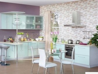
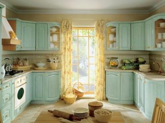
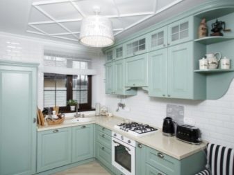
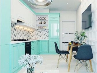
There are also disadvantages that most often occur with an excess of mint:
- light tones in large quantities unduly relax (to an apathetic state);
- the wrong choice of shade will make the kitchen "lifeless";
- Not suitable for all styles.
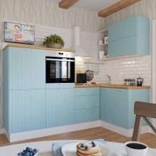
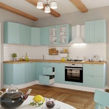
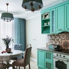
Use possibilities
It is possible to arrange the kitchen in mint shades in different ways.
Mint walls. Ideally, not all are designed, but one or two walls in this shade. Apron, furniture and decor of a different color will help to dilute the mint background beautifully.
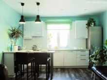
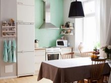
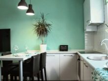
- Mint furniture. A very sophisticated solution, unusual and spectacular. As an additional mint shade fits perfectly.
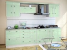
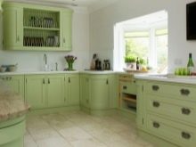
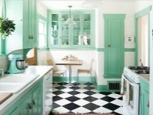
- Furniture, walls in mint color. This solution is not often chosen; it is best to design the kitchen in different shades of menthol. As the main color, choose more faded tones, for furniture - saturated.
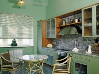
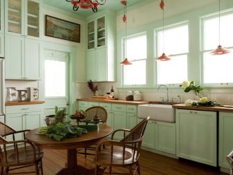
The best combinations
Any beautiful color can be "killed" or set in an unsightly light, if you choose an unfavorable combination for it. It is very important to combine the tones into a single composition. This must be done at the planning stage so as not to result in an unpleasant picture that will annoy and look unaesthetic. Designers recommend adhering to certain mint combination rules.
Choose hues in a single saturation spectrum. If you have chosen a pastel mint tone, all other colors must be selected in the same palette. Calm tones are suitable: beige, milk, soft gray, delicate blue, light pink, faded yellow, lavender, lilac.
In the event that the choice fell on bright mint, it is necessary that the colors in the union are not lost next to it. Saturated brown, blue, pink shades, fuchsia, coral, violet, orange, olive will do.
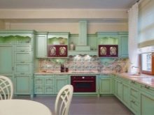

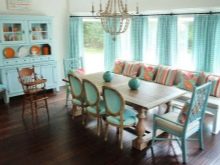
The design most often uses five popular combinations.
Mint and white. Mint and white kitchen is a very effective and widespread way of decoration. The result is a very fresh, lightweight design. You can apply not only boiling white, but also beige, ivory. So the contrast will be softer. An ideal solution for modern interior styles.
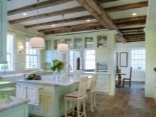
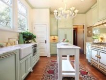
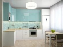
- Mint and chocolate. This is a classic combination, they can be distributed and combined in different ways. Even kitchen sets can combine both colors: the base and countertop - chocolate, facades - mint. Or a dark floor, light furniture. Great for classic styles.

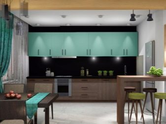
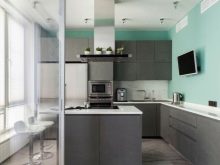
- Mint and gray. Mint gray kitchen is suitable for noble, restrained interiors. This is one of the most unobtrusive and elegant solutions. Gray will be able to concise any shade of mint, even the brightest.
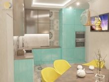
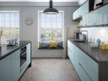
- Mint and pink. A very glamorous combination, romantic and tender. In such a kitchen would be nice to be. The perfect solution is pink furniture and walls in a light shade of menthol.
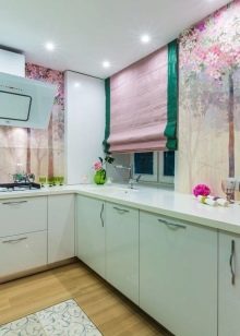
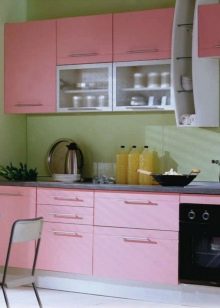
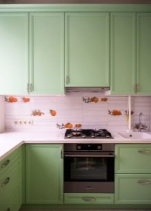
- Mint and violet. A very effective way of decoration that suits lovers of austere and energetic interiors. It is best to combine bright menthol with saturated violet or pale lavender with subtle mojito.
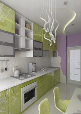
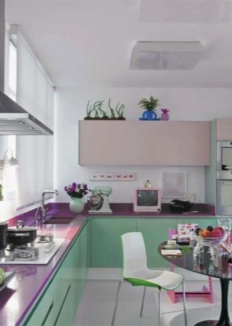
If you do not want to bet on contrast, choose shades that are close in gamut. So, in a company with blue and green, mint will look organic and elegant, and the design itself will be harmonious.
Which style do you prefer?
Since mint is a natural shade, it looks best in combination with natural materials. All tones of wood look great with menthol. Glossy design will give the right mood to the modern interior. A lot depends on the style in which the kitchen is equipped.
Country. Rustic, close to eco style involves the use of natural shades, landscape motifs. Green colors play a special role here, especially in combination with wood finishes. It is better to opt for soft menthol.
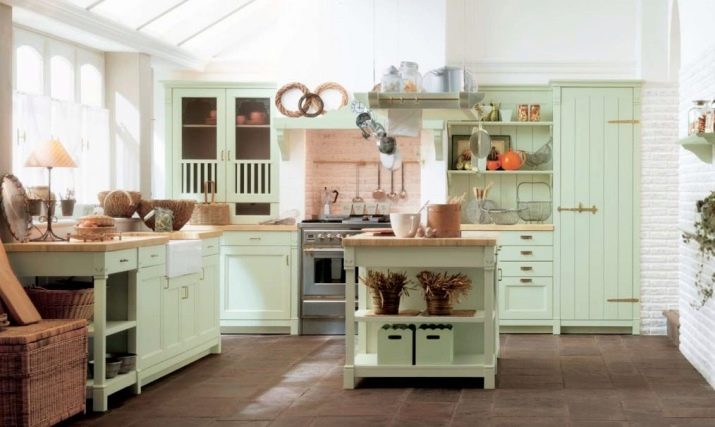
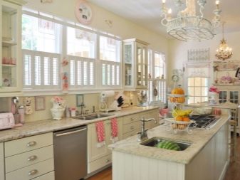
- Provence. The style of the French province is made out in a slightly different way.Mostly bleached furniture, pastel colors, floral motifs. Menthol in this case is chosen light, soft, faded, as gentle as possible.
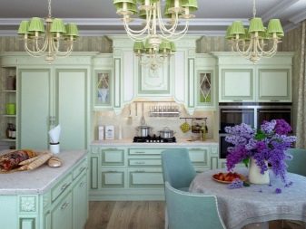
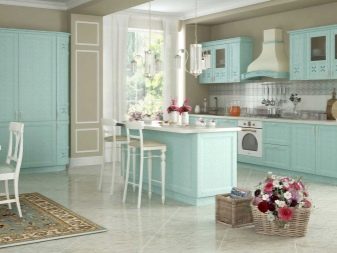
- Classic. Mint and brown - a leader in interior design in a classic style. Natural materials, high-quality textiles, lack of pretentiousness. The stake is on status and comfort.
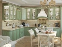
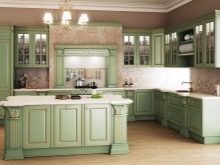
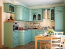
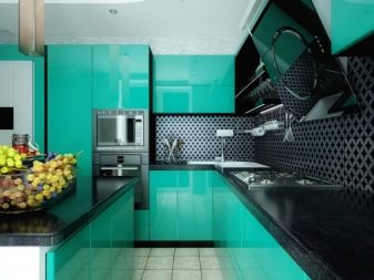
- Modern styles. These include minimalism and hi-tech. Their distinguishing features are contrast and manufacturability. Decor is minimized, functionality comes first. You can choose intense shades, but neglect the small details, decorations, excess elements. They are replaced by accessories of chrome type, gloss in the design of surfaces.
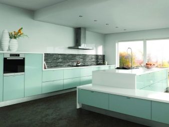
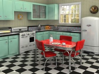
- Vintage styles. Retro is a very fashionable direction in which mint is present in a soft embodiment. This composition is complemented by geometric silhouettes without sharp corners, contrasting combinations.
Putting the right accents
Oversaturation with shades of menthol affects the overall composition in a negative way. If you are not sure about your color or don’t want to bet on peppermint, try using this color as an accent. It is enough if the shade is present in the textile ornament, wallpaper pattern. The glossy mint apron looks luxurious, especially in combination with brown.
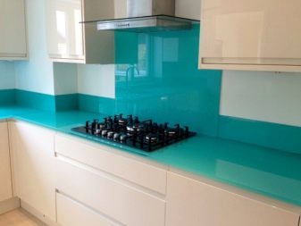

Peppermint details look great on a snow-white background. The ornament can be floristic, curly, abstract - depending on the chosen style. It is worth adding a bright blue stroke to this picture - and you get an incredibly beautiful design. Popular menthol emphasis solutions:
- towels, tablecloths, curtains;
- a wall in this color decorated with monochrome photos in white passepartout;
- mint mint tone and metallic glitter technique.
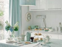
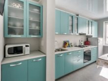
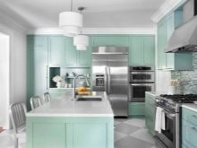
In addition to the detailed design, emphasis can be placed on the floor, walls, and ceiling. You should not choose a bright gloss for their design - it is better if they are matte. Against such a background, a kitchen set in a different color will look best: red, catchy blue, white, wood color. It depends on the style decision.
Choosing ceramic tile as the material, you can safely experiment with mint, but it is better if it is a pale, unexpressed tone.
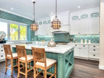
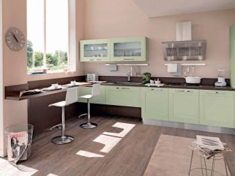
The flooring may not be monochrome. Original look: cell, gray-white stripes. A spectacular accent is the dishes in this gamut, it is better if it is a little more saturated than other menthol shades in the room.
Be sure to consider the degree of illumination: in dark rooms, use lighter tones, in well-lit ones - bright, saturated.
