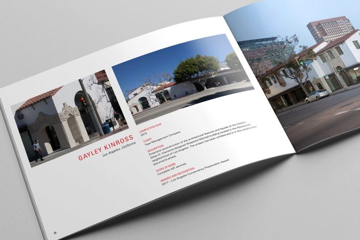
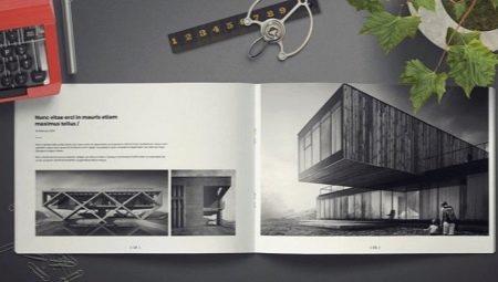
Portfolio - a professional document of any specialist in the creative field. When applying for a job, designers, fashion designers and architects should attach presentation material to the resume. However, architects in this matter are much more difficult. Their work is very rarely placed on the album format, so you have to improvise. Moreover, a detailed explanation must be attached to each work.
Decor
An architect's portfolio is his business card. A specialist with extensive experience in such folders have more than one page. But for students who have just completed their studies, compiling a portfolio is very difficult. Firstly, they have only educational drawings in stock. Secondly, they do not know the rules of registration of self-presentation.
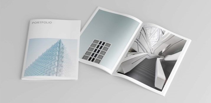
For these reasons, former students use a single design template. However, there are certain norms of this business card, which is not recommended to be avoided.
- File size. The total file size must not exceed 15 MB. Otherwise, when sending the portfolio to the email address of the employer, the document may be damaged.
- Words and mistakes. When compiling a portfolio, it is important to check the text for errors. An illiterate specialist will not be able to work in a large company.
- Length and content. The electronic version of the portfolio should not be voluminous. But the printed material in the folder can occupy any number of pages.
- Creation. Decorating portfolio pages should not interrupt the main details.
- Image selection. In the portfolio, it is necessary to exhibit works of various types of execution, for example: technical drawings, complex figures in the context, as well as term papers in paints.
- Layout. It is important to keep track of the structure of each individual portfolio page. There should not be any empty spots on the sheet, especially on the title page.
- Details Small, barely noticeable design details will help fill in the empty parts of the pages.
A visual example will help to understand the presented norms.
What should it be?
There are 5 basic principles for creating the perfect portfolio. And if you do not ignore them, you will be able to create a chic self-presentation.
- You can’t think about the cover for long.. Painted design only repels customers and employers.
- The rule of three. The portfolio should be viewed professional growth. For this reason, it is divided into student, professional and personal parts. The first section shows the work done while studying. The second section presents working drawings taking into account career growth. The third section talks about the imagination of the architect and its additional features.
- Many images - little textual information. The employer is looking at the work of the applicant, will not read the long text with an explanation of the submitted images.
- Freehand images. This format of work is of great interest to customers. An architect capable of creating not only on a computer, but also on plain paper, will never be left without work.
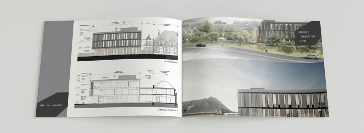
- Identical format. When compiling a portfolio, you can not deviate from the intended design. Indentation, font, and even the presence of a frame of images should be the same on all sheets. Otherwise, the overall picture will be lost.
It is proposed to consider the corresponding sample of several sheets as an example of design.
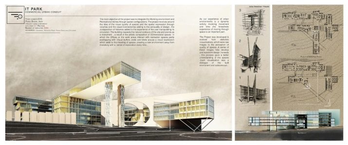
Possible mistakes
Many young professionals make a number of serious mistakes when compiling a portfolio. Unfortunately, such oversights result in a lack of work.
- You can’t put all the works in the portfolio. For such an important document, you should choose the best drawings.
- On the first page of the portfolio should be a brief biography of the architect. When telling about yourself, do not go into the smallest details of a career. Suggestive phrases will make the employer become interested in the person of the applicant and learn more about him during the interview.
- Only those works should be published in the portfolio which like the architect himself.
- You can use collaborative projects in your personal portfolio. However, in the explanation of the work, it is important to indicate the names of all the creators of the architectural masterpiece.
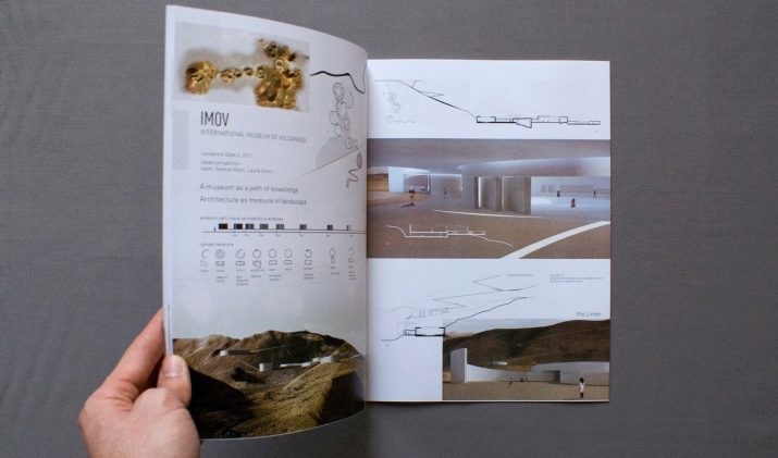
Compilation tips
Making a good architect portfolio is really easy. The main thing is to adhere to the basic rules and try not to make mistakes during design.
The best architects, understanding the importance of the portfolio for young professionals, are ready to give some important tips that will make it possible to make the perfect self-presentation.
- When considering a portfolio the employer must read footnotes and postscripts to images. There should be no errors in this text.
- For a portfolio in several languages, it is imperative to compose foreign texts in the correct meaning. Especially in the descriptions there is an architectural terminology that is familiar exclusively to specialists. Text translated online may not be correct. To prevent this from happening, it is best to contact a professional translator.
- Explanatory text should be easy to read and understand.. The complex structure of speech only discourages employers and customers.
- It is strictly forbidden to use someone else's text. Copying is plagiarism. A serious specialist does not need to steal someone’s work and words. In any case, deception will be revealed, which means that the reputation will suffer.And not everyone can restore confidence in themselves.
